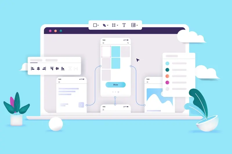
Every tap, swipe, and scroll on your mobile app creates a moment of connection between your user and your interface. These tiny interactions happen hundreds of times during a typical app session, yet most users barely notice them—unless they're done wrong. That's when the magic of good UX design becomes painfully obvious by its absence.
The secret lies in understanding two powerful tools that can make or break your mobile app experience: animations and micro-interactions. Both serve different purposes in your app's ecosystem, but they're often confused or used interchangeably. Getting this distinction right can transform a functional app into something users genuinely love using.
Great UX design is invisible until it's missing
When I'm working with clients on their mobile apps, I see this confusion all the time. Someone will ask for "more animations" when what they really need are better micro-interactions, or vice versa. The result? Apps that feel either lifeless or overwhelmingly flashy—neither of which keeps users engaged. Understanding when to use each approach, and how they work together, is what separates amateur app design from professional mobile experiences that users return to again and again.
What Are Animations In Mobile Apps
Animations in mobile apps are moving elements that happen on your screen—think of a button that grows bigger when you tap it, or a menu that slides in from the side. They're basically any visual change that happens over time rather than instantly. I've been working with these for years now, and they've become one of the most powerful tools we have for making apps feel alive and responsive.
The main job of animations is to guide users through your app and make interactions feel natural. When you swipe to delete an email and it smoothly slides away, that's an animation working to show you what's happening. Without it, things would just appear and disappear abruptly, which feels jarring and confusing.
Types of Animations You'll See
- Transitions between screens (like sliding from one page to another)
- Loading animations (spinning wheels or progress bars)
- Feedback animations (buttons changing colour when pressed)
- Entrance and exit effects (elements fading in or out)
- Scroll animations (parallax effects or sticky headers)
Good animations should feel purposeful, not decorative. They help users understand what's happening, where they are in the app, and what they can do next. When done right, people don't even notice them—they just make the whole experience feel smooth and polished.
What Are Micro-Interactions In Mobile Apps
Micro-interactions are the small, brief moments when users interact with your mobile app. Think of them as tiny responses that happen when someone taps a button, swipes through photos, or pulls down to refresh content. They're called "micro" because they last just a few seconds—sometimes less than that!
These little interactions give users instant feedback about what's happening in your app. When you tap the heart button on Instagram and it fills with red colour, that's a micro-interaction. When you slide the toggle switch in your settings and it smoothly moves from left to right, that's another one. They make your app feel alive and responsive.
The Four Key Parts of Micro-Interactions
Every micro-interaction has four parts: a trigger (what starts it), rules (what happens), feedback (what the user sees), and loops (what happens next time). The trigger might be tapping a button; the rules determine how the button responds; the feedback shows the user what happened; and loops decide if it should work differently next time.
Keep micro-interactions simple and fast—users shouldn't have to wait more than a second to see the response to their action.
Good micro-interactions make your mobile app feel polished and professional. They help users understand what's happening without having to think too hard about it, which is exactly what great UX design should do.
Key Differences Between Animations And Micro-Interactions
Right, so we've covered what animations and micro-interactions are—now let's talk about how they're actually different. I see a lot of confusion around this topic, and honestly, it's understandable because they do overlap quite a bit. But there are some clear distinctions that will help you choose the right approach for your app.
The biggest difference is scope. Animations tend to be larger, more noticeable movements that grab attention. Think of a screen transition or a loading spinner that fills half your screen. Micro-interactions, on the other hand, are those subtle little responses that happen when you tap a button or pull down to refresh. They're quieter, more focused on specific user actions.
Purpose and Function
Animations are often decorative—they make things look polished and professional. Micro-interactions are more functional; they're there to give users feedback and guide them through tasks. Here's a breakdown of the main differences:
- Animations: Usually longer duration, more dramatic movement, often decorative
- Micro-interactions: Brief, subtle, always tied to user actions
- Animations: Can be purely visual enhancement
- Micro-interactions: Always serve a functional purpose
- Animations: Often involve multiple elements moving together
- Micro-interactions: Usually focus on single elements or small groups
The key thing to remember is that good micro-interactions feel invisible—users don't really notice them, but they'd definitely miss them if they weren't there. Animations, by contrast, are meant to be seen and appreciated.
When To Use Animations In Your Mobile App
After years of building mobile apps, I've learned that animations work best when they solve actual problems—not just when they look pretty. The key is knowing when your users need guidance through your app's interface and when they might feel lost without visual cues.
Animations shine during transitions between screens, loading states, and when you need to show users where content is coming from or going to. They're brilliant for onboarding sequences where you want to teach users how your app works. Think about when someone opens a menu drawer or when content slides in from the side—these moments need animation to feel natural and help users understand the spatial relationship between different parts of your mobile app.
Loading States and Feedback
Loading animations are probably the most common use case I see in UX design. When your app needs time to fetch data or process something, a well-crafted animation keeps users engaged rather than staring at a blank screen wondering if something's broken.
Good animations in mobile apps should always serve the user first and look beautiful second
Status changes are another perfect spot for animations—when someone likes a post, adds an item to their basket, or completes a task. These micro-moments benefit from animated feedback that confirms the action worked.
When To Use Micro-Interactions In Your Mobile App
Right, let's talk about when micro-interactions make sense in your mobile app—and when they don't. After building countless apps over the years, I've learned that micro-interactions aren't just decoration; they're functional elements that solve real user problems. The key is knowing when to use them.
You want micro-interactions when users need immediate feedback from their actions. Think about when someone taps a button—they need to know the app has registered their touch. A subtle colour change or gentle bounce tells them "yes, I heard you" without making a song and dance about it. The same goes for form validation; a quick red shake when someone enters incorrect details is much clearer than just showing an error message.
Perfect Situations for Micro-Interactions
- Button presses and taps that need acknowledgment
- Loading states that keep users informed
- Form validation and error correction
- Pull-to-refresh gestures
- Toggle switches and checkbox selections
- Progress indicators during multi-step processes
The golden rule? Use micro-interactions when they help users understand what's happening or what they should do next. If it's just there to look pretty, skip it. Your users will thank you for keeping things snappy and purposeful.
Common Mistakes With Animations And Micro-Interactions
After years of working with mobile app development teams, I've noticed the same errors cropping up time and time again. Teams get excited about adding movement to their apps—and rightly so—but they often miss the mark on execution. The biggest mistake I see? Overusing animations and micro-interactions just because they look cool. Every tap, swipe, and button press doesn't need a fancy animation attached to it.
Speed is another area where teams frequently stumble. Animations that take longer than 300 milliseconds start to feel sluggish, whilst micro-interactions should respond almost instantly. Users expect immediate feedback when they interact with your mobile app, not a theatrical performance. I've seen beautiful animations that completely ruin the UX design because they're too slow or happen at the wrong moments.
The Most Common Problems We See
- Making animations too long or complex for simple actions
- Adding movement without any clear purpose or user benefit
- Forgetting to test on slower devices where animations might stutter
- Using inconsistent timing across different micro-interactions
- Ignoring accessibility settings that disable motion
Always ask yourself: does this animation help the user understand what's happening, or is it just decorative? If it's purely decorative, you probably don't need it.
The key is restraint. Good animations and micro-interactions should feel invisible—they guide users without drawing attention to themselves. When done right, people won't even notice them consciously, but they'll definitely notice when they're missing or poorly implemented.
Best Practices For Both Animations And Micro-Interactions
After years of building mobile apps, I've learnt that creating good animations and micro-interactions isn't just about making things look pretty—it's about making your app feel right. The most successful apps I've worked on follow a few simple rules that make all the difference.
Keep It Simple and Meaningful
Every animation and micro-interaction should have a clear purpose. Don't add movement just because you can; add it because it helps users understand what's happening. When someone taps a button, a subtle press animation tells them their action worked. When content loads, a smooth transition keeps them engaged rather than confused.
Speed and Timing Matter
I can't stress this enough—timing is everything. Animations should feel snappy, not sluggish. Most interactions work best when they last between 200-500 milliseconds. Any longer and users get impatient; any shorter and they might miss what happened entirely.
Always test your animations on different devices too. What runs smoothly on the latest iPhone might struggle on older Android phones. I've seen beautiful animations that completely ruined the user experience because they were too demanding on the device's processor.
Remember, good animations and micro-interactions should feel invisible—users notice when they're missing, not when they're there.
Conclusion
After building mobile apps for years, I can tell you that understanding the difference between animations and micro-interactions is one of those things that separates good UX design from great UX design. It's not just about making things look pretty—though that's nice too—it's about creating experiences that feel natural and help users achieve their goals.
The key takeaway? Animations are your storytellers; they guide users through bigger moments and transitions in your mobile app. Micro-interactions are your silent helpers; they provide instant feedback and make every tap, swipe, and action feel responsive. Both have their place, and when used thoughtfully together, they create apps that people genuinely enjoy using.
Don't fall into the trap of thinking you need flashy animations everywhere or that every button needs a fancy micro-interaction. The best mobile apps use both sparingly but effectively. Start with your user's needs, then add these elements to support those needs—not the other way around. Remember, users don't download apps to be impressed by your animation skills; they want to get things done quickly and easily. When your animations and micro-interactions help rather than hinder that goal, you're on the right track.