Over 80% of smartphone users have switched to dark mode at least once, yet most people don't realise that Android dark mode and iOS dark mode work quite differently behind the scenes. What looks like a simple colour flip on your screen actually involves complex design decisions, technical implementations, and user experience considerations that vary significantly between these two major platforms.
I've noticed that many app developers assume dark mode works the same way across all devices—and that assumption can lead to some pretty jarring user experiences. When you're designing an app that needs to work seamlessly on both Android and iOS, understanding these platform differences becomes absolutely critical. It's not just about making things look dark; it's about respecting how each operating system approaches the entire concept.
The devil is in the details when it comes to dark mode implementation, and those details can make or break your app's user experience
This guide will walk you through the key differences between Android dark mode and iOS dark mode, covering everything from visual design choices to technical implementation requirements. By the end, you'll understand why your app might look perfect on one platform but feel completely wrong on the other—and more importantly, how to fix it.
What Is Dark Mode
Dark mode is a display setting that swaps the traditional light backgrounds and dark text for dark backgrounds with light text. Instead of staring at a bright white screen, you get a sleek black or dark grey interface that's easier on your eyes—particularly when you're using your phone in low-light conditions.
The concept isn't new; computer terminals back in the day displayed green or amber text on black screens. But modern dark mode is much more sophisticated than those early displays. It's not just about inverting colours—it's about creating a balanced, readable interface that looks good and works well.
Why Dark Mode Became Popular
There are several reasons why dark mode has taken off in recent years. Battery life is a big one, especially on phones with OLED screens where black pixels are actually turned off, saving power. Many users also find dark interfaces less straining on their eyes, particularly during evening use.
Both iOS and Android now offer system-wide dark mode options that can automatically switch based on time of day or ambient light conditions. Apps can either follow the system setting or provide their own dark mode toggle, and understanding the advantages of Android customization can help explain why these platforms handle dark mode differently.
What Makes Good Dark Mode Design
Good dark mode isn't just about making everything black. The best implementations use:
- Carefully chosen grey tones rather than pure black
- Proper contrast ratios for text readability
- Adjusted colours that work well on dark backgrounds
- Consistent behaviour across the entire app
The key is making sure the interface remains usable and attractive whilst providing the benefits users expect from dark mode.
How iOS Dark Mode Works
Apple introduced Dark Mode with iOS 13, and it's been a game-changer for iPhone users ever since. The system works by automatically switching your device's interface from light backgrounds to dark ones—but there's more happening behind the scenes than you might think.
When you enable Dark Mode on iOS, the system doesn't just flip colours randomly. Apple uses what they call "semantic colours" which means each colour has a specific purpose and automatically adapts based on whether you're in light or dark mode. Your status bar, navigation bars, and system controls all change together seamlessly.
Activation Methods
iOS gives you three ways to control Dark Mode. You can toggle it manually through Settings, set it to follow your sunrise and sunset times, or schedule it for specific hours. The scheduling option is particularly clever—it can use your location to automatically switch modes based on natural light patterns.
Most users don't realise that iOS Dark Mode affects more than just Apple's own apps. Third-party apps that support the system will automatically switch too, creating a consistent experience across your entire device.
Technical Implementation
Apple's approach uses dynamic colours that respond to the current appearance setting. When developers build iOS apps, they can assign colours that automatically change based on the user's preference. This means the transition happens instantly across all compatible apps when you switch modes, and this consistency is part of what makes Apple's product ecosystem so cohesive.
- Automatic colour adaptation using semantic naming
- System-wide consistency across all Apple apps
- Location-based scheduling options
- Instant switching with no app restarts required
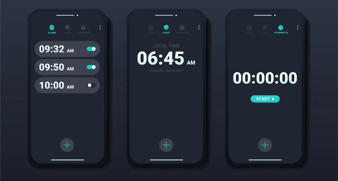
How Android Dark Mode Works
Android's approach to dark mode is quite different from iOS—and honestly, it's a bit more complex under the hood. Google introduced system-wide dark mode support in Android 10, which means the operating system can tell all apps to switch to their dark versions at once. But here's where it gets interesting: Android gives users much more control over when and how this happens.
System-Level Controls
Android users can toggle dark mode from the settings menu, but they also get some neat extras. The system can automatically switch between light and dark modes based on sunrise and sunset times, or users can set custom schedules. This flexibility is quite handy—you might want dark mode during evening hours but prefer light mode during the day.
How Apps Respond
When Android switches to dark mode, it sends a signal to all installed apps. Apps that support dark mode will automatically switch their interface colours, backgrounds, and text to match the system setting. Apps that don't support it yet will just carry on looking the same as before.
The really clever bit is that Android can also apply a basic dark theme to apps that haven't been updated yet—though this doesn't always look perfect, it's better than nothing. This means users get at least some dark mode benefits across their entire device, even with older apps.
Design Differences Between iOS and Android Dark Mode
After years of designing apps for both platforms, I can tell you that iOS and Android dark mode differences go way beyond just switching colours around. Apple's approach to dark mode is quite strict—they use what they call "semantic colours" which means the system automatically picks the right shade based on what you're doing. Their blacks are more of a deep charcoal grey, and they really focus on maintaining that premium feel you'd expect from Apple.
Android dark mode gives developers much more freedom to play with. Google's Material Design guidelines are more like suggestions than rules, so you'll see a lot more variety in how apps look. Some use pure black backgrounds (great for OLED screens), while others stick to dark greys similar to iOS. The customisation options are endless—which can be both a blessing and a curse depending on how you look at it, especially when following modern app design trends.
The key difference is that iOS prioritises consistency across all apps, while Android celebrates creative freedom and personalisation
When it comes to platform differences, iOS apps tend to look more uniform because Apple's design system is so rigid. Android apps can vary wildly in their dark mode implementation, which means users get a less predictable experience but potentially more exciting visual variety. Both approaches have their merits—it really depends on what you value more as a user.
User Experience Variations
The way people actually use dark mode on iOS and Android feels quite different in practice. I've watched countless users switch between both platforms and the differences are more subtle than you might expect—but they're definitely there.
On iOS, dark mode feels like a complete transformation of the interface. Apple's approach means that when you flip the switch, almost everything changes colour instantly. The control centre, settings, messages, even third-party apps that support it—they all shift together. It creates this cohesive feeling where your entire phone has changed its personality.
Android's Flexible Approach
Android users get more choice in how they experience dark mode. Some people love that they can keep certain apps in light mode while others stay dark. You might have your messaging app in dark mode for late-night texting but keep your photo gallery light because colours look better that way.
The scheduling options work differently too. iOS users can set dark mode to follow sunrise and sunset, which feels natural but isn't very customisable. Android lets you pick specific times—maybe you want dark mode to start at 8pm rather than when the sun goes down.
Battery life improvements tend to be more noticeable on Android phones with OLED screens, though this varies by device manufacturer and how they've implemented the feature.
Technical Implementation Differences
When it comes to actually building dark mode into your app, iOS and Android couldn't be more different. I've spent countless hours wrestling with both platforms—and let me tell you, each has its own quirks that'll keep you on your toes!
iOS makes things relatively straightforward with its semantic colour system. You define colours like "labelColor" and "systemBackground" once, and the system automatically switches between light and dark variants. It's almost too easy! The tricky bit is making sure your custom colours play nicely with these system ones.
Key Implementation Approaches
- iOS uses semantic colours that adapt automatically
- Android relies on themes and resource qualifiers
- iOS switches happen instantly system-wide
- Android dark mode requires more manual configuration
Android dark mode takes a different approach entirely. You'll need to create separate resource folders (like "values-night") and define your colours twice—once for light mode, once for dark. It's more work upfront, but it gives you greater control over the final result, and understanding how to maintain control of your app source code becomes crucial when managing these multiple implementations.
Always test your dark mode implementation on actual devices, not just simulators. The way colours render can vary significantly between emulated and real hardware.
The biggest headache? Making sure your app responds properly when users switch modes whilst your app is running. Both platforms handle this differently, and getting it right takes practice, especially when working with experienced app development teams who understand these platform nuances.
Conclusion
After working with both iOS and Android dark modes across countless projects, I can tell you that whilst they share the same goal—reducing eye strain and saving battery life—they achieve it quite differently. Apple's approach feels more structured and predictable, with their clear semantic colour system making it straightforward for developers to implement. Google's Material You system offers more flexibility but requires careful consideration to get right.
The user experience differences matter more than you might think. iOS users get consistent dark mode behaviour across all apps, which creates a seamless experience. Android users benefit from more customisation options, including different shades of dark and better integration with system themes. Both have their strengths.
From a technical standpoint, the implementation methods reflect each platform's philosophy. iOS focuses on simplicity and consistency—you define your colours once and the system handles the rest. Android gives you more control but expects you to manage more of the complexity yourself.
When designing for dark mode, don't assume what works on one platform will work on the other. Test thoroughly on both systems, pay attention to the native design guidelines, and remember that your users have chosen their platform for a reason. Respect those differences and your app will feel at home wherever it lives.