Which Psychological Principles Should Guide Your ASO Strategy?
Nearly half of all downloaded apps get deleted within the first week. That's millions of pounds in development costs and marketing spend going straight down the drain because apps failed to connect with users on a psychological level. After years of building apps and watching some soar while others crash spectacularly, I've learned that successful App Store Optimisation isn't just about keywords and pretty screenshots—it's about understanding the human mind.
Most developers think ASO is a technical challenge. Write better descriptions, pick the right keywords, optimise for the algorithm. But here's what they're missing: every tap, swipe, and download decision is driven by psychological triggers that have been hardwired into our brains for thousands of years. The apps that succeed aren't necessarily the best ones—they're the ones that speak to these deep-seated psychological patterns.
People don't buy products, they buy better versions of themselves
When someone scrolls through the App Store, they're not just looking for software. They're looking for solutions to problems, ways to feel better about themselves, or tools that make them appear smarter, more organised, or more successful to others. Understanding this shift in perspective changes everything about how you present your app.
The psychology behind user behaviour affects every element of your ASO strategy—from the colours you choose in your icon to the way you structure your app description. Social proof influences download decisions, cognitive biases shape first impressions, and emotional triggers determine whether someone hits that install button or scrolls past. Get these psychological principles right, and you'll see your conversion rates climb. Ignore them? Well, you'll be joining that depressing statistic of forgotten apps.
The Psychology Behind App Discovery
Right, let's talk about how people actually find apps—because its not the way most developers think it happens. I've watched countless clients spend months perfecting their app only to wonder why nobody's downloading it. The truth? App discovery is messy, emotional, and often completely irrational.
Most people don't wake up thinking "I need a productivity app today." Instead, they're scrolling through their phone at 11pm, feeling overwhelmed by tomorrow's to-do list, and suddenly they're searching the App Store. That emotional state—that moment of need—shapes everything about how they evaluate apps.
The Paradox of Choice in App Stores
Here's something that might frustrate you: having too many options actually makes people less likely to choose anything at all. When someone searches for "fitness app" and sees thousands of results, their brain basically shuts down. This is why the apps that succeed aren't necessarily the best ones—they're the ones that make the decision easy.
I've seen this play out countless times. The apps that get downloaded are those that appear in the first few results and immediately communicate what they do. No fancy descriptions needed. Just clear, obvious value that matches what someone's looking for in that exact moment.
Mental Shortcuts Rule Everything
People use mental shortcuts constantly when browsing app stores. They'll judge your app's quality by its icon within milliseconds—honestly, it's that fast. They'll assume an app with 4.8 stars is better than one with 4.2 stars, even if they never read a single review. These shortcuts aren't logical, but they're predictable. And once you understand them, you can design your app store presence to work with these natural tendencies rather than against them.
Cognitive Biases That Drive Downloads
Right, let's talk about the mental shortcuts our brains take when deciding whether to download an app. As someone who's optimised thousands of app store listings, I can tell you that understanding these cognitive biases is like having a secret weapon in your ASO strategy. These aren't manipulation tactics—they're just how human psychology works, and if you ignore them, you're basically fighting an uphill battle.
The scarcity bias is probably the most powerful one I've seen in action. When people think something might not be available later, they want it more. Limited-time offers, exclusive features, or even phrases like "join thousands of users" create that sense of urgency. I've watched apps increase their conversion rates by 40% just by adding time-sensitive language to their descriptions.
The Big Three Biases That Matter Most
- Anchoring bias - Users fixate on the first piece of information they see (your app icon and title)
- Confirmation bias - People look for evidence that supports what they already believe about your app
- Loss aversion - The fear of missing out is stronger than the desire to gain something
Here's something that might sound obvious but gets overlooked constantly: people don't actually read your entire app description. They scan it looking for confirmation that this app will solve their specific problem. That's confirmation bias in action—they've already decided what they want, and they're just checking you tick the right boxes.
The bandwagon effect is massive too. When someone sees "over 1 million downloads" or "rated #1 productivity app," their brain automatically assumes it must be good because everyone else chose it. Social proof isn't just nice to have; it's a psychological trigger that directly impacts download decisions.
Test different variations of your app title and description that appeal to these biases, but keep it honest. Users will figure out if you've oversold your app, and that leads to terrible reviews and high uninstall rates.
Social Proof and User Decision Making
When users are browsing app stores, they're basically making split-second decisions based on what other people think. It's mad how much we rely on other peoples opinions, isn't it? But that's exactly how social proof works in psychology—and its one of the most powerful forces driving app downloads.
I've seen apps with mediocre functionality get thousands of downloads simply because they had strong social signals. Meanwhile, genuinely good apps struggle because they haven't cracked the social proof code. The thing is, when someone's scrolling through search results, they're not going to spend ages evaluating each app. They want shortcuts to make quick decisions.
The Main Types of Social Proof That Drive Downloads
- Download numbers (the "10M+ downloads" badge carries serious weight)
- Star ratings and review counts
- Featured placements and editorial selections
- Social media mentions and influencer endorsements
- Awards and recognition badges
- User-generated content in screenshots
But here's what most developers get wrong—they think social proof is just about showing big numbers. Actually, its about showing the right kind of social validation for your target audience. A fitness app targeting serious athletes might benefit more from endorsements by professional trainers than from having millions of casual downloads.
The review section is where social proof gets really interesting. People don't just look at the star rating; they read the actual comments to see if other users are like them. When I'm optimising ASO strategies, I always tell clients to encourage specific types of reviews that speak to their ideal users pain points and success stories.
You know what's particularly effective? Responding to reviews publicly. It shows potential users that theres a real team behind the app who cares about user experience. That human touch can be the deciding factor between your app and a competitor's.
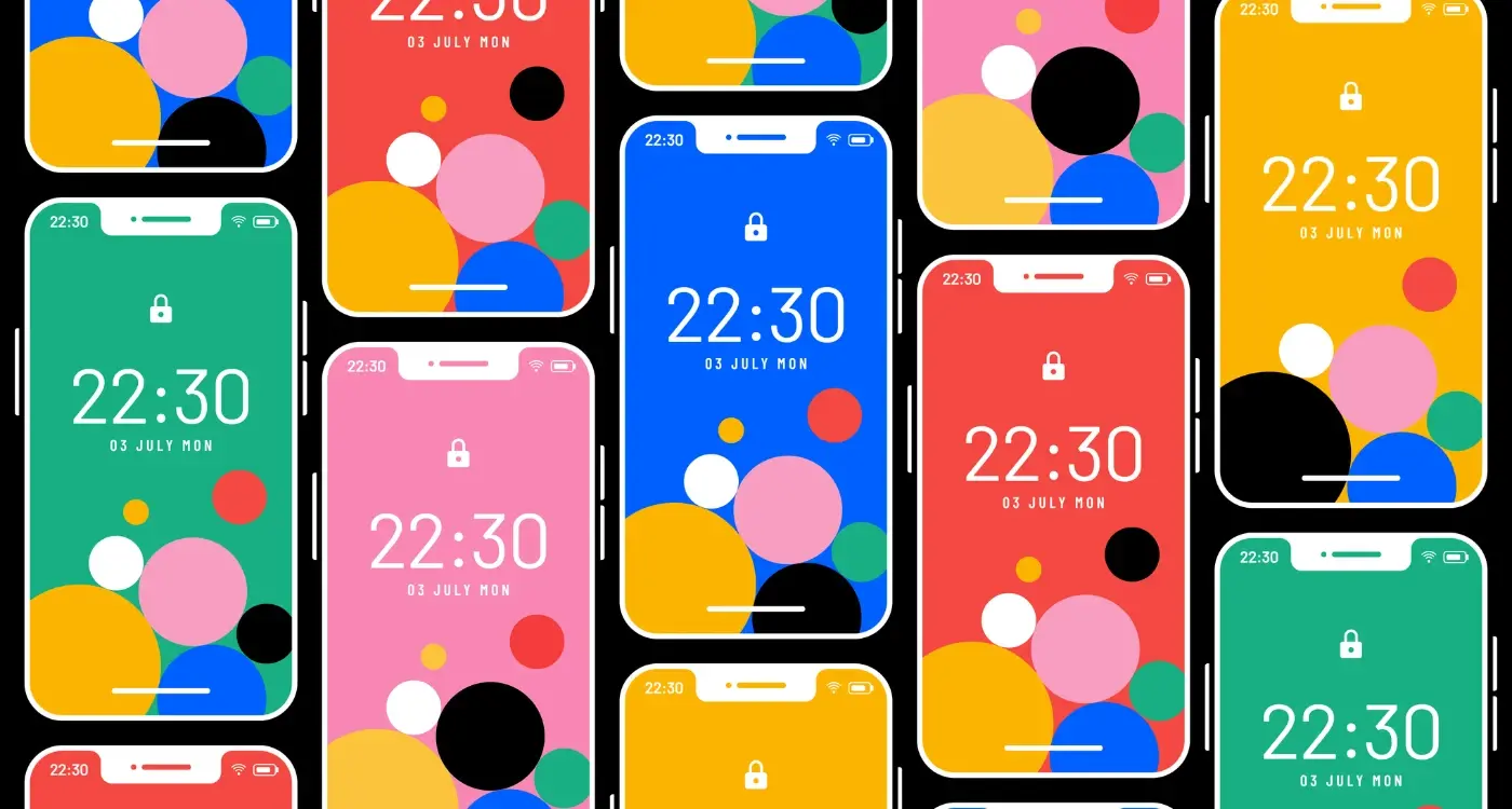
The Power of First Impressions in App Stores
You've got about three seconds. That's it—three seconds before someone decides whether your app is worth their time or if they're moving on to the next option. I've watched this happen thousands of times through user testing sessions, and honestly, it's both fascinating and terrifying how quickly people make these snap judgements.
Your app icon is doing most of the heavy lifting here. It needs to communicate what your app does without any explanation—which sounds simple but is bloody difficult in practice. I've seen brilliant apps fail because their icon looked too similar to existing apps, or worse, looked like something completely different than what the app actually does. The brain processes visual information incredibly fast; if there's any confusion about what your app is, people will skip it entirely.
The Screenshot Sequence Strategy
Here's where things get interesting—most people don't just look at your first screenshot, they actually scan the sequence quite quickly. The psychological principle at work here is called "cognitive fluency"—basically, if information is easy to process, we're more likely to view it positively. Your screenshots need to tell a story that flows naturally from one to the next.
The first impression your app makes in the store isn't just about looking good—it's about communicating value and building trust in milliseconds
What really matters is that first screenshot showing the core value proposition immediately. Don't make people guess what your app does or why they need it. I always tell clients: if someone can't understand your app's main benefit from that first image alone, you've already lost them. And remember, on mobile devices, that screenshot is tiny—every pixel counts in making your case.
Emotional Triggers in App Descriptions
Your app description isn't just a list of features—it's your chance to connect with people on an emotional level. After spending years crafting descriptions for everything from meditation apps to fintech platforms, I've learned that the most successful descriptions tap into specific feelings and desires that drive human behaviour.
The opening lines are absolutely critical. You've got about three seconds before someone scrolls away, so lead with emotion, not features. Instead of "Our app has advanced analytics," try "Finally understand what your customers really want." See the difference? The second version speaks to the frustration and curiosity that business owners actually feel.
Core Emotional Drivers That Work
- Fear of missing out - "Join millions who've already discovered..."
- Time anxiety - "Get results in just 5 minutes a day"
- Status and achievement - "Master skills that set you apart"
- Belonging - "Connect with your community"
- Control and empowerment - "Take charge of your health today"
I always tell clients to write their descriptions like they're talking to a friend who has a specific problem. What would you say to convince them this app will genuinely help? That conversational tone, combined with emotional understanding, creates descriptions that feel human rather than corporate.
One thing that really works is addressing the emotional 'before' state—the frustration, confusion, or struggle someone feels—then painting a picture of the 'after' state your app provides. People don't download productivity apps because they love task management; they download them because they're stressed about forgetting important things. Speak to that stress first, then offer the solution.
The most effective descriptions I've written focus 70% on emotional benefits and only 30% on features. Features tell, but emotions sell.
Visual Psychology for App Screenshots
Your app screenshots are basically your shop window—and people make decisions about them in milliseconds, not minutes. I've seen brilliant apps fail because their screenshots looked amateurish, and average apps succeed because they understood visual psychology. It's a bit mad really, but users form opinions about your app's quality before they even read a single word of description.
The first screenshot is your hero shot; it needs to communicate your app's core value instantly. Most people scan from left to right (at least in Western markets), so your most compelling visual should be front and center. But here's the thing—your screenshots shouldn't just show your app, they should tell a story about how it fits into someone's life.
The Power of Visual Hierarchy
Human brains process visual information in a predictable pattern. We look at faces first, then text, then other UI elements. If your app has user profiles or avatars, make sure they're showing happy, diverse people who represent your target audience. I always tell clients to avoid showing empty states or placeholder content—it makes the app feel lifeless and unused.
Use the "squint test" on your screenshots. If you squint and can't immediately understand what each screenshot shows, neither will potential users scrolling through the app store.
Colour psychology plays a huge role too. Warm colours like red and orange create urgency and excitement, whilst cool colours like blue and green suggest reliability and calm. Your screenshot backgrounds shouldn't compete with your app's interface—they should support it. And honestly? Less is more. Don't try to cram every single feature into five screenshots. Show your app solving real problems for real people instead.
Building Trust Through Reviews and Ratings
Reviews and ratings are basically the lifeblood of your app's credibility—honestly, they can make or break your download numbers faster than any other single factor. I've seen brilliant apps struggle because they had a few early negative reviews, and I've watched mediocre apps thrive simply because they managed their review strategy well from day one.
The psychology here is pretty straightforward; people trust other people's experiences more than they trust marketing copy. When someone sees an app with 4.8 stars and hundreds of positive reviews, their brain shortcuts straight to "this must be good" without much further analysis. But here's where it gets interesting—the way people process reviews isn't always logical.
The Review Scanning Pattern
Most users don't actually read reviews thoroughly. They scan for patterns, look for recurring complaints, and pay particular attention to recent reviews. A single well-written negative review can outweigh ten generic positive ones if it mentions specific issues that resonate with potential users concerns.
One thing I always tell my clients is that responding to reviews—especially negative ones—shows you're actively listening. Users notice this stuff. When they see a developer taking the time to address complaints and offer solutions, it builds confidence that the app is being maintained and improved.
Timing Your Review Requests
The moment you ask for a review matters enormously. Ask too early and users haven't experienced enough value; ask after they've encountered a bug and you're asking for trouble. The sweet spot is usually after users have completed a successful action or achieved something meaningful within your app.
- Target users who've been active for at least a week
- Ask after positive interactions or completed tasks
- Make it easy to dismiss the request without feeling guilty
- Follow up with power users who might become advocates
Remember, fake reviews are a terrible idea—app stores are getting better at detecting them, and users can often spot them too. Focus on genuinely earning those reviews through great user experiences instead.
Behavioural Economics in App Pricing
Price anchoring is probably the most powerful psychological principle I've seen work in app stores. When users see three pricing tiers—let's say £2.99, £7.99, and £14.99—they almost always gravitate towards the middle option. It's mental, really. We automatically assume the middle price represents the best value, even when we haven't properly evaluated what we're getting for our money.
The freemium model plays brilliantly into our loss aversion bias. Once people have used your app for free and built up some progress or content, they become genuinely reluctant to lose that investment. I've worked on fitness apps where users wouldn't dream of switching to a competitor after logging weeks of workouts—even if the competitor was objectively better. That psychological ownership is incredibly powerful.
Decoy Pricing and the Goldilocks Effect
Here's something that works really well: if you want people to choose your premium plan at £9.99, don't just offer a free version. Add a basic paid tier at £7.99 that's only slightly better than free. Suddenly, your premium option looks like incredible value. Users think they're being clever by avoiding the "obvious" rip-off middle tier, but you've actually guided them exactly where you wanted them to go.
The most successful apps don't compete on price—they make price comparisons irrelevant by creating unique value propositions that users can't find elsewhere
Subscription fatigue is real though. People are becoming more selective about their monthly commitments, so your pricing psychology needs to work harder. I've found that offering annual plans with monthly pricing ("just £0.99 per month, billed annually") makes the commitment feel smaller whilst actually increasing customer lifetime value. The human brain struggles with long-term cost calculations, and we tend to focus on that smaller monthly figure rather than the £11.99 yearly total.
Conclusion
After building apps for nearly a decade, I can tell you that understanding psychology isn't just helpful for ASO—it's absolutely fundamental. The days when you could throw an app into the store and hope for the best are long gone. Today's users make split-second decisions based on psychological triggers that most developers don't even think about.
What strikes me most is how predictable human behaviour really is when it comes to app discovery. We've covered social proof, cognitive biases, first impressions, emotional triggers—and honestly? These principles work because they tap into how our brains are actually wired. People want to feel safe with their choices, they want to belong to something bigger, and they want to believe they're making smart decisions.
Here's the thing though—you don't need to manipulate people to succeed. The best ASO strategies I've seen simply make it easier for users to recognise that an app is right for them. When you align your screenshots with what people expect to see, when you use reviews to build genuine trust, when you price your app in a way that feels fair... you're not tricking anyone. You're just removing the friction between a user's need and your solution.
The psychological principles we've discussed work best when they're authentic. Users can sense when something feels forced or fake, and the app stores are getting better at identifying manipulative tactics. Focus on understanding your users' real motivations and fears, then address them honestly in your store presence. That's how you build an ASO strategy that converts visitors into users and users into advocates.
Share this
Subscribe To Our Learning Centre
You May Also Like
These Related Guides
How Does Colour Psychology Impact App Store Performance?

How Do I Improve App Store Rankings Using Psychology?