A photographer launches their new camera app with high hopes. The interface looks sleek, the filters are top-notch, and the editing tools rival professional software. But within weeks, users start abandoning it. Reviews mention the app feeling "clunky" and "unresponsive"—even though everything technically works perfectly. What went wrong? The app was missing those tiny moments of delight that make users fall in love with digital products.
This scenario plays out thousands of times across app stores every day. Developers focus so much on big features that they forget about the small details that actually matter to users. These details—called micro-interactions—are the difference between an app that gets deleted after one use and one that becomes part of someone's daily routine.
The best mobile app experiences aren't built on grand gestures; they're crafted from hundreds of tiny, thoughtful moments that guide users seamlessly through their journey.
After building mobile apps for over eight years, I've seen how these split-second interactions can make or break user engagement. A button that responds instantly when tapped; a loading animation that keeps people interested instead of frustrated; a form that gently guides users when they make mistakes. These aren't just nice touches—they're what separate amateur apps from professional ones that users actually want to keep using. The truth is, users might not consciously notice good micro-interactions, but they definitely feel their absence. And in a world where people have millions of apps to choose from, that feeling matters more than any feature list ever could.
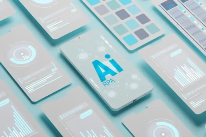
What Are Micro-Interactions and Why Should You Care
Micro-interactions are those tiny moments in your app that respond to what users do. When you tap a button and it changes colour, when you pull down to refresh and see a spinning wheel, or when you receive a gentle vibration after typing—that's a micro-interaction. They're the small details that make your app feel alive and responsive.
Think of them as your app's way of having a conversation with users. Without them, your app would feel cold and unresponsive; with them, it feels like it's actually listening and reacting to what people want to do. These interactions happen in milliseconds, but they shape how users feel about your entire app.
The Four Parts of Every Micro-Interaction
Every micro-interaction follows the same pattern, and understanding this helps you design better ones:
- Trigger—something that starts the interaction (like tapping a button)
- Rules—what happens when the trigger occurs
- Feedback—how the app shows the user what's happening
- Loops—what happens if the interaction repeats or continues
Here's why you should care about getting these right: users notice when micro-interactions are missing more than when they're there. When done well, they're invisible—people don't consciously think about them, but they feel right. When done poorly or not at all, your app feels broken or cheap.
After working on hundreds of apps, I can tell you that micro-interactions are often what separate apps that users love from apps that get deleted after a few uses. They don't just make your app prettier—they make it more usable and trustworthy.
The Science Behind Why Small Details Make Big Differences
Your brain processes about 11 million bits of information every second, but you're only consciously aware of about 40 bits. That's a tiny fraction—and it explains why micro-interactions in your mobile app are so powerful. They work below the radar of conscious thought, creating feelings and responses that users can't quite put their finger on.
When someone taps a button and it responds instantly with a subtle animation, their brain releases a small hit of dopamine. It's the same chemical that makes social media so addictive, but in this case, it's telling the user "yes, that worked exactly as expected." No frustration, no confusion—just smooth progress towards their goal.
The Psychology of Expectation
Users develop expectations within milliseconds of opening your app. If a loading spinner appears immediately when they tap something, they'll wait longer than if nothing happens at all. Their brain interprets the spinner as "something is happening" rather than "this app is broken." That split-second feedback prevents them from tapping repeatedly or abandoning the task altogether.
The same principle applies to form validation. When users see a green tick appear next to a correctly filled field, they get confirmation that they're on the right track. Without it, they're left wondering whether they've made a mistake—and that uncertainty creates stress.
Cognitive Load and User Engagement
Every decision your users make requires mental energy. Smart micro-interactions reduce cognitive load by providing clear, immediate feedback about what's happening and what comes next. This keeps users engaged longer and makes them more likely to complete the actions you want them to take.
Test your app's micro-interactions by using it with the sound off and in a noisy environment—if you can still understand what's happening through visual feedback alone, you're on the right track.
Common Micro-Interaction Mistakes That Push Users Away
After years of working with apps that succeed and apps that don't, I can tell you that most micro-interaction failures come down to the same handful of mistakes. The good news? They're all completely avoidable once you know what to look for.
The biggest problem I see is animations that are too slow or too fast. When a button takes half a second to respond to a tap, users start thinking something's broken—they'll tap again, creating all sorts of confusion. On the flip side, animations that happen too quickly feel jarring and cheap. The sweet spot sits between 200-300 milliseconds for most interactions.
The Most Common Slip-Ups
- Loading spinners that don't give any sense of progress or time remaining
- Error messages that appear and disappear too quickly to read
- Buttons that don't show any visual feedback when pressed
- Animations that keep playing when users navigate away from a screen
- Micro-interactions that drain battery life with unnecessary complexity
Another mistake that drives users mad is inconsistent behaviour across the app. If swiping works one way on the home screen but differently on the settings page, people get confused fast. Your micro-interactions need to follow the same rules throughout your entire app.
The worst offender, though, has to be ignoring accessibility. Not everyone can see your fancy animations or feel your haptic feedback. When you design micro-interactions that only work for some users, you're basically telling others they don't matter. That's not just bad design—it's bad business. Always include alternatives like audio cues or simple text confirmations for users who might need them.
Button Animations That Actually Work
Buttons are the workhorses of any mobile app—they're what gets people from point A to point B. But here's the thing: most button animations are either completely missing or so overdone they make users want to throw their phone across the room. I've seen buttons that bounce like rubber balls and ones that spin like washing machines. Not helpful.
The best button animations are subtle and purposeful. When someone taps a button, they need immediate feedback that something happened. A simple colour change or gentle press effect works wonders for user engagement. The animation should happen instantly—we're talking milliseconds here, not seconds. Any delay and people start tapping repeatedly, which breaks the whole experience.
The Press and Release Pattern
This is mobile app design basics: when someone presses a button, it should look pressed. When they release, it should return to normal. Sounds obvious, right? Yet so many apps get this wrong. The button might change colour on press but then snap back too quickly, leaving users wondering if they actually tapped it.
Good button feedback makes users feel confident about their actions, whilst poor feedback makes them question whether the app is working properly
Loading states deserve special mention here. If tapping a button triggers something that takes time—like submitting a form or processing a payment—the button needs to show this. A spinning icon inside the button works well, but disable the button too so people can't tap it repeatedly. This kind of thoughtful design consistency prevents frustration and keeps people engaged with your app instead of abandoning it halfway through important actions.
Loading States That Keep Users Happy
Nothing kills the mood quite like a blank screen that sits there doing absolutely nothing. We've all been there—you tap something and then... silence. Is it loading? Has it crashed? Should you tap again? This is where smart loading states come to the rescue, and trust me, they're one of the easiest wins you can get.
The key is giving users something to look at whilst your app does its thing in the background. A simple spinner can work, but why stop there? Progressive loading shows content as it becomes available—think about how Instagram loads low-quality images first, then sharpens them up. Popular apps like Draw Something showed us how important server scalability is for maintaining smooth user experiences.
Keep It Honest About Timing
Here's something most people get wrong: fake progress bars. You know the ones—they zip to 90% in two seconds then crawl for ages. Users aren't stupid; they notice this stuff. If you can't predict timing accurately, use an indeterminate spinner instead. It's better to be vague than dishonest.
For longer waits, give users something useful. Show tips, display interesting facts about your service, or let them browse other content. The worst thing you can do is leave someone staring at a static screen wondering if anything's actually happening. Even a simple "Loading your data..." message with animated dots makes a huge difference—it tells users the app is alive and working on their request.
Form Feedback That Guides Without Frustrating
Forms are where good mobile app experiences go to die. I've lost count of how many times I've watched users get halfway through filling out a form, hit an error, and just give up entirely. The problem isn't that people hate forms—they just hate bad form feedback.
The key to getting form micro-interactions right is timing and tone. Real-time validation is your friend here, but only when it's done properly. Show users they've entered something correctly with a subtle green tick or positive message. For errors, don't wait until they hit submit—tell them immediately, but gently.
When to Show Feedback
Password fields are perfect examples of where micro-interactions shine. As users type, show them which requirements they're meeting with visual indicators. Email validation should happen as soon as they move to the next field, not when they submit the entire form. This approach prevents that horrible moment when someone thinks they've completed everything perfectly, only to be told they made five different mistakes.
Making Errors Less Painful
Error messages need personality, but not too much. "Oops! That email doesn't look quite right" feels much better than "INVALID EMAIL FORMAT". Pair helpful text with subtle animations—a gentle shake or colour change draws attention without making users feel stupid.
Never clear a form field when there's an error. Users will want to throw their phone across the room if they have to retype everything because of one small mistake.
The goal is making users feel guided through the process rather than judged by it. Good form feedback transforms a necessary evil into something that actually improves user engagement with your mobile app.
Measuring the Impact of Your Micro-Interactions
Right, so you've spent time crafting these lovely micro-interactions—now what? Well, you need to know if they're actually working. There's no point having beautiful animations if they're making people leave your app faster than they arrived.
The good news is that measuring micro-interactions isn't rocket science. You just need to look at the right things. Start with your basic metrics: user engagement, session length, and completion rates for key actions. If people are spending more time in your app and actually finishing tasks, your micro-interactions are probably doing their job.
Key Metrics to Track
- Task completion rates—are people finishing what they started?
- Time spent on specific screens—longer isn't always better, but it can indicate engagement
- User drop-off points—where are people giving up?
- Return usage—are people coming back for more?
- Support tickets—fewer confused users means clearer interactions
Here's something I've learned over the years: micro-interactions work best when users don't really notice them consciously. They should feel natural, like part of the flow. If people are commenting on your button animations, they might be too flashy.
Testing Your Changes
A/B testing is your friend here. Run your new micro-interactions against the old version and see what happens. Sometimes what looks great in design doesn't translate to better user behaviour—and that's perfectly fine. Reliable analytics tools are essential for making informed decisions about your app's performance.
Don't forget to check performance metrics too. Beautiful animations mean nothing if they make your app slow or drain battery life. Balance is everything in mobile design.
Conclusion
After working on countless mobile app projects, I can tell you that micro-interactions are one of those things that separate good apps from great ones. They're not just decorative elements or afterthoughts—they're the small moments that make users feel like your app actually understands them. When someone taps a button and it responds just right, or when a loading animation keeps them engaged instead of frustrated, that's when you know you've got something special.
The beauty of micro-interactions lies in their subtlety. Users might not consciously notice when they're done well, but they'll definitely feel the difference. Your mobile app becomes more intuitive, more responsive, and frankly, more human. That translates directly into better user engagement and higher retention rates—something every app owner cares about.
But here's what I want you to remember: start small. You don't need to redesign your entire app overnight. Pick one area where users seem to struggle or drop off, then add a thoughtful micro-interaction to guide them through. Test it, measure it, and see what happens. Often, the smallest changes make the biggest impact on UX enhancement.
The apps that succeed today aren't just the ones with the best features—they're the ones that make every interaction feel effortless. Micro-interactions are your secret weapon for creating that feeling. They're the difference between an app that works and an app that users actually love using.