Have you ever noticed how your phone automatically switches between light and dark backgrounds throughout the day? This isn't just a trendy feature—it's become one of the most important aspects of modern mobile app design. Users expect apps to work seamlessly in both modes, and frankly, they get quite annoyed when they don't.
Over the years I've worked on dozens of mobile apps, and I can tell you that getting light and dark mode right is trickier than most people think. It's not just about flipping colours from white to black and calling it a day. There's proper planning involved—choosing the right colours, making sure text stays readable, and keeping buttons looking good in both settings.
The best apps are the ones that look like they were designed specifically for whichever mode you're using
The thing is, adaptive design has moved from being a nice-to-have feature to something users genuinely expect. When someone opens your app at 2am, they want dark mode to protect their eyes; when they're outside in bright sunlight, light mode needs to be crystal clear. Getting this balance right can make the difference between an app that feels professional and one that feels like an afterthought.
What Is Light And Dark Mode
Right, let's start with the basics—what exactly are light and dark modes? Think of them as two different ways your app can look on someone's phone or tablet. Light mode is what most people are used to; it's got a white or light-coloured background with dark text on top. Dark mode flips this around completely—dark backgrounds with light text.
Most apps these days offer both options, and users can switch between them whenever they want. Some phones even change automatically based on the time of day, which is quite clever really. The user might have your app in light mode during the day and dark mode in the evening without even thinking about it.
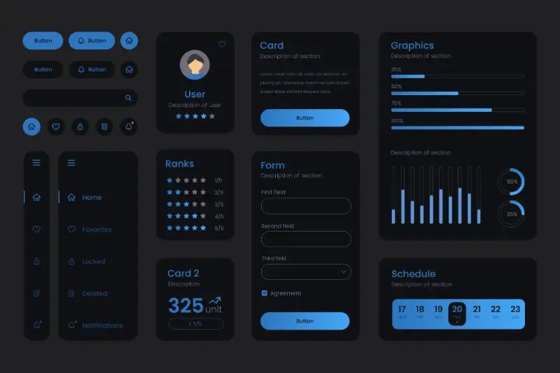
The Technical Side
When we build apps, we don't just make one version that looks good in light mode and hope for the best. We actually create two complete visual styles:
- Light mode styling with dark text on light backgrounds
- Dark mode styling with light text on dark backgrounds
- Different colour schemes for buttons, menus, and other elements
- Proper contrast ratios for both modes
The tricky bit is making sure everything works perfectly in both modes. Text needs to be readable, buttons need to stand out, and the whole app needs to feel consistent no matter which mode someone chooses.
Why People Choose Different Modes
When I'm designing apps, I always get asked the same question: why do some people love light mode whilst others swear by dark mode? The truth is, it's not just about personal preference—there are some pretty solid reasons behind these choices.
Light mode tends to be the go-to choice during daytime hours. It's easier on the eyes when you're in bright environments like offices or outdoors. Your phone screen needs to compete with all that natural light, and dark text on a white background just works better. Plus, most people grew up reading books and newspapers this way, so it feels natural.
The Dark Mode Appeal
Dark mode has become massively popular, especially among younger users. It's brilliant for late-night scrolling—much gentler on your eyes when you're lying in bed. Battery life is another big win; OLED screens use less power when displaying black pixels. Some people find it looks more modern and sleek too.
- Better for low-light environments
- Saves battery on OLED displays
- Reduces eye strain during extended use
- Popular with tech-savvy users
- Can help with light sensitivity issues
Remember that user preferences can change throughout the day. Many people switch between modes depending on their environment, so your mobile app design needs to work brilliantly in both.
The key thing to understand is that neither mode is inherently better—they serve different needs at different times. Smart adaptive design means giving users the choice and making sure your app looks fantastic either way.
Making Text Easy To Read In Both Modes
Text readability can make or break your app experience—and it's one of the trickiest parts of designing for both light and dark modes. I've seen too many apps where the text looks perfect in light mode but becomes nearly invisible when users switch to dark mode. The problem isn't just about making text darker or lighter; it's about understanding contrast ratios and how our eyes work differently in each mode.
The golden rule is contrast. Your text needs to stand out clearly from its background without being so harsh that it hurts to read. In light mode, dark grey text (not pure black) works better than you might think—pure black can be too stark and actually harder to read. For dark mode, avoid pure white text for the same reason; a light grey is much easier on the eyes.
Text Contrast Guidelines
- Light mode: Use dark grey (#333333) instead of pure black for body text
- Dark mode: Use light grey (#E0E0E0) instead of pure white for body text
- Headlines can be darker/lighter than body text for hierarchy
- Test your text on different screen brightnesses
- Check that your text passes accessibility standards (WCAG AA minimum)
Remember that people often switch between modes based on their environment—bright sunlight or dim bedrooms. Your text needs to work in both situations without forcing users to squint or strain their eyes.
Picking The Right Colours For Any Setting
Getting colours right for both light and dark modes is probably one of the trickiest parts of mobile app design—and trust me, I've seen plenty of apps get this wrong over the years. The problem isn't just picking nice colours; it's making sure those colours work well when someone switches between modes at any time of day.
Your primary colours need to be flexible. A bright blue that looks perfect in light mode might become overpowering in dark mode, whilst a deep purple could disappear completely against a white background. The secret is testing your colour palette in both settings from the very beginning, not as an afterthought.
Building Your Colour System
I always recommend starting with neutral colours first—your greys, whites, and blacks. These form the foundation of your app's colour system. Then you can add your brand colours on top, but make sure they have enough contrast against both light and dark backgrounds.
The best adaptive designs don't just invert colours—they create a completely different mood whilst maintaining the same brand identity
Red is particularly tricky because it can strain people's eyes in dark mode. Green works well in most situations, but avoid using it for important buttons in dark mode since it can feel too aggressive. Yellow should be used sparingly—it's hard to read in light mode and can be jarring in dark mode.
How Buttons And Menus Work In Light And Dark
Buttons and menus are the parts of your app that people tap most often—they're what makes everything happen. Getting them right in both light and dark mode can be tricky because what works well in one mode might disappear completely in the other.
In light mode, buttons usually have darker colours or borders to stand out against the bright background. But flip to dark mode and those same buttons might look weird or too harsh. The trick is making sure your buttons have enough contrast in both modes without looking out of place.
Making Buttons That Work Everywhere
I've found that the best approach is to use different button styles for each mode rather than trying to make one design work for both. Your light mode buttons might use subtle shadows and light borders, while dark mode buttons could use brighter colours or glowing effects.
Menus face the same challenges. Drop-down menus and navigation bars need to be clearly visible without being too bright in dark mode or too dark in light mode.
- Use stronger contrast for dark mode buttons
- Test menu visibility in both modes
- Make sure pressed states look different
- Check that disabled buttons are still obvious
The key is testing these interactive elements constantly as you build them—what seems obvious to you might not work for your users.
Testing Your App In Both Modes
Right, so you've designed your app to work in both light and dark modes—but how do you know it actually works properly? Testing is where the magic happens, and trust me, you'll be surprised at what you discover when you start switching between modes.
The first thing I always do is test every single screen in both modes. Every button, every menu, every text field. It sounds boring, but you'd be amazed how often something that looks perfect in light mode completely disappears in dark mode. I've seen white text on white backgrounds, buttons that blend into the interface, and icons that become invisible ghosts.
What To Check During Testing
- Text readability on all backgrounds
- Button visibility and contrast
- Icon clarity in both modes
- Loading screens and animations
- Pop-ups and notification colours
- Status bar and navigation elements
Don't just test on one device either. Different phones have different screen brightness levels and colour settings. What looks great on your iPhone might be completely unreadable on an Android device with different display technology.
Test your app in various lighting conditions—bright sunlight, dim rooms, and complete darkness. Your adaptive design needs to work everywhere users might be.
The real test comes when you hand your phone to someone else and ask them to use your app. Fresh eyes always spot problems you've missed, and that's exactly what you need before launching your mobile app design into the world.
Conclusion
Creating apps that work brilliantly in both light and dark modes isn't just about flipping colours around—it's about understanding how people actually use their devices. Some folks prefer the crisp, clean look of light mode during the day, whilst others find dark mode easier on their eyes, especially when they're scrolling through their phone late at night.
The key things to remember are pretty straightforward: make sure your text is always easy to read, choose colours that work well together in both settings, and test everything properly before you launch. Your buttons need to be clearly visible whether someone's using your app in bright sunlight or in a dimly lit room; your menus should feel natural to navigate regardless of the colour scheme.
What I've learned from years of building apps is that the best ones are the ones people don't have to think about. When someone switches from light to dark mode, they shouldn't notice any problems—everything should just work. It's one of those things that users might not consciously notice when it's done well, but they'll definitely notice when it's done poorly. Getting this right means your app will feel polished and professional, no matter how or when people choose to use it.
