Over 95% of mobile users prefer dark mode when it's available in their favourite apps. That's a staggering number that shows just how much people value this feature. Yet many app developers still treat dark mode as an afterthought—something they'll add later if they have time. This approach is a mistake that can cost you users and engagement.
Dark mode isn't just about inverting colours and calling it done. It's about creating a completely new visual experience that feels natural and comfortable for your users. The colour choices you make will affect everything from battery life to user retention. Get it wrong and your app will feel jarring and unprofessional. Get it right and you'll create an experience that users genuinely prefer.
The best dark mode implementations feel like they were designed dark-first, not light-first with colours flipped around
Throughout this guide, we'll explore the science behind effective dark mode colour schemes and give you practical frameworks for choosing the right palette. You'll learn how to balance contrast for readability, select accent colours that pop without being harsh, and test your choices across different devices and lighting conditions. By the end, you'll have the knowledge to create dark mode experiences that users actually want to use.
Understanding Dark Mode and Why It Matters
I've been designing mobile apps for over eight years now, and I can tell you that dark mode has completely changed how we think about app design. It's not just a trendy feature anymore—it's something users actively expect from their apps.
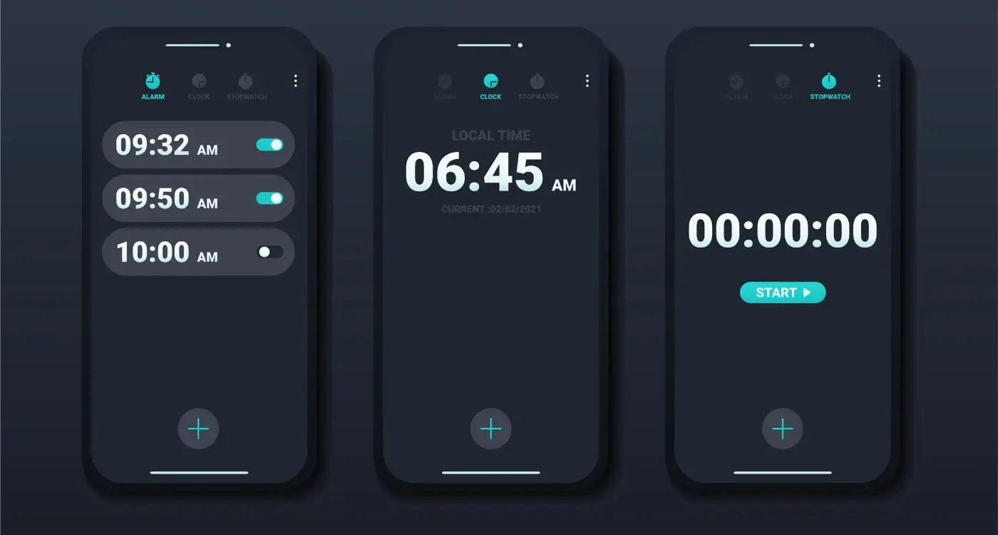
Dark mode flips the traditional light background and dark text combination on its head. Instead, you get dark backgrounds with light text and interface elements. Most smartphones now offer system-wide dark mode settings, which means your app can automatically switch between light and dark themes based on what the user prefers.
The Real Benefits Users Care About
From a user perspective, dark mode offers some genuine advantages. It reduces eye strain in low-light conditions, which is brilliant for people scrolling through apps late at night. Battery life gets a boost too, particularly on phones with OLED screens where black pixels actually turn off completely.
But here's what really matters from a business standpoint: users love having choice. When you offer both light and dark modes, you're showing that you care about user preferences and accessibility. Apps without dark mode can feel outdated compared to those that offer it.
Why Colour Choice Becomes More Complex
The tricky bit is that colours behave differently in dark mode. What looks great on a white background might be completely unreadable on a dark one. This is why understanding the right colour choices for dark mode isn't just helpful—it's absolutely necessary for creating an app that works well for everyone.
The Psychology of Dark Mode Colours
People think differently when they look at dark backgrounds compared to light ones—it's not just about making things look cool or trendy. Dark backgrounds actually make our brains work in a different way, which affects how users feel when they're using your app.
When someone opens an app with a dark colour scheme, their eyes naturally focus more on the bright elements that stand out. This means text, buttons, and important features get more attention than they would on a light background. It's like how a candle flame draws your eye in a dark room—the contrast does the heavy lifting for your mobile app design.
How Dark Colours Affect User Behaviour
Dark mode makes people feel more relaxed and focused. Studies show that darker UI design can help reduce eye strain during long sessions, which keeps users engaged for longer periods. This is particularly important for apps that people use in the evening or in low-light conditions.
The psychological effect goes deeper than comfort though. Dark backgrounds create a sense of sophistication and modernity—users often associate them with premium experiences. This can make your app feel more professional and trustworthy, which is brilliant for conversion rates.
Users scan dark mode interfaces differently than light ones, so place your most important elements where the natural eye movement patterns will find them first.
Essential Colour Principles for Dark Mode Design
Getting dark mode colours right isn't just about flipping everything to black—there's actually a bit more science to it than that. After working on countless app designs over the years, I've learned that the most successful dark modes follow a few key principles that make all the difference between a polished app and one that feels like it was thrown together.
Contrast Is Your Best Friend
The golden rule for dark mode is making sure your text stands out clearly against your background. You want at least a 4.5:1 contrast ratio between your text and background colours; this means your users won't have to squint or strain their eyes when reading. Dark greys work much better than pure black for backgrounds because they're easier on the eyes and create a more natural reading experience.
Layer Your Greys Properly
Think of your dark mode interface like a stack of cards—each element needs to sit at a different level. Your main background should be the darkest, then cards and panels get slightly lighter greys, and interactive elements like buttons get even lighter still. This creates depth and helps users understand what they can tap or swipe. Most successful apps use about 4-6 different shades of grey to create this layered effect without overwhelming the user.
Choosing Your Primary Dark Mode Palette
Right, let's talk about picking your main colours for dark mode—this is where things get interesting. After years of working on mobile app design projects, I've learnt that your primary palette sets the entire mood for your app. You can't just flip your light colours to dark and call it a day; that's a recipe for disaster.
Your primary dark mode palette should consist of three main elements: your darkest background colour, your surface colour, and your lightest accent. Most successful apps use a near-black background rather than pure black (#000000) because pure black can be too harsh and creates uncomfortable contrast with white text. Something like #121212 or #1a1a1a works much better for mobile app design.
Building Your Foundation
Surface colours sit between your background and content—think of card backgrounds or menu panels. These should be lighter than your main background but still dark enough to maintain that dark mode feel. A good rule is to keep your surface colours in the #2a2a2a to #3a3a3a range.
The best dark mode colour schemes feel intentional, not like someone just inverted the light theme
Your accent colour needs to pop without being overwhelming. Blues and greens work brilliantly in dark environments, whilst reds and oranges need careful handling. Remember, your UI design needs to work across different devices and lighting conditions—what looks good on your laptop might not translate well to a phone screen outdoors.
Text and Content Readability in Dark Mode
Getting text right in dark mode is probably the most important part of your colour scheme—and honestly, it's where I see most apps go wrong. You can't just flip your colours and hope for the best. Dark mode text needs careful consideration because our eyes process light text on dark backgrounds differently than the other way around.
The golden rule is simple: never use pure white text on pure black backgrounds. It creates something called halation—where the bright text seems to glow and blur, making it hard to read. Instead, use off-white colours like #F5F5F5 or #FAFAFA on dark grey backgrounds rather than true black.
Text Hierarchy in Dark Mode
Your text needs different levels of opacity to create a clear hierarchy. Here's what works well:
- Primary text: 87% opacity white for headings and main content
- Secondary text: 60% opacity white for subheadings and descriptions
- Disabled text: 38% opacity white for inactive elements
- Hint text: 38% opacity white for placeholders and labels
Colour Contrast Requirements
You still need to meet accessibility standards in dark mode. Aim for a contrast ratio of at least 4.5:1 for normal text and 3:1 for large text. Tools like WebAIM's contrast checker make this easy to verify—I use it constantly during development to make sure we're hitting the right levels.
Accent Colours and Interactive Elements
Right, let's talk about the fun stuff—accent colours and interactive elements. These are the bits that make your mobile app design actually feel alive and responsive. Think buttons, links, toggles, and anything else users tap, swipe, or interact with. In dark mode, these elements need to stand out without being obnoxious about it.
Your accent colours should be bright enough to catch attention but not so bright they burn retinas at midnight. Blue works brilliantly for most apps—it's trustworthy and shows up well against dark backgrounds. Green's great for positive actions like 'Save' or 'Confirm'. Orange and yellow can work too, but use them sparingly; they're quite intense in dark environments.
Making Interactive Elements Pop
Interactive elements need different states. A button can't look the same when it's just sitting there versus when someone's pressing it. Create subtle variations—maybe your blue button becomes slightly lighter when pressed, or gets a gentle glow around the edges.
Test your accent colours on different devices and brightness settings. What looks perfect on your laptop might be too dim on a phone screen outdoors.
Remember, consistency is king with your colour scheme. If links are blue in one part of your app, they should be blue everywhere. Users learn these visual cues quickly, and changing them mid-app just confuses people.
Testing and Refining Your Dark Mode Colour Scheme
Right, you've got your dark mode colours sorted—or so you think. But here's the thing: what looks brilliant on your design screen might not work so well in the real world. I've seen countless apps launch with dark modes that looked perfect in theory but failed when users actually started using them.
Testing isn't just about checking if your colours work; it's about making sure they work for everyone, in every situation. You need to test your dark mode in different lighting conditions—bright sunlight, dim rooms, and everything in between. Your users won't always be in perfect lighting, and your app needs to perform regardless.
Testing Methods That Actually Work
Start with real devices, not just your computer screen. colours behave differently on various phone screens, and what looks great on your iPhone might be completely wrong on an Android device. Test with people who have different visual needs too—colour blindness affects more people than you might think.
- Test on multiple device types and screen sizes
- Check accessibility with colour contrast tools
- Get feedback from users with visual impairments
- Test in various lighting environments
- Monitor user behaviour and engagement metrics
Refining Based on Real Feedback
Don't be stubborn about your colour choices. If users are struggling with readability or complaining about eye strain, listen to them. Small adjustments—like increasing contrast or tweaking accent colours—can make a huge difference to the user experience.
Conclusion
Creating a successful dark mode colour scheme for your mobile app design isn't just about making everything black and calling it a day—though I've seen plenty of apps try that approach! The right colour scheme can transform your app from something that feels harsh and uninviting into a sleek, professional interface that users actually want to spend time with.
Throughout this guide, we've covered the fundamentals of dark mode UI design, from understanding colour psychology to choosing the perfect palette for your brand. The key takeaway? Start with a solid foundation of deep greys rather than pure black, maintain proper contrast ratios for readability, and test your choices across different devices and lighting conditions.
Your accent colours need to work harder in dark mode—they're often the only bright elements guiding users through your interface. Don't be afraid to adjust their saturation and brightness compared to your light mode versions. What looks perfect in light mode might feel overwhelming against a dark background.
Remember, dark mode isn't a trend that's going away anytime soon. Users expect it, and when done well, it can significantly improve the user experience of your app. Take the time to get your colour choices right, and your users will thank you for it.
