A user opens a shopping app and taps the "Add to Cart" button. Nothing happens. They tap again, harder this time. Still nothing. By the third tap—now accompanied by an audible sigh—they've already started forming negative opinions about the entire brand. The app eventually responds, but the damage is done. Three taps, five seconds, one frustrated customer.
This scenario plays out millions of times every day across mobile apps worldwide. Users don't just abandon apps when they're broken; they start getting annoyed long before that point. The tricky part is that most app developers miss these early warning signs completely. We're so focused on building features and fixing major bugs that we overlook the subtle micro-interactions that reveal when users are getting frustrated.
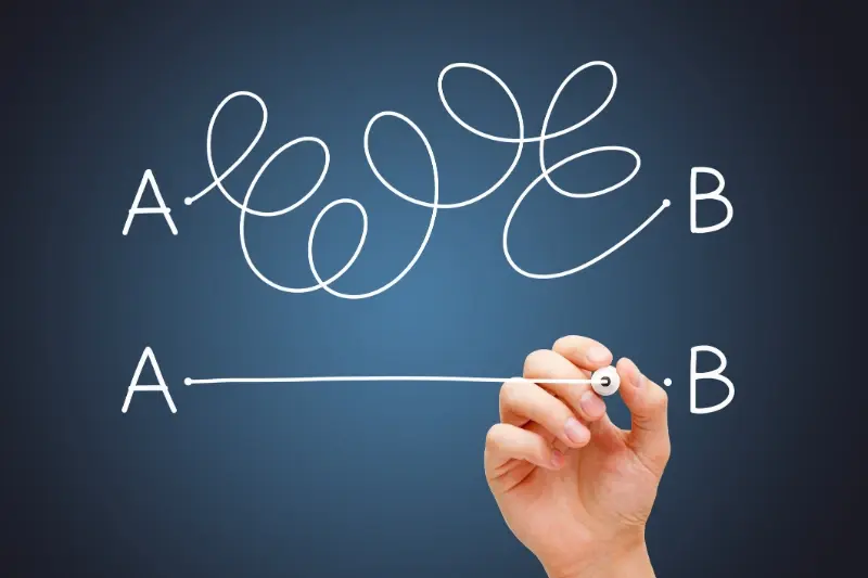
The difference between a good app and a great app isn't just what it does—it's how quickly it recognises when users are struggling and responds accordingly.
Micro-interactions are those tiny moments of engagement between users and your app. A button press, a swipe gesture, the time someone spends staring at a loading screen. These interactions might seem insignificant on their own, but they're actually goldmines of user experience data. When someone double-taps instead of single-taps, or when they pause for too long before making a selection, they're sending clear signals about their mental state. The apps that succeed are the ones that learn to read these signals early—before frustration turns into abandonment. And trust me, after years of building mobile apps, I can tell you that understanding these patterns isn't just helpful; it's what separates apps that users tolerate from apps they actually love using.
Understanding Micro-Interactions in Mobile Apps
Micro-interactions are the tiny moments that happen when you use an app—things like tapping a button and seeing it change colour, pulling down to refresh a page, or watching a heart icon fill up when you like something. They're small, but they make up a huge part of how your app feels to use.
Think of them as the digital equivalent of body language. Just like you can tell if someone's interested in what you're saying by watching their facial expressions, micro-interactions tell you what's happening in your user's mind. The difference is that most app developers aren't paying attention to what their users are actually doing.
Why These Small Details Matter So Much
Every time someone interacts with your app, they're having a conversation with it. When they tap something and nothing happens immediately, that's frustration building up. When they swipe the wrong way because your gestures aren't clear, that's confusion. When they keep tapping the same button repeatedly, that's desperation.
The brilliant thing about micro-interactions is that they give you early warning signs—like a smoke detector for user frustration. Most developers wait until users leave bad reviews or abandon the app completely before they realise something's wrong. But if you know what to look for, you can spot problems much earlier.
The Three Types of Micro-Interaction Signals
There are three main ways users signal their frustration through micro-interactions:
- Visual cues—what they're looking at and how their attention moves around the screen
- Touch patterns—how they tap, swipe, and gesture differently when they're getting annoyed
- Time-based signals—changes in how quickly or slowly they interact with your app
Understanding these signals means you can fix problems before they become deal-breakers. And that's exactly what we'll explore in the next sections.
Common User Behaviours That Reveal Growing Frustration
When users start getting frustrated with your app, they don't usually send you a polite email explaining what's wrong. Instead, they show you through their behaviour—and these micro-interactions happen long before they hit the delete button. Learning to spot these early warning signs can save your app from losing users who might otherwise stick around.
One of the most telling signs is when users start interacting with your app more aggressively. They'll tap buttons harder, swipe faster, and generally handle your interface like it's not responding properly. This increased force in their touch patterns often happens when something isn't working as expected, but they're still trying to make it work.
Repetitive Actions Signal Problems
Users who are getting frustrated will often repeat the same action multiple times in quick succession. They might tap a button three or four times when it should only need one tap, or they'll keep swiping in the same direction hoping for different results.
- Multiple taps on the same button within seconds
- Rapid back-and-forth swiping between screens
- Repeatedly opening and closing the same menu
- Quick zoom in and out gestures on images or text
- Fast scrolling up and down the same content
Navigation Patterns Show Confusion
Another clear indicator is when users start navigating erratically through your app. They might jump between different sections rapidly, use the back button excessively, or spend unusually long periods on pages that should be quick to complete. This scattered navigation usually means they can't find what they're looking for or don't understand how your app is organised.
Track user session recordings to see exactly how people interact with your app. Tools like Hotjar or FullStory can reveal frustration patterns that analytics alone won't show you.
The key is recognising these behaviours early enough to intervene. Once you know what to look for, you can start building better responses that address user frustration before it leads to app abandonment.
Visual Cues Your Users Are Getting Annoyed
Sometimes your users will tell you they're frustrated without saying a word. Their fingers do the talking instead. After building apps for over eight years, I've learned to spot these visual warning signs before they turn into one-star reviews.
The most obvious sign? Rapid, aggressive tapping. When someone can't find what they're looking for, they start jabbing at the screen like it owes them money. You'll see this pattern emerge when buttons aren't responding quickly enough or when users are hunting for features that should be easier to find.
Screen Interaction Patterns That Scream Problems
Watch out for these telltale visual behaviours that signal mounting user frustration:
- Multiple taps in the same spot within seconds—they're convinced something should happen there
- Frantic swiping back and forth between screens—they're lost in your navigation
- Pinching and zooming repeatedly on text or buttons—your interface elements are too small
- Long pauses followed by sudden bursts of activity—they're trying to figure out what went wrong
- Repeated attempts to scroll past the bottom of lists—your pagination isn't clear enough
The Dead Giveaway Nobody Talks About
Here's what really gives frustrated users away: they start treating your app like a broken vending machine. They'll tap the same button five times, then try a completely different area of the screen, then go back to the original button. It's almost like they're hoping the app will suddenly understand what they want.
The good news? These patterns are actually gifts. They're showing you exactly where your app is failing users—and more importantly, they're showing you early enough that you can fix the problems before people give up entirely.
Touch Patterns That Warn of Problems
Your users' fingers tell stories that your analytics might miss completely. After years of watching people interact with mobile apps, I've noticed that touch behaviour changes dramatically when frustration kicks in—and these patterns are surprisingly consistent across different user types.
The most obvious warning sign is the dreaded multi-tap syndrome. When users repeatedly tap the same button or area within seconds, they're basically screaming that something isn't working as expected. This happens when feedback is delayed, when buttons don't respond immediately, or when the visual state doesn't change to show an action has been registered. Users assume their first tap didn't work, so they keep trying.
Pressure and Speed Changes
Modern touchscreens can detect pressure variations, and frustrated users tend to press harder—much harder than they would during normal interactions. They also develop erratic scrolling patterns; instead of smooth, deliberate swipes, their movements become jerky and aggressive. Fast, short swipes replace the flowing gestures they used when things were going well.
Touch pressure increases by an average of 40% when users encounter unexpected app behaviour or delayed responses
The Panic Tap Pattern
Perhaps the most telling sign is when users start tapping random areas of the screen—what I call panic tapping. This usually happens when they feel stuck or can't find what they're looking for. They'll tap navigation elements repeatedly, try different areas of the interface, or even tap empty spaces hoping something will respond. This behaviour signals that your mobile app design isn't providing clear enough feedback about what's happening in your app.
Time-Based Signals You Cannot Ignore
Time tells a story that most developers miss completely. When users spend ages on what should be simple tasks, they're practically shouting about problems with your app—you just need to know how to listen.
The most obvious signal is dwell time on individual screens. If someone sits on your login page for three minutes, they're not admiring your design work; they're stuck. Same goes for checkout processes, form submissions, or any screen that should take seconds to complete. I see apps where users spend five times longer than expected on basic actions, and the development teams have no idea it's happening.
Session Duration Patterns
Short sessions followed by immediate app abandonment are red flags waving frantically. When people open your app, spend thirty seconds trying to do something, then close it without completing their task, that's frustration in its purest form. Even worse is when this pattern repeats—they come back later, spend another minute, then give up again.
The Dangerous Pause
Watch for unusual pause patterns during user flows. People don't naturally stop mid-way through booking a taxi or ordering food unless something's wrong. These pauses often happen right before users encounter confusing interfaces or unclear next steps. The pause is them trying to work out what you want them to do—and failing.
Time between taps can reveal confusion too. Quick, confident taps suggest users know exactly what they're doing. Long gaps between interactions? That's people hunting around your interface, trying to figure out their next move. Your analytics should track these timing patterns religiously.
Building Better Responses to User Signals
Right, so you've spotted the warning signs—your users are tapping aggressively, lingering too long on screens, and showing all the classic behaviours of mounting frustration. Now what? This is where the magic happens in app UX design, and honestly, it's where most apps either save themselves or completely lose their users.
The key is building micro-interactions that respond intelligently to these frustration signals before they escalate. When someone's been stuck on a form for over thirty seconds, your app should offer help. When they've tapped the same button three times with no response, show them what's happening. These aren't just nice-to-have features—they're the difference between user retention and deletion.
Smart Intervention Strategies
Your app needs to become more observant and reactive. Mobile app psychology tells us that users appreciate when technology anticipates their needs, but they hate being interrupted unnecessarily. The trick is timing your interventions perfectly.
- Progressive help tooltips that appear after repeated failed attempts
- Loading indicators that show actual progress, not just spinning wheels
- Smart error messages that suggest solutions rather than just stating problems
- Contextual hints that activate when users pause too long
- Alternative pathway suggestions when users seem stuck
Response Timing Matters
The timing of your responses can make or break the user experience. Too early and you're annoying; too late and the frustration has already set in. We've found that monitoring user experience signals for about fifteen to twenty seconds gives you the sweet spot for helpful intervention without being intrusive.
Track multiple frustration signals simultaneously rather than relying on just one indicator—users rarely show frustration through a single behaviour pattern.
Conclusion
Spotting user frustration before it becomes a real problem isn't just good practice—it's what separates apps that survive from those that get deleted. The micro-interactions we've covered aren't complex rocket science, but they're powerful signals that your users are sending you every single day.
Think about it this way: every rapid tap, every unusual swipe pattern, every pause that lasts too long is your user trying to communicate with you. They're not always going to fill out feedback forms or send you detailed emails about what's wrong. Most of the time, they'll just leave quietly and find something else that works better.
The beauty of understanding these signals is that you can catch problems early. Before users get so frustrated that they give up completely. Before your app ratings start dropping. Before you lose people who might have become your biggest fans if only you'd noticed they were struggling.
Building systems that respond to these warning signs doesn't require a massive technical overhaul either. Start small—pick one or two signals that seem most relevant to your app and begin tracking them. Watch for patterns. See what happens when users exhibit these behaviours and what you can do to help them get back on track.
Your users are already telling you everything you need to know about how to make your app better. You just need to listen to what their fingers are actually doing, not just what they're saying.