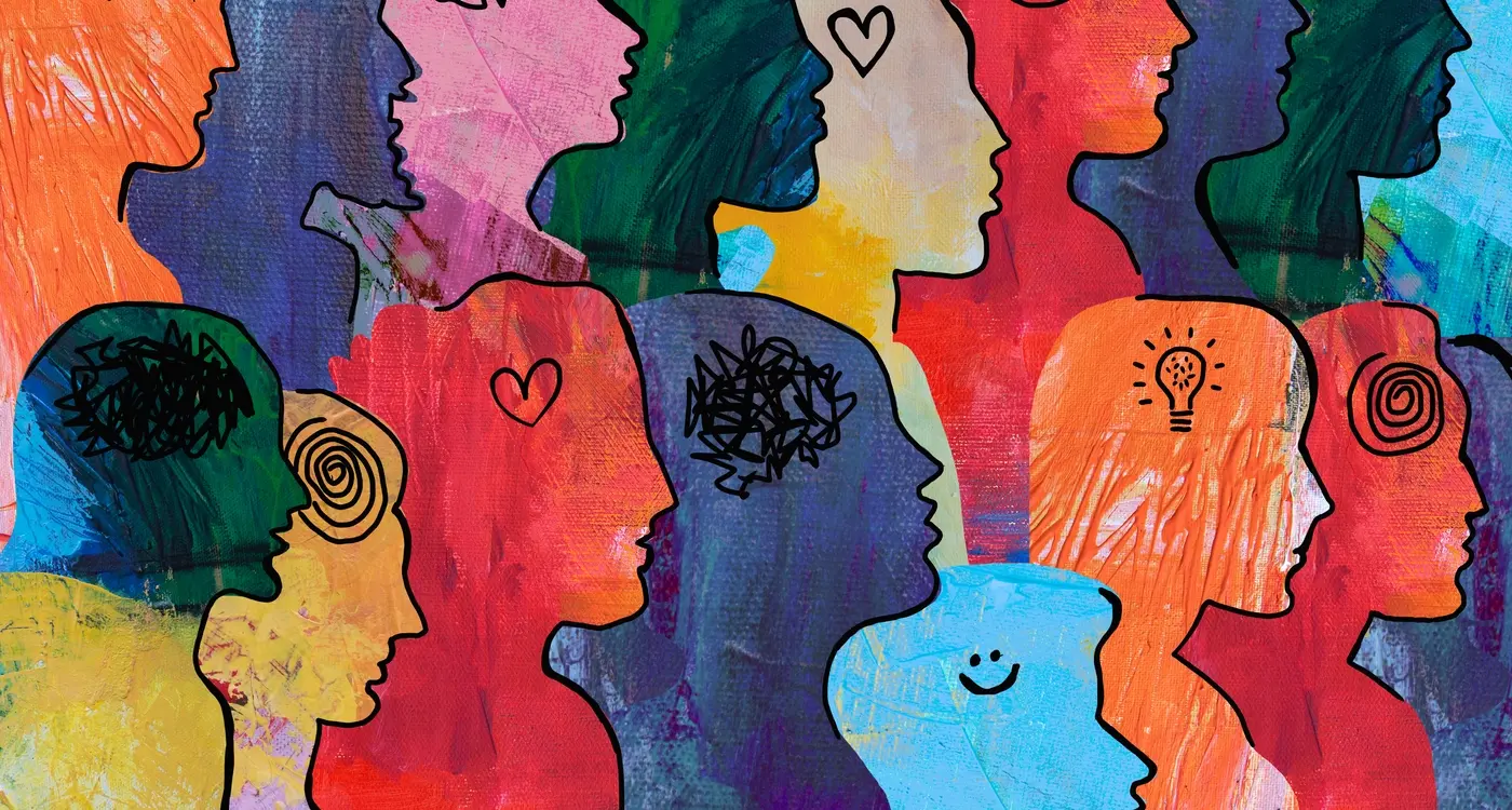
Your brain makes a decision about an app's quality within 50 milliseconds of seeing it. That's faster than a blink. In that split second, users decide whether they're looking at something cheap and forgettable or something worth their time and money. The difference between these two reactions isn't luck—it's psychology.
We've all felt it. That moment when you open an app and instantly know it's different. Maybe it's the smooth animations, the perfect spacing, or just the way everything feels right under your finger. You can't put your finger on exactly what makes it special, but you know it is. That's the psychology of luxury app design at work, and it's changing how people interact with technology.
The most successful luxury apps don't just look expensive—they make users feel like they deserve something better
What makes this topic fascinating is how premium design shapes user behaviour in ways we don't even realise. When an app feels luxurious, people spend more time using it, trust it more with their personal information, and yes—they're willing to pay more for it. Understanding this psychology isn't just about making things look pretty; it's about creating experiences that tap into fundamental human desires for quality, status, and belonging. Brand perception shifts dramatically when design communicates value, and that shift has real business implications.
What Makes Luxury Apps Feel Different
You know that feeling when you open an app and instantly think "this is expensive"? It's not just one thing that creates that impression—it's dozens of tiny details working together. After years of building apps for premium brands, I've noticed that luxury apps have a completely different rhythm to them.
The animations are slower and more deliberate. Where a standard app might have a quick 200-millisecond transition, luxury apps often use 400-500 milliseconds. Everything feels more considered, more thoughtful. The spacing between elements is generous too—there's no cramming of buttons or text. White space becomes a design feature rather than wasted screen real estate.
The Subtle Details That Matter
Premium apps make different choices about how they present information and respond to your touch:
- Haptic feedback that feels precise and satisfying
- Micro-interactions that acknowledge every tap and swipe
- Typography that's readable but distinctive
- Colour palettes with fewer, more refined choices
- Loading states that feel intentional rather than apologetic
These apps don't rush you through tasks—they make the journey feel as important as the destination. When you're paying premium prices, every interaction needs to reinforce that you've made the right choice.
How Our Brains Process Premium Design
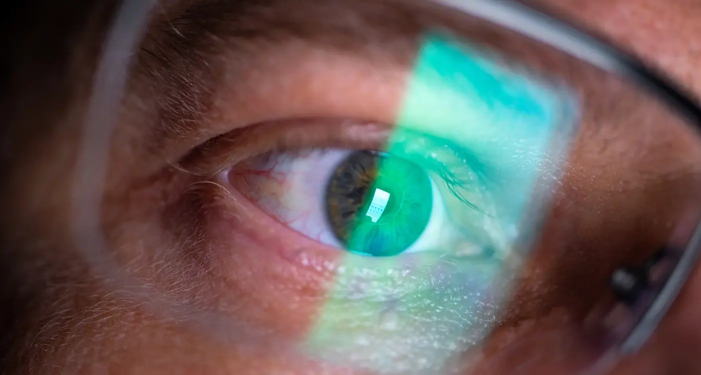
Our brains are surprisingly good at spotting quality—even when we're not consciously thinking about it. When someone opens a luxury app, their brain starts making judgements within milliseconds. The smooth animations, carefully chosen colours, and polished interface elements all send signals that get processed faster than we can actually think about them.
This happens because our brains have evolved to make quick decisions about what's safe, trustworthy, and worth our attention. In the digital world, this translates to premium design being interpreted as professional, reliable, and valuable. It's not just about looking pretty; it's about triggering the right psychological responses that make users feel confident about using the app.
Users form their first impression of your app within 50 milliseconds—that's faster than the blink of an eye, so every visual element needs to work hard from the moment they open it.
The Speed of First Impressions
Research shows that people can distinguish between high-quality and low-quality design almost instantly. When users encounter premium design, their brains release small amounts of dopamine—the same chemical that makes us feel good. This creates a positive association that influences how they perceive the entire brand and affects their behaviour throughout the app experience.
- Smooth transitions make users feel the app is well-built
- Consistent spacing creates a sense of order and professionalism
- High-quality imagery suggests attention to detail
- Thoughtful typography implies care and expertise
The Trust Factor in High-End App Experiences
Trust is a funny thing when it comes to luxury apps—it's both the hardest thing to earn and the easiest thing to lose. I've worked with clients who've spent months perfecting their app's functionality, only to have users abandon it within seconds because something just felt "off". The psychology here is fascinating; people expect luxury apps to work flawlessly, and any hiccup immediately breaks that premium spell.
When users download a high-end app, they're essentially making a psychological contract. They expect perfection in return for their time, money, or data. This means every interaction needs to reinforce that they made the right choice. Small details matter enormously—smooth animations, instant responses, and zero crashes aren't just nice-to-haves, they're table stakes.
Building Trust Through Consistency
The most successful luxury apps I've developed follow these trust-building principles:
- Every button responds immediately when tapped
- Loading states are elegant and informative
- Error messages are helpful, not frustrating
- The app remembers user preferences perfectly
- Updates improve the experience without breaking familiar patterns
What's interesting is how users perceive reliability differently in luxury apps. A budget app might get forgiven for the occasional glitch, but premium users expect perfection. This isn't unfair—it's just human nature. When people invest in luxury, they're buying peace of mind as much as functionality.
Visual Elements That Signal Quality
After working with luxury brands for years, I've noticed something interesting—people can spot premium design within seconds of opening an app. It's not magic; it's about understanding which visual elements make users think "this looks expensive" versus "this looks cheap." The difference often lies in the smallest details that most people never consciously notice.
Typography is probably the biggest giveaway. Premium apps use custom fonts or carefully selected typefaces that feel exclusive—never the default system fonts that scream "we didn't invest in design." The spacing between letters, the weight of the text, even the way paragraphs are structured all contribute to that luxury feeling. White space plays a massive role too; high-end apps aren't afraid to leave areas empty because cramming everything together makes an app feel rushed and cheap.
Luxury is in each detail
Colour choices separate premium design from everything else. Luxury apps often use deeper, more sophisticated colour palettes—think rich blacks, elegant greys, or muted golds rather than bright primary colours. The materials and textures matter as well; subtle gradients, soft shadows, and refined animations all signal quality. When users see these elements working together harmoniously, their brains automatically assume the app—and the brand behind it—is worth more.
How Luxury Apps Shape User Behaviour
When people use luxury apps, something interesting happens—they start acting differently than they would with regular apps. I've watched this play out countless times during user testing sessions; people slow down, they're more careful with their taps, and they seem to pay closer attention to every interaction.
This isn't just coincidence. Premium apps actually change how we behave because they create what psychologists call "heightened engagement." When someone perceives an app as high-quality, they naturally invest more mental energy into using it properly. They read instructions more carefully, they explore features more thoroughly, and they're more likely to complete complex tasks.
The Commitment Effect
Luxury apps also trigger something called the commitment effect. When users feel like they're using something special or exclusive, they become more committed to the experience. This means they're less likely to abandon tasks halfway through and more willing to learn how to use advanced features.
The behavioural changes I see most often include:
- Users spend longer on each screen before moving on
- They're more tolerant of loading times (within reason!)
- Higher completion rates for onboarding flows
- More careful consideration before making purchases or commitments
- Greater likelihood to recommend the app to others
This shift in behaviour creates a positive feedback loop—users who engage more deeply get more value from the app, which reinforces their perception of quality.
The Business Impact of Premium Design Choices
Right, let's talk money—because at the end of the day, that's what your board cares about. I've worked with clients who've spent months debating whether to invest in premium design, and I can tell you the numbers don't lie. Apps with luxury design elements consistently outperform their basic counterparts across key metrics.
The financial benefits are pretty straightforward when you break them down. Users spend more time in well-designed apps, they're more likely to make purchases, and they stick around longer. We're talking about measurable differences here—not just prettier screenshots for your marketing team.
Key Performance Indicators That Improve
- Customer lifetime value increases by 15-25% on average
- In-app purchase conversion rates climb significantly
- User retention rates improve across all time periods
- App store ratings and reviews become more positive
- Word-of-mouth referrals increase naturally
Here's something interesting I've noticed: premium design doesn't just affect user behaviour—it changes how your entire team thinks about the product. When you invest in quality design, everyone from customer service to marketing starts treating the app differently. They take more pride in it, which shows in their work.
Track your app's revenue per user before and after design improvements. The difference will surprise you and make the business case for future design investments much easier.
The return on investment for premium design typically pays for itself within six months through improved user engagement and reduced churn rates.
Common Mistakes When Building Luxury Apps
Over the years I've watched plenty of brands try to build premium apps—and honestly, most of them get it wrong. The biggest mistake? Thinking that luxury means throwing gold colours everywhere and adding fancy animations to everything that moves. That's not luxury; that's just gaudy.
Overcomplicating the User Experience
High-end users don't want to jump through hoops to complete simple tasks. I've seen apps with six-step checkout processes because someone thought more steps meant more premium. Wrong. Luxury users value their time above almost everything else, so every extra tap or swipe better serve a real purpose.
Ignoring Performance for Pretty Effects
Nothing kills the luxury feeling faster than a slow, laggy app. I've worked with clients who wanted particle effects and complex transitions but didn't want to invest in proper optimisation. The result? Beautiful apps that crashed constantly and frustrated users who expected perfection.
Another common error is copying what other luxury brands do without understanding why they do it. Just because one successful app uses minimalist design doesn't mean your brand should too. Your luxury app needs to reflect your brand's unique values—not follow a generic template that screams "trying too hard" rather than "effortlessly premium".
Conclusion
Building luxury apps isn't just about making things look pretty—though that's certainly part of it. What we've explored here shows how premium design works at a much deeper level, tapping into how our brains process quality signals and make snap judgements about trust and value.
The psychology behind luxury app experiences affects everything from user behaviour to business outcomes. When you understand that people form opinions about your app within milliseconds, you realise why every design choice matters. The spacing, the typography, the micro-interactions—they all contribute to that gut feeling users get about whether your app is worth their time and money.
Brand perception isn't built overnight, but it can be damaged in seconds if your app doesn't live up to expectations. That's why getting the fundamentals right—the loading speeds, the intuitive navigation, the attention to detail—is so important for any business wanting to position itself as premium.
The best luxury apps don't just look expensive; they make users feel valued and understood. They anticipate needs, remove friction, and create moments of delight that keep people coming back. That's the kind of user behaviour that drives long-term success, not just flashy visuals that wear thin after a few uses.