Research shows that 88% of users will abandon an app completely after just one bad experience when making a high-stakes decision. That's a sobering number when you think about it—people will walk away from something they might genuinely need, simply because they don't trust the process. I've been designing and developing mobile apps for over eight years now, and I can tell you that building user trust isn't just nice to have; it's absolutely fundamental to your app's survival.
When users open your app to make big decisions—whether they're choosing a financial service, booking medical appointments, or making significant purchases—their guard is up. They're scanning for red flags, looking for reasons to doubt you. One poorly placed button, one confusing piece of copy, or one moment of uncertainty can send them straight to your competitor. The stakes are high because their stakes are high.
Trust is built in drops and lost in buckets, and nowhere is this truer than in mobile app experiences where users are making decisions that matter to them.
The good news? Building trust isn't about expensive marketing campaigns or flashy features. It's about understanding what makes people feel safe and confident when they're vulnerable. Throughout this guide, we'll explore the psychology behind big decisions, examine design patterns that build credibility, and look at communication strategies that put users at ease. By the end, you'll have a toolkit for creating experiences that don't just look trustworthy—they genuinely earn and deserve that trust.
Understanding What Makes Users Trust You
Trust doesn't happen by accident—it's something you build deliberately through every single choice you make in your app. After working with hundreds of clients over the years, I've noticed that the apps which succeed aren't necessarily the flashiest or most feature-packed ones. They're the ones that make users feel safe and confident about their decisions.
When someone downloads your app, they're taking a leap of faith. They're giving you their time, personal information, and sometimes their money. That's a big deal, especially when they're making important decisions through your platform. Whether they're booking a holiday, choosing a financial service, or selecting a healthcare provider, users need to know they can rely on you.
The Foundation Elements
Trust starts with the basics—things most people never consciously notice but absolutely feel when they're missing. Your app needs to work reliably every single time someone opens it. Nothing destroys confidence faster than crashes, slow loading times, or features that simply don't work as promised.
Clear, honest communication is just as fundamental. When users understand what your app does, how it works, and what happens to their data, they feel more in control. Uncertainty breeds anxiety, and anxious users don't make big decisions—they leave.
Beyond Technical Reliability
Trust also comes from consistency in your visual design and user interface. When buttons look clickable, when navigation makes sense, and when the whole experience feels cohesive, users develop confidence in your competence. Small details matter too: professional imagery, proper spelling, and thoughtful micro-interactions all contribute to that sense of trustworthiness. Users might not articulate why they trust one app over another, but these elements create the feeling that real professionals built something worth their attention.
The Psychology Behind Big Decisions
When users are facing big decisions—like choosing a financial app to handle their savings or picking a dating platform—their brains work quite differently than when they're choosing what to watch on Netflix. The stakes feel higher, so they become much more cautious and analytical.
Think about it: when someone's considering downloading your app to manage their investments or book their wedding venue, they're not just thinking about whether it looks nice. They're wondering if you'll mess up something that really matters to them. Their guard is up, and rightfully so.
How Fear Influences Decision-Making
Fear of making the wrong choice is the biggest barrier you'll face when building user trust. People naturally want to avoid loss more than they want to gain something—psychologists call this loss aversion, and it's incredibly powerful when big decisions are involved.
Users will spend ages researching, comparing options, and looking for reasons NOT to choose you. This isn't personal; it's just how our brains are wired to protect us from potential harm or disappointment.
Give users easy ways to reverse or undo their decisions where possible. Knowing they can change their mind later makes the initial decision feel much less risky.
The Need for Control and Information
When decisions feel big, people desperately want to feel in control of the outcome. They want to understand exactly what will happen, when it will happen, and what their options are if things don't go to plan.
Here's what users typically need when making big decisions:
- Clear information about what happens next
- Visible ways to contact you if something goes wrong
- Evidence that other people have made the same choice successfully
- Time to think without pressure
- Easy ways to get answers to their specific questions
Building Credibility Through Design
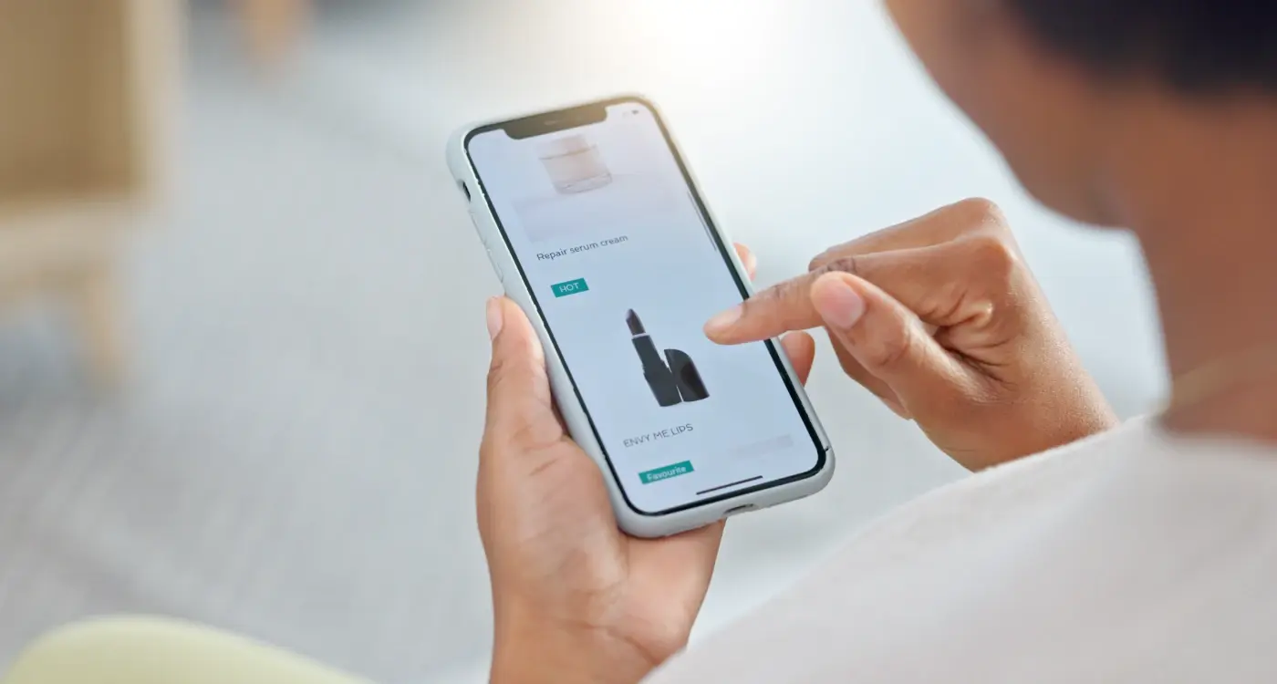
Your app's design speaks before you do. When someone opens your app for the first time, they make judgements about whether they can trust you within seconds—not minutes, seconds. That's the reality we're working with.
Professional design doesn't mean expensive or flashy. It means thoughtful. Clean layouts, consistent colours, and readable text all signal that you care about details. If you can't get the basics right visually, users wonder what else you might have missed. Fair or not, that's how people think.
Visual Trust Signals That Actually Work
Some design choices build trust more effectively than others. Here's what really makes a difference:
- Use familiar patterns—people trust what they recognise
- Show real photos instead of stock images when possible
- Keep your branding consistent across every screen
- Make buttons look clickable and forms look secure
- Use white space generously—cramped designs feel suspicious
The devil is in the details here. Broken images, misaligned text, or buttons that don't work properly all chip away at confidence. Users start thinking: if they can't manage their app properly, how will they handle my personal information or money?
Professional Polish Without the Price Tag
You don't need a massive budget to look trustworthy. What you need is consistency and attention to detail. Choose a simple colour palette and stick to it. Pick two fonts maximum. Make sure everything loads quickly and works as expected.
Remember, your design is doing the talking when you're not there. Every visual choice either builds trust or breaks it down. There's no neutral ground—your design is either helping your cause or hurting it.
Transparent Communication Strategies
When users are making big decisions, they need to feel like you're being completely honest with them. This means no hidden costs, no surprise terms and conditions, and no vague promises about what your app can do. I've seen too many apps lose user trust because they weren't upfront about limitations or pricing from the start.
The best approach is to put everything out in the open right away. If your app has premium features that cost extra, tell users exactly what they get for free and what they'll need to pay for. If there are any restrictions or limitations, mention them clearly. Users would rather know the truth upfront than discover it later when they're already invested.
Clear Language Wins Every Time
Skip the fancy marketing speak and technical jargon—users just want straight answers. When you're explaining how your app works or what it costs, use simple words that anyone can understand. If you need to use technical terms, explain them in plain English too.
Transparency isn't about sharing every detail of your business, it's about being honest about the things that matter to your users
Keep Users Informed
Communication shouldn't stop after users download your app. When things go wrong (and they will), tell users what's happening and when you expect to fix it. If you're making changes that affect how they use your app, give them advance notice. Regular updates about improvements, fixes, or new features help maintain that trust you've worked so hard to build. Remember, users appreciate honesty even when the news isn't perfect.
Social Proof and Trust Signals
When you're asking people to trust you with their money, time, or personal information, showing them that others have already done so successfully is one of the most powerful tools you have. Social proof works because people naturally look to others when they're unsure about something—it's basic human psychology and it works particularly well in mobile apps.
The most obvious form of social proof is customer reviews and ratings. But here's what many app developers get wrong: they only show the good stuff. Smart users know this, and when they see nothing but five-star reviews, they get suspicious. Show a mix of ratings and respond to negative feedback publicly; this demonstrates that you're listening and improving.
Types of Social Proof That Actually Work
- Real customer testimonials with photos and names (not generic stock photos)
- Download numbers or user counts, but only if they're impressive
- Media mentions and awards from recognised sources
- Customer success stories that show specific results
- Security badges and certifications from trusted authorities
- Integration partnerships with known brands
Trust signals go beyond social proof—they're the visual and textual cues that tell users your app is legitimate and secure. Think SSL certificates, privacy policy links that actually work, and clear contact information. Don't hide your company address or make users hunt for your terms of service.
Building Trust Through Transparency
One thing I've learnt over the years is that users appreciate honesty about limitations. If your app doesn't work in certain countries or with specific devices, say so upfront. If there are fees involved, make them clear before users invest time in signing up. This transparency might seem counterintuitive, but it builds trust with the users who matter most—the ones who'll actually become loyal customers.
Handling User Concerns and Questions
When users are making big decisions through your app, they'll have questions. Lots of them. This isn't a bad thing—it shows they're engaged and considering your service seriously. The problem comes when those questions go unanswered or users can't find help when they need it most.
I've seen too many apps lose potential customers at the final hurdle because they didn't make it easy enough to get support. Users might be ready to buy, sign up, or commit to something important, but then they hit a snag or need clarification on something. If they can't get answers quickly, they'll abandon the process and probably won't come back.
Making Help Accessible
Your support options need to be visible throughout the decision-making process—not hidden away in a settings menu. Place help buttons or chat options on key screens where users typically have questions. Think about checkout pages, sign-up forms, or anywhere users need to provide personal information.
Position your most common questions and answers directly on the pages where users need them most, rather than making them hunt through a separate FAQ section.
Speed Matters More Than You Think
When someone's making a big decision, timing matters. A response that comes three hours later might as well not come at all—the moment has passed. If you can't offer live chat, make sure your FAQ section covers the real questions people ask, not just the ones you think they should ask. Auto-responses can work too, as long as they actually address the user's concern and don't just say "thanks for contacting us."
Creating Safety Through User Experience
Safety isn't just about security badges and privacy policies—it's woven into every interaction your users have with your app. When people are making big decisions, they need to feel protected at each step of the journey. This means designing an experience that guides them confidently forward whilst giving them control over their choices.
The foundation of safe UX starts with clear navigation and predictable interactions. Users should never feel lost or confused about where they are or what happens next. When someone taps a button, they need to know exactly what will occur—no surprises, no sudden redirects to unexpected pages. This predictability builds the psychological safety that users need when they're considering important decisions.
Building Safety Into Key Interactions
The moments that matter most are often the ones where users feel most vulnerable. Checkout processes, form submissions, and account creation all need extra attention to safety signals. Here's how to make these interactions feel secure:
- Show progress indicators so users know where they are in the process
- Provide clear confirmation messages after important actions
- Allow users to review their choices before committing
- Offer easy ways to edit or cancel decisions
- Use familiar patterns that users recognise from other trusted apps
Error handling plays a massive role in maintaining trust when things go wrong. Nobody expects perfection, but they do expect helpful guidance when problems arise. Write error messages in plain language, explain what went wrong, and always provide a clear path forward—even if that means contacting support.
The Power of User Control
Users feel safest when they feel in control. This means giving them options to customise their experience, clear ways to manage their data, and simple methods to change or reverse their decisions. When people know they can step back or modify their choices, they're much more likely to move forward with confidence.
Conclusion
Building user trust when people are making big decisions isn't something you can wing—it takes proper planning and a good understanding of what makes people feel safe. Throughout this guide, we've looked at the nuts and bolts of creating an experience that puts users at ease, from the psychology behind why people hesitate to the practical design elements that signal credibility.
The truth is, trust doesn't happen overnight. It's built through consistent, transparent communication and by proving that you understand what's at stake for your users. When someone's making a big decision through your app—whether that's buying a house, choosing healthcare, or investing money—they need to feel like you've got their back. This means being upfront about costs, clear about processes, and ready to answer their concerns before they even ask.
Social proof remains one of your strongest tools; people want to see that others have walked this path before them and come out happy on the other side. But don't just slap some testimonials on a page and call it done. Make sure your entire user experience reinforces the message that you're trustworthy—from your loading screens to your error messages.
What I've learned over the years is that users can spot fake confidence from a mile away. Be honest about limitations, clear about what you can deliver, and transparent about what happens next. That's how you build the kind of trust that turns nervous browsers into confident customers who'll recommend you to their friends.