
How Do I Create Consistent Visual Hierarchy in Mobile Apps?
Have you ever opened an app and felt completely lost, not knowing where to look or what to tap first? That's what happens when visual hierarchy goes wrong—and trust me, I've seen it happen more times than I'd like to admit in my years building mobile apps.
Visual hierarchy is basically the way we guide users' eyes around the screen, showing them what's most important first, then second, and so on. It's like creating a roadmap for their attention. Without it? Well, your app becomes a confusing mess where everything screams for attention at once—which means nothing gets attention at all.
The thing is, mobile screens are tiny compared to desktop displays. We've got maybe 5-6 inches to work with, and users are often distracted, using apps whilst walking, commuting, or multitasking. That makes good visual hierarchy absolutely critical for mobile apps. There's no room for guesswork when someone's thumb is hovering over your interface.
Good visual hierarchy doesn't just make apps look better—it makes them work better by reducing cognitive load and helping users complete their tasks faster
I've worked with startups whose brilliant app ideas failed because users couldn't figure out how to use them, and I've helped established companies boost their engagement rates by 40% just by fixing their visual hierarchy. The difference between a confusing interface and an intuitive one often comes down to understanding these design principles—size, colour, spacing, typography, and positioning. Get these right, and users will navigate your app like they've been using it for years. Get them wrong, and even the most useful app will struggle to find an audience.
Understanding Visual Hierarchy Basics
Right, let's get straight to the point—visual hierarchy is basically about making sure people know where to look first, second, and third on your app screen. It sounds simple enough, but you'd be surprised how many apps I've seen that completely mess this up. The user opens the app and their eyes just... wander around aimlessly because nothing is guiding them.
Visual hierarchy works because our brains are wired to process information in a specific order. We naturally look at bigger things before smaller ones, bright colours before muted ones, and text that's bold before text that's regular weight. It's not magic—it's just how humans work, and we can use this to our advantage by understanding how cognitive biases shape user interface design decisions and influence these natural scanning patterns.
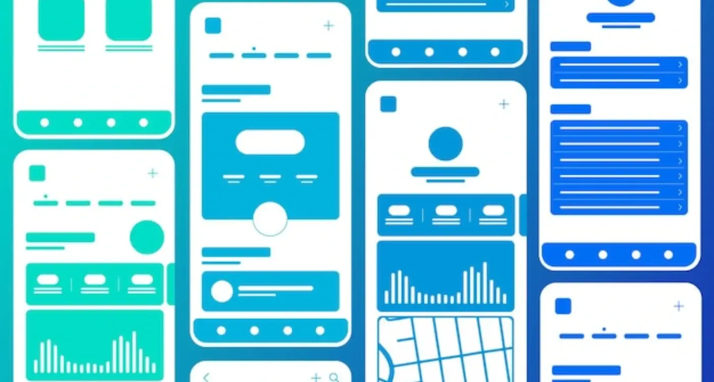
The Key Elements That Create Hierarchy
When I'm designing an app interface, I'm constantly thinking about these core elements that help establish what users should focus on:
- Size - Bigger elements get noticed first, no question about it
- Colour - High contrast colours naturally draw attention
- Position - Top and left areas typically get looked at first
- Spacing - White space around elements makes them stand out more
- Typography - Bold, larger text creates natural reading order
The thing is, you can't just make everything big and bold and expect it to work. That's like shouting at someone—eventually they stop listening. Good hierarchy is about creating a clear path for the user's eye to follow, from the most important element down to the least important.
I've learned that the best mobile interfaces feel almost invisible to users because the hierarchy is so well thought out. They don't have to think about where to tap or what to read first—it just feels natural and obvious.
Size and Scale in Mobile Interfaces
Getting size and scale right on mobile is absolutely critical—and honestly, it's where I see most apps fall flat on their face. You've got this tiny screen to work with, maybe 5-6 inches at best, and every single pixel matters. When I'm designing mobile interfaces, I always start with the smallest screen size first because if it works there, scaling up is straightforward; going the other way round? That's where things get messy.
The key is establishing a clear size hierarchy that immediately tells users what's important. Your primary call-to-action button should dominate the screen—I typically use at least 44x44 pixels for touch targets because anything smaller becomes a nightmare for users with larger fingers. Secondary actions get smaller treatment, maybe 32-36 pixels, whilst tertiary options can be even more subtle.
Mobile-Specific Size Considerations
Mobile users interact differently than desktop users—they're often distracted, using one hand, or dealing with glare and movement. This means your size decisions need to account for real-world usage patterns, not just what looks good in your design tool.
- Primary buttons: 44-48px minimum height for comfortable tapping
- Secondary buttons: 36-40px height with clear visual distinction
- Text links: 32px minimum touch target with adequate spacing
- Form elements: 40px height minimum for easy interaction
- Icons: 24-32px for recognition without overwhelming content
Test your size hierarchy by squinting at your design—the most important elements should still be clearly visible and distinguishable. If they blend together, your scale needs more contrast.
I've learned that users make split-second decisions about where to tap based purely on visual weight. Make sure your sizing supports those instinctive choices rather than fighting against them.
Colour and Contrast for Clear Communication
Right, let's talk about colour—because honestly, this is where I see so many apps go wrong. You know what? It's not about making things pretty (though that helps); it's about making sure people can actually use your app without squinting at their screens or missing important buttons entirely.
I mean, I've lost count of how many times I've seen beautiful apps with grey text on slightly darker grey backgrounds. Sure, it looks sophisticated in your design mockup, but try using it in bright sunlight or when you're tired after a long day. Its just not practical, is it?
The magic number you need to remember is 4.5:1—that's the contrast ratio between text and background colours that makes content readable for most people. There are loads of online tools that'll check this for you, and I genuinely use them on every single project. But here's the thing: don't just check your primary colours. Check your secondary text, your disabled states, your error messages... basically everything.
Using Colour to Guide User Actions
Now, this is where colour gets really powerful for visual hierarchy. Your primary action button—let's say it's blue—should be the most vibrant colour on the screen. Secondary actions? Maybe a lighter blue or grey. Destructive actions like "Delete"? Red, obviously, but make sure its accessible too.
One trick I've learned over the years is to use colour temperature as well as saturation. Warm colours (reds, oranges) naturally draw attention, while cool colours (blues, greens) recede into the background. Use this to your advantage when you want to guide users through your app's flow.
And please—for the love of good UX—don't rely solely on colour to communicate important information. Add icons, text labels, or other visual cues so people with colour vision differences can still use your app comfortably.
Typography Hierarchy That Works
Typography is where most mobile apps either nail their visual hierarchy or completely fall apart. I mean, you can have the most beautiful colour scheme and perfect spacing, but if your text hierarchy is a mess? Users won't know where to look first—and they'll give up faster than you can say "user retention".
The golden rule I follow is the "squint test". Squint at your screen until the text gets blurry. Can you still identify what's most important? If everything looks the same size when squinted at, you've got a problem. Your headings should be noticeably larger than your body text, which should be bigger than your captions or helper text.
Here's something that trips up loads of designers: mobile screens are tiny, so you can't just shrink your desktop typography and hope for the best. Your primary headings need to be big enough to grab attention—I'm talking 24-28px minimum for main titles. Body text should sit around 16-18px because anything smaller becomes a strain to read, especially for older users.
Font Weight Does Heavy Lifting
Don't rely solely on size to create hierarchy. Font weight is your secret weapon. Use bold for headings, medium weight for subheadings, and regular weight for body text. But please—and I cannot stress this enough—stick to a maximum of three font weights in your app. Any more and it starts looking like a ransom note.
Good typography is invisible to the user but does all the heavy lifting in guiding their eye through your interface
Line height matters more on mobile than anywhere else. Cramped text is nightmare fuel for mobile users. I typically use 1.4-1.6 line height for body text—it gives the text room to breathe without wasting precious screen space. And remember, your typography hierarchy should work consistently across every screen in your app. If your heading styles change from page to page, you're breaking the user's mental model of how your app works.
Spacing and Layout Principles
Getting spacing right in mobile apps is honestly one of those things that separates the pros from the amateurs. I mean, you can have the most beautiful colours and perfect typography, but if your spacing is off? The whole thing falls apart—and users will notice, even if they can't put their finger on why something feels wrong.
The golden rule I always tell clients is this: white space isn't wasted space. It's working harder than any other element on your screen. White space gives your content room to breathe and helps users process information without feeling overwhelmed. On mobile screens where every pixel counts, this becomes even more critical.
The 8-Point Grid System
Most successful mobile apps use what we call an 8-point grid system. Basically, all your spacing measurements should be multiples of 8 pixels. So you'd use 8px, 16px, 24px, 32px and so on. Why 8? Well, it's divisible by common screen densities and works perfectly with both iOS and Android design guidelines.
Here's how I typically structure spacing in mobile apps:
- 8px for tight spacing between related elements
- 16px for standard spacing between components
- 24px for section breaks within the same screen
- 32px or more for major section divisions
- 16-24px minimum for touch target spacing
But here's the thing—you don't need to be religious about the 8-point rule. If 12px looks better between two specific elements, use 12px. The grid is there to help you, not constrain you. What matters most is consistency throughout your app.
Touch targets are another spacing consideration that's unique to mobile. Apple recommends 44px minimum touch targets, while Google suggests 48dp. I usually go with 48px as a safe bet—nobody ever complained about buttons being too easy to tap!
Creating Consistent Navigation Patterns
Navigation is where visual hierarchy meets user behaviour in the most direct way possible. You know what? I've seen apps with gorgeous designs completely fall apart because their navigation patterns were inconsistent. Users get confused, frustrated, and ultimately delete the app. Its that simple.
The key to solid navigation hierarchy is establishing clear visual patterns that users can learn once and apply throughout your entire app. This means your primary navigation should always look and behave the same way, whether someone's on the home screen or buried five levels deep in settings. I always tell clients—if users have to think about how to get around your app, you've already lost them.
Primary vs Secondary Navigation
Your primary navigation needs the strongest visual weight in your hierarchy. This typically lives in a bottom tab bar or hamburger menu, and it should be immediately obvious what it is. Secondary navigation—like filters, sorting options, or contextual actions—should have less visual prominence but still maintain consistency in how they appear and function.
Test your navigation by asking someone to find three different sections of your app without any guidance. If they hesitate or tap the wrong thing, your hierarchy needs work.
- Use the same icons, colours, and typography for similar navigation elements
- Keep navigation placement consistent across all screens
- Make active states visually distinct from inactive ones
- Ensure touch targets are large enough (minimum 44px) and properly spaced
- Use breadcrumbs or clear back buttons for deeper navigation levels
The best navigation feels invisible because users never have to think about it. When someone opens your app for the tenth time and instinctively knows exactly where to tap—that's when you know your navigation hierarchy is working properly.
Visual Weight and Element Positioning
When I'm designing an app interface, I like to think of visual weight as the pulling power each element has on a user's attention. Some elements naturally grab more attention than others—and understanding this is key to guiding users through your app exactly how you want them to move.
Visual weight isn't just about making things bigger (though size definitely matters). A bright red button will have more visual weight than a grey one, even if they're the same size. Dark elements feel heavier than light ones. Complex shapes draw more attention than simple ones. It's a bit like arranging furniture in a room—you need to balance everything so it feels right.
Creating Balance Through Strategic Positioning
Where you place elements matters just as much as how they look. Users scan mobile screens in predictable patterns, and I use this to my advantage by leveraging user psychology and design decisions that work with natural scanning behaviours. The top-left corner gets noticed first in most cultures, so that's prime real estate for important elements. The centre of the screen is your power position for primary actions.
Here's what I consider when positioning elements:
- Place heavy visual elements higher on the screen to create stability
- Use asymmetrical layouts to create movement and interest
- Group related elements close together to reduce cognitive load
- Leave breathing room around important buttons and calls-to-action
- Position secondary actions away from primary ones to avoid confusion
Testing Visual Flow
One trick I use is the blur test—blur your screen and see which elements still stand out. Those are your heavy hitters. If the wrong things are grabbing attention, you need to adjust the visual weight distribution. Sometimes it's as simple as changing a colour or moving an element a few pixels.
Testing Your Visual Hierarchy
Right, so you've built what you think is a solid visual hierarchy for your mobile app. But here's the thing—you won't actually know if it works until real people start using it. I've seen apps that looked perfect in design mockups completely fall apart when users got their hands on them.
The simplest test? Get someone who's never seen your app before and watch them try to complete basic tasks. Don't give them any guidance, just observe. Where do their eyes go first? Do they tap on the right buttons? Are they scanning the screen in the order you intended? It's genuinely fascinating to watch—and sometimes a bit painful when they completely miss what you thought was obvious.
Quick Testing Methods That Actually Work
One technique I use all the time is the "five-second test." Show someone your screen for exactly five seconds, then ask them what they remember seeing. If they can't recall the most important elements, your hierarchy needs work. Another method is to blur your screenshots slightly—the elements that still stand out are probably doing their job correctly.
The best visual hierarchy is invisible to users; they simply flow through your app without thinking about where to look or what to do next
Heat mapping tools can show you where users actually tap and scroll, which often reveals surprising patterns. But honestly? Sometimes just asking users "what would you do next?" while they're using your app tells you more than any fancy analytics tool. The goal is creating that seamless flow where users never have to stop and think about what's clickable or important—they just know.
Building consistent visual hierarchy in mobile apps isn't just about making things look pretty—it's about creating experiences that actually work for real people using real devices in real situations. After eight years of building apps for everyone from scrappy startups to massive corporations, I can tell you that the apps that succeed are the ones where users never have to think twice about what to do next.
The thing is, most people won't consciously notice good visual hierarchy. They'll just find your app easy to use. Bad hierarchy? That's when they notice—and not in a good way. When users start squinting at buttons or can't figure out what's clickable, that's when you've lost them. And getting them back is bloody expensive these days.
What I've learned is that consistency beats creativity every single time. Users don't want to relearn how your app works on every screen; they want patterns they can rely on. Your button styles, spacing, colour choices—these need to be predictable throughout your entire app. Once someone understands how to navigate your home screen, they should instinctively know how to use every other screen too.
The mobile space moves fast, but good visual hierarchy principles don't really change. People's brains still process information the same way—they scan before they read, they notice bigger things first, and they expect similar elements to behave similarly. Get these fundamentals right and your app will feel natural to use, regardless of what new design trends come and go. That's what separates apps that last from apps that get deleted after the first use.
Share this
Subscribe To Our Learning Centre
You May Also Like
These Related Guides
How Can Gestalt Theory Transform Your Mobile Interface Layout?

How Do You Design Voice Interactions for Wearable Applications?