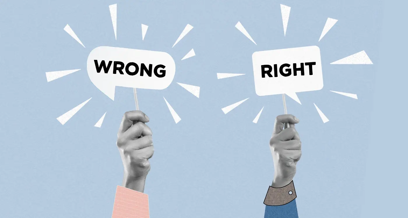
Yåou've spent months perfecting your app, the functionality is spot on, the user experience is smooth as silk, and you're ready to launch globally. Then someone points out that your beautiful white colour scheme might represent death and mourning in certain Asian markets. Or that hand gesture in your onboarding images? It's deeply offensive in half the countries you're targeting. I've seen this happen more times than I care to count, and it's always painful to watch.
Cultural design isn't just about making things look pretty—it's about making sure your international app actually works for the people using it. Every colour carries meaning, every image tells a story, and every symbol speaks a language that goes far deeper than words. Get it wrong and you'll alienate entire markets before users even open your app; get it right and you'll create experiences that feel like they were made just for them.
The smallest design decisions can make the biggest cultural impact—a red notification badge might urgently grab attention in London but signal danger and bad luck in Beijing.
This guide will walk you through the minefield of cultural design considerations, helping you avoid the expensive mistakes whilst building apps that truly connect with users worldwide. No cultural faux pas, no embarrassing oversights—just practical advice from someone who's been there, done that, and learned the hard way.
Understanding Cultural Design Basics
When I first started designing apps for global markets, I made the classic mistake of thinking good design was universal. Turns out, what works brilliantly in London might completely miss the mark in Tokyo or Lagos. Cultural design isn't just about translating text—it's about understanding how different cultures perceive colours, shapes, and imagery.
Culture shapes everything about how people interact with design. The way someone from Germany processes information on a screen differs from someone in Brazil or India. Some cultures read left to right, others right to left, and this affects where people naturally look first on your app screen. What's more, certain colours carry completely different meanings across cultures—white might represent purity in Western countries but mourning in parts of Asia.
Why Cultural Context Matters
Think about religious holidays, local customs, and even historical events that shape how people in different regions view certain symbols or colours. A thumbs-up gesture might seem universally positive, but it's actually offensive in some Middle Eastern countries. The same logic applies to every design choice you make, from the colours in your app icon to the gestures your users need to perform.
Getting cultural design right isn't about being politically correct—it's about creating an app that feels natural and trustworthy to your users, wherever they are in the world.
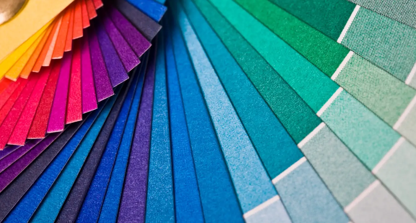
The Psychology of Colours Across Cultures
Colours speak before words do—and they don't always say what you think they're saying. After working on international app projects for years, I've learned that what feels right in one culture can feel completely wrong in another. Red might scream "danger" to Western users, but in China it's the colour of luck and celebration. White represents purity in many Western cultures, yet in some Asian countries it's associated with mourning and death.
The challenge with cultural design gets even trickier when you consider that colours carry emotional weight. Blue tends to feel trustworthy and calm across most cultures—which is why you'll see it used by banks and social media platforms worldwide. Green usually signals nature, growth, or "go ahead" in most places, though the specific shade matters more than you might expect.
Always test your colour choices with local users before launching your international app. What looks perfect in your home market might completely miss the mark elsewhere.
Getting the Basics Right
When designing for different cultures, start with research rather than assumptions. Purple might feel royal and luxurious in Europe, but in some Latin American countries it's linked to death and mourning. These aren't small details—they're the difference between users feeling comfortable with your app or feeling like something's just not quite right.
Image Selection for Different Markets
Choosing the right images for your mobile app across different markets isn't just about finding pretty pictures—it's about understanding what resonates with people in each culture. After working with clients across dozens of countries, I've learned that what makes perfect sense in one market can completely miss the mark in another.
People connect with images that reflect their own experiences and values. In some cultures, showing individual success might be motivating, whilst in others, community and family imagery works better. The key is researching your target audience properly; what are their daily lives like? What matters most to them? What makes them feel comfortable and understood?
Photography Styles That Work
Different regions prefer different photography styles. Western markets often favour clean, minimalist imagery with lots of white space. Meanwhile, many Asian markets respond better to busier, more detailed images that show energy and activity. Latin American audiences tend to prefer warmer, more emotional photography that shows real connections between people.
Avoiding Cultural Missteps
Some images that seem harmless can actually cause problems. Hand gestures, clothing choices, and even the way people are positioned in photos can send the wrong message. Before launching in any new market, run your images past local contacts or cultural consultants—they'll spot issues you might miss and save you from embarrassing mistakes that could damage your app's reputation.
Cultural Symbols and Religious Considerations
When I'm working on cultural design for an international app, religious symbols and cultural icons can make or break your success in a market. What seems perfectly innocent in one country might be deeply offensive in another—and trust me, you don't want to learn this the hard way after launch.
Animals are probably the trickiest area to navigate. Cows are sacred in Hindu culture, pigs are forbidden in Islamic countries, and owls represent death in some parts of Asia. Even something as simple as a dog icon for a pet app needs careful thought; many Middle Eastern cultures consider dogs unclean.
Religious Symbols and Sacred Imagery
Religious symbols need special attention in your design choices. Crosses, crescents, and other religious icons should only appear when specifically relevant to your app's purpose. Hand gestures can be tricky too—what looks like a friendly wave in Western cultures might be rude elsewhere.
The key is researching each market thoroughly before finalising your visual elements, rather than assuming what works in one culture will work everywhere
Colours combined with symbols create even more complexity. Red and gold together might suggest luck in China, but the same combination could have different meanings in other cultures. The safest approach? Test your designs with local users before rolling out your international app to avoid costly mistakes.
Testing Your Design Choices
Right, so you've picked your colours and chosen your images—but how do you know if they'll actually work with your target audience? This is where testing becomes your best friend. I can't tell you how many times I've seen apps launch with designs that looked brilliant on paper but completely missed the mark with real users.
The smartest approach is to test early and test often. Start with focus groups from your target markets; show them your colour schemes and images before you build anything. Ask direct questions about what they see and how it makes them feel. You might discover that your carefully chosen blue actually represents mourning in their culture, or that your hero image contains symbols that mean something completely different to what you intended.
Testing Methods That Actually Work
Online surveys work brilliantly for this kind of research. You can reach people from different countries without breaking the bank. A/B testing is another winner—show version A to one group and version B to another, then measure which performs better.
- Focus groups with native speakers from your target markets
- Online surveys using platforms like SurveyMonkey or Typeform
- A/B testing different colour schemes and images
- User interviews via video calls
- Beta testing with local users before launch
Don't skip this step. Trust me, fixing design issues after launch costs about ten times more than catching them early.
Common Mistakes to Avoid
I've watched countless apps fail spectacularly when they launch into new markets, and nine times out of ten it's because they've made the same cultural design mistakes. The biggest one? Assuming that Western design principles work everywhere. They don't. Just because your app looks brilliant in London doesn't mean it'll work in Mumbai or Tokyo.
One classic error I see regularly is using the wrong colours for your target market. Red might mean luck in China, but it signals danger in many Western countries. I've seen apps use white extensively thinking it looks clean and modern, only to discover it represents mourning in parts of Asia. The solution isn't to avoid colours altogether—it's to research what they actually mean in your target culture.
Never rely on machine translation for cultural research. Real people from your target market will give you insights that Google Translate simply cannot.
Another mistake is copying symbols or imagery without understanding their meaning. That innocent hand gesture in your app icon might be offensive in certain cultures. Religious symbols, traditional patterns, even seemingly neutral objects can carry meanings you never expected.
The worst part? These mistakes are completely avoidable. Test your international app with real users from your target markets before launch. Cultural design isn't guesswork—it's about understanding people.
Conclusion
Getting your images and colours right for different cultures isn't just about being polite—it's about making your app work properly for everyone who uses it. I've seen too many apps fail in new markets simply because someone picked the wrong shade of red or used an image that offended half their potential users. The good news? Most of these mistakes are completely avoidable if you do your homework.
The key thing to remember is that colour meanings and image preferences aren't just random cultural quirks—they're deeply rooted in history, religion, and everyday life. What feels natural and welcoming in one country might feel strange or even offensive in another. That's why testing your design choices with real people from your target markets is so important; you can't just guess and hope for the best.
Start small if you need to. Pick one or two markets and really understand them before expanding further. Learn about their colour associations, religious symbols, and cultural taboos. Test your designs with local users and be prepared to make changes based on what you learn. The investment you make in getting this right will pay off when your app actually connects with people instead of confusing them.