Studies show that 25% of mobile app users abandon an app after just one use. That's a quarter of your potential audience walking away before they've even given your app a proper chance. The culprit? Poor onboarding experiences that frustrate users from the very first tap.
After building mobile apps for countless startups and established brands, I've witnessed the same onboarding mistakes repeated time and again. The good news is that these errors are completely avoidable once you know what to look for. Most developers focus heavily on the app's core functionality but treat onboarding as an afterthought—a quick welcome screen here, a sign-up form there, and job done. This approach is a recipe for disaster.
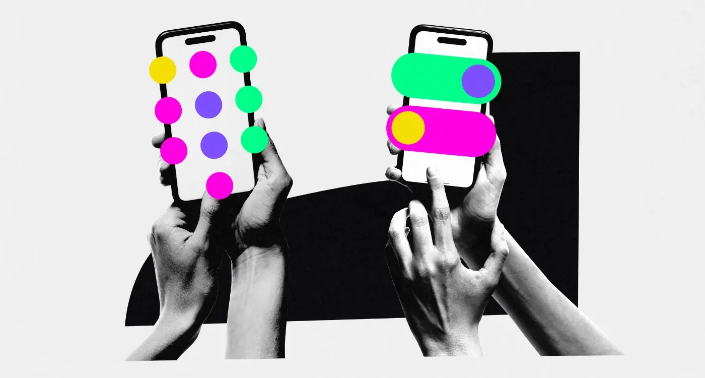
Great onboarding doesn't just introduce your app; it transforms curious visitors into engaged users who understand your app's value within seconds
In this guide, we'll explore the most common onboarding mistakes that kill user engagement and, more importantly, how to fix them. Whether you're designing your first mobile app or refining an existing one, understanding these pitfalls will help you create an onboarding experience that keeps users coming back. Your UX design decisions in those first few moments can make or break your app's success.
Making People Wait Too Long
There's nothing worse than downloading a new app, opening it up, and then staring at a loading screen for what feels like forever. I've tested hundreds of apps over the years and the ones that make me wait more than a few seconds always get deleted straight away—and I'm not alone in this behaviour.
Most people expect apps to load within two to three seconds maximum. Any longer than that and you'll start losing users before they've even seen what your app can do. It's a bit like having a brilliant shop but keeping the door locked for five minutes whilst customers stand outside getting frustrated.
The Technical Side
Long loading times usually happen because apps are trying to download too much data at once during startup. Maybe you're pulling in high-resolution images, loading entire databases, or connecting to slow servers. The solution isn't always making things faster—sometimes it's about being smarter with what you load first.
Smart Loading Strategies
The best apps load the most important bits first, then quietly fetch everything else in the background. Show users something useful immediately, even if it's just a basic version of your interface. You can always fill in the details later once they're already engaged and using your app.
Remember, first impressions matter enormously in mobile apps. If people have to wait too long right at the start, they'll assume your entire app is slow and unreliable.
Too Many Steps To Get Started
After working on mobile app development for over eight years, I can tell you that nothing kills user enthusiasm faster than making people jump through endless hoops just to start using your app. The reality is that most people will abandon your mobile app if they face more than three or four steps during onboarding—and that's being generous.
Think about it from a user experience perspective: someone has just downloaded your app because they want to solve a problem or achieve something specific. They're motivated right now, but that motivation won't last forever. Every additional step you add gives them another chance to change their mind and delete your app.
Common Onboarding Steps That Add Up Fast
- Account creation with email verification
- Phone number verification
- Personal information forms
- Tutorial screens
- Permission requests
- Payment setup
- Profile customisation
The key is prioritising what's absolutely needed for the user to experience your app's core value. Everything else can wait until later. Good UX design means getting users to that "aha moment" as quickly as possible—not putting barriers in their way.
Allow users to explore your app's main features first, then gradually ask for additional information when it's actually needed for specific actions.
Not Showing The App's Value Early
When someone downloads your app, they're basically saying "I'm willing to give you a chance". But here's the thing—that chance is incredibly short. People will delete your app faster than you can say "mobile development" if they don't see what's in it for them straight away.
I've worked with clients who want to show off every single feature their app has during onboarding. They're so proud of what they've built (and rightly so!) that they want users to see it all. But this approach backfires spectacularly. Users don't care about your complete feature list; they care about solving their problem right now.
Lead with benefits, not features
Your app solves a problem—whether that's helping people order food, track their fitness, or manage their finances. Show users that solution within the first 30 seconds of using your app. Don't make them hunt for it buried under three screens of explanations.
The quick win strategy
Smart apps give users a quick win during onboarding. A meditation app might start with a 2-minute breathing exercise rather than explaining all their premium features. A productivity app could let users tick off their first task before showing them advanced settings. These small victories make users think "this actually works" and that's when they'll stick around to explore more.
Overwhelming Users With Information
I've watched countless apps fail because they tried to show users everything at once during onboarding. It's like trying to drink from a fire hose—people just can't process that much information and they'll abandon your mobile app before they even get started. The temptation is always there to explain every single feature, every button, every clever thing your development team has built. But here's the thing: users don't care about all of that straight away.
Your onboarding should focus on the bare minimum information needed to get someone using your app successfully. Think about it this way—when you walk into a new restaurant, you don't need to know about the history of the building, the chef's entire biography, and every single item on the menu before you can order a drink. You just need to know where to sit and how to get someone's attention.
Keep It Simple
The best mobile app onboarding experiences teach users one thing at a time. Show them how to complete their first meaningful action, then let them discover other features naturally as they use the app. This approach creates a much better user experience because people feel confident rather than confused.
Good UX design is about removing friction, not adding more steps that users have to think about
Information overload during onboarding is one of the quickest ways to lose users before they've even experienced what makes your app special. Save the advanced features for later—your users will thank you for it.
Asking For Too Much Personal Data
People are getting more protective of their personal information—and rightfully so. I've seen apps that ask for everything from your phone number to your grandmother's maiden name before you've even seen what the app can do. This is a sure-fire way to make people hit the back button.
The golden rule is simple: only ask for what you absolutely need right now. If you're building a photo editing app, you don't need someone's email address straight away. If it's a fitness tracker, you might need their age and weight for calculations—but their full address? Probably not.
Start Small, Build Trust
Think of data collection like building a friendship. You wouldn't ask someone's life story when you first meet them. Start with the bare minimum and ask for more information later when users understand the value they're getting in return.
Social login options can help here too. Many people are happy to sign in with Google or Apple because it feels safer and faster than filling out yet another form. Just make sure you're clear about what data you're accessing and why.
The apps that get this right are the ones that explain why they need each piece of information. "We need your location to show nearby restaurants" makes sense—"We need your location because we said so" doesn't.
Skipping The Teaching Part
I've worked on hundreds of mobile apps over the years, and one mistake I see time and time again is teams assuming users will just "get it" straight away. They build these brilliant features, put them in the app, and then wonder why nobody uses them properly. The truth is, even the most intuitive mobile app needs some teaching during onboarding.
Users aren't mind readers. They don't know that swiping left reveals hidden options or that holding down a button brings up a menu. These interactions might seem obvious to you—you've been staring at the app for months—but for someone opening it for the first time, they're completely new. Without proper guidance, users will either miss key features entirely or abandon the app out of frustration.
What Users Actually Need to Learn
The teaching part doesn't mean overwhelming people with information. It means showing them the specific gestures, shortcuts, and features that make your app special. Think about what makes your UX design unique and focus on those elements.
- Custom gestures that aren't standard across other apps
- Hidden features that improve the user experience
- Shortcuts that save time once people know about them
- Navigation patterns specific to your app
Use interactive tutorials that let users practice actions rather than just showing them static screenshots. This helps people learn by doing, which creates better retention.
The key is making the teaching feel natural and contextual. Show users how to use features when they're most likely to need them, not all at once during the first launch.
Not Testing With Real Users
I've watched countless apps fail because their creators thought they knew what users wanted—without actually asking them. This happens more often than you'd think, and it's one of the biggest mistakes you can make with your onboarding process.
Building an app in isolation is like cooking a meal for guests you've never met. You might create something that tastes great to you, but what if they're vegetarian and you've made a beef stew? Testing with real users means putting your onboarding in front of actual people who represent your target audience, not just your team or your friends.
What Real User Testing Reveals
When you test with real users, you discover things that will genuinely shock you. Buttons that seem obvious to you are invisible to them. Steps that feel logical make no sense to someone using your app for the first time. Words you think are clear are confusing.
Real users will show you exactly where they get stuck, what questions they have, and—most importantly—where they give up. They'll tell you if your onboarding is too long, too complicated, or simply not helpful enough.
Simple Ways to Test Your Onboarding
- Watch people use your app while they talk through their thoughts
- Ask specific questions about each step of the onboarding process
- Record where users pause, look confused, or make mistakes
- Test with people who've never seen your app before
- Get feedback from both tech-savvy and less technical users
Testing doesn't have to be expensive or complicated—even watching five people use your app will reveal most of the major problems with your onboarding flow.
Conclusion
Getting mobile app onboarding right isn't rocket science, but it does require you to think like your users. After eight years of building apps for all sorts of clients, I can tell you that the companies who nail their onboarding are the ones who genuinely care about their users' first experience. They're not just thinking about what they want to show people—they're thinking about what people actually need to see.
The mistakes we've covered in this guide all stem from the same problem: putting your own needs before your users' needs. When you ask for too much information upfront, skip the teaching moments, or overwhelm people with features, you're thinking like a business owner, not like someone who just downloaded your app and wants to get something done quickly.
Here's what I've learned works: keep it simple, show value fast, and test everything with real people. Your onboarding should feel like a helpful friend showing you around, not a demanding gatekeeper blocking your way. The apps that get this right see better retention rates, happier users, and stronger long-term growth. The ones that don't? Well, they usually end up wondering why their user experience isn't converting downloads into active users.
Start with one improvement at a time. Your future users will thank you for it.