Did you know that 94% of users form their first impression of an app within seconds of opening it? That split-second judgement isn't just about whether your app works—it's about whether it feels right, looks professional, and matches what they expect from your brand. One poorly placed logo or jarring colour choice can make users question whether they've downloaded the real thing or some knock-off version.
Building a mobile app isn't just about cramming your website into a smaller screen. Your app becomes a direct extension of your brand that sits in people's pockets, sends them notifications, and potentially interacts with them multiple times per day. That's a big responsibility and a massive opportunity rolled into one.
Your app is often the most intimate touchpoint between your brand and your customers—it deserves the same level of brand consideration as your shopfront or website
The challenge is that mobile app branding comes with its own unique set of rules. What works on your website might look terrible on a phone screen; your usual fonts might be impossible to read on smaller devices. This guide will walk you through creating comprehensive app brand guidelines that work specifically for mobile, helping you maintain that all-important brand consistency from the moment someone spots your app icon through to every interaction they have inside your app.
Understanding Your Brand Identity Before You Build
Before you even think about colours or fonts or where to put your logo, you need to know who you are as a brand. I can't tell you how many times I've seen companies rush straight into app development without properly defining their brand identity first—and trust me, it always comes back to bite them later.
Your brand identity is basically the personality of your business. It's how you want people to feel when they interact with your company, what values you stand for, and how you're different from everyone else doing something similar. Think about it this way: if your brand was a person, what would they be like? Would they be serious and professional, or fun and chatty? Would they use big words or keep things simple?
What Makes Your Brand Unique
Start by writing down three things that make your business different from your competitors. Not features—actual differences in approach or values. Maybe you're the budget-friendly option, or perhaps you're all about premium quality. Maybe you focus on being super helpful, or you're the no-nonsense, straight-talking choice.
Once you've got this sorted, every design decision in your app becomes much easier. You'll know instantly whether that bright orange button fits your brand or whether that casual message sounds right for your audience. Understanding why your app needs to reflect well on your brand is crucial before moving into development.
Creating Your App Brand Guidelines Document
Right, so you've figured out your brand identity—now what? Well, you need to get it all down on paper (or screen, more accurately). Creating proper app brand guidelines isn't just about making things look pretty; it's about making sure everyone working on your app speaks the same visual language.
I've seen too many projects go sideways because the designer had one idea, the developer had another, and the client had something completely different in mind. Your brand guidelines document becomes the single source of truth that stops these mix-ups before they happen.
What Goes Into Your Guidelines
Your mobile app branding document should cover the basics but be specific enough that there's no guesswork. Here's what you need to include:
- Your exact colour codes (hex, RGB, and CMYK values)
- Font families and sizes for different screen elements
- Logo variations and minimum size requirements
- Spacing rules and grid systems
- Voice and tone examples
- Do's and don'ts with visual examples
Keep your brand guidelines document as a living document—update it as your app evolves and you discover what works (and what doesn't) in real-world testing.
Making It Actually Useful
The best brand consistency app design documents are the ones people actually use. Make yours scannable with clear headings, visual examples, and practical instructions. Nobody wants to read through pages of theory when they're trying to build something.
Choosing Colours That Work on Mobile Screens
Mobile screens are tricky little things—they're viewed in bright sunlight, dim bedrooms, and everything in between. Your brand colours might look perfect on your desktop monitor, but they could become unreadable on a phone screen. I've seen beautiful brand palettes completely fall apart when they hit mobile devices.
The biggest challenge is contrast. Your text needs to stand out clearly against your background colours, and this becomes even more critical on smaller screens where users are often squinting or scrolling quickly. Dark text on light backgrounds generally works best, but if your brand uses lighter colours, make sure there's enough difference between them.
Testing Your Colours Across Different Conditions
Here's what you need to check your colours against:
- Direct sunlight (try viewing your app outside)
- Low light conditions (bedroom browsing is real!)
- Different screen brightnesses
- Various phone models and screen types
Your brand's signature purple might look stunning in your logo, but if it makes text disappear on mobile screens, you'll need to create mobile-specific variations. This doesn't mean abandoning your brand colours—it means adapting them intelligently. Consider creating darker or lighter versions of your main colours specifically for mobile use, keeping the essence whilst making them practical for tiny screens. Understanding the psychology of colour and app design can help you make more informed colour choices that support both your brand and user experience.
Typography and Text That Stays Readable
Getting your typography right in mobile app branding is trickier than most people think. I've worked on apps where the brand looked perfect on desktop mockups but completely fell apart once we got it onto actual phones. The text was too small, the fancy fonts looked blurry, and users couldn't read half the content without squinting.
Your app brand guidelines need to specify font sizes that work across different screen sizes—not just the latest flagship phones. Start with your primary brand font and test it at various sizes. If it becomes hard to read below 16px, you'll need a backup plan. Many brands use their signature typeface for headings and switch to something more readable for body text.
Making Smart Font Choices
System fonts like San Francisco on iOS and Roboto on Android are popular choices for mobile app branding because they're designed specifically for screens. They load quickly and look crisp at any size. Custom fonts can work brilliantly for your brand consistency app design, but they need proper testing on real devices—not just the simulator.
The best typography is invisible—users should never struggle to read your content because of poor font choices
Line spacing matters more on mobile than anywhere else. Text that looks fine on a computer screen often feels cramped on a phone. Your branded app development should include guidelines for minimum line heights and spacing between text elements. Trust me, your users will thank you for it.
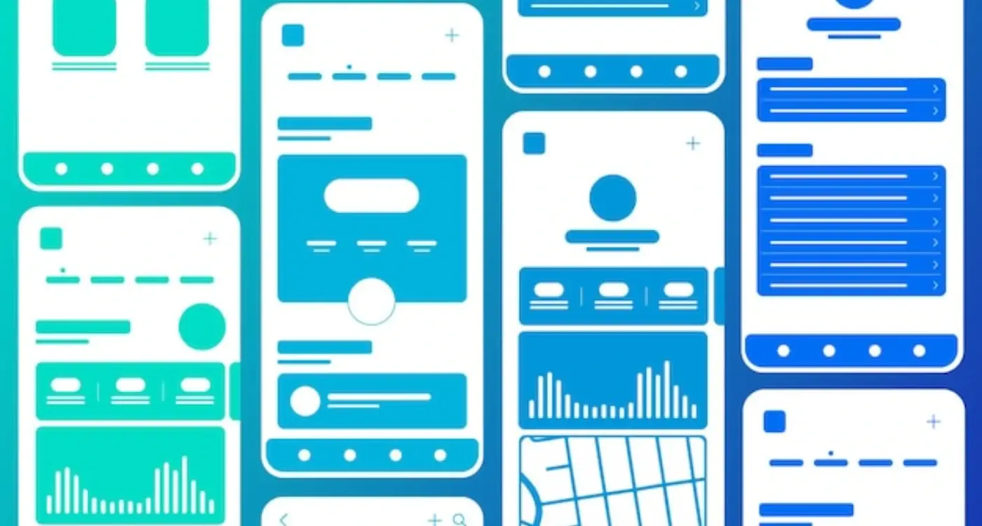
Logo Placement and Sizing Across Different Screens
Getting your logo right across different screen sizes is trickier than most people think. I've seen apps where the logo looks perfect on an iPhone but then gets completely squashed on an Android tablet—not exactly the professional look you're going for!
The key is creating multiple versions of your logo for different contexts. You'll need a full horizontal version, a stacked version, and what we call a favicon version (that's the tiny square one). Each serves a different purpose depending on the available space.
Where Should Your Logo Live?
Most apps place their logo in the top navigation bar, but don't just stick it anywhere. Think about the user's journey through your app. On your home screen, you might have room for the full logo; but on deeper pages where space is tight, a smaller symbol works better.
Size Guidelines That Actually Work
Here's what I've learned works across most devices:
- Main navigation: 120-180 pixels wide maximum
- Small screens: Keep height under 44 pixels
- Tablets: You can go bigger but don't exceed 200 pixels wide
- Always leave breathing room—at least 8 pixels padding around your logo
Test your logo on actual devices, not just your computer screen. What looks good on your laptop might be completely illegible on a phone. Trust me, I've made this mistake more times than I care to admit!
Keeping Your Voice and Tone Consistent Throughout
Your app's voice and tone are just as important as its colours and fonts—they're what make your brand feel human. I've worked on apps where the onboarding sounds friendly and welcoming, but then the error messages are cold and robotic. Talk about confusing! Users notice these inconsistencies more than you'd think, and it makes your brand feel unreliable.
Voice is your brand's personality—are you helpful, playful, professional, or cheeky? Tone is how that personality adapts to different situations. Your voice stays the same, but your tone might be more serious when handling security issues and lighter when celebrating user achievements.
Where Voice and Tone Show Up in Apps
- Button text and call-to-action labels
- Error messages and notifications
- Onboarding screens and tutorials
- Empty states and loading screens
- Push notifications and email communications
- Help documentation and support messages
Create a simple voice and tone guide with examples of how to write in different scenarios. Include do's and don'ts for common situations like errors, celebrations, and instructions.
The secret is documenting your voice and tone decisions in your app brand guidelines. Write down how your brand would handle apologies, give instructions, or celebrate with users. When your whole team understands this, every piece of text—from tiny microcopy to major announcements—will feel like it comes from the same brand. Don't forget that even empty states in your mobile app design are opportunities to reinforce your brand voice and create memorable experiences.
Testing Your Brand Elements with Real Users
Here's something I learned the hard way after years of app development—what looks perfect on your designer's screen might completely fall apart when real people start using it. I've seen gorgeous brand guidelines that made perfect sense in theory but confused users in practice. That stunning colour palette? Turns out half your audience can't read the text properly. Those carefully chosen fonts? They're giving people headaches on smaller screens.
Getting Honest Feedback Early
The trick is testing your brand elements before you've invested too much time and money. You don't need fancy focus groups or expensive research companies. Start simple—show your app to friends, family, or colleagues who aren't involved in the project. Ask them to complete basic tasks whilst you watch how they interact with your brand elements. Do they hesitate when looking for buttons? Are they squinting at your text? These small reactions tell you everything.
What to Look For
Pay attention to where people's eyes go first, how quickly they can find what they're looking for, and—this is big—whether they can use your app in different lighting conditions. I always recommend testing outside, under fluorescent lights, and in dimly lit rooms. Your brand needs to work everywhere, not just in perfect conditions. Remember that avoiding common mistakes when developing a branded app starts with proper user testing of your brand elements.
Conclusion
Building a branded app that feels consistent across every screen isn't just about making things look pretty—it's about creating an experience that people trust and remember. Throughout this guide, we've covered everything from setting up your app brand guidelines document to testing those elements with real users, and honestly, that's the foundation you need to get this right.
The thing is, brand consistency in mobile app development doesn't happen by accident. It takes planning, documentation, and quite a bit of testing to make sure your colours work on different devices, your typography stays readable at various sizes, and your voice remains recognisable whether someone's reading an error message or a welcome screen. I've seen too many apps that started strong but lost their way because they didn't have proper branded app development processes in place.
What matters most is that you've now got the tools to maintain that consistency from day one. Your app brand guidelines will become your best friend during development—trust me on this one. When your team knows exactly how to implement your brand across every interaction, you'll end up with an app that not only looks professional but feels like a natural extension of your business. And that's when you know you've got mobile app branding figured out.
