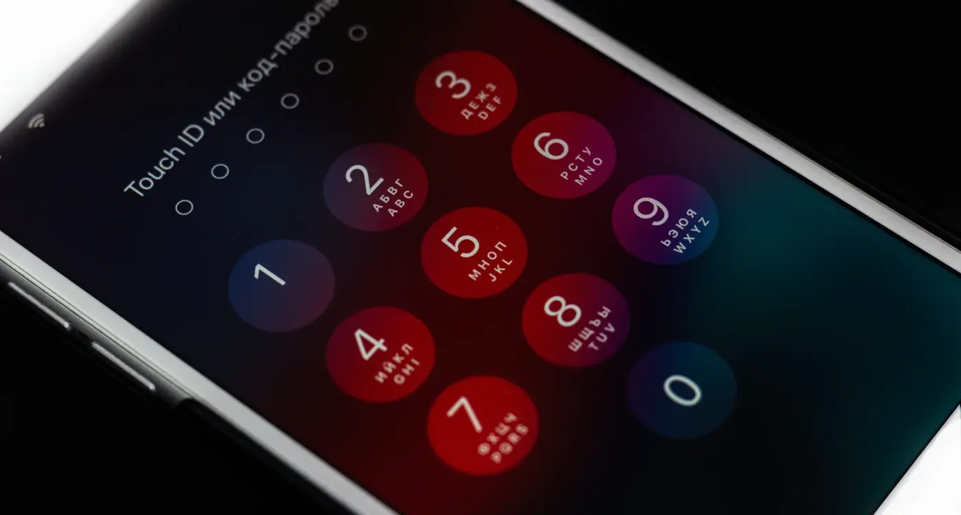
Over 85% of smartphone users now have dark mode enabled by default on their devices. That's a massive shift from just a few years ago when light mode was the only option. This means your app icons need to look brilliant in both settings—or risk looking completely out of place on millions of home screens.
I've spent years working on mobile app design projects, and I can tell you that getting icons right for both light mode and dark mode isn't just about swapping colours around. It's much more complex than that. Your icon is often the first thing people see when they discover your app, and it's what they'll tap on every single time they want to use it. Get it wrong, and your beautifully designed app might never get opened at all.
The best app icons work seamlessly in any environment, becoming invisible bridges between user intent and app experience
The challenge is real: what looks perfect on a bright white background can disappear completely on a dark interface. Colours that pop in light mode might look muddy or aggressive in dark mode. Text that's readable in one setting becomes invisible in another. But here's the thing—with the right approach, you can create icons that not only work in both modes but actually look better because of this dual consideration. Throughout this guide, we'll walk through everything you need to know to master dual-mode icon design, from the technical basics to the psychological principles that make icons truly effective.
Understanding Light and Dark Mode Basics
Light and dark mode aren't just trendy features that tech companies added to look modern—they serve real purposes that affect how people use their devices every day. Light mode displays content with dark text on bright backgrounds, whilst dark mode flips this around with light text on darker backgrounds. Most smartphones now switch between these modes automatically based on the time of day or ambient light conditions.
The shift to dark mode gained serious momentum when major operating systems started offering it as a standard feature. Apple introduced it across iOS and macOS, Google rolled it out for Android, and suddenly everyone expected their favourite apps to support both modes. This wasn't just about following trends; users genuinely benefit from having options that suit different lighting conditions and personal preferences.
Why Both Modes Matter
From a technical standpoint, dark mode can help save battery life on devices with OLED screens since black pixels require less power. But the real driver is user comfort—many people find dark interfaces easier on their eyes in low-light situations, like browsing their phone before bed or working late at the office.
Your app icons need to work seamlessly in both environments because users don't want to think about which mode they're in. They just want their apps to look good and be easy to find. When an icon fails to adapt properly, it can become nearly invisible against certain backgrounds or clash horribly with the interface aesthetic. This creates friction in the user experience and makes your app feel outdated or poorly designed.
The Technical Reality
Operating systems handle the mode switching automatically, but your icons need to be designed with this flexibility in mind from the start. This means thinking beyond just "making it work" in both modes and considering how your icon communicates your brand effectively regardless of the background it sits against.
The Psychology Behind Icon Design in Different Modes
People's brains process visual information differently depending on whether they're looking at light backgrounds or dark ones. This isn't just about personal preference—it's actual science. When someone switches from light mode to dark mode on their phone, their pupils dilate slightly and their eyes work harder to pick out details. The icons that looked perfect in light mode might suddenly feel invisible or overwhelming.
Think about how you feel when you open your phone late at night. Dark mode feels gentler, doesn't it? That's because our brains associate dark environments with rest and relaxation. But here's where it gets tricky for effective mobile UX design—icons need to maintain their meaning and impact regardless of which mode someone chooses.
How Our Eyes Interpret Icons Differently
In light mode, our eyes naturally look for darker elements first. We scan for shadows, outlines, and bold shapes. But flip to dark mode and suddenly our brains start hunting for bright spots and highlights instead. This means the same icon can feel completely different depending on the background it sits on.
Your icon's visual hierarchy will shift between light mode and dark mode, so test how users' eyes move across your interface in both settings.
The emotional response to icons changes too. Bright icons on dark backgrounds can feel more energetic and modern, while the same icons in light mode might appear more professional and trustworthy. Neither response is right or wrong—they're just different psychological reactions we need to account for.
User Expectations Across Different Modes
Users have developed certain expectations about how icons should behave in each mode. Here are the key psychological patterns:
- Light mode icons should feel stable and familiar
- Dark mode icons can be slightly more expressive
- Transitions between modes shouldn't jar or confuse
- Icon meaning must stay consistent regardless of appearance
Getting this psychology right means understanding that your users aren't just switching themes—they're switching mindsets too.
Essential Design Principles for Dual-Mode Icons
When you're designing icons that need to work in both light and dark mode, there are some key principles that'll make your life much easier. I've learnt these the hard way over the years—through countless iterations and more than a few client revisions!
The most important principle is simplicity. Icons that work well across both modes tend to be clean, minimal designs without too much detail. Complex gradients, intricate shadows, and busy patterns might look lovely in one mode but can become completely illegible in the other. Keep your shapes bold and your details to a minimum.
Core Design Principles
- Use strong, recognisable silhouettes that work without relying on colour
- Maintain consistent visual weight across both light and dark backgrounds
- Design with scalability in mind—your icon should work at 16px and 512px
- Avoid pure white or pure black fills that might disappear against backgrounds
- Keep stroke weights consistent and avoid hairline details
- Test readability at actual device sizes, not just on your monitor
Another principle that's often overlooked is semantic clarity. Your icon should communicate its function clearly regardless of the mode it's displayed in. This means avoiding decorative elements that don't add to the icon's meaning—every pixel should serve a purpose.
Adaptive Design Approach
Rather than creating completely different icons for each mode, think about creating adaptive versions. This means your core design stays the same, but elements like stroke thickness, internal spacing, or accent colours can shift slightly to maintain optimal visibility. This approach keeps your brand consistent whilst ensuring functionality across all viewing conditions.
Colour Theory and Contrast Requirements
Getting colour right for both light mode and dark mode can make or break your app icon design. I've seen countless icons that look perfect in one mode but completely disappear in the other—and that's usually down to poor contrast choices rather than bad design skills.
The golden rule here is simple: your icon needs to stand out against both white and black backgrounds. This means avoiding pure white elements (they'll vanish in light mode) and pure black elements (goodbye visibility in dark mode). Instead, think about using colours that have enough contrast against both extremes.
Understanding Contrast Ratios
For mobile app design, you want a contrast ratio of at least 3:1 between your icon and the background. That might sound technical, but it's just a way of measuring how different two colours are. The higher the number, the more they stand out from each other.
Dark blues, deep greens, and rich purples work brilliantly because they provide strong contrast against light backgrounds whilst still being visible on dark ones. Bright colours like orange, yellow, and red can work too, but you need to be careful with their intensity—too bright and they'll hurt people's eyes in dark mode.
The best icons use colours that feel natural in both environments, not colours that fight against them
Here's something that catches many designers off guard: colours behave differently depending on what's around them. A grey that looks perfect in light mode might appear washed out in dark mode, even though it's technically the same colour. That's why testing your icons in both modes isn't optional—it's part of the design process. Your icon should feel like it belongs in both environments, not like it's been forced into one of them.
Testing Your Icons Across Both Modes
Right, you've designed your icons and you think they look great—but here's where the real work begins. Testing your icons across both light and dark modes isn't something you can rush through or leave until the end. I've seen too many developers get caught out by icons that looked perfect in one mode but completely disappeared in the other.
The first thing you need to do is set up a proper testing environment. You'll want to view your icons on actual devices, not just your computer screen. Phone displays behave differently than monitors, and what looks good on your desktop might look awful on a mobile device. Switch between light and dark modes repeatedly—this isn't a one-time check.
Key Testing Scenarios
Test your icons in different lighting conditions too. That beautiful icon you created might be perfect indoors but completely unreadable when someone's using their phone in bright sunlight. Dark mode particularly struggles with outdoor visibility, so pay extra attention to this.
- Test on multiple device types and screen sizes
- Check visibility in bright outdoor lighting
- Verify icons work in low-light conditions
- Test with different system accessibility settings enabled
- Review icons alongside other UI elements for consistency
Don't forget about accessibility testing either. Turn on high contrast modes, adjust text size settings, and check how your icons perform. Some users rely on these features, and your icons need to work for everyone.
The testing phase often reveals issues you never expected. Maybe your icon's shadow disappears in dark mode, or perhaps the contrast isn't strong enough for users with visual impairments. That's exactly why we test—to catch these problems before your users do.
Common Mistakes to Avoid
I've seen so many brilliant app concepts fall flat because of simple icon design mistakes. And honestly, the dual-mode challenge makes these errors even more obvious. When your app switches between light mode and dark mode, every flaw gets magnified—trust me on this one.
The biggest mistake I see? Using pure black or pure white in your icons. Sounds logical, right? Wrong! Pure black (#000000) on a dark background creates harsh contrast that feels jarring, whilst pure white (#FFFFFF) can be blinding on light backgrounds. Your eyes need breathing room, so stick to off-blacks and off-whites instead.
Design Decisions That Backfire
Always test your icons on actual devices, not just your computer screen. Colours behave differently on mobile displays, and what looks perfect on your laptop might be invisible on a phone.
Another common trap is over-complicating your icons. When you're worried about dual-mode compatibility, there's a temptation to add extra elements or effects. But complex icons become muddy messes when they're shrunk down to actual app size—especially on older devices with lower resolution screens.
Here are the mistakes that'll kill your mobile app design:
- Using text or tiny details that disappear at small sizes
- Relying on colour alone to convey meaning
- Creating different icons for each mode instead of one adaptive design
- Forgetting to check accessibility standards
- Testing only on one device type or screen brightness
The biggest revelation most designers have is this: good dual-mode icons work because they're simple, not because they're clever. Focus on clear shapes and proper contrast ratios rather than trying to reinvent the wheel.
Technical Implementation Best Practices
Right, let's get into the nuts and bolts of making your dual-mode icons actually work. This is where the rubber meets the road—you've designed something beautiful, but now you need to implement it properly across different platforms and devices.
The most important thing to understand is that each platform handles dark mode differently. iOS uses system-level appearance changes, whilst Android relies on configuration changes within your app. You'll need to create separate asset files for each mode—don't try to be clever and use one icon with programmatic colour changes; it rarely works well and causes more headaches than it's worth.
File Organisation and Naming
Keep your files organised with clear naming conventions. I use suffixes like "_light" and "_dark" for my icon files, though some developers prefer "_day" and "_night". Whatever you choose, stick with it throughout your entire project. Your future self will thank you when you're hunting through hundreds of assets at 2am trying to fix a bug.
Testing Across Real Devices
Here's something that catches people out—always test on actual devices, not just simulators. Different screen technologies render colours differently, and what looks perfect on your MacBook might look terrible on an OLED display. Samsung devices, iPhones, budget Android phones—they all have different characteristics that can make your icons appear washed out or too dark.
Set up automated switching in your test builds so you can quickly toggle between modes. This saves hours of manual testing and helps you spot inconsistencies faster. Trust me, the time investment in proper testing infrastructure pays dividends when you're trying to ship quality work.
Conclusion
Creating app icons that work brilliantly in both light mode and dark mode isn't just about making two versions of the same design—it's about understanding how your users will actually interact with your app throughout their day. When someone switches from bright sunlight to a dimly lit room, your icon needs to remain clear, recognisable, and functional.
The principles we've covered—proper contrast ratios, thoughtful colour choices, and smart use of outlines and shadows—form the foundation of successful dual-mode mobile app design. But here's what really matters: testing your icons in real-world conditions. Your design might look perfect on your computer screen, but how does it perform on a cracked phone screen in bright sunlight? Or when someone's scrolling through their apps late at night with the lights off?
Most designers make the mistake of treating dark mode as an afterthought, simply inverting colours and calling it done. The best icons are designed from the ground up with both modes in mind. This means thinking about your icon's core elements—what makes it recognisable—and ensuring those elements shine through regardless of the background.
The mobile app landscape changes constantly, but good design principles remain constant. Users expect seamless experiences across both light and dark mode now; it's not a nice-to-have feature anymore. Your icon is often the first impression users have of your app, and getting it right in both modes can be the difference between someone downloading your app or scrolling past it entirely.
