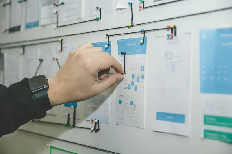
Picture this: someone downloads your mobile app, opens it for the first time, stares at the screen for thirty seconds, then deletes it. Sound familiar? Research shows that 25% of users abandon an app after just one use. The culprit? Poor user experience and design that feels alien to first-time users.
Making your app intuitive isn't about following every design trend or cramming in fancy features—it's about understanding how people naturally think and behave when they encounter something new. When someone picks up your app, they're bringing years of experience from other apps, websites, and real-world interactions. They expect certain things to work in predictable ways.
The best mobile apps feel like they were designed specifically for each user, even though they serve millions of people with different needs and backgrounds
Throughout this guide, we'll explore the psychology behind intuitive design, examine proven patterns that work across different types of apps, and show you practical techniques for creating an experience that feels natural from the moment someone opens your app. Whether you're building your first mobile app or redesigning an existing one, these principles will help you create something that users can understand and navigate without thinking twice about it.
Understanding Your Users' Mental Models
I've watched countless app launches over the years, and there's one thing that separates the winners from the disasters—understanding how people actually think about your app before they even download it. Your users come to your app with a mental model already formed; they've got expectations about how things should work based on every other app they've ever used.
Think about it this way: when someone opens a camera app, they expect the big round button at the bottom to take a photo. Why? Because that's what every other camera app does. Break that expectation and you'll confuse people instantly. This isn't about being boring—it's about being smart with where you choose to innovate.
Common Mental Models Your Users Already Have
- Shopping apps should have a basket icon in the top right
- Swiping left or right moves between screens
- The back button should always take you to the previous screen
- Red usually means delete or danger
- A hamburger menu (three lines) hides more options
The secret isn't to copy every other app—it's to understand what your users expect and then decide consciously when to meet those expectations and when to surprise them. Get the basics right first, then you can be clever with the details.
The Power of Familiar Design Patterns
Here's something I learned the hard way after years of mobile app development—users don't want to learn new tricks every time they download an app. They want things to work exactly how they expect them to work. When someone taps a button, they expect it to do something predictable. When they swipe left, they expect a consistent response across different apps.
Think about it this way: every time you open a new app, your brain is already working with patterns from hundreds of other apps you've used. If your hamburger menu icon is in the bottom right corner instead of the top left, you're making people think harder than they need to. That's not clever design—that's just making life difficult for your users.
Common Design Patterns That Work
- Bottom navigation tabs for main sections
- Pull-to-refresh for updating content
- Swipe gestures for moving between screens
- Search icons in the top navigation bar
- Back buttons in the top left corner
The beauty of using familiar design patterns is that they reduce cognitive load. Users can focus on what they want to achieve rather than figuring out how your app works. This is especially important for first-time users who are already dealing with new content and features.
Don't reinvent the wheel unless you have a really good reason. Stick to established patterns that users already understand, and save your creativity for the features that make your app unique.
Crafting Clear Navigation That Makes Sense
After building hundreds of mobile apps, I can tell you that navigation is where most first-time users get stuck. Not because they're not clever enough—but because we developers often forget how confusing our creations can be when you're seeing them for the first time.
Good navigation should be invisible. Users shouldn't have to think about where to tap next; they should just know. This means placing your main navigation where people expect it—at the bottom of the screen for mobile apps, not hidden in a hamburger menu that newcomers might never discover.
The Golden Rules of Mobile Navigation
- Keep your main navigation to 5 items or fewer
- Use icons that people already understand (home, search, profile)
- Make sure buttons are big enough to tap easily
- Show users where they are with clear visual indicators
- Test your navigation with people who've never used your app
One mistake I see constantly is apps that try to cram too much into their navigation. Yes, your app might do twenty different things, but your main navigation should only show the most important ones. Think of it like a TV remote—you want the volume and channel buttons to be obvious, not buried amongst fifty other options.
Remember, confused users become former users pretty quickly. Keep it simple, keep it familiar, and your first-time users will thank you for it.
Creating Effective Onboarding Without Overwhelming Users
Here's something I've learned after years of building mobile apps—most people will delete your app within the first three minutes if they can't figure out what to do. That's not because they're impatient (well, maybe a little), but because a confusing onboarding experience makes them feel stupid. And nobody likes feeling stupid.
The trick with onboarding is showing people just enough to get them started, not everything your app can do. Think of it like learning to ride a bike—you don't start by explaining gear ratios and brake mechanics. You show them the pedals, the handlebars, and get them moving.
Keep It Short and Sweet
Your onboarding should have three screens maximum. Any more than that and people start getting restless; they want to use your app, not read about it. Focus on the one thing that makes your app special and show them how to do it straight away.
The best onboarding feels like a gentle nudge in the right direction, not a lecture about features they haven't asked for yet
Let Them Learn by Doing
Instead of explaining every button and feature, let users discover things naturally. Use tooltips that appear when they need them, not before. Progressive disclosure works brilliantly here—reveal features as people become ready for them, not all at once during their first visit.
Writing Copy That Speaks Your Users' Language
Words matter more than most people think when it comes to apps. I've seen brilliant apps fail because the copy was confusing, and I've seen average apps succeed because they spoke to users in exactly the right way. The trick isn't using fancy words or trying to sound clever—it's about matching how your users actually think and speak.
Start by ditching the jargon. What you call "user account creation" your users probably think of as "signing up". What your development team calls "data synchronisation" is just "saving my stuff" to everyone else. Use the words your users would use when describing your app to their friends. This means listening to real conversations, reading reviews, and paying attention to support tickets.
Keep Instructions Simple and Direct
Button text should tell users exactly what will happen when they tap it. "Get Started" works better than "Initialise Process". "Save Photo" beats "Commit Changes". Your copy should remove doubt, not create it. If users have to think twice about what a button does, you've already lost them.
Error messages deserve special attention too. Instead of "Authentication failed", try "Wrong password—give it another go". People make mistakes; your copy should help them fix those mistakes without feeling stupid. That's the difference between users who stick around and users who delete your app.
Visual Hierarchy and the Art of Guiding Attention
When someone opens your mobile app for the first time, their eyes don't just wander around randomly—they follow a predictable pattern. Understanding this pattern is what separates apps that feel intuitive from those that leave users confused and frustrated. Visual hierarchy is your secret weapon for controlling where users look first, second, and third.
Think of it this way: your app screen is like a conversation, and you need to control who speaks when. The most important elements should shout the loudest, whilst supporting information whispers in the background. Size, colour, and positioning are your main tools here—bigger elements naturally draw attention first, bright colours pop against neutral backgrounds, and items at the top of the screen get noticed before those at the bottom.
Use the squint test on your app screens. If you squint and can still identify the most important element immediately, your visual hierarchy is working.
The Building Blocks of Attention
Creating effective visual hierarchy isn't about making everything big and bold—that just creates visual noise. Here are the key elements that guide user attention:
- Size and scale differences between elements
- Colour contrast and saturation levels
- White space to create breathing room
- Typography weight and font variations
- Positioning and alignment choices
I've watched hundreds of first-time users navigate apps during testing sessions, and the ones that succeed have clear visual priorities. Users scan in predictable patterns—usually top to bottom, left to right—so placing your most important actions along these natural eye paths makes your mobile app feel effortless to use.
Testing Your App With Real First-Time Users
Right, you've built what you think is an intuitive app—but here's the thing: you're not a first-time user anymore. You know exactly where everything is and how it all works. That's why testing with real people who've never seen your app before is absolutely critical.
The best way to do this is through user testing sessions. Find five or six people who match your target audience and watch them use your app for the first time. Don't give them instructions—just ask them to complete a simple task like signing up or finding a specific feature. You'll be amazed at what you discover.
What to Look For During Testing
Pay attention to where users pause, tap the wrong buttons, or look confused. These moments reveal friction points that need fixing. If someone can't figure out how to get back to the main screen, your navigation needs work. If they're squinting at text or missing important buttons, you've got visual hierarchy issues.
Acting on Your Findings
Don't try to fix everything at once—prioritise the biggest problems first. If three out of five users struggled with the same thing, that's your starting point. Make changes, then test again. This cycle of testing and improving is what separates good apps from great ones.
Conclusion
Making your mobile app intuitive for first-time users isn't rocket science, but it does require thought and planning. Throughout this guide, we've covered the building blocks that make apps feel natural and easy to use—from understanding how people think to creating clear navigation that doesn't leave users scratching their heads.
The truth is, there's no magic formula that works for every app. What feels intuitive depends on your users, your app's purpose, and how well you've done your homework. But the principles we've discussed—familiar design patterns, clear copy, smart visual hierarchy, and proper testing—these will serve you well regardless of what you're building.
I've seen too many apps fail because their creators assumed they knew what users wanted without actually asking them. Don't make that mistake. Test early, test often, and listen to what real people tell you about your app. Your assumptions will be wrong sometimes, and that's perfectly fine.
User experience isn't something you can bolt on at the end; it needs to be baked into every decision you make. When you put your users first and design with their mental models in mind, you're not just creating an app—you're creating something people will actually want to use.