Every tap, swipe, and scroll you make on your phone triggers something magical—a tiny moment of delight that most people never notice. These moments are called micro-interactions, and they're the secret ingredient that makes apps feel alive. When you pull down to refresh Instagram and see that satisfying loading animation, or when Facebook's like button bounces just right after you tap it, you're experiencing carefully crafted micro-interactions that took teams of designers weeks to perfect.
The best apps don't just work well; they feel incredible to use. There's a massive difference between an app that gets the job done and one that makes you smile every time you open it. That difference often comes down to these small but powerful details that guide users through their journey whilst providing feedback, reducing confusion, and creating emotional connections.
Great design is invisible until it's missing—micro-interactions are the bridge between functional software and delightful experiences
Throughout this guide, we'll explore real app examples from companies like Instagram, Facebook, Tinder, and Slack to understand how micro-interactions transform ordinary UX design into something extraordinary. Each case study will show you exactly what makes these interactions work and why they've become benchmarks for mobile app development. By the end, you'll spot these design patterns everywhere and understand how they shape the way millions of people interact with their favourite apps every day.
What Are Micro-Interactions and Why Do They Matter
I've been designing mobile apps for years now, and one thing that consistently separates good apps from great ones is the attention to detail in micro-interactions. These are the tiny moments that happen when you interact with an app—the split second when you tap a button, swipe a screen, or pull down to refresh. They're so small you might not even notice them consciously, but your brain definitely does.
Micro-interactions are essentially the app's way of talking back to you. When you like a post on Instagram and that little heart fills with colour, that's a micro-interaction responding to your tap. When you're typing a message and see those three dots indicating someone else is typing back, that's another one. They provide feedback, guide you through tasks, and make the whole experience feel more natural and responsive.
The Four Parts of Every Micro-Interaction
Every micro-interaction follows the same basic structure:
- Trigger - what starts the interaction (like tapping a button)
- Rules - what happens during the interaction
- Feedback - how the app responds to let you know something happened
- Loops - whether the interaction repeats or has different states
The beauty of micro-interactions lies in their subtlety. They make apps feel alive and responsive without being distracting or overwhelming. When done well, they guide users naturally through the app experience, reduce confusion, and create those satisfying moments that keep people coming back. They're the difference between an app that feels robotic and one that feels human.
Pull-to-Refresh: Instagram's Satisfying Content Updates
Instagram's pull-to-refresh feature is one of those micro-interactions that feels completely natural now, but when it first appeared it was quite revolutionary. The gesture itself is simple—you pull down on your feed and release to refresh your content. What makes Instagram's version special is the smooth animation and the satisfying feedback it provides.
When you pull down, you'll see a small loading spinner that appears at the top of your feed. The animation is smooth and responds directly to your finger movement. Pull a little, and the spinner starts to appear. Pull further, and it becomes fully visible. Release, and it spins while new content loads. This direct connection between your action and the visual feedback makes the whole experience feel responsive and engaging.
Why This Micro-Interaction Works So Well
The genius of Instagram's implementation lies in its predictability and instant feedback. Users know exactly what will happen when they perform the gesture, and they get immediate visual confirmation that their action has been registered. This creates a sense of control and satisfaction that keeps people engaged with the app.
- Clear visual feedback during the pull gesture
- Smooth animation that follows your finger movement
- Satisfying completion when new content appears
- Consistent behaviour across the entire app
The key to a successful pull-to-refresh is making the animation feel connected to the user's gesture. If there's a delay or disconnect between the pull and the visual response, it breaks the magic and feels clunky.
Like Button Animations: Facebook and Twitter's Emotional Feedback
The like button might be the most recognisable micro-interaction in social media history. When Facebook introduced the heart animation for their like button, they weren't just adding a pretty effect—they were creating an emotional connection between users and content. The animation starts small and grows bigger with a gentle bounce, making users feel satisfied when they tap it.
Twitter took this concept even further with their heart animation. When you tap the like button, the heart fills with red colour whilst small particles burst outward like tiny fireworks. It's a simple animation that lasts less than a second, but it makes the action feel special and rewarding. The animation gives users immediate feedback that their action worked, which is exactly what good micro-interactions should do.
Why These Animations Work So Well
Both Facebook and Twitter understand that liking content is an emotional action. People like posts because they make them happy, angry, or interested. The animations reflect these feelings by being warm and celebratory rather than cold and mechanical. The bouncing heart feels human and friendly, encouraging users to engage more with the platform.
These like button animations have become so successful that countless other apps have copied similar approaches. They prove that even the smallest interactions can have a big impact on how people feel about using your app.
Swipe Gestures: Tinder's Revolutionary Match System
When Tinder launched, they didn't just create a dating app—they invented a whole new way to interact with mobile screens. The swipe gesture became so popular that people now use "swipe left" and "swipe right" in everyday conversation, even when they're not talking about dating apps!
The genius of Tinder's swipe system lies in its simplicity. Right means yes, left means no. That's it. No complicated buttons or menus to navigate. The micro-interaction happens the moment your finger touches the screen—the card begins to tilt and fade, giving you immediate feedback about your action.
Why This Micro-Interaction Works So Well
The swipe gesture feels natural because it mimics how we might physically move a photo aside on a table. When you swipe right, a green heart appears; swipe left and you'll see a red X. These visual cues confirm your choice before you've even completed the gesture.
The swipe became such a cultural phenomenon that it changed how we think about mobile interaction design across all types of apps
What makes this micro-interaction truly brilliant is how it removes friction from decision-making. Users can quickly sort through profiles without the mental burden of clicking specific buttons. The smooth animation and instant visual feedback create an almost addictive experience that keeps users engaged—which explains why so many other apps have borrowed this interaction pattern for their own interfaces.
Loading Animations: Slack's Playful Progress Indicators
I've always been fascinated by how Slack handles loading states—they've turned what could be a frustrating wait into something genuinely entertaining. When you're starting up the app or switching between workspaces, you're greeted with delightful animations that make the wait feel shorter than it actually is.
Slack's loading animations are brilliant because they serve multiple purposes at once. They tell you the app is working (not frozen), they give you something to look at, and they inject personality into an otherwise boring moment. The animations range from simple bouncing dots to more elaborate sequences that match Slack's playful brand identity.
What Makes Slack's Loading Animations Work So Well
- They're contextual—different animations appear for different loading states
- The timing feels natural, not too fast or painfully slow
- They maintain visual consistency with the overall app design
- The animations provide clear feedback about progress
- They reduce perceived waiting time through distraction
The key lesson here is that loading states don't have to be throwaway moments. When done thoughtfully, they become part of your app's character. Turning empty states into bold brand experiences proves that even mundane interactions can be opportunities to delight users and reinforce your brand—something we always keep in mind when designing loading experiences for our clients.
Form Validation: Mailchimp's Helpful Error Messages
Forms are the bane of mobile users everywhere—nobody wants to fill them out, and when things go wrong, people get frustrated fast. That's why Mailchimp's approach to form validation is so brilliant. Instead of making users feel stupid when they make mistakes, their micro-interactions actually help people fix problems quickly.
When you're creating an account or updating your profile in Mailchimp, the app checks your input as you type. Make a mistake with your email format? A gentle red highlight appears with a clear message explaining what's wrong. No angry red boxes or confusing error codes—just simple, human language that tells you exactly what needs fixing.
Real-Time Feedback That Works
The magic happens in real-time. As soon as you finish typing in a field, Mailchimp's validation kicks in. Password too short? You'll see a helpful message before you even move to the next field. This immediate feedback prevents the awful experience of filling out a long form only to discover multiple errors at the end.
- Instant validation as you type or move between fields
- Clear, friendly error messages in plain English
- Visual cues that guide you to the problem
- Success indicators when you get things right
Always test your form validation with real users—what seems obvious to developers often confuses regular people.
This approach reduces form abandonment rates significantly. When people understand what's wrong and how to fix it, they're much more likely to complete the process rather than giving up in frustration.
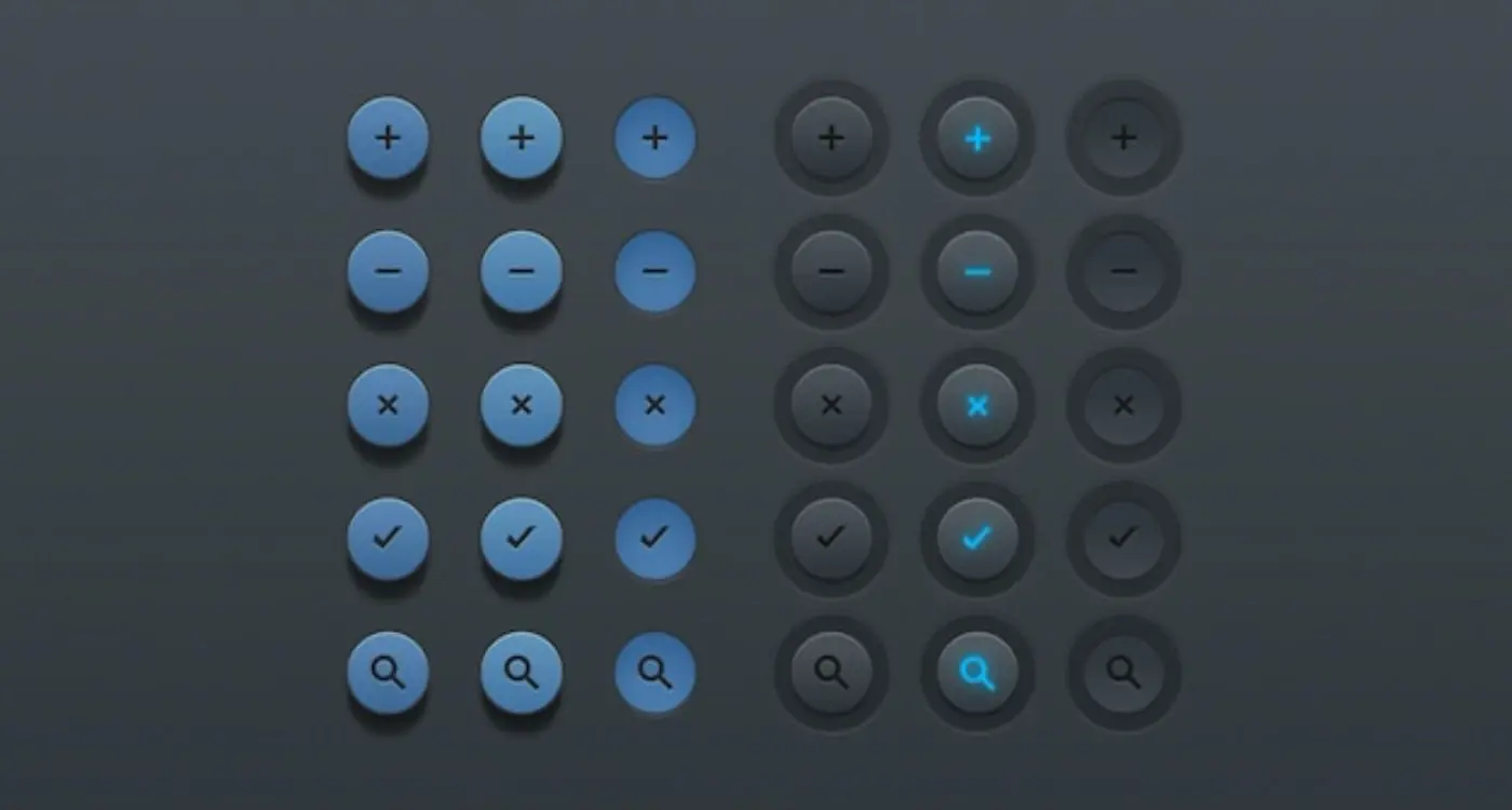
Button States: Spotify's Clear User Feedback
I've always admired how Spotify handles their button states—it's one of those things that seems obvious once you see it done properly, but so many apps get it wrong. When you tap the play button in Spotify, it doesn't just change from a triangle to two parallel lines; it smoothly morphs between states with a subtle animation that makes the transition feel natural and responsive.
The genius lies in how Spotify uses visual feedback to communicate what's happening. Press play and the button immediately responds with a gentle press effect before transitioning to the pause state. This instant feedback tells users their tap registered, even before the music starts playing. It's those few milliseconds of acknowledgement that make the difference between an app that feels sluggish and one that feels lightning-fast.
Why Button States Matter
Button states aren't just about looking pretty—they're about communication. When users interact with your app, they need to know three things: did my action register, what's happening now, and what can I do next. Spotify's buttons answer all three questions through their visual design.
Key Elements of Effective Button States
- Immediate visual feedback when pressed
- Clear distinction between active and inactive states
- Smooth transitions that don't feel jarring
- Consistent behaviour across the entire app
- Appropriate timing that matches user expectations
The shuffle and repeat buttons are brilliant examples too—they change colour and add subtle glows when activated, making it crystal clear which playback modes are currently active. This attention to detail in creating interfaces that feel effortless builds trust with users because they always know where they stand.
Conclusion
After looking at all these app examples, you can see how micro-interactions aren't just nice extras—they're what separates good apps from great ones. Instagram's pull-to-refresh feels natural because it mimics real-world actions; Facebook's like button gives you that tiny dopamine hit; Tinder's swipe changed how we think about mobile interfaces completely. These aren't accidents.
The best UX design happens when you don't notice it's there. When Slack shows you a quirky loading animation, you're not thinking "oh, that's a clever micro-interaction"—you're just enjoying the moment whilst the app does its thing. That's the magic of good design; it feels effortless even though someone spent ages perfecting it.
What strikes me most about these case studies is how they solve real problems whilst adding personality. What separates good apps from great ones is often these micro-interactions that don't just tell you what's wrong—they do so in a way that doesn't make you feel stupid. Spotify's button states give you confidence that your actions are working. These details matter more than most people realise.
The apps that get remembered and recommended are the ones that make people smile during those tiny moments between actions. That's what great micro-interactions do—they turn necessary functions into delightful experiences.
