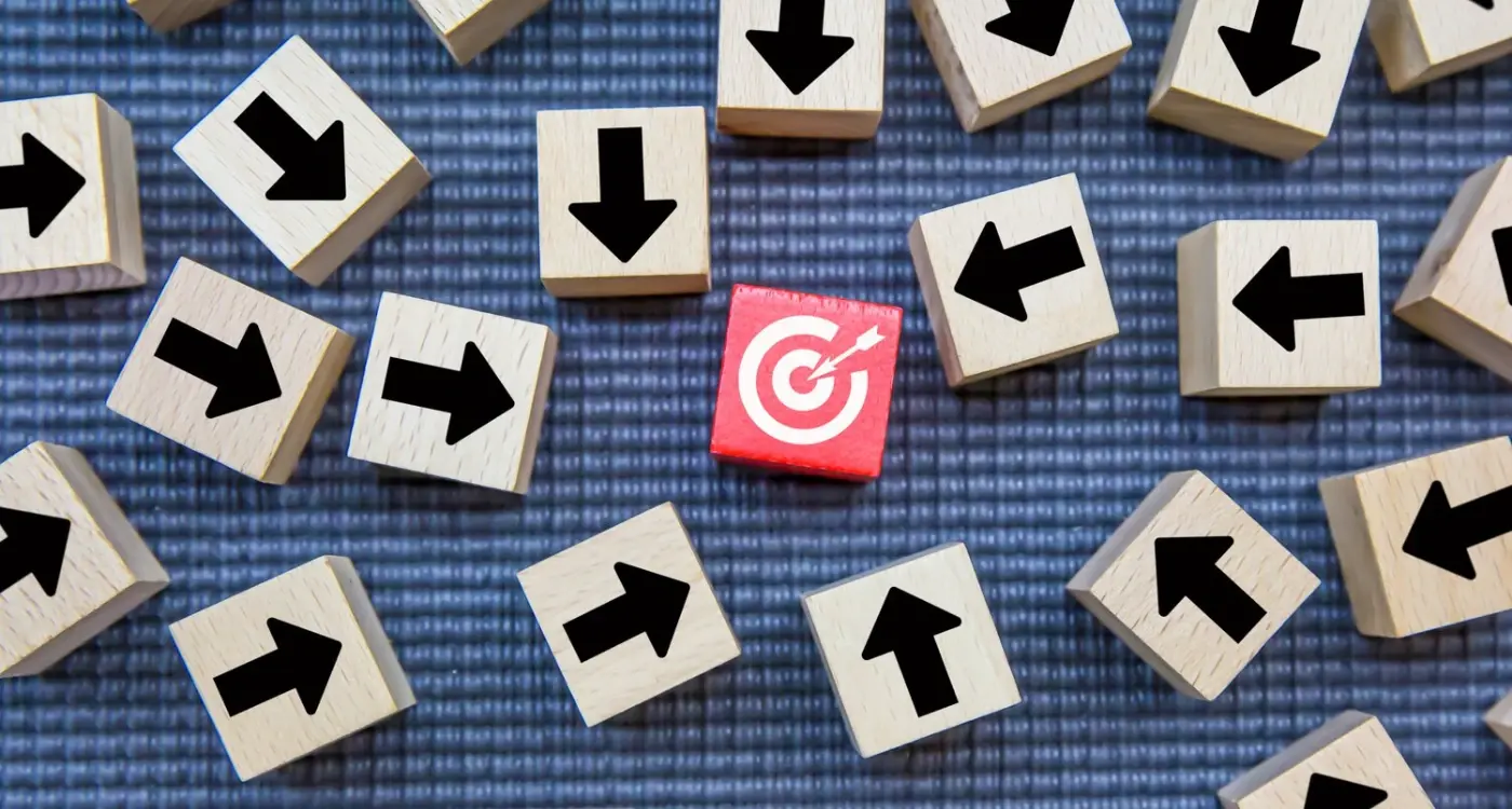
How Do I Test Different App Store Screenshots for Better Results?
You've spent months building your app, poured your heart into the design, worked with developers to get every feature just right—and then you launch it. The downloads trickle in. Maybe a few hundred in the first week if you're lucky. You check the App Store page obsessively, trying to figure out what's wrong. The thing is, most people never get past your screenshots. They land on your store page, scroll through three or four images, and they're gone. Just like that. Its not that your app is bad;it's that your screenshots didn't convince them to hit download. And here's the mad bit—most app developers just guess which screenshots to use, throw them up on the store, and hope for the best.
I've worked on enough app launches to know that guessing doesn't cut it anymore. The app stores are too crowded, competition is too fierce, and users make decisions in literally seconds. Your screenshots are doing the heavy lifting whether you realise it or not. They're your sales pitch, your first impression, and often your only chance to convert a browser into a user. But how do you know if the screenshots you've chosen are actually any good? How do you know if showing your login screen first is better than showing your main feature? You don't. Not unless you test them.
Testing your app store screenshots isn't about finding perfection—its about finding what actually makes people tap the download button instead of scrolling past your app.
That's what this guide is about. I'm going to walk you through exactly how to set up proper screenshot tests, what to look for, which tools actually work, and how to read your results without second-guessing yourself. No fluff, no theory—just practical steps that work.
Why App Store Screenshots Actually Matter for Downloads
Here's something most people get wrong about app stores—they think its all about the icon and the title. But actually? Your screenshots are doing most of the heavy lifting when it comes to convincing someone to hit that download button. I mean, think about how you browse apps yourself; you tap on something that catches your eye, then immediately start scrolling through those screenshots to see what the app actually does.
The data backs this up too. App store screenshots are typically the second thing people look at after your icon (and sometimes they look at screenshots first if they've clicked through from a search result). And here's the thing—most users make their download decision within about 7 seconds of landing on your app store page. Seven seconds! That's barely enough time to read your description, let alone watch a preview video.
Your screenshots need to work incredibly hard in that tiny window of time. They're essentially your sales pitch, your product demo, and your brand story all rolled into one. When I'm working with clients on their app store presence, I always tell them that screenshots aren't just pretty pictures of your app—they're conversion tools that need to communicate value immediately. The visual elements you choose, from how colours influence user emotions to the layout of your interface, all play crucial roles in that first impression.
But here's what makes this tricky; what works for one app might not work for another. A fitness app might do better showing transformation results and workout screens, while a productivity app might need to focus on simplicity and ease of use. The only way to know what resonates with your specific audience is to test different approaches. And honestly? Most developers never bother testing their screenshots at all, which means they're leaving downloads (and money) on the table.
Setting Up Your First Screenshot Test
Right, so you've decided to test your app store screenshots—great decision, honestly. But here's the thing, most people overcomplicate this part and end up never actually starting the test at all. I've seen it happen more times than I care to count; people spend weeks planning the "perfect" test setup when they could've already gathered useful data.
The first thing you need to do is pick exactly what you're testing. And I mean exactly. Are you testing the first screenshot only? The entire set? A specific feature highlight? You cant test everything at once (well, you can, but you wont know what actually made the difference). Start with your first screenshot—its the most important one since thats what people see before they even tap through to your full listing. Makes sense, right?
Next up, you need to decide on your variants. Keep it simple for your first test; two versions is enough. Maybe one screenshot shows your app's interface with a big headline about your main benefit, whilst the other shows a person actually using the app in a real situation. The key here is making sure the difference between them is obvious—if you're just changing the shade of blue in the background, you're wasting your time and money. Consider how different colour choices can impact purchase decisions when creating your variants.
What You Need Before You Start
Before you launch anything, make sure you've got these basics sorted:
- At least 2 distinct screenshot variations ready to go
- A clear metric you're tracking (usually impression-to-download conversion rate)
- Enough traffic to get meaningful results—you need at least 300-500 impressions per variant
- A testing tool set up properly (more on this in the next chapter)
- A timeframe in mind, typically 7-14 days minimum
Don't test during major holidays or big marketing campaigns; the unusual traffic patterns will mess up your results and you wont know if the screenshot change actually worked or if it was just the increased attention on your app.
Getting Your Test Live
Actually, the technical setup is easier than most people think. If you're using Apple's Product Page Optimisation feature, you just create your variants within App Store Connect—no third-party tools needed. For Google Play, you'll use the Experiments section in the Play Console. Both platforms handle the traffic splitting automatically, which is honestly a lifesaver compared to the old days when we had to run separate campaigns and try to balance everything manually.
One mistake I see all the time? People forget to screenshot their original version before they start testing. Sounds daft, but when you're comparing results later, you need to know exactly what you tested against. Take screenshots of everything—your variants, your original, even your test settings. You'll thank yourself later when you're trying to remember which version had the blue button versus the green one.
What Makes a Screenshot Worth Testing
Not every screenshot deserves your time and energy—its just not practical to test everything. After years of running these tests for clients, I've learned that the best candidates for testing are the ones where you genuinely can't decide between two strong options. If you're sitting there thinking "hmm, I'm not sure which angle works better," that's your signal to test it.
The screenshots worth testing are the ones that appear first in your app store listing. Simple as that really. Your first three screenshots on iOS and your first two on Android are what most people see before they scroll (if they even bother scrolling at all). These are your money shots—the ones that'll make or break your conversion rate. I mean, why would you test screenshot number seven when most users never get that far?
What Actually Moves the Needle
Here's the thing—you want to test changes that are big enough to matter. Changing a button colour from blue to slightly darker blue? Probably not worth it. But testing whether to show your app's interface or happy people using your app? Now that's worth testing. The difference between showing features versus benefits, or text-heavy versus minimal designs...these are the kinds of decisions that can swing your install rate by 10-20% or more.
Elements That Make Strong Test Candidates
- Your opening screenshot angle (product features vs user benefits)
- Text overlays versus no text at all
- Showing the actual app interface versus lifestyle imagery
- Different value propositions in your messaging
- Before/after comparisons if your app solves a clear problem
- Social proof elements like ratings or user numbers
One mistake I see constantly? Testing tiny variations that users wont even notice. You're not testing for yourself; you're testing for people who spend maybe three seconds looking at your listing before deciding. Make your test variations different enough that even a distracted person scrolling quickly would spot the difference.
The Tools You Need for Screenshot Testing
Right, so you're ready to start testing your screenshots—but which tools should you actually use? I've tried pretty much every platform out there over the years, and honestly, there's no single perfect solution that works for everyone. It depends on your budget, your technical know-how, and how detailed you want to get with your data.
For most clients I work with, I recommend starting with StoreMaven or SplitMetrics. These are proper ASO testing platforms built specifically for app store visuals, and they let you test screenshots before you even submit them to the App Store. They show your test screenshots to real users and track how they interact with them—which ones get more taps, which ones people scroll past, all that good stuff. The downside? They're not cheap. You're looking at a few hundred quid a month at minimum.
If you're on a tighter budget (and lets be honest, most startups are), Google Play actually has built-in A/B testing called Store Listing Experiments. Its completely free and works directly in the Play Console. The catch is it only works for Android, and you need real traffic to your store listing for it to work properly. So if you're just launching, you might not have enough visitors to get meaningful results.
The best testing tool is the one you'll actually use consistently, not the one with the most features you'll never touch
For iOS testing, you're a bit more limited since Apple doesn't offer built-in A/B testing yet. You can use Apple Search Ads to drive traffic to different versions of your listing, but it gets expensive fast. Some agencies swear by PreApps for pre-launch testing—it's cheaper than StoreMaven but still gives you decent insights from real users before you commit to changes in the actual store.
Running Your Test Without Making Common Mistakes
Right, so you've got your test set up and you're ready to go—but here's the thing, I've seen so many tests get completely messed up by simple mistakes that could have been avoided. And I mean genuinely simple stuff that ends up costing people thousands in wasted ad spend or missed opportunities. Let me walk you through the biggest ones.
First up: sample size. This is where most people fall flat on their face, honestly. You cant just run a test for 100 downloads and call it done; you need at least 1,000-2,000 impressions per variant to get anything meaningful. Less than that and you're basically just guessing. I know it takes longer (and costs more if you're running paid traffic) but its the difference between making decisions based on actual data versus...well, making them up.
The Mistakes That Actually Matter
Here are the ones I see most often:
- Changing your test mid-way through—seriously, don't do this, it ruins everything you've collected so far
- Testing too many variants at once which splits your traffic too thin and makes it impossible to reach statistical significance
- Running tests during unusual periods like holidays or major events when user behaviour isn't typical
- Not accounting for different traffic sources—organic behaves differently to paid, and they should be tested separately
- Stopping tests too early because one variant looks like its winning (give it time, early results lie constantly)
Keep Your Variables Consistent
One more thing that catches people out? They'll change their app description or run a big marketing campaign halfway through their screenshot test. Now you cant tell if the performance change was from your screenshots or from everything else you changed. Keep everything else the same while your test runs—and I mean everything. Your pricing, your app name, your other store assets, all of it stays locked down until you have clear results.
Reading Your Results and Knowing What They Mean
Right, so you've run your test and now you're staring at a bunch of numbers wondering what any of it actually means. I get it—this is where a lot of people panic or worse, make decisions based on the wrong data. The key thing to remember is that you're looking for statistical significance, not just which screenshot got more downloads. Because here's the thing, random fluctuations happen all the time and they dont mean anything.
Most testing tools will tell you when you've reached statistical significance (usually 95% confidence level), but basically what that means is: can we be sure this result didn't just happen by chance? If your test says variant B got 50 more downloads than variant A, but the sample size is tiny, that could just be luck. You need enough data to be confident the difference is real. And this takes time—sometimes weeks depending on your app's traffic.
What Numbers Actually Matter
When I'm reviewing test results, I look at conversion rate first and foremost; that's the percentage of people who saw your app page and actually downloaded it. If variant A has a 12% conversion rate and variant B has a 15% conversion rate, that's a meaningful difference worth paying attention to. But you also need to check the sample size—did each variant get shown to at least a few thousand users? If not, keep the test running.
Don't celebrate too early. I've seen tests that looked like clear winners after 3 days completely flip by day 7. Give your tests at least a week, preferably two, to account for weekday vs weekend behaviour patterns.
Beyond Just Download Numbers
Here's something people often miss: downloads aren't the only metric that matters. If your new screenshot gets more downloads but those users uninstall within 24 hours, you've actually made things worse. Some testing platforms let you track post-install behaviour too, and honestly that's where the real insights live. A screenshot that sets accurate expectations might get fewer downloads but better retention, and that's usually the better choice in the long run. This is where understanding how visual design affects user emotions becomes crucial for long-term app success.
| Metric | What It Tells You | Why It Matters |
|---|---|---|
| Conversion Rate | % of viewers who download | Direct measure of screenshot effectiveness |
| Statistical Confidence | How sure we are results are real | Prevents making changes based on luck |
| Sample Size | How many people saw each variant | Larger samples = more reliable data |
| Day 1 Retention | Users still active next day | Shows if screenshots set right expectations |
One more thing—dont just look at overall numbers. Break down your results by traffic source if you can. Sometimes a screenshot performs brilliantly with search traffic but terribly with browse traffic, or vice versa. That kind of insight is gold because it tells you about user intent and what different types of users are actually looking for when they find your app.
When to Stop Testing and Launch Your Changes
Right, so you've been running your screenshot test for a while now and you're seeing some data come through—but how do you know when its actually time to stop testing and push those new screenshots live? This is where a lot of people get stuck honestly, because they either pull the trigger too early or they keep testing forever hoping for more "proof".
Here's the thing though; you need what we call statistical significance before you make any decisions. Basically, this means you need enough data to be confident that your results aren't just random luck. Most testing tools will tell you when you've reached this point, but as a general rule I look for at least 300-500 downloads per variation before I trust the numbers. If one screenshot is performing 15-20% better and you've hit that download threshold? That's usually a pretty clear winner. Remember that visual choices, including strategic colour decisions that influence purchasing behaviour, can have lasting impacts on your app's commercial success.
But here's where people mess up—they see a "winner" after 50 downloads and immediately change everything. Don't do that! Small sample sizes can be misleading; what looks like a winner on Tuesday might be a loser by Friday. I typically run tests for at least 7-10 days to account for weekly patterns in user behaviour (weekends vs weekdays can show very different results).
Signs Its Time to Launch Your Changes
You'll know you're ready to move forward when you can tick off most of these criteria:
- You've collected data from at least 300-500 downloads per variation
- The test has been running for minimum 7-10 days
- One variation is clearly outperforming by 15% or more
- Your testing tool shows statistical significance (usually 95% confidence or higher)
- The results make logical sense based on what you changed
And look, if after two weeks you're not seeing any meaningful difference between variations? That's also a result. It means your original screenshots were probably fine, or the changes you made weren't significant enough to impact user decisions. Don't keep testing indefinitely hoping for different results—move on to testing something else instead.
Conclusion
Look, testing your app store screenshots isn't rocket science—but it does require patience and a proper process. I've seen too many developers rush through this, make a few quick changes based on gut feeling, and then wonder why their conversion rates haven't improved. The truth is, screenshot testing works, but only if you actually follow through with it properly and give it the time it needs to generate meaningful data.
Here's the thing; your screenshots are often the only chance you get to convince someone to download your app. They're scrolling through dozens of options, probably whilst waiting for their coffee or sitting on the bus, and you've got maybe three seconds to grab their attention. That's why testing different approaches—whether its highlighting different features, using actual UI screenshots versus lifestyle images, or experimenting with text overlays—can make such a massive difference to your download numbers.
The process we've covered isn't complicated. Set up your test properly, focus on one variable at a time, wait for statistical significance (even when its tempting to call it early), and then implement what you've learned. Rinse and repeat. Some of the most successful apps I've worked on have gone through five or six rounds of screenshot testing before finding the combination that really resonated with their audience.
And remember—what works today might not work in six months. User preferences change, competitors update their store pages, and new design trends emerge. Make screenshot testing a regular part of your ASO strategy, not just a one-time thing you did at launch. The apps that consistently perform well are the ones that never stop learning about what their potential users actually want to see.
Share this
Subscribe To Our Learning Centre
You May Also Like
These Related Guides
How Do I Know Which Marketing Channel Works Best?

How Do I Make My App Show Up in Search Results?