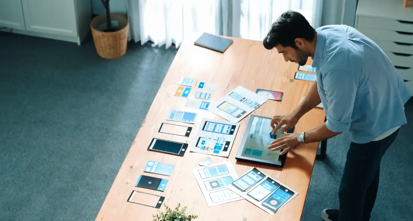
How Do Colours Change What People Buy in Your App?
You've spent months building your app, getting the features just right, making sure everything works perfectly—and then you launch it and wonder why people aren't buying. The conversion rates are lower than expected. Users browse but don't commit. It's frustrating because the app works brilliantly, yet something isn't clicking with your audience. Here's what most developers miss: the colours you chose might be actively stopping people from making purchases.
I've seen this happen more times than I can count. A client comes to us with an app that's technically sound but its struggling to convert users into paying customers. We look at the design and straight away we can spot the problem—the colour choices are sending completely the wrong signals. Maybe they've used red for their primary action buttons in a healthcare app (which creates anxiety rather than trust), or they've picked colours that clash so badly users feel uncomfortable without quite knowing why.
Colour isn't just decoration in app design; it's one of the most powerful psychological tools we have for influencing user behaviour and purchase decisions.
The thing is, colour psychology isn't magic or guesswork—it's based on how our brains are wired to respond to visual information. Different colours trigger different emotional responses, and these emotions directly impact whether someone feels confident enough to pull out their credit card. Understanding this connection between colour and user behaviour can be the difference between an app that converts at 2% and one that converts at 8%. That's not a small difference when you're talking about real revenue.
In this guide, I'm going to walk you through everything I've learned about using colour to influence purchase decisions in mobile apps. We'll look at the psychology, the practical applications, and the mistakes you need to avoid.
Why Colour Matters More Than You Think
I've watched apps fail because of colour choices. Not joking—apps with brilliant functionality and solid business models that nobody used because the colour scheme made people uncomfortable or confused. It's a bit mad really, but colour is one of those things that works at a subconscious level; people don't actively think about it, they just feel something's off and delete your app.
When you're building an app, you might think colour is just about making things look nice. But here's the thing—colour directly affects whether someone clicks that purchase button or not. Studies show that colour increases brand recognition by up to 80%, and about 85% of consumers say colour is the primary reason they decide to buy a product. That applies to your in-app purchases too.
The mobile screen is small. Really small compared to a desktop. This means every pixel counts and every colour choice has more impact because its right there in someones hand, taking up their entire field of vision. You cant afford to waste that space on colours that don't work hard for your conversion goals.
What Colour Actually Does in Your App
Colour affects three main things that directly impact your bottom line:
- Trust—certain colours make people feel safe enough to enter their payment details
- Urgency—other colours create that feeling of "I need to act now"
- Emotion—colours trigger specific feelings that make people want to buy or run away
- Navigation—colour helps users understand where to tap and what's important
I mean, you could have the best pricing in your industry but if your checkout button is the wrong colour? People won't even see it. Thats not an exaggeration—I've seen conversion rates double just by changing a button from green to orange. Same app, same functionality, different colour. Of course, this is particularly important when you consider that app security features already create friction in the purchase process—you don't want colour choices adding to that barrier.
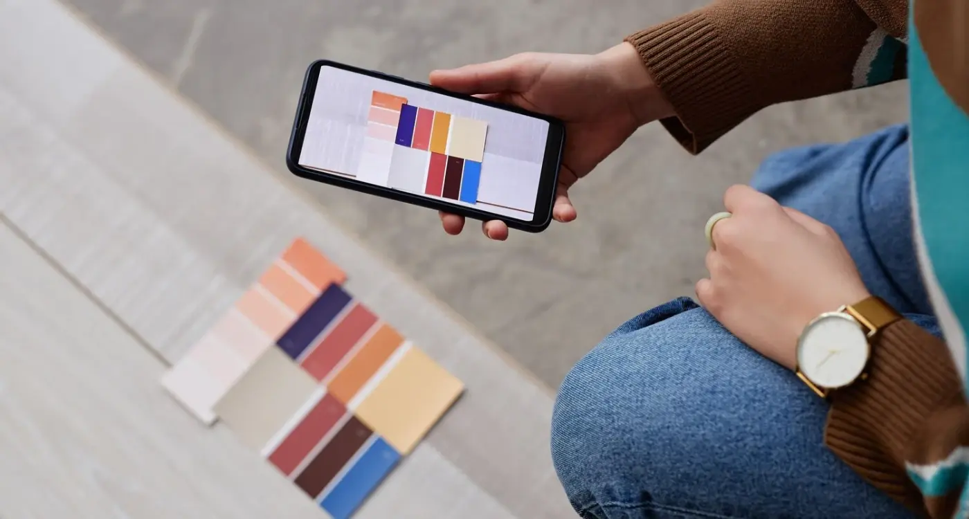
The Psychology Behind Each Colour Choice
Right, lets break down what each colour actually does to peoples brains when they see it in your app. I've tested this stuff across dozens of apps over the years and honestly—the differences can be bloody mad. Its not magic or anything like that; its just how our brains are wired to respond to different colours based on years of exposure and cultural conditioning.
Red is the big one for urgency and action. When you see red, your heart rate actually increases a tiny bit (I know, sounds dramatic but its true). This is why sale tags and "buy now" buttons often use red—it creates that sense of "I need to act right now or I'll miss out." But here's the thing; too much red can make people anxious or even aggressive, which isn't great if you're trying to build trust. I use red sparingly, usually just for important call-to-action buttons or limited-time offers.
Blue is the opposite in many ways. It calms people down and makes them feel like they can trust you. Banks and financial apps love blue because it says "we're reliable, we're professional, we won't run off with your money." The downside? Blue doesn't create urgency at all. If you want people to take immediate action, blue probably isn't your best choice for that specific button.
Green works brilliantly for anything related to health, nature, or money. It feels positive and affirming—like "yes, you're making a good choice here." I use green for confirmation messages and success states all the time. Its also great for "go" actions, like submitting a form or completing a purchase, because we're all conditioned to associate green with moving forward. This is especially important when you're designing interfaces that need to work in different lighting conditions, as wearable app interfaces have taught us about screen visibility.
Orange and yellow are interesting because they sit between red and green psychologically. Orange creates excitement without the anxiety of red—it feels friendly and energetic. Yellow grabs attention immediately (think of how road signs use it) but can be overwhelming if you use too much. A little yellow highlight can draw the eye exactly where you want it; too much yellow and people start feeling stressed.
Don't just pick your favourite colour for important buttons. Test what actually makes people click—you might be surprised that the colour you personally dislike performs better than the one you love.
Purple has this weird association with luxury and creativity. Its not used as often in app design, which can actually work in your favour if you want to stand out. Black and white are the neutrals that let other colours shine, but black on its own conveys sophistication and premium quality (look at any luxury brand's app).
Here's what I've seen work across different use cases:
- Red: urgent actions, sales, warnings, important notifications
- Blue: trust-building, financial transactions, healthcare, professional services
- Green: positive confirmations, health and wellness, environmental products, "proceed" actions
- Orange: friendly calls-to-action, creative apps, food and entertainment
- Yellow: attention-grabbing highlights, warnings that aren't severe, playful brands
- Purple: premium features, creative tools, beauty and wellness
- Black: luxury products, professional tools, premium memberships
The real trick is understanding that these aren't hard rules. Context matters. A red button on a meditation app would feel completely wrong, but that same red button on a flash sale notification? Perfect. You've got to think about what emotional state your users are in when they see each colour and whether that colour reinforces or contradicts what you're trying to make them feel.
How Different Industries Use Colour to Sell
After years of building apps across different sectors, I've noticed something fascinating—each industry has its own colour language, and breaking those rules can either make you stand out or make you look like you don't know what you're doing. Its not random either; there's solid reasoning behind why finance apps lean heavily into blues whilst food delivery apps seem to love reds and oranges.
Let me break down what I've seen work across the major industries:
Finance and Banking Apps
Blue dominates here, and for good reason. We've built dozens of fintech apps and every time a client suggests using bright orange or purple as their primary colour, we have to gently explain why thats probably not the best idea. Blue signals trust, security, and professionalism—exactly what people want when they're trusting you with their money. This is particularly crucial when you consider that mobile security features can already create friction in the user experience. But here's the thing—too much blue can make your app feel cold and corporate, which is why we often pair it with warmer accent colours for buttons and success states.
Food and Restaurant Apps
Red, orange, and yellow absolutely dominate food apps. These colours literally stimulate appetite (there's actual science behind this) which is why you'll see them everywhere from Deliveroo to McDonald's. Green has become popular too, especially for healthy eating apps or anything trying to position itself as fresh or organic. One mistake I see constantly? Food apps using too much blue—it actually suppresses appetite, which is the opposite of what you want.
Healthcare apps typically use calming blues and greens to create a sense of cleanliness and trust. E-commerce apps have more freedom but often use black or white for luxury positioning, whilst discount retailers love bright reds and yellows. Gaming apps? They go wild with whatever fits their brand—there are no real rules there, which makes those projects quite fun actually.
The key takeaway is this: understand your industry's colour conventions first before you decide to break them. Sometimes following the crowd is exactly what your users expect and need.
Colour Combinations That Make People Take Action
Right, so you've picked your main colours—but here's where it gets interesting. The real magic happens when you start combining colours together, because that's what actually drives user behaviour in your app. I've tested hundreds of colour combinations over the years and some patterns just keep showing up again and again.
The classic pairing that almost never fails? Blue and orange. Its become a bit of a cliche in app design honestly, but theres a reason for that—it works. Blue builds trust (especially important for any purchase decision) whilst orange creates urgency without being aggressive like red can be. You'll see this combo everywhere from booking apps to fintech products, and the conversion rates speak for themselves.
Purple and yellow is another combination I've used quite a bit, particularly for apps targeting younger audiences or creative industries. The contrast is strong enough to draw attention but it doesnt feel corporate or cold. Green and white works brilliantly for health and wellness apps; it feels clean and reassuring which is exactly what people want when they're making decisions about their wellbeing or spending money on fitness stuff.
The best colour combinations dont just look good—they create a visual hierarchy that guides users naturally towards the actions you want them to take
But here's the thing—you need enough contrast between your background and your call-to-action buttons. I mean really enough contrast. I've seen so many apps with beautiful colour schemes that absolutely tank on conversions because the "Buy Now" button blends into the background. Your action buttons should stand out immediately; if someone has to squint or search for them you've already lost the sale. Dark backgrounds with bright accent colours work well for this, as do light backgrounds with saturated button colours. Test the contrast ratio—aim for at least 4.5:1 for text and 3:1 for larger elements.
Common Colour Mistakes That Kill Sales
Right, let's talk about the colour choices that actually cost you money—because I've seen these same mistakes across hundreds of apps and its painful every time. The biggest one? Using too many colours at once. I mean, I get it, you want your app to look exciting and modern, but when you've got six or seven different colours competing for attention, users don't know where to look; their brain just shuts down and moves on.
Another massive mistake is using low contrast between text and background colours. You'd be surprised how many apps I review where the call-to-action button is barely visible because someone thought light grey text on a white background looked "clean." It doesn't look clean—it looks invisible. And that checkout button you cant see? That's literally money walking out the door.
Ignoring Your Brand Identity
Here's one that drives me mad: picking colours because they're trendy rather than because they fit your brand or industry. Sure, that hot pink might look great on a fashion app, but slap it on a banking app and people will question whether you're trustworthy. Colour needs to match what your app does and who its for, not what looks good on someone else's design.
Forgetting About Accessibility
Actually, the worst mistake I see is not testing colours for accessibility. About 8% of men have some form of colour blindness—that's a huge chunk of your potential users. If your "buy now" button only stands out because its red and everything else is green, those users literally cannot see the difference. You're excluding people without even realising it, and that affects your bottom line more than you'd think. This is something we see addressed well in colour accessibility for wearables, where designers have had to be particularly mindful of contrast and visibility.
The fix for all these problems? Test everything. Don't assume. Don't guess. Show your colour choices to real people and watch how they actually use your app.
Testing Colours to Find What Works Best
Right, so you've picked your colours based on psychology and what your competitors are doing—but here's the thing, you won't actually know if they work until you test them. I mean, you can make educated guesses all day long, but real user behaviour will surprise you every single time. I've seen apps where a button colour we were certain would perform brilliantly actually tanked conversion rates by 15%. Its a bit mad really, but that's why testing is so important.
A/B testing is your best friend here. You basically show half your users one colour and the other half a different colour, then measure which one gets more clicks, purchases, or whatever action you're trying to encourage. The key is to only test one thing at a time—if you change the button colour AND the text at the same time, you won't know which one made the difference. Start with your most important actions first; things like your checkout button, sign-up forms, or add-to-cart buttons. These are the places where small changes can have big impacts on your bottom line.
But here's what most people get wrong: they don't run the test long enough. You need proper sample sizes and enough time to account for different user behaviours throughout the week. Testing for just two days isn't going to give you reliable data. I usually recommend at least two weeks, sometimes longer if your app doesn't have massive traffic. And don't just look at click rates—look at the whole journey. A red button might get more clicks but if those users abandon the checkout process more often, whats the point?
Start with testing your primary call-to-action buttons first—these typically have the biggest impact on conversions and will give you the quickest insights into what colours resonate with your specific audience.
Key Elements to Test in Your Colour Strategy
- Primary action buttons (buy now, sign up, checkout)
- Navigation bar and menu colours
- Background colours for important sections
- Text and heading colours for readability
- Colour combinations for promotions and special offers
- Alert and notification colours
One thing I've learned over the years is that your initial assumptions about colour will probably be wrong at least 40% of the time. Users don't always behave the way we think they will, and that's fine—that's exactly what testing is for. I've worked on finance apps where blue didn't perform as well as we expected, and e-commerce apps where orange completely outperformed red for purchase buttons. You just never know until you test it properly.
Document everything you test and the results you get. Build up your own library of what works for your specific audience because that knowledge is gold. What works for one app wont necessarily work for another, even in the same industry. Your users are unique, their preferences are unique, and your colour strategy should reflect that reality rather than just following generic advice.
Cultural Differences in Colour Meaning
Right, so here's something that catches people out all the time—colour doesn't mean the same thing everywhere. I've worked on apps that launched in multiple countries, and honestly, the colour choices that worked brilliantly in the UK completely backfired in other markets. It's a bit mad really, but you need to think about this stuff if you're planning to go global with your app.
In Western countries, white typically represents cleanliness and simplicity (think Apple's design language). But in many Asian countries? White is associated with mourning and funerals. Launch your meditation app with a pure white interface in China and you might not get the calming response you were hoping for. Red is another interesting one—whilst we might use it for warnings or danger in the West, it's actually the colour of luck, prosperity and celebration in China. That's why you'll see so many Chinese e-commerce apps using red as their primary colour; it just feels right to their users.
Green means "go" for most of us, but in some Southeast Asian countries its got different cultural associations that might not align with your brand message. And don't even get me started on purple—it's royalty in Europe, but in some Latin American countries it's linked to death and mourning.
Key Colour Meanings Across Different Cultures
- White: purity in the West, mourning in Asia
- Red: danger in Western markets, luck and prosperity in China
- Yellow: optimism in the US, sacred in India, mourning in Egypt
- Blue: trust and calm almost universally (your safest bet)
- Black: sophistication in Western markets, bad luck in some Asian countries
- Green: nature and growth in most places, but different associations in Indonesia
The solution isn't to avoid colour altogether—it's to do your research before launching in new markets. I mean, sometimes you can keep your core brand colours but adjust accent colours or background choices. Blue is probably the most universally "safe" colour, which is why so many global apps (Facebook, Twitter, LinkedIn) lean on it heavily. But safe doesn't always mean memorable, does it?
Making Your Colour Choices Accessible for Everyone
Right, here's something that gets overlooked way too often in app design—colour accessibility. And I mean, its not just about being nice to people, its actually about making sure you don't accidentally exclude a massive chunk of your potential customers. About 1 in 12 men and 1 in 200 women have some form of colour vision deficiency. That's millions of people who might struggle to use your app if you haven't thought this through properly.
The most common issue? Red-green colour blindness. I've seen so many apps use red for error messages and green for success without any other visual cues, which means those users literally cannot tell if something went right or wrong. Bloody hell, that's frustrating for them isn't it? The fix is simple though—add icons, use patterns, change the shape of buttons, add text labels. Don't rely on colour alone to communicate important information. The principles we've learned from dark mode wearables really apply here—accessibility considerations often lead to better design for everyone.
Contrast ratios are another big one. The Web Content Accessibility Guidelines (WCAG) recommend a contrast ratio of at least 4.5:1 for normal text and 3:1 for large text. Sounds technical, but there are free tools that check this for you in seconds; I use them on every project now because its just become second nature. Low contrast might look sophisticated to you, but it makes your app genuinely unusable for people with low vision or anyone using their phone in bright sunlight.
Accessible design isn't a separate consideration from good design—it's part of what makes design good in the first place
Here's the thing—when you design with accessibility in mind from the start, you usually end up with a better app for everyone. Clear contrast helps all users read faster. Multiple visual cues reduce cognitive load. Its one of those rare situations where doing the right thing also happens to improve your conversion rates across the board.
Look—colour isn't some magic button you press to make people buy things. It's not that simple, never has been. But what colour can do is support everything else you've built in your app; the functionality, the user experience, the value you're actually delivering. When we get colour right its working quietly in the background making everything feel more trustworthy, more urgent, or more calming depending on what your users need in that moment.
I've seen apps transform their conversion rates just by changing a single button colour—and I've also seen apps waste thousands testing colour variations when their real problem was a confusing checkout flow. The trick is knowing when colour matters and when its just rearranging deck chairs. You need to understand your users first, your industry second, and only then should you start thinking about whether that call-to-action should be orange or green.
The apps that succeed don't just pick colours because they look nice or because some blog post said "red creates urgency". They test their choices, they consider accessibility from day one, and they understand that colour means different things to different people. A colour scheme that works brilliantly for a meditation app would probably tank a sports betting platform.
Here's what I tell every client—start with your users and work backwards. What do they expect from your industry? What emotions do you need them to feel at each stage of their journey? How can you make sure everyone can actually see and use your app regardless of their vision? Answer those questions first, then choose your colours based on real insight rather than guesswork. Test what you build, measure the results, and be willing to change things if the data tells you to. That's how you use colour to actually move the needle on your business goals rather than just making things look pretty.
Share this
Subscribe To Our Learning Centre
You May Also Like
These Related Guides
How Do I Design for Users with Colour Blindness?

How Do I Ensure My App Matches Our Brand?