How Do Loading Animations Keep Users Patient and Happy?
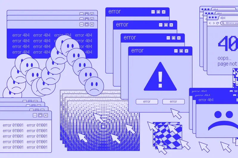
Loading animations are everywhere in modern mobile apps—those little spinning wheels, progress bars, and bouncing dots that appear when your app is fetching data, processing a payment, or loading new content. They're so common that most people don't even think about them anymore. But here's the thing; these tiny micro-interactions are doing some pretty heavy lifting when it comes to keeping users happy whilst they wait. And trust me, after building apps for nearly a decade, I can tell you that getting your loading states right is one of those details that separates a good app from one that people actually love using.
You know what? Most people assume loading animations exist purely to tell users "hey, the app hasn't frozen, we're working on it." And sure, thats part of it. But the psychology behind waiting is way more interesting than that. When users are staring at a blank screen with no feedback, every second feels like an eternity—their brain starts questioning whether something's gone wrong, whether they should tap again, whether the app is broken. Its a bit mad really how much anxiety a few seconds of uncertainty can create.
The perception of time during waiting is influenced far more by what users see and feel than by the actual duration of the wait itself
Progress indicators and loading animations exist to manage user patience by providing visual feedback, setting expectations, and creating a sense that progress is happening. In the mobile world where attention spans are measured in milliseconds and users have literally thousands of alternative apps they could switch to, keeping people engaged during those unavoidable waiting moments isn't just about good UX design; it's about keeping your users from hitting that back button and never returning. I've seen apps lose half their users simply because their loading experience felt sluggish or unresponsive, even when the actual loading time was exactly the same as their competitors.
Why Waiting Feels Longer Than It Actually Is
Here's something I've noticed after building apps for almost a decade—people are terrible at judging time when they're waiting for something. Absolutely terrible. A three-second delay can feel like thirty seconds if nothing is happening on screen, and its not just perception...it actually affects whether users will stick around or abandon your app entirely. This is one of those insights you really only learn through proper mobile app market research, where you observe real user behaviour patterns.
The problem is how our brains work when we're idle. When you're actively doing something—scrolling, tapping, reading—your brain is engaged and time seems to pass normally. But the moment you're forced to wait with no feedback? Your brain starts paying attention to the waiting itself. You become hyper-aware of every passing second. Its like when you're standing in a queue with nothing to look at versus one where you can watch what's happening at the counter; the second one always feels shorter even if it takes the same amount of time.
I've watched this play out in user testing sessions more times than I can count. Users will wait patiently for a loading process that takes five seconds if something is moving on screen, but they'll get frustrated and bail after just two seconds of staring at a blank screen. The actual wait time matters less than the perceived wait time—and that's the bit most developers get wrong when they're building apps.
There's also this thing called "uncertain waits" which feel longer than known waits. If your app shows a progress bar that moves predictably, users can estimate how long they need to wait. But if there's just a spinning wheel with no indication of progress? That uncertainty makes the wait feel endless. Your brain cant prepare for an unknown duration, so it assumes the worst and every second drags.
What Loading Animations Do to Your Brain
Your brain is a funny thing when it comes to waiting. I mean, we all know waiting is rubbish—but why does a spinning wheel or a progress bar actually make it feel less terrible? Well, theres quite a bit of psychology at work here, and understanding it has helped me design better loading experiences over the years.
When you're staring at a blank screen, your brain goes into a bit of panic mode. Is the app frozen? Did something break? Should I tap again? This uncertainty is what makes waiting feel unbearable; its not really the time itself but the lack of information that drives people mad. Loading animations solve this by giving your brain something to focus on and—more importantly—confirmation that something is actually happening.
Here's the thing though—loading animations work because they create what we call "active waiting" instead of "passive waiting". When you watch a progress bar fill up or see an animation loop, your brain is processing visual information and tracking progress (even if its fake progress!). This keeps your prefrontal cortex engaged rather than letting anxiety take over. Its a bit mad really, but even a simple spinning circle can reduce perceived wait time by up to 40% compared to a blank screen.
The brain also responds differently to different types of movement. Smooth, predictable animations are calming—they suggest everything's working as it should. Jerky or stuttering animations? They trigger stress responses because they signal something might be wrong. Thats why I always tell clients that a well-designed loading animation isn't just decoration; it's genuinely important for keeping users calm while your app does its work in the background. This is especially crucial when you're preparing your app for future AI personalisation features, where loading states become even more critical for user experience.
If your loading time is longer than 2 seconds, always show some form of progress indicator—even an indeterminate one beats showing nothing at all.
The Different Types of Progress Indicators
Right, so there's actually quite a few ways to show progress in an app—and I mean, some work better than others depending on what you're trying to do. The one you choose can make a massive difference to how patient your users are.
Let's break down the main types you'll see:
Determinate vs Indeterminate Indicators
Determinate indicators are the ones that show you exactly how much progress has been made; think of that classic progress bar that fills from 0% to 100%. These work brilliantly when you actually know how long something will take—like downloading a file or uploading photos. Users can see they're 60% done and they feel in control.
Indeterminate indicators are different—they just show that something is happening, but they dont tell you when it'll finish. Spinners, pulsing dots, those infinity loops that go round and round. These are what you use when you genuinely cant predict the time, like waiting for a server response that might take 2 seconds or might take 10.
The Most Common Types
Here's what I use most often in projects:
- Progress bars—the classic horizontal bar that fills up, perfect for file transfers or multi-step processes
- Spinning wheels—those circular animations that just keep going, good for quick unknown waits
- Skeleton screens—grey placeholder boxes that mimic your actual content layout (more on these later)
- Percentage counters—actual numbers ticking up, which work well alongside progress bars
- Activity indicators—small animated icons that show the app is working without being too distracting
- Pull-to-refresh animations—those little icons that appear when you drag down to reload content
The trick is matching the right indicator to your specific situation. Using a progress bar when you don't know the actual progress? That's worse than using a simple spinner, because you're setting false expectations. I've seen developers fake progress bars that get stuck at 90% for ages—honestly, it drives users mad and destroys trust in your app.
How Fast Does a Loading Animation Need to Be
Here's the thing—there isn't a magic number that works for everyone, but there are some pretty clear thresholds that we've learned through years of testing. If your loading animation finishes in under 1 second, most users won't even register it as "waiting." It just feels instant. Between 1-3 seconds? That's where loading animations actually earn their keep; they keep people engaged and give feedback that something's happening.
Once you hit that 3 second mark though, things get tricky. Users start getting impatient, no matter how lovely your animation is. And past 5 seconds? You're in dangerous territory—people will start abandoning your app or thinking its broken. I've seen beautifully designed loading animations that couldn't save apps from poor performance, and honestly, no amount of visual polish can make a 10 second wait feel acceptable.
The animation itself needs to move at the right speed too. If it loops too quickly (say, every 0.5 seconds), it looks frantic and actually makes the wait feel longer. Too slow (3+ seconds per loop) and users think the app has frozen. Sweet spot? Around 1-2 seconds per animation cycle—fast enough to show activity but not so fast that it looks desperate.
The best loading animation is the one users never see because your app loaded so quickly they didn't need it
But here's what really matters: the perceived speed. An animation that shows clear progress (like a bar filling up) makes a 4 second wait feel shorter than a spinning wheel for 3 seconds. Why? Because progress indicators give people a sense of control and predictability. They know its working, they know roughly how long they have left, and that psychological difference is massive when it comes to user patience.
Skeleton Screens vs Spinning Wheels
Right, so this is where things get interesting—because these two approaches to loading couldn't be more different in how they work. I've tested both extensively across different apps and the results are honestly a bit surprising sometimes.
Spinning wheels (or spinners, or whatever you want to call them) are what most people think of when they picture a loading indicator. They're simple, theyve been around forever, and everyone understands what they mean. But here's the thing—they make people very aware that they're waiting. Your brain sees that spinning circle and immediately goes into "I'm waiting for something" mode, which actually makes the time feel longer. Not ideal.
Skeleton screens are different. They show you the basic structure of what's about to load—the shape of text blocks, image placeholders, button outlines. Its like seeing the bones of the page before the content fills in. The clever bit? Your brain starts processing the layout immediately, so it feels like something is already happening. Users report waiting times feeling up to 30% shorter with skeleton screens compared to traditional spinners, even when the actual loading time is identical.
But skeleton screens aren't always the right choice. They work brilliantly for content-heavy screens like social feeds or product listings where the layout is predictable. Spinning wheels make more sense for simple actions like submitting a form or refreshing data—situations where there's not really a layout to preview.
When to Use Each Approach
- Use skeleton screens for initial page loads, content feeds, and complex layouts with multiple elements
- Use spinners for quick actions, form submissions, and simple refresh operations
- Use skeleton screens when you want to reduce perceived wait time and keep users engaged
- Use spinners when the action takes less than 2 seconds (skeletons can actually feel slower for very quick loads)
- Consider skeleton screens for first-time users who need to understand your app's structure
I generally push clients towards skeleton screens for anything that takes longer than a second or two to load. The difference in how users perceive the experience is genuinely noticeable, and once you start using them properly it's hard to go back to basic spinners.
When Loading Animations Actually Make Things Worse
Right, so here's something most people don't realise—loading animations can actually annoy users more than having nothing at all. I know that sounds backwards, but its true and I've seen it happen time and time again in apps I've worked on.
The biggest problem? When your loading animation takes longer than the actual task. If something loads in half a second but your fancy animation runs for two seconds, you've just made your app feel slower than it really is. Users aren't stupid; they notice when they're being made to wait for no reason and it frustrates them more than a quick flash of loading would have done.
Another issue—and this ones a bit subtle—is when loading animations lie to users. You know those progress bars that zoom to 90% then sit there forever? Yeah, those are worse than useless. They break trust because users think they're nearly done, but then they're stuck waiting with no idea how much longer its actually going to take. At least an honest spinner doesn't make false promises about timing. This kind of trust issue can be particularly damaging if you're still in the pre-launch phase and haven't yet figured out who to trust with your app idea.
Loading animations also cause problems when they're too distracting or too heavy. I've seen apps where the animation itself was so complex that it slowed down the actual loading process...which is just mad really. The animation is supposed to help, not make things worse! And if your animation is flashy and attention-grabbing, it can actually make the wait feel longer because users are focused entirely on waiting rather than being gently occupied.
If your process takes less than 0.5 seconds, skip the loading animation entirely—users won't even notice the wait and adding an animation just draws attention to it.
Here's the thing—sometimes the best loading experience is instant feedback followed by progressive disclosure. Show users something useful immediately, even if its incomplete, then fill in the details as they load. This way people feel like progress is happening rather than just watching a spinner tell them to be patient.
Building Loading States That Match Your Brand
Here's where things get interesting—your loading animation isn't just a functional element, its actually a branding opportunity. I mean, think about it; users are staring at this thing while they wait, so why not make it memorable? The difference between a generic spinning circle and a branded loading experience can genuinely affect how people perceive your entire app.
When I build loading states for clients, I always start by looking at their existing brand guidelines. What colours do they use? What's their personality like—are they playful or professional? Do they have any visual elements that could translate into motion? A fintech app probably shouldn't have bouncing cartoon characters (though I've seen it tried!) but an app for kids definitely can. The key is making sure your loading state feels like it belongs to your app, not something you borrowed from a tutorial.
What Makes a Loading State Feel Branded
You don't need to reinvent the wheel here. Actually, sometimes the simplest approach works best. Here are the main elements you can customise to make a loading state your own:
- Colour scheme that matches your primary brand colours (but watch out for accessibility issues with low contrast)
- Animation style that reflects your brand personality—smooth and slow for luxury brands, quick and bouncy for youth-oriented apps
- Custom illustrations or icons that relate to your product or service
- Micro-copy that uses your brand's tone of voice during longer waits
- Timing and easing that feels right for your audience—older users often prefer slower, more predictable animations
But here's the thing—don't let branding get in the way of clarity. I've seen apps where the loading animation was so stylised that users couldn't tell if the app was actually doing something or if it had frozen. Your users need to understand that progress is happening; that always comes first, then you layer the branding on top. Its a balance really, and it takes a bit of testing to get it right.
Testing Whether Your Loading Experience Works
Right, so you've designed this beautiful loading animation—but how do you actually know if its doing its job? I mean, you could just ship it and hope for the best, but that's not really how we work is it? Testing loading states is one of those things developers often skip because it feels a bit tedious, but honestly, it's where you discover whether your users will stick around or bail on your app. This is where using proper market research tools becomes invaluable for understanding real user behaviour patterns.
The simplest test is the 5-second rule; if your loading animation hasn't communicated what's happening within 5 seconds, users start getting nervous. You can test this by watching real people use your app—not your team, actual users who've never seen it before. Their faces tell you everything. Do they look confused? Frustrated? Are they tapping the screen repeatedly? These are all signs your loading experience isn't working.
Testing Real-World Conditions
Here's something most developers forget: testing on your fancy office WiFi doesn't tell you much. You need to test on 3G connections, in areas with poor signal, on older devices that process things slower. I use network throttling tools constantly because the loading experience on a slow connection is completely different from what you see on your development machine. And that's where most users actually experience your app—on the bus, in a cafe, basically anywhere thats not your office.
The best loading test is watching someone use your app while they're standing in line at the supermarket with one hand holding shopping and patchy signal
Track your analytics too; look at drop-off rates during loading sequences. If 40% of users abandon your app on a particular loading screen, that's a massive red flag. Compare different loading styles using A/B testing—skeleton screens versus spinners, for example. The data doesn't lie, even if it sometimes hurts to see it.
Conclusion
Look—loading animations aren't going to fix a slow app. Lets be clear about that from the start. If your app takes ten seconds to load a simple screen, no amount of fancy animation is going to make users happy about waiting that long. The real work is in optimising your backend, reducing unnecessary API calls, and making sure your code is as efficient as it can be.
But here's the thing; once you've done all that work to make your app as fast as possible, there will still be moments where users have to wait. That's just the reality of mobile development. Networks drop. Servers have bad days. Complex calculations take time. And in those moments, a well-designed loading state makes all the difference between a user who sticks around and one who closes your app and never comes back.
I've seen apps with really slow load times get better reviews than faster apps simply because they managed expectations better. Users dont mind waiting when they know whats happening and roughly how long it'll take. What they hate is uncertainty—that feeling of "is this broken or just slow?" That's what good loading animations solve.
The best approach? Start with the basics. Make sure users always know something is happening. Then test it with real people, not just your development team. And remember that different parts of your app might need different loading strategies. A skeleton screen works brilliantly for a feed, but might feel odd for a button action. Its about matching the loading experience to what users expect in that specific moment.
Loading animations are a small detail in the grand scheme of building an app, but they're the kind of detail that separates good apps from great ones. Get them right and most users won't even notice them—which, honestly, is exactly what you want.
Share this
Subscribe To Our Learning Centre
You May Also Like
These Related Guides
How Do I Add Micro-Interactions To My Mobile App Without Overdoing It?

How Do I Design Cards That Users Want to Tap?