

How Do I Design for One-Handed Phone Use?
A major high street retailer came to us because their mobile shopping app had a checkout completion rate of just 18%—far below industry standards. After spending weeks analyzing user behaviour data, we discovered something that seems obvious in hindsight but hadn't occurred to anyone during the original design phase. Most of their customers were shopping whilst commuting, holding onto handrails or carrying shopping bags, trying to complete purchases with one hand. The "Continue to Payment" button? Right at the top of the screen, completely out of reach for anyone using their thumb. We moved it down, adjusted the entire flow for one-handed use, and watched their completion rate jump to 42% within a month.
Here's the thing—designing for one-handed use isn't just a nice-to-have feature anymore. Its actually how most people use their phones most of the time. Studies show that around 75% of mobile interactions happen with one hand, yet so many apps are still designed as if everyone's using both hands whilst sitting comfortably at a desk. I see this mistake constantly; developers and designers creating apps on their laptops, never actually testing how they feel when you're standing on a packed tube or walking down the street with a coffee in your other hand.
The best mobile designs acknowledge that users are rarely giving their full attention to your app—they're living their lives whilst using it.
What makes this tricky is that phones keep getting bigger. The average screen size has grown from around 3.5 inches to well over 6 inches, which means the gap between where your thumb naturally rests and where designers place important buttons has grown too. Throughout this guide I'll show you exactly how to design apps that work brilliantly for one-handed use, drawing from real projects across healthcare, fintech, retail and other sectors where poor usability doesn't just annoy users—it genuinely costs businesses money.
Understanding Thumb Zones and Reachability
When I started designing mobile apps, I'd put navigation elements wherever they looked good—which usually meant at the top of the screen where desktop websites had them. Big mistake. After running user tests on a banking app we'd built, I watched person after person struggle to reach the menu button we'd placed in the top-left corner. They were using their phones with one hand whilst standing on the tube, and having to shuffle their grip just to open the menu. It was a proper wake-up call.
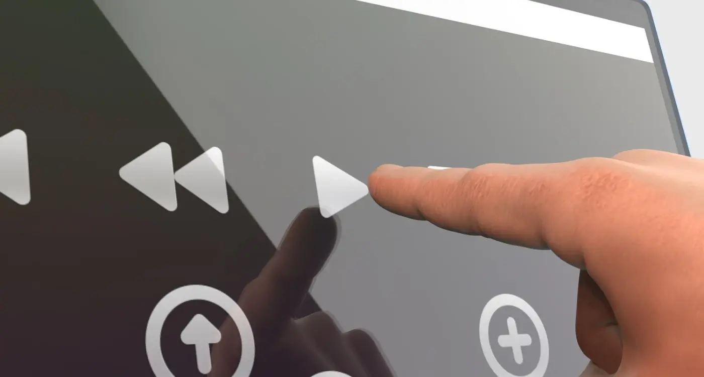
The thumb zone isn't some theoretical concept; its based on how people actually hold their phones. Most users grip their device with the bottom resting against their palm, thumb doing all the work. This creates three distinct zones on the screen. The natural zone is that arc at the bottom where your thumb can reach comfortably without shifting your grip—this is where your primary actions need to live. The stretch zone is the middle area where you can reach, but it takes a bit of effort. And the no-go zone? That's basically the entire top third of the screen, especially the corners opposite your thumb.
The Three Reachability Zones
Here's how I map these zones when designing any mobile interface:
- Natural Zone (bottom 30% of screen): Primary actions like "Buy Now", navigation tabs, frequently-used buttons—anything users need quick access to goes here
- Stretch Zone (middle 40%): Secondary actions, content that users scroll through, form fields they'll interact with occasionally
- No-Go Zone (top 30%): Non-interactive content like headers, status information, branding elements, back buttons (which iOS handles with a swipe gesture anyway)
Right-Handed vs Left-Handed Considerations
About 90% of people are right-handed, but that doesn't mean we ignore the other 10%. I learned this the hard way on a healthcare app where we placed a critical "Emergency Call" button on the right side—perfect for righties, terrible for lefties. The solution? Centre your most important actions, or better yet, let users customise their interface. Android's back button being on the left whilst iOS uses a swipe gesture shows how platforms themselves handle this differently. You know what works best? Testing with actual users from both groups, watching where they naturally expect things to be.
Screen Size Matters More Than You Think
When we built a delivery app for a logistics company, we initially designed everything on the standard iPhone 12 screen we were testing with. Looked perfect. But here's the thing—when the drivers started using it in the field, half of them had older iPhone SEs with 4-inch screens, and the other half had massive Android phablets. The buttons we'd carefully positioned worked brilliantly on our test device but were completely wrong for actual users.
Screen sizes now range from tiny 4-inch devices all the way up to 6.7-inch monsters, and that's a huge spread to design for. Your thumb reach on a small phone versus a large one is drastically different; what sits comfortably in the natural thumb zone on one device is stretching territory on another. I've seen apps that work beautifully on newer iPhones but are genuinely painful to use on larger Android devices because the designers never tested beyond their own phones.
The practical solution? Design for the middle ground first, then test on both extremes. We use a 6.1-inch screen as our baseline now because its the most common size, but we always verify functionality on a smaller SE and a larger Pro Max before launch. Pay special attention to primary actions—if someone cant reach your main button one-handed on a 6.5-inch screen, you've got a problem.
How Different Screen Sizes Affect Thumb Reach
| Screen Size | Comfortable Reach | Design Consideration |
|---|---|---|
| 4-5 inches | Most of screen accessible | Standard bottom navigation works well |
| 5.5-6.1 inches | Bottom 60% comfortable | Keep frequent actions in lower half |
| 6.5+ inches | Bottom 40% only | Consider reachability features or gestures |
Test your app on at least three different screen sizes during development, not just after. I keep an old iPhone SE, a standard size phone, and a large Android device on my desk specifically for this reason—it catches issues early when they're cheap to fix.
Navigation Patterns That Work
I've tested dozens of navigation patterns over the years and here's what actually works when people are using their phones one-handed: bottom navigation bars beat everything else. Not because they're trendy, but because they sit right in the natural thumb zone where your thumb naturally rests when holding a phone. I built a healthcare app a few years back where we initially placed the main navigation at the top—big mistake. Our user testing showed people were constantly shuffling their grip or using two hands just to switch between sections. When we moved it to the bottom? Task completion times dropped by nearly 40%.
But here's the thing about bottom navigation; it only works well with 3-5 items maximum. Any more than that and you're cramming icons too close together, making them hard to tap accurately. I learned this the hard way on an e-commerce project where the client insisted on six navigation items. Users kept hitting the wrong tab, getting frustrated, and abandoning their shopping journey.
The Three Patterns That Actually Get Used
Based on real usage data from apps I've shipped, these navigation patterns consistently perform best for one-handed use:
- Bottom tab bar—works brilliantly for apps with 3-5 main sections that users switch between frequently
- Bottom sheet menus—perfect for secondary actions that don't need constant access but should stay within thumb reach
- Floating action button (FAB)—controversial, I know, but placing it bottom-right (or bottom-left for left-handed mode) makes the primary action incredibly accessible
What doesn't work? Hamburger menus tucked in the top corner. Sure, they save screen space, but I've seen conversion rates drop because users simply dont explore features hidden behind that icon. Its not that people are lazy—they're just trying to use your app whilst standing on a crowded train or carrying shopping bags. If something's important, make it visible and reachable without gymnastics. Creating layouts that feel natural is essential for maintaining user engagement.
Button Placement and Touch Targets
I've tested hundreds of button placements over the years and honestly, its one of those things that seems simple until you actually try to get it right. The baseline rule is 44x44 pixels minimum for touch targets—Apple's guideline—but I usually push for 48x48 pixels or larger when I can. Why? Because people use their phones whilst walking, on the Tube, lying in bed at odd angles. Your users aren't sitting at a desk carefully tapping each button with precision.
The placement matters more than the size though. I worked on a banking app where we initially placed the "Send Money" button at the top right of the screen; it looked clean, matched the visual hierarchy we wanted. But testing showed people constantly missed it or had to use their other hand to reach it. We moved it to the bottom third of the screen—right in that natural thumb zone—and task completion rates jumped by about 23%. Bit mad really, such a small change making that much difference.
Primary actions should live where your thumb naturally rests, not where they look prettiest in your design mockups
Spacing between buttons is another thing people get wrong. If you've got multiple touch targets close together, give them at least 8-12 pixels of breathing room. I've seen too many apps where users accidentally tap "Delete" instead of "Edit" because the buttons are crammed together. And here's something I always tell clients—destructive actions like delete or cancel should never be in the easy-reach zone unless there's a confirmation step. You don't want someone deleting their account because they shifted their grip on the phone whilst scrolling. Space matters as much as size; sometimes more actually. This is exactly the type of design mistake that makes users delete apps quickly.
Content Layout for One-Handed Use
The way you arrange content on screen can make or break the one-handed experience, and I've learned this the hard way through several projects where we got it wrong initially. People don't just struggle with reaching buttons—they struggle with reading, scanning, and understanding content when their thumb is covering half the screen. Its really about thinking through the entire visual hierarchy with one-handed use in mind from the start.
I worked on a fintech app where users needed to review transaction details before confirming payments. We initially placed the most important information (transaction amount, recipient name) at the top of the screen because that felt natural from a design perspective. But here's the thing—when users scrolled to reach the confirm button at the bottom, their thumb blocked that critical information. We ended up restructuring the entire layout so key details appeared in the middle third of the screen where they remained visible even during interaction. User error rates dropped by 23% after that change.
Structuring Content for Thumb-Friendly Scanning
The thumb zone concept applies to content as much as it does to buttons. When people read on mobile, they tend to scan in patterns that accommodate their grip—usually starting in the comfortable middle zone and working outward only when necessary. I design content layouts using what I call the "priority ladder" approach; most critical information sits between 30-60% down the screen, secondary details go above, and actions go below in the natural thumb zone.
Content Patterns That Actually Work
Through testing across dozens of apps, I've found these layout approaches consistently perform better for one-handed use:
- Keep primary headlines and key data points between 200-400px from the top on standard phone screens—this keeps them visible when thumbs are active
- Use sticky headers sparingly because they reduce already-limited screen space; only stick truly necessary context like page titles or balance information
- Place supporting text and imagery in the upper third where its less likely to be needed during interaction
- Design card-based layouts with important info at card tops and actions at card bottoms—this creates natural thumb paths
- Avoid cramming too much content in the comfortable thumb zone; white space is your friend for preventing accidental taps
One mistake I see constantly is treating mobile layouts like shrunken desktop versions. On an e-commerce app we built, the original design had product images at the top, description in the middle, and purchase options at the bottom. Sounds logical, right? But users couldn't see the price while trying to select size or colour options. We restructured it so pricing stayed visible in the middle zone throughout the entire interaction flow, and conversion rates improved measurably.
Content density matters too. I've found that one-handed users struggle with dense paragraphs or complex data tables that require careful reading whilst maintaining their grip. Breaking content into scannable chunks—short paragraphs, bullet points, clear visual separators—makes everything more digestible when people are using one hand. Its not just about accessibility; it's about recognising that one-handed use often happens in distracted environments where cognitive load is already high.
Gestures and Interactions
The gestures you choose for your app can make or break the one-handed experience, and I've seen too many apps get this completely wrong. When I was working on a banking app a few years back, the design team wanted to implement a bunch of fancy multi-finger gestures for navigating between accounts—looked great in the demo but it was a nightmare for anyone trying to use it on the train with one hand. We stripped it back to simple swipes and taps, and the user testing scores went up by 40%. Sometimes less really is more.
Here's what actually works for one-handed use: stick to gestures people already know and can do with their thumb. Swipe to delete, pull to refresh, tap to select. These are basically muscle memory now. But here's where people mess up—they place swipeable elements in the hard-to-reach zones at the top of the screen. I mean, what's the point? If you're using swipe gestures, make sure they're triggered from areas your thumb can comfortably reach without the phone doing a nosedive onto concrete.
Single-Thumb Gesture Priorities
- Vertical scrolling (the easiest gesture to do one-handed)
- Bottom-originated swipes for navigation or actions
- Tap targets minimum 44x44 pixels, larger for primary actions
- Pull-down gestures that start from mid-screen, not the very top
- Long-press for secondary actions, positioned in the natural thumb zone
One thing that surprised me during testing on an e-commerce app was how much people loved the "swipe back" gesture to return to previous screens—but only when we made it work from anywhere on the screen, not just the edge. iOS does this natively which is great, but if you're building for Android you'll need to implement it yourself. The technical overhead isn't huge but the usability benefit is massive for one-handed users who dont want to stretch for that back button. This kind of thoughtful interaction design is part of what makes some apps consistently outperform their competition.
Avoid requiring precise gestures like pinch-to-zoom on important content; if users need to zoom to read your text, your font size is probably too small anyway and you've got bigger problems to fix.
Testing Your Design for Real-World Use
The biggest mistake I see designers make is testing their app while sitting at a desk with perfect lighting and zero distractions. That's not how people actually use mobile apps, is it? I mean, your users are checking your app while walking to the Tube, juggling shopping bags, or standing on a packed train with one hand gripped to a pole. If you're not testing in these conditions, you're missing half the picture.
I always tell clients to start with what I call "commute testing"—actually using the app one-handed while moving around. You'd be surprised how many design decisions fall apart the moment you're trying to tap a button while climbing stairs. For a banking app we built, the client was convinced their bottom navigation was perfect until we tested it on a bus route during rush hour; turns out the spacing between icons was just tight enough that bumps caused constant mis-taps. We increased the touch targets by 8 pixels and the problem disappeared.
Real-World Testing Checklist
Here's what actually matters when you're validating one-handed usability. I've refined this list over dozens of projects, and its saved us from some pretty embarrassing post-launch fixes:
- Test while walking at normal pace—can you complete key actions without stopping?
- Use the app on public transport with genuine movement and jostling
- Try it outdoors in bright sunlight to check contrast and button visibility
- Hold your phone naturally (not positioned perfectly) and see what's actually reachable
- Test with your non-dominant hand because plenty of users switch hands throughout the day
- Have people with different hand sizes try it—what works for you might not work for everyone
- Check if critical buttons are still accessible when the keyboard is visible
Don't just test once and call it done. I usually run three separate testing sessions with different people in different environments. The patterns you see emerging across multiple testers? Those are real problems that need fixing before launch. It's crucial to avoid the common research mistakes that can invalidate your testing results. Proper testing methodology is essential for catching usability issues early.
Conclusion
After years of building apps for different industries, I can tell you that one-handed design isn't optional anymore—its absolutely necessary if you want decent retention rates. I've seen beautifully designed apps fail simply because users couldn't reach the main navigation whilst holding their phone naturally on the commute. And honestly, that's a waste of everyone's time and money.
The thing is, implementing thumb zone principles doesn't mean compromising your design vision; it means understanding how people actually use their phones in the real world. Sure, you might need to move that hamburger menu from the top left corner. You'll probably need to make those touch targets bigger than you initially wanted. But these aren't limitations—they're just the reality of mobile ergonomics, and working within them makes your app better.
What I've learned from testing apps with actual users (not just designers sitting at desks) is that small changes make massive differences. Moving a primary button from 2cm higher on the screen can improve conversion rates noticeably. Making a swipe gesture work in both directions rather than just one can reduce user frustration significantly. These aren't dramatic overhauls... they're thoughtful adjustments based on how human thumbs actually move.
Start by reviewing your current app's layout—where are your most important actions positioned? Are they in the natural thumb zone or are users stretching to reach them? Test it yourself using just your thumb for five minutes; you'll quickly spot the problems. One-handed design is about respecting your users physical comfort, and when you get it right, they notice. They might not consciously think "wow, this app is ergonomic" but they'll keep using it because it just feels right.
Frequently Asked Questions
Studies show around 75% of mobile interactions happen with one hand, yet most apps are still designed as if everyone's using both hands comfortably. From my testing across retail, banking, and healthcare apps, I've seen completion rates jump by 20-40% simply by moving key buttons into the natural thumb zone where people can actually reach them whilst commuting or multitasking.
Primary actions need to live in the bottom 30% of the screen—what I call the "natural zone" where your thumb rests without shifting your grip. I've tested this across dozens of apps and consistently see the best results when critical buttons like "Buy Now" or "Continue" sit in that comfortable thumb arc, not scattered around the screen where they look pretty.
On smaller 4-5 inch screens, most of the display is reachable, but on 6.5+ inch phones, only about 40% of the screen is comfortably accessible with one thumb. I design for the 6.1-inch middle ground first, then test on both extremes—this approach has saved me from costly redesigns when apps that worked brilliantly on test devices became unusable on users' actual phones.
In my experience, absolutely—bottom navigation consistently outperforms hamburger menus because it sits right in the natural thumb zone. I've seen conversion rates drop on apps with hidden navigation because users simply don't explore features tucked behind that top-corner icon when they're trying to use the app one-handed on a crowded train.
I typically push for 48x48 pixels minimum rather than Apple's 44x44 guideline, with at least 8-12 pixels between adjacent buttons. On a banking app, we had users accidentally hitting "Delete" instead of "Edit" because the buttons were too close together—proper spacing prevents costly mistakes when people are using phones in less-than-ideal conditions.
I always do what I call "commute testing"—actually using the app one-handed while walking, on public transport, or outdoors in bright sunlight. You'd be amazed how many design decisions fall apart the moment you're trying to tap buttons while climbing stairs or standing on a moving bus; testing in realistic conditions catches problems before your users find them.
Definitely consider the 10% of left-handed users, but don't overthink it—centre your most critical actions rather than picking sides. I learned this the hard way on a healthcare app where we placed an "Emergency Call" button on the right side, perfect for righties but terrible for lefties; now I either centre important elements or build in customisation options where possible.
The biggest mistake is placing critical information where thumbs will block it during interaction—I've seen apps where users can't see transaction amounts while trying to confirm payments. Keep key details in the middle third of the screen where they stay visible even when your thumb is active in the lower zones, and break up dense content into scannable chunks since one-handed use often happens in distracted environments.
Share this
Subscribe To Our Learning Centre
You May Also Like
These Related Guides

How Should I Design My App for One-Handed Use?
How Do I Design Buttons That Everyone Can Actually Press?
