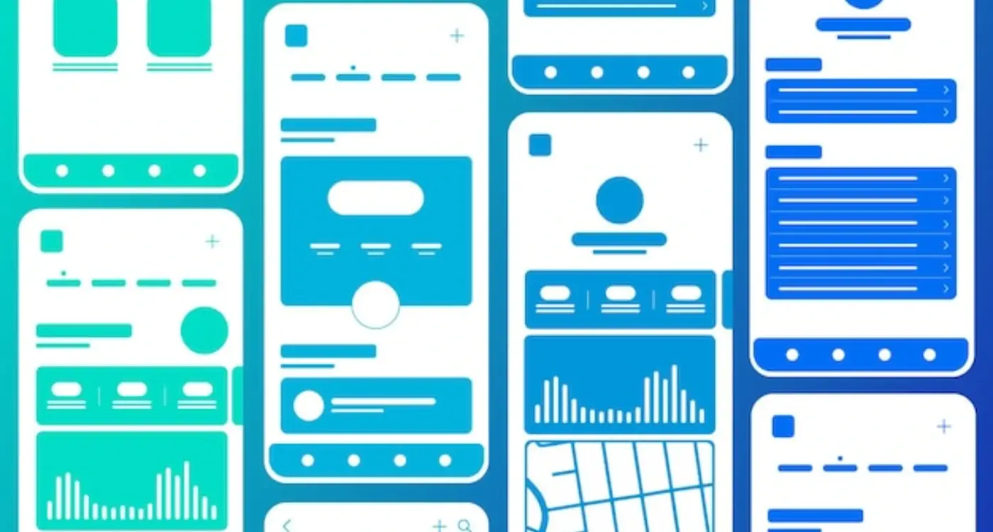
How Do Users Actually Read Your App Screen Layout?
A major car manufacturer spent millions redesigning their booking app a few years back—new branding, updated colours, the works. Launch day came and within a week their support team was drowning in complaints. Test drives weren't being booked. Service appointments were down by 30%. What went wrong? The designers had moved the primary action button to match their new brand guidelines, but they'd completely ignored how users actually look at screens. People's eyes weren't going where the designers expected them to go, and the whole thing fell apart. It's a costly lesson about something most app developers don't really understand; how users actually read (or don't read) your app screen layout.
Here's the thing—users dont really read your app. Not properly anyway. They scan it. They glance at it. They look for what they need and ignore everything else. I've watched hundreds of user testing sessions over the years and the pattern is always the same; people move fast, really fast, and if your layout doesn't work with their natural reading patterns, you've lost them in about three seconds.
The way users scan mobile screens is predictable and follows specific patterns that have been documented through thousands of eye-tracking studies, but most app developers still design as if users read every word from top to bottom.
This guide is going to show you exactly how people look at your app screen layout and what you can do about it. We'll cover the science behind reading patterns, the common mistakes that kill user engagement, and the practical design choices that actually work in the real world. Because understanding how users scan your screens isn't just nice to know—its the difference between an app people use and one they delete after the first frustrating experience.
Why Most Apps Get Screen Layout Wrong
After building apps for so many years, I can spot a poorly designed screen layout within seconds of opening an app—and honestly, it happens more often than it should. The problem isn't that designers and developers don't care; its that they're designing based on what looks good to them rather than how users actually interact with their screens. Big difference there.
Most teams make the same mistake when they start laying out their app screens. They treat the entire screen like a billboard, trying to cram everything they want users to see into one view. Navigation at the top, important buttons scattered everywhere, promotional banners fighting for attention, and somewhere in all that mess the actual content users came for gets lost. I mean, I get it—everyone wants their bit of screen real estate—but users don't scan screens the way we think they do.
Here's the thing that catches most people out: mobile screens are different from desktop screens in ways that go way beyond just size. Users hold their phones differently, they scan content differently, and they make decisions much faster. Like, really fast. You've got maybe two or three seconds to help someone understand whats on the screen before they bounce. And yet I still see apps that put their most important content at the bottom of the screen or hide key actions behind three menu levels.
The biggest issue? Most designers test their layouts on simulators or by looking at them on their desk. But that's not how people use apps in real life. Users are walking down the street, sitting on the bus, lying in bed with their phone at a weird angle. They're using one hand while holding coffee in the other; they're in bright sunlight or in the dark. Your perfect layout needs to work in all these situations, and that's where most apps fall down.
How People Actually Scan Mobile Screens
Right, so here's where things get interesting—people don't actually read mobile screens the way most app developers think they do. They scan. Big difference. When someone opens your app, their eyes are darting around looking for specific things: buttons they recognise, words that matter to them, images that catch their attention. Its not a careful, methodical reading process; its more like a quick hunt for what they need right now.
I've watched hundreds of user testing sessions over the years, and the pattern is always the same. Users spend maybe 2-3 seconds deciding if your screen has what they want. That's it. If they cant find it quickly, they're moving on—or worse, deleting your app altogether. The mobile screen is tiny compared to a desktop, which means every pixel matters and every second of attention is precious.
What Users Actually Look At First
When someone lands on your app screen, their eyes follow a pretty predictable path. They start at the top left (where most important stuff lives on mobile), then they scan across and down in chunks rather than reading word by word. Text gets ignored unless its in a heading or stands out visually. Images pull attention immediately, especially faces or anything that looks clickable. Buttons need to look like buttons—I mean really look like them—because users wont waste time figuring out what's tappable and what isnt.
Place your most important content in the top third of your screen where users naturally look first; everything below that gets significantly less attention and might not be seen at all.
The Speed Problem Nobody Talks About
Here's the thing that catches most designers off guard: mobile scanning happens faster than desktop scanning. Why? Because people use their phones differently. They're often distracted, doing something else, or just killing time. Your app needs to work with this behaviour, not against it. That means larger tap targets, higher contrast between elements, and clear visual hierarchy so users can process information in literally seconds.
The screens that work best are the ones that respect how people's brains actually process visual information. Use size to show importance. Use colour to draw attention. Use spacing to separate different types of content. And for the love of all thats holy, dont make users think too hard about what they need to do next—it should be obvious within that first 2-3 second scan.
- Users scan in a top-to-bottom, left-to-right pattern on mobile screens
- Eye tracking studies show people focus on the upper portion of screens most
- Images and faces grab attention before any text does
- Users typically decide whether to engage within 2-3 seconds of viewing
- Contrast and size differences help guide the scanning process naturally
- Mobile users are often distracted, so clarity matters more than cleverness
The F-Pattern and Z-Pattern Explained
Right, so these two patterns—the F-pattern and Z-pattern—sound a bit technical but they're actually dead simple to understand. And once you do? They'll change how you think about laying out every screen in your app.
The F-pattern is what happens when people are looking at content-heavy screens, like a news feed or a product listing. Users eyes move in a pattern that looks like the letter F; they scan across the top of the screen first (that's the top of the F), then they look down the left side a bit and scan across again (the middle bar), and finally their eyes just drift down the left edge of the screen (the vertical line). It's a bit mad really—we don't even realise we're doing it, but eye-tracking studies have shown this pattern hundreds of times. This means your most important content needs to be in those hot zones: the top of the screen and down the left side where peoples attention naturally falls.
The Z-pattern is different. It happens on simpler screens with less content—think login pages, landing screens, or checkout flows. Here, users eyes move like they're reading a big letter Z across your screen: top left to top right, then diagonally down to bottom left, then across to bottom right. Makes sense when you think about it because that's basically how we were taught to read.
When to Use Each Pattern
So which one should you design for? Well, it depends on what you're building:
- Use F-pattern thinking for content-heavy screens like feeds, article lists, search results, and dashboard views
- Use Z-pattern thinking for simple conversion screens like sign-up forms, payment pages, and promotional banners
- For mixed-content screens, combine both—put your most important action buttons in the Z-pattern flow but arrange supporting content using F-pattern principles
- Always put your primary call-to-action where the pattern naturally ends (bottom left for F, bottom right for Z)
I've tested this approach across dozens of apps and the difference in user engagement is genuinely noticeable. When you work with these natural reading patterns instead of against them, everything just feels easier for users—even though they cant quite put their finger on why.
Where Users Look First on Your App
Right, so you've probably heard about F-patterns and Z-patterns by now—but where do people actually look first when they open your app? Because that first glance matters more than anything else. I mean, we're talking about the first 2-3 seconds here, and if you mess this up your users wont stick around to see the rest of your beautiful design.
The top-left corner. That's where most peoples eyes go first. It's not random—it's because we've been trained since childhood to start reading from the top-left (at least in Western markets). Your logo usually sits here, maybe a back button or menu icon. But here's the thing; just because users look there first doesn't mean they find what they need there. Actually, the real magic happens in what I call the "primary action zone"—the area about a third down from the top of the screen where your most important content should live.
The Natural Eye Journey
After that initial top-left glance, users typically scan across the top bar (looking for navigation cues, their profile, settings) then their eyes drop down to wherever theres visual weight. Bright colours? They'll look there. A persons face? Definitely looking there. Large text? Yep, that too. This is why placing your key message or primary call-to-action in that upper-middle section works so well—its where eyes naturally settle after the initial scan.
The first element your user sees should answer the question: am I in the right place?
One mistake I see constantly is apps that put everything important at the bottom of the screen or bury it below a massive header image. Sure, headers look nice, but if users have to scroll before they understand whats on offer you've already lost half of them. The fold still matters on mobile—maybe even more than on desktop because screen space is so limited. Put your hero content where peoples eyes naturally land, not where it looks prettiest in your design mockup.
Designing for Thumb-Friendly Navigation
Here's something I see designers get wrong all the time—they design apps on their desktop computers and forget that people are going to use them with their thumbs. And not just one thumb either; most people switch between one-handed and two-handed use depending on what they're doing. Its a completely different experience to tapping away on a laptop trackpad.
I've tested this with dozens of apps over the years and the data is pretty clear; there are comfortable zones on your screen and then there are zones that make people's thumbs hurt. The bottom third of the screen? That's prime real estate. The top corners? Basically no-mans land for one-handed use. Yet I still see apps putting their most important actions up there, which honestly baffles me a bit.
The Thumb Zone Breakdown
Think about how you hold your phone right now. Your thumb naturally rests somewhere in the middle-bottom area of the screen, right? That's your natural zone—the area you can reach without shifting your grip or using your other hand. Then there's the stretch zone, which you can reach but its uncomfortable. And finally the no-go zone at the top opposite corner.
- Natural zone: Bottom third of screen, particularly the bottom-right for right-handed users
- Stretch zone: Middle sections and same-side top area
- No-go zone: Top opposite corner and far edges
- Safe zone: Bottom navigation bars and floating action buttons in the lower-right
This is why you see so many successful apps moving their navigation to the bottom of the screen instead of the top. Instagram, Twitter, TikTok—they all figured this out ages ago. Your primary actions need to live where thumbs naturally want to go, not where it looks nice in your design mockup. And here's the thing; this isn't just about comfort, its about speed too. When people can tap things quickly without adjusting their grip, they engage more with your app. Simple as that really.
Common Layout Mistakes That Kill Engagement
Right, let's talk about the mistakes I see over and over again—the ones that make users close your app and never come back. First up is the wall of text problem. I mean, I get it, you've got loads to say about your product or service, but nobody—and I mean nobody—is reading three paragraphs of text on a tiny mobile screen. Break it up. Use headings, bullet points, white space. Give people's eyes somewhere to rest because honestly, dense text blocks are an instant turn-off.
Another massive issue? Hiding your main action button below the fold or making it blend into the background. Your primary call-to-action needs to stand out, it needs to be obvious, and it needs to be within easy reach of the user's thumb. I've seen apps where the "Buy Now" button is pale grey on a white background—it's mad really. If users can't find what they're supposed to do next, they'll just leave.
Ignoring Visual Hierarchy
Here's the thing—when everything on your screen is the same size and weight, nothing stands out. Users need a clear hierarchy to guide them through your content. Your most important information should be bigger, bolder, or more colourful than everything else. Secondary information comes next. Tertiary stuff? Make it smaller or lighter. This isn't rocket science but you'd be surprised how many apps get it wrong; treating every piece of text like its equally important when it definitely isn't.
Cluttering the Screen
Then there's the temptation to cram everything onto one screen. More features, more buttons, more options—thinking it makes your app look more capable. Actually, it just makes it look confusing. White space is your friend. Sometimes the best thing you can do is remove elements rather than add them. I've worked on redesigns where we cut the number of on-screen elements by half and engagement went up by 40%. Less really can be more in mobile design.
Test your layouts on actual devices, not just your computer screen—what looks fine on a 27-inch monitor often looks terrible on a phone. Also, ask someone who's never seen your app to complete a task without any guidance; if they struggle to find key elements, your layout needs work.
Testing Your Layout With Real Users
Right, so you've designed your layout based on all these patterns and best practices—but heres the thing, you wont actually know if it works until real people start using it. I mean, you can follow every rule in the book and still end up with an app that confuses users or sends them in completely the wrong direction.
Testing with real users is where theory meets reality; its where you discover that the button you thought was obvious is actually being completely ignored, or that people are trying to tap on things that aren't even interactive. Honestly, watching someone use your app for the first time is both terrifying and incredibly valuable because they'll do things you never expected.
Start Testing Early (Even With Rough Designs)
You dont need a fully functional app to start testing. Actually, some of my best feedback has come from showing people simple wireframes or clickable prototypes—just basic layouts without all the final polish. Users can tell you if they understand where things are and what they're supposed to do next, which is really what matters most at this stage.
Five users will uncover about 85% of your usability problems. Sure, more is better, but even testing with just three or four people will reveal the biggest issues with your layout. Watch where they tap first, notice where they hesitate, and pay attention to the moments when they look confused or frustrated.
What to Look For During Testing
The best insights come from watching, not asking. People will tell you they understand something when they actually don't—its just human nature to want to be helpful or to avoid looking silly. But their actions tell the truth; if someone's searching all over the screen for a back button thats right there in the top corner, you've got a layout problem that needs fixing regardless of what they say afterwards.
Making Your Content Easy to Scan
Right, so we've talked about how users scan screens—now let's make that work in your favour. The biggest mistake I see is designers treating mobile screens like they're writing an essay. They're not. Users don't read every word; they skim for what matters to them, and if they cant find it quickly? They leave. Simple as that.
Breaking up your text is absolutely critical. Short paragraphs work better than long blocks of text—I mean, look at social media apps like Twitter or Instagram, they understand this instinctively. Use whitespace generously between sections because it gives peoples eyes a place to rest and helps them distinguish between different pieces of information. And here's something that sounds obvious but so many apps get wrong: your most important content needs to be at the top where people actually look first.
Use Visual Hierarchy Properly
Size matters when it comes to text and buttons. Your headings should be noticeably larger than body text—not just a point or two bigger but properly distinct. Bold text draws the eye naturally but don't overuse it or everything becomes noise. Colour can help too; use it to highlight calls-to-action or important information but be consistent about what each colour means throughout your app.
The best content layouts guide users through information without them even realising its happening
Make Actions Obvious
Buttons need to look like buttons, honestly. I know flat design is popular but if users have to guess whether something is tappable, you've already lost them. Use clear labels like "Get Started" or "Save Changes" instead of vague ones like "Submit" or "OK". Icons are helpful but pair them with text labels whenever possible—what seems obvious to you might not be obvious to your users, and thats a lesson I've learned the hard way over the years building apps for all kinds of audiences.
Conclusion
After years of building apps and testing layouts with real users, I can tell you that getting your screen layout right isn't about following rigid rules—its about understanding how people actually use their phones. The F-pattern, the Z-pattern, thumb zones...they're all just frameworks to help you think about user behaviour. What really matters is whether your app makes sense the moment someone opens it.
Here's the thing—you don't need to redesign your entire app tomorrow. Start small. Look at your most important screens and ask yourself: where are users' eyes going first? Is the most important content actually in the most visible spot? Can someone reach your primary action button without hand gymnastics? These simple questions will get you further than any complex design theory.
I've seen apps with beautiful layouts fail because nobody could figure out how to use them, and I've seen apps with basic layouts succeed because they just made sense. The difference? Testing. You need to watch real people use your app—not your team, not your mates, but actual users from your target audience. Their confused expressions and where they tap first will teach you more than any guide (including this one) ever could.
The mobile world keeps changing; new screen sizes appear, new interaction patterns emerge, user expectations shift. But the fundamentals stay the same. People scan screens in predictable ways. They use their thumbs to navigate. They want to find what they need quickly and get on with their day. Build for that reality, test your assumptions, and keep iterating. That's how you create layouts that actually work.
Share this
Subscribe To Our Learning Centre
You May Also Like
These Related Guides
How Do You Make Complex Tasks Feel Simple in Apps?