
How Do You Build Apps for Multiple Screen Sizes?
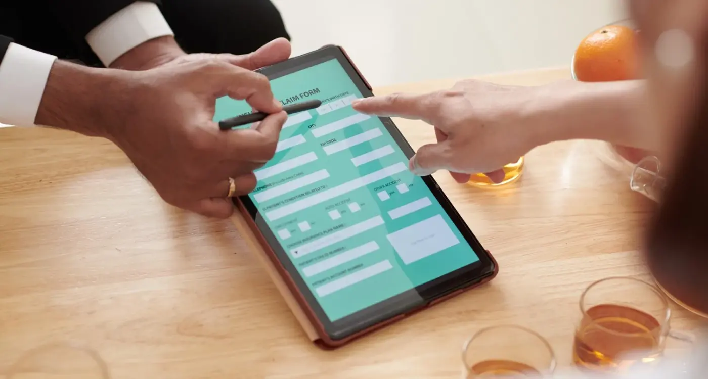
A major logistics company recently launched their new fleet management app, confident it would work perfectly across all devices. The design looked brilliant on the developers' laptops and worked well on the latest iPhone during testing. But within hours of launch, complaints started flooding in. Drivers using older Android tablets couldn't read the delivery schedules—the text was microscopic. Warehouse managers on various screen sizes found buttons overlapping, making it nearly impossible to update inventory. What seemed like a simple oversight actually cost the company thousands in lost productivity and emergency fixes.
This scenario plays out more often than you'd think, and it highlights one of the biggest challenges in mobile app development today. We're not just building for one screen size anymore—we're building for an entire ecosystem of devices. From compact phones to massive tablets, from different Android manufacturers to various iOS devices, each with their own screen dimensions, pixel densities, and user interface quirks.
When I first started building apps, the choice was much simpler. You had iPhone screens at one size and Android phones at roughly another. But now? We've got foldable phones, tablets that work like laptops, watches, and devices we haven't even seen yet. Each one needs to display your app in a way that actually makes sense for that particular screen.
The best apps don't just fit different screens—they feel like they were designed specifically for each device, even when they use the same underlying code
Building apps for multiple screen sizes isn't just about making things smaller or bigger. It's about understanding how people interact differently with different devices, what they expect from each experience, and how to create layouts that work beautifully regardless of the screen they're viewed on. That's what we're going to explore in this guide.
Understanding Screen Sizes and Device Types
Right, let's start with the basics because honestly, this stuff can get confusing fast. When I first started building apps, there were maybe three or four screen sizes to worry about. These days? It's a bit mad really—we've got everything from tiny smartwatches to massive tablets, and your app needs to work on all of them.
The iPhone alone comes in about six different screen sizes now, and that's before we even think about Android devices. Samsung makes phones that are basically small tablets, Google has their Pixel range, and don't get me started on foldable phones—those things are giving developers nightmares! But here's the thing: you can't just ignore the variety and hope for the best.
The Big Three Categories
I always tell my clients to think about three main groups. First, you've got your standard phones—these are what most people use day-to-day, with screens roughly between 4.7 and 6.7 inches. Then there's tablets, which can be anywhere from 7 inches up to those massive 12.9-inch iPad Pros. And finally, there are the edge cases: really small phones, phablets (yes, that's still a thing), and those new foldable devices.
The tricky bit isn't just the physical size though. It's the pixel density, the aspect ratios, and how people actually use these devices. Someone scrolling through your app on their phone while walking is behaving completely differently than someone sat at their desk with a tablet. Your app design needs to account for both scenarios, and that means thinking beyond just "will it fit on the screen?"
Designing Flexible User Interfaces
Right, let's talk about designing interfaces that actually work across different screens—and I mean really work, not just "squeeze everything smaller and hope for the best" work. The biggest mistake I see is designers treating mobile layouts like tiny desktop screens. That's like trying to fit a double-decker bus through a car park barrier; it's just not going to end well.
The secret to flexible interfaces isn't about making everything smaller—it's about making smart choices about what matters most on each screen size. On a phone, you've got precious little space, so every pixel counts. On a tablet? You can spread out a bit more, maybe show two columns instead of one. But here's the thing: your core user journey should stay the same regardless of the device.
Hierarchy and Priority Systems
When I'm designing interfaces, I always start by ranking every element by importance. What does the user absolutely need to see? What's nice to have? What can we hide behind a menu or move to a secondary screen? This isn't just about visual design—it's about understanding user behaviour and making tough decisions.
- Primary actions (buy, sign up, search) stay prominent on all screens
- Secondary features adapt based on available space
- Navigation simplifies on smaller screens but remains accessible
- Content hierarchy becomes more pronounced on mobile
- White space increases proportionally on larger screens
Touch targets are another big consideration that people often mess up. Your buttons need to be big enough for actual human fingers—not stylus tips from 2007. Apple recommends 44 pixels minimum, but I usually go bigger because, honestly, nobody's ever complained about buttons being too easy to tap.
Always design your mobile interface first, then scale up to larger screens. Its much easier to add elements than to figure out what to remove later.
The key is thinking modular. Each interface component should be like a Lego block—it knows how to behave whether its got loads of space or just a tiny corner to work with.
Right, let's talk about responsive layouts that don't fall apart the moment someone rotates their phone or opens your app on a tablet. I've seen far too many apps that look gorgeous on the designer's MacBook but turn into a complete mess on actual devices—and honestly, it's usually down to getting the fundamentals wrong.
The secret isn't in complex frameworks or fancy design systems; its actually about understanding how content flows and behaves when space changes. Most developers I work with get caught up in pixel-perfect designs, but responsive layouts are about relationships between elements, not fixed positions.
Start With Content, Not Containers
Here's what I've learned after building hundreds of apps: your content should dictate the layout, not the other way around. When I'm working on a new project, I always ask what happens when that button text gets longer in German? What if the user's name is 30 characters instead of 10? These aren't edge cases—they're Tuesday.
Use flexible containers that can grow and shrink. Set minimum and maximum widths rather than fixed dimensions. Your text fields need breathing room, your buttons should expand with their content (to a point), and your images... well, they need special treatment which we'll cover properly later.
The Magic of Constraint-Based Design
Whether you're using Auto Layout on iOS or ConstraintLayout on Android, the principle is the same: define relationships, not positions. Instead of saying "put this button 20 pixels from the top," say "keep this button 20 pixels below that text field." When the text field grows because someone's entered a longer message, your button moves with it automatically.
This approach has saved me countless hours of debugging and made my apps genuinely work across different screen sizes without constant patches and fixes.
Handling Images and Media Across Devices
Right, let's talk about images and media—this is where things get properly tricky with multi-device apps. I've seen so many apps that look fantastic on the developer's MacBook but then completely fall apart when users try to load them on their actual phones. The main culprit? Images that are either massive files that take forever to load, or tiny pixelated messes that look awful on high-resolution screens.
The key is understanding that different devices need different image sizes. A thumbnail that looks crisp on an iPhone SE will be a blurry mess on an iPad Pro if you just stretch it. That's why we use multiple image assets—typically 1x, 2x, and 3x versions for different screen densities. Yes, it means more files to manage, but your users will thank you when everything loads quickly and looks sharp.
Smart Loading Strategies
Here's what I do for every project: implement progressive image loading. Load a tiny, blurred version first (we're talking 1-2KB), then replace it with the full image once its downloaded. Users see something immediately instead of staring at empty grey boxes. Instagram does this beautifully—you've probably noticed that soft blur effect before photos fully load.
The biggest mistake developers make is treating images as an afterthought, but they're often 80% of your app's download size
For video content, adaptive streaming is your best friend. Don't force someone on a dodgy connection to download 4K video when 720p will do perfectly fine on their screen. Most mobile users are on limited data plans anyway, so being smart about media consumption isn't just good UX—it's respectful of their circumstances. And honestly? A video that actually plays beats a high-quality one that buffers every few seconds.
Testing on Real Devices vs Simulators
Here's something that'll save you months of headaches—simulators are brilliant for quick testing, but they're also massive liars. I mean, they'll tell you your app looks perfect when in reality it's completely broken on actual devices. The simulator might show your button placement is spot on, but then you test on a real iPhone and suddenly half your interface is cut off or unresponsive.
Don't get me wrong, simulators have their place in the development process. They're fast, convenient, and great for catching obvious layout issues during development. But here's the thing—they can't replicate the real world performance, memory constraints, or how your app actually feels in someone's hands. I've seen apps that run buttery smooth on a simulator but turn into sluggish messes on older devices.
What Real Device Testing Actually Reveals
Real devices expose problems that simulators simply can't. Touch responsiveness feels different. Screen brightness affects visibility. Battery drain becomes apparent. And those edge cases? They only show up when you're testing on actual hardware with real-world conditions.
- Performance bottlenecks under actual memory pressure
- Touch interaction issues that simulators miss
- Screen quality differences affecting readability
- Battery impact on older devices
- Network connectivity variations
- Real-world multitasking scenarios
My approach is pretty straightforward—use simulators for rapid iteration during development, but always validate on real devices before calling anything finished. You don't need every device on the market, but you should have a few key ones representing different screen sizes, ages, and performance levels. Trust me, your users will thank you for it, and you'll catch problems before they become expensive fixes post-launch.
Common Mistakes That Break Your Design
After years of building mobile apps and fixing other peoples broken designs, I've seen the same mistakes crop up again and again. Its honestly quite predictable at this point—teams get excited about their app idea, dive straight into development, and completely ignore how their beautiful design will look on a tiny phone screen versus a massive tablet.
The biggest mistake? Designing for just one screen size and hoping everything else will magically work. I can't tell you how many times I've inherited projects where the app looks perfect on an iPhone but completely falls apart on Android devices. Buttons get cut off, text becomes unreadable, and users end up deleting the app within minutes.
The Fatal Four Design Mistakes
Here are the mistakes that consistently break multi-device designs, and honestly, they're all completely avoidable:
- Fixed pixel dimensions instead of flexible units that scale properly
- Ignoring safe areas around screen notches and home indicators
- Using tiny touch targets that work fine on desktop but are impossible to tap accurately
- Cramming too much content onto small screens without considering how users actually interact with mobile devices
Always design your touch targets to be at least 44x44 points on iOS and 48x48 density-independent pixels on Android. Your users fingers haven't gotten smaller, so your buttons shouldn't either.
The Testing Trap
Another massive mistake is testing on simulators only. Sure, your app might look great on your computer screen, but how does it feel when you're actually holding a device? Real-world testing reveals issues that simulators simply can't replicate—like how readable your text is in bright sunlight or whether your navigation feels natural when using the app one-handed.
The solution isn't complicated, but it does require discipline. Test early, test often, and test on real devices across different screen sizes. Your users will thank you for it.
The mobile world moves fast—and I mean properly fast. One minute we're all designing for the iPhone's home button, the next minute it's gone and we're dealing with notches and dynamic islands. But here's the thing, if you want your app to survive in this industry, you need to think ahead.
Foldable phones aren't just a gimmick anymore; they're becoming mainstream. Samsung's Galaxy Fold series has proven there's real demand for devices that can switch between phone and tablet modes instantly. Your app needs to handle these transitions smoothly—users expect the interface to adapt when they unfold their device, not just stretch awkwardly.
Wearable screens are getting more capable too. Apple Watches can now run proper apps, not just simple notifications. If your app makes sense on a tiny screen (think fitness tracking, quick tasks, or simple interactions), you should be thinking about how to extend your experience there.
Preparing for What's Next
The secret to future-proofing isn't predicting exactly what comes next—it's building flexibility into your code from day one. Use responsive design principles that can adapt to any screen size, not just the ones you know about today. Build your layouts with components that can scale up or down gracefully.
AR and VR integration is creeping into mainstream apps too. You don't need to build the next big VR experience, but consider how your app might work with augmented reality features. Apple's ARKit and Google's ARCore make it easier than ever to add simple AR functionality.
The apps that thrive long-term are the ones built to bend, not break, when new technologies emerge. Stay flexible, keep your code clean, and always be ready to adapt when the next big screen change comes along.
Managing Development Costs and Time
Right, let's talk money. Building apps for multiple screen sizes doesn't have to break the bank—but it will cost more than building for just one device type. I mean, that's obvious really! The question is how much more, and where you can save without compromising quality.
In my experience, responsive app development typically adds 20-30% to your development timeline. That might sound scary, but here's the thing—it's much cheaper than building separate apps for different devices. I've seen businesses try that approach and honestly, its a nightmare to maintain. You're basically doubling your ongoing costs forever.
Smart Ways to Control Costs
Start with your core user journey on one screen size first. Get that working perfectly, then expand outwards. Don't try to design for every possible screen from day one—you'll go mad and your developer will probably quit! Focus on the three most common sizes: phone, tablet, and maybe desktop if that's relevant to your users.
The biggest mistake I see is businesses trying to be everything to everyone from launch. Pick your battles, nail the basics, then expand.
Use design systems and component libraries; they'll save you weeks of work. Sure, the upfront investment feels expensive, but when you need to add a new screen size later, you'll thank yourself. Test early and often—catching layout issues during the core development time is way cheaper than fixing them after launch. And honestly? Sometimes a simple solution that works across all devices beats a fancy one that breaks on tablets. Keep it practical, keep it working, and your users will be happy.
Conclusion
Building apps for multiple screen sizes isn't just a technical challenge—it's become a business necessity. I mean, you can't afford to ignore users just because they have a different phone than you do, right? The good news is that once you understand the core principles we've covered, it becomes much more manageable than most developers expect.
The key is starting with a flexible foundation rather than trying to retrofit your app later. Design systems that bend without breaking; use relative units instead of fixed pixels; test early and test often on actual devices. Sure, it takes a bit more planning upfront, but trust me—it saves you countless hours of frustration down the road.
What I find most developers get wrong is thinking they need to create completely different experiences for every screen size. Actually, its usually about making smart compromises and understanding what your users really need on each device. A tablet user might want more information density, but a phone user probably wants simpler navigation. Neither is wrong—they're just different.
The mobile landscape keeps evolving too. Foldable phones, new aspect ratios, different pixel densities—there's always something new to consider. But here's the thing: if you build with flexibility in mind from the start, these changes become opportunities rather than problems.
Remember, your users don't care about the technical challenges you face. They just want your app to work brilliantly on their device, whatever that might be. When you nail that experience across all screen sizes, you're not just solving a technical problem—you're opening your app to everyone who might love it.
Share this
Subscribe To Our Learning Centre
You May Also Like
These Related Guides
What Are the Biggest Mistakes Developers Make With Accessible Forms?
How Can I Design for Different Screen Sizes Effectively?