
How Can I Design for Different Screen Sizes Effectively?
A productivity app I worked on recently launched with what looked like a perfect interface on the designer's laptop. Clean layouts, readable text, intuitive buttons. But when users started downloading it? Chaos. The same app looked cramped on phones, stretched awkwardly on tablets, and had tiny buttons that were impossible to tap accurately. Within weeks, the app store reviews were brutal—and the download numbers reflected it. This isn't uncommon; it's actually one of the biggest mistakes I see teams make when building mobile apps.
The mobile world is fragmented in ways that would make your head spin. We've got everything from compact phones with 4-inch screens to massive tablets pushing 13 inches, plus everything in between. Android alone has thousands of different screen configurations, and even Apple's "simplified" ecosystem now spans multiple sizes and resolutions. If you're not designing with this variety in mind from day one, you're basically planning to alienate huge chunks of your potential users.
Responsive design isn't just a nice-to-have feature anymore—it's become the foundation of good mobile development. When I talk to clients about screen compatibility, I always emphasise that we're not just making things "fit" on different devices; we're creating experiences that feel native and natural regardless of what someone's using. That means thinking about touch targets, readable text, logical layouts, and how people actually hold and interact with their devices.
The best mobile apps don't just work on different screen sizes—they feel like they were designed specifically for whatever device you're using
This guide will walk you through the practical steps of designing for multiple screen sizes without losing your sanity. We'll cover everything from planning your design system to avoiding the most common pitfalls that trip up even experienced developers. By the end, you'll have the knowledge and tools to create apps that look and work brilliantly across the entire spectrum of mobile devices.
Understanding Screen Size Fundamentals
Right, let's get into the nitty-gritty of screen sizes—and honestly, it's more complex than most people realise. When I first started building apps, we basically had two sizes to worry about: iPhone and iPad. Those days are long gone! Now we're dealing with everything from tiny smartwatches to massive tablets, and each one needs your app to look and work perfectly.
The key thing to understand is that screen size isn't just about physical dimensions—it's about density, resolution, and how people actually hold their devices. A 6-inch phone might have the same pixel count as a 10-inch tablet, but users interact with them completely differently. You know what I mean?
Core Screen Categories You Need to Know
- Small phones (under 5.5 inches) - Think compact Android phones and older iPhones
- Standard phones (5.5-6.5 inches) - Your bread and butter market right here
- Large phones/phablets (6.5+ inches) - Getting more popular each year
- Small tablets (7-9 inches) - Often used like big phones
- Large tablets (10+ inches) - Usually landscape orientation
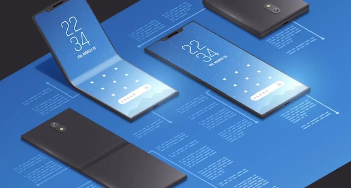
- Foldable devices - The wild card that's becoming mainstream
But here's where it gets tricky—and this is something that trips up loads of developers. Screen density matters just as much as size. Two phones might be exactly the same physical size, but one could have twice as many pixels crammed in. This affects everything from how sharp your images look to how big your buttons appear.
I always tell clients to think about context too. Someone using a phone is likely on the go, maybe using one hand. Tablet users? They're probably settled in somewhere, using both hands. Your design needs to work for both scenarios, and that starts with understanding these fundamentals properly.
Planning Your Design System
Right, let's talk about design systems—because honestly, this is where most apps either set themselves up for success or create a right mess that haunts them for months. I've seen both scenarios play out more times than I care to count, and trust me, you want to be in the first group.
A design system is basically your rulebook for how everything looks and behaves across different screen sizes. It's not just about making things pretty; it's about creating consistency so your app feels familiar whether someone's using it on their tiny phone or their massive tablet. And here's the thing—without a proper system in place, you'll end up with buttons that look different on every screen, text that's too small on phones but huge on tablets, and spacing that makes no sense anywhere.
Start with your breakpoints. These are the specific screen widths where your design changes to accommodate different devices. I typically use three main breakpoints: mobile (up to 768px), tablet (769px to 1024px), and desktop (1025px and above). But don't just copy these numbers—they should match the devices your actual users are on.
Create a component library with at least three variations of each element—one for mobile, tablet, and desktop. This saves massive amounts of time later and keeps your responsive design consistent.
Your design system should also define how spacing works across different screen sizes. I use a scaling system where margins and padding increase proportionally with screen size. What works as 16px spacing on mobile might become 24px on tablet and 32px on desktop. It keeps everything balanced without looking cramped or wastefully spread out.
Mobile-First Design Approach
Right, let's talk about mobile-first design—and I mean properly mobile-first, not just "we'll make it work on phones later" which honestly happens way too often. After years of building apps and watching design trends come and go, I can tell you that starting with mobile isn't just trendy advice; it's actually the smartest way to approach any design project.
When you design mobile-first, you're forced to focus on what really matters. There's no room for fancy animations or unnecessary buttons when you've only got a 5-inch screen to work with. This constraint—and it is a constraint—makes you ruthless about content priorities. What absolutely needs to be on this screen? What can wait until later? It's brutal but brilliant.
Core Mobile-First Principles
The beauty of mobile-first is that you start with the hardest problem first. Once you've nailed the mobile experience, expanding to tablets and desktops becomes about adding features back in, not cramming them down. Here's what I focus on when starting any mobile design:
- Content hierarchy—what's the most important thing users need to see first?
- Touch-friendly interactions—buttons need to be big enough for thumbs, not mouse cursors
- Loading speed—mobile users are impatient and often on slower connections
- Single-column layouts—forget complex multi-column designs on small screens
- Thumb-friendly navigation—everything important should be reachable with one hand
One thing that still surprises clients is how different the user behaviour is on mobile versus desktop. People scan differently, they scroll differently, and their attention span is shorter. When you design mobile-first, you're designing for these behaviours from day one rather than trying to retrofit a desktop experience onto a tiny screen—which never works well, trust me.
Flexible Grid Layouts
Right, let's talk about flexible grids—honestly, this is where responsive design gets really interesting. I've seen so many apps fail because developers tried to force fixed layouts onto different screen sizes. It's like trying to squeeze a large pizza into a small box; something's going to get messy!
The beauty of flexible grids is that they adapt naturally to whatever screen they're displayed on. Instead of saying "this column is exactly 320 pixels wide," you tell it to take up a percentage of the available space. So on a phone, your main content might use 100% of the width, but on a tablet it could be 70% with a sidebar taking the remaining 30%.
How Flexible Grids Actually Work
Think of your screen as a container that can stretch and shrink. Your grid system divides this container into columns—usually 12 or 16 columns work well for most apps. Each element in your design takes up a certain number of these columns depending on the device. A product card might span 12 columns on mobile (full width) but only 4 columns on desktop (showing three cards side by side).
The key to successful responsive design isn't trying to control every pixel—it's learning to let your layouts breathe and adapt naturally to their environment.
I always tell my clients to stop thinking in fixed measurements. CSS frameworks like Bootstrap or CSS Grid make this much easier, but the principle remains the same. Your layout should be fluid, not rigid. When users rotate their phones or switch between devices, your app should respond gracefully—not break into a mess of overlapping elements or tiny, unreadable text.
Scalable Typography and Images
Getting your text and images to look good across every screen size? Honestly, it's one of those things that seems simple until you actually try to do it. I've watched apps crash and burn because the text was unreadable on smaller screens or images looked pixelated on high-resolution displays.
Let's start with typography—and I mean this when I say it's make or break for your app. You can't just pick a font size and hope for the best. Your text needs to scale properly, which means using relative units instead of fixed pixels. I always tell my clients to think in terms of proportions rather than absolute sizes.
Typography Best Practices
- Use scalable units like em, rem, or percentages instead of fixed pixels
- Maintain readable contrast ratios—at least 4.5:1 for normal text
- Set minimum and maximum font sizes to prevent text becoming too small or comically large
- Test your typography on actual devices, not just emulators
- Consider line spacing and letter spacing adjustments for different screen densities
Images are trickier because they need to look crisp on everything from budget Android phones to the latest iPhone Pro Max. Vector graphics work brilliantly for icons and simple illustrations—they scale perfectly without losing quality. But for photos and complex images, you'll need multiple versions at different resolutions.
Image Optimization Strategy
The smart approach is using responsive images that load the appropriate resolution based on the device capabilities. This means smaller file sizes for lower-end devices and crystal-clear images for premium screens. You know what? Proper image and video optimization also helps with loading times, which directly impacts user retention.
Here's something most people get wrong—they optimize for the newest devices and forget that millions of users are still on older phones with smaller screens and slower processors. Your scalable design needs to work beautifully for everyone, not just the people with the latest tech.
Touch Targets and Interactive Elements
Here's something that drives me absolutely mad—apps with tiny buttons that require surgical precision to tap. After years of watching users struggle with poorly sized interactive elements, I can tell you that getting touch targets right is make or break for your app's success. Apple recommends a minimum of 44x44 points for touch targets, while Google suggests 48dp minimum. But honestly? I always go bigger when possible.
The reality is people use their phones in all sorts of conditions. They're walking, holding coffee, or using their device one-handed on the tube. Your touch targets need to work for thumbs, not just index fingers. I've seen perfectly good apps get terrible reviews simply because users couldn't reliably tap the buttons they wanted to.
Spacing and Visual Hierarchy
It's not just about size though—spacing between interactive elements matters just as much. If your buttons are too close together, users will constantly hit the wrong one. I typically leave at least 8dp between touch targets, more if they're critical actions like "delete" or "purchase".
Always make your primary action button the largest and most prominent on the screen. Users should never have to hunt for what you want them to do next.
Visual feedback is another thing that gets overlooked. When someone taps a button, they need immediate confirmation that something happened. This could be a colour change, animation, or haptic feedback. Without it, users often tap multiple times, which can cause problems with forms or payment processing.
Different Device Considerations
Touch targets that work brilliantly on a phone might feel awkward on a tablet. Larger screens need proportionally larger interactive elements, but you also have more space to work with. I usually test touch targets across different device sizes to make sure they feel natural everywhere.
| Platform | Minimum Size | Recommended Size |
|---|---|---|
| iOS | 44x44 points | 48x48 points |
| Android | 48x48 dp | 56x56 dp |
| Tablets | Same as above | 20% larger |
Testing Across Different Devices
Right, let's talk about testing—because honestly, this is where a lot of apps fall apart. You can have the most beautiful design in the world, but if it doesn't work properly on your users' actual devices, you're in trouble.
I've seen too many apps that look perfect on the designer's MacBook but completely break on a budget Android phone with a different screen ratio. The thing is, your users aren't all running the latest iPhone Pro Max—they're using everything from tiny budget phones to massive tablets, and your app needs to work on all of them.
Device Testing Strategy
Here's what I recommend for testing across different devices. Start with the most popular devices in your target market—not the fanciest ones, but the ones people actually use. For most UK audiences, that means testing on a mix of iPhone models, Samsung Galaxy phones, and at least one budget Android device.
- Test on at least 3-4 different screen sizes during development
- Include one budget Android device (these often have performance constraints)
- Check both portrait and landscape orientations
- Test touch interactions, not just visual layout
- Verify text remains readable at different sizes
- Confirm buttons are still easy to tap on smaller screens
Real Device vs Simulators
Simulators are great for quick checks, but they can't replace real device testing. Touch sensitivity, screen brightness, and performance all feel different on actual hardware. I always tell clients to test on real devices before launch—it's saved us from some pretty embarrassing bugs over the years.
The good news? You don't need to buy every device. Most development teams can get by with 4-5 test devices covering the main screen sizes and operating systems their users actually have. When you're working with remote development teams, coordinating device testing becomes even more important for maintaining quality across different time zones.
Common Design Mistakes to Avoid
Right, let's talk about the mistakes I see time and time again when designers try to make their apps work across different screen sizes. These aren't just small oversights—they're the kind of errors that can make users delete your app within minutes of downloading it.
The biggest mistake? Fixed pixel dimensions. I can't tell you how many times I've seen designs that look perfect on the designer's laptop but completely fall apart on actual phones. Buttons get cut off, text overlaps, and the whole interface becomes unusable. Your design needs to breathe and adapt, not stay rigid like its trapped in a box.
Typography That Breaks Everything
Text sizing is where things go wrong fast. Setting font sizes in pixels instead of scalable units means your carefully crafted headlines might be microscopic on smaller screens or massive on tablets. And don't get me started on designers who assume everyone has perfect eyesight—your text needs to remain readable even when users have larger system fonts enabled.
Touch Targets From Hell
Here's something that drives me mad: tiny buttons and links that are impossible to tap accurately. Apple recommends 44 points minimum for touch targets, but I regularly see apps with buttons half that size. Users will try once, maybe twice, then give up. Its basic usability, but somehow gets overlooked constantly.
The moment your app becomes frustrating to use is the moment users start looking for alternatives
Navigation is another area where things fall apart quickly. What works as a horizontal menu on desktop often becomes a cluttered mess on mobile. Plan your navigation hierarchy from the smallest screen up, not the other way around. Trust me, your users will thank you for it.
These issues often surface during comprehensive pre-submission testing, which is why thorough quality assurance across multiple devices is absolutely essential before your app goes live.
Conclusion
After years of building apps for every screen size you can think of—and some you probably can't—I can tell you that designing for different screen sizes isn't rocket science. But it does require thinking differently about how people interact with your app. The mobile-first approach we've covered isn't just a trendy methodology; it's how successful apps get built in the real world.
The truth is, most of the apps I see fail at responsive design make the same basic mistakes. They treat different screen sizes as an afterthought rather than a core part of the design process. They use fixed layouts when they should be flexible. They forget that fingers need proper touch targets. These aren't complex problems—they're just things that need to be planned for from day one.
Your users don't care about the technical challenges you faced making your app work across devices. They just want it to work well on whatever device they happen to be using. And honestly? That's exactly how it should be. When someone downloads your app on their tablet after using it on their phone, they should feel like it belongs there—not like it's been awkwardly stretched or shrunk to fit.
The design system approach I've outlined here will save you countless hours of rework and frustrated conversations with developers. More importantly, it'll give your users the consistent, polished experience they expect. Start with the smallest screen, build flexible layouts, test early and often. It's really that straightforward. Your future self will thank you for getting this right from the beginning.
Share this
Subscribe To Our Learning Centre
You May Also Like
These Related Guides

Should My App Look the Same on Every Screen?
How Do I Design App Icons That Work in Both Light and Dark Mode?