How Do You Create Effective Notifications for Wearable Devices?
Wearable devices generate significantly more engagement per notification than smartphones—but they also have a much higher abandonment rate when users get overwhelmed by alerts. I've been working on wearable app development since the early days of smartwatches, and honestly? The difference between getting notifications right and wrong on these devices is massive. Get it wrong and users will disable your app notifications faster than you can say "Apple Watch." Get it right, and you'll have created something genuinely useful that people rely on every day.
The thing about wearable notifications is they're completely different from what we do on phones. We're talking about tiny screens, split-second attention spans, and devices that are literally attached to people's bodies. When someone's wrist buzzes during a meeting or while they're exercising, you've got maybe two seconds to communicate something valuable before they dismiss it. There's no room for lengthy text, complex interactions, or notifications that don't immediately make sense.
The best wearable notifications feel like they're reading your mind—they show up exactly when you need them with exactly the information that matters at that moment.
What makes this particularly tricky is that wearables are deeply personal devices. They're monitoring heart rates, tracking sleep, counting steps—they know more about users' daily rhythms than any other technology. This creates both an opportunity and a responsibility. You can create incredibly contextual, helpful alerts, but you can also become intrusive in ways that feel genuinely uncomfortable. I've seen apps that nailed the technical side but completely missed the human side, and vice versa. The secret is finding that sweet spot where technology and empathy meet.
Understanding Wearable Notification Challenges
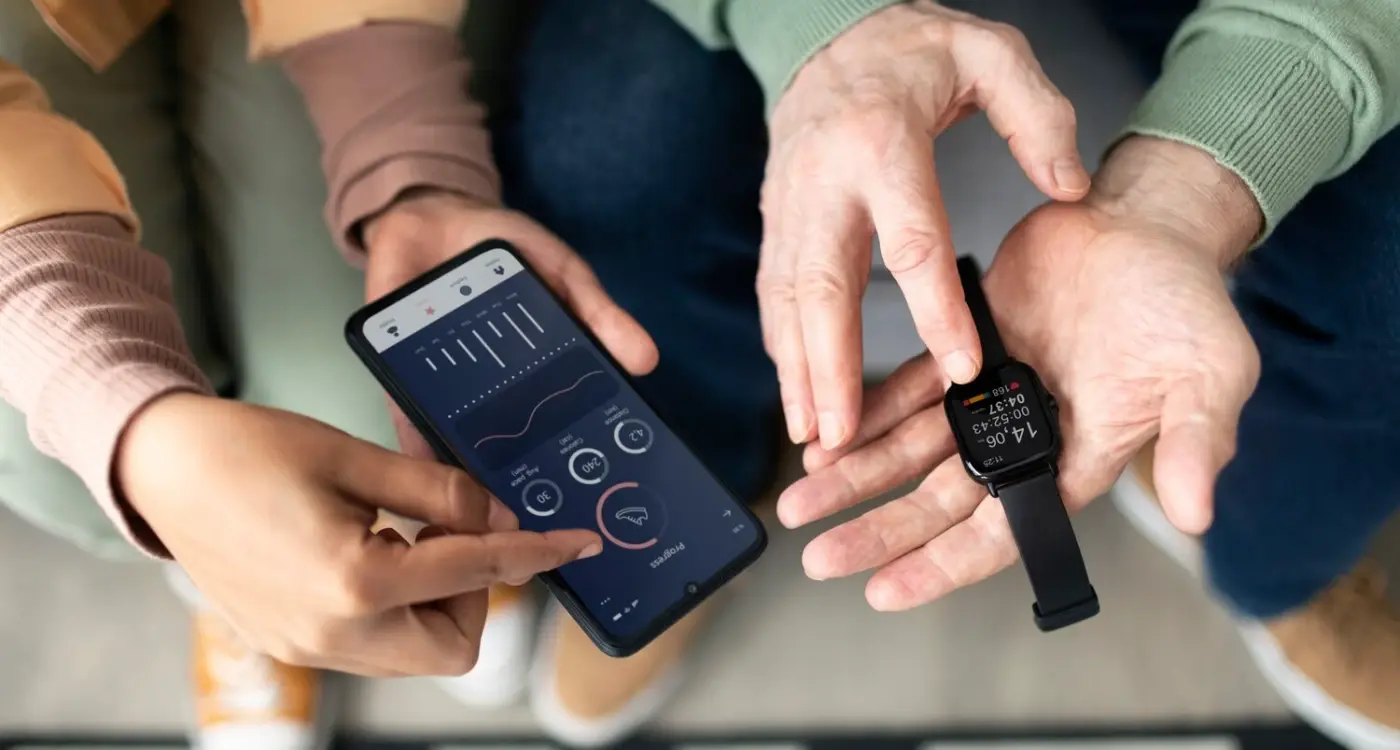
Wearables present a completely different beast when it comes to notifications. I mean, we're talking about devices that sit directly on someone's body—that's intimate territory right there. After building notification systems for smartwatches and fitness trackers across different platforms, I've learned that what works brilliantly on a phone can be absolutely terrible on a wearable.
The fundamental challenge? You're interrupting someone's physical experience, not just their digital one. When a smartwatch buzzes during a meeting or while someone's exercising, that interruption needs to be worth it. And honestly, most notifications aren't.
The Unique Constraints of Wearable Devices
Wearables operate under constraints that would make any app developer's head spin. You've got tiny screens—we're talking about 1.4 inches if you're lucky. Battery life that dies faster than enthusiasm at a Monday morning meeting. And processing power that makes a smartphone look like a supercomputer.
But here's what really gets me—the attention span issue. People glance at their smartwatch for maybe 2-3 seconds maximum. That's it. If your notification can't communicate its value in that timeframe, you've lost them. And probably annoyed them in the process.
- Screen real estate is severely limited (often under 400 pixels wide)
- Users interact through quick glances rather than focused attention
- Battery drain from frequent notifications can kill device usability
- Physical positioning affects readability (wrist angle, lighting conditions)
- Context switching cost is higher when interrupting physical activities
The biggest mistake I see? Developers treating wearable notifications like miniature phone notifications. That approach fails spectacularly because the use cases are fundamentally different. Your phone sits in your pocket; your watch sits on your pulse point, demanding immediate attention every time it vibrates.
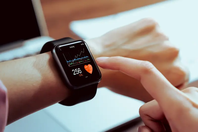
Designing for Small Screens and Limited Attention
When you're creating wearable notifications, you're essentially trying to fit an entire message into a space smaller than a postage stamp—and honestly, that's one of the trickiest parts of the job. After years of building notifications for smartwatches and fitness trackers, I've learned that what works on a phone screen is completely useless on a wearable device.
The golden rule? Keep it ridiculously simple. You've got maybe 2-3 seconds of someone's attention before they either act on your notification or dismiss it forever. That means every single word counts, every pixel matters, and any unnecessary information is just noise.
Essential Design Principles for Wearable Screens
Your notification design needs to follow what I call the "glance test"—can someone understand the message and know what to do next in a single glance? This means using large, readable fonts (nothing smaller than 14px), high contrast colours, and clear visual hierarchy. Dark backgrounds work best because they save battery life and reduce eye strain.
- Use maximum 1-2 lines of text for the main message
- Choose bold, sans-serif fonts that remain legible at small sizes
- Implement high contrast ratios (at least 4.5:1)
- Include clear action buttons with plenty of touch area
- Prioritise the most important information at the top
Test your wearable notifications in bright sunlight and low-light conditions—screens behave completely differently in various lighting situations, and your users won't always be indoors when they receive alerts.
The biggest mistake I see is trying to cram too much information onto the screen. Remember, wearables are about quick interactions, not detailed reading. If your message needs scrolling or multiple taps to understand, you're probably better off sending them to their phone instead.
Timing and Context in Wearable Alerts
Getting the timing right for wearable notifications is absolutely critical—and honestly, it's where I see most apps get it spectacularly wrong. Your users smartwatch or fitness tracker is literally strapped to their wrist, which means every notification you send creates an immediate physical interruption. That buzzing sensation? It demands attention in a way that a phone notification simply doesn't.
The key thing to understand is that context is everything when it comes to wearables. A notification that makes perfect sense at 2pm on a Tuesday might be completely inappropriate at 11pm on a Sunday. I've worked on apps where we initially treated wearable notifications exactly like phone notifications—big mistake. Users started turning off our alerts within days because we were interrupting their sleep, their workouts, and their family time.
Smart Timing Strategies That Actually Work
The most successful wearable apps I've built use what I call "contextual intelligence." This means looking at multiple data points before deciding when to send an alert. Is the user currently active? Are they in a meeting? Have they been receiving a lot of notifications recently? All of these factors should influence your timing decisions.
Here's what works best in my experience:
- Use quiet hours by default—most people don't want notifications between 10pm and 7am
- Monitor user activity patterns and avoid interrupting focused work periods
- Batch less urgent notifications together rather than sending them individually
- Respect "do not disturb" modes religiously
- Learn from user behaviour—if they consistently dismiss certain types of alerts, stop sending them
The goal isn't to grab attention at any cost; its to provide value at the exact moment when that value is most appreciated. Get this balance right, and your users will actually thank you for the interruption.
Writing Clear and Actionable Notification Content
Writing notification content for wearables is honestly one of the trickiest parts of the whole process. You've got maybe 20-30 characters to work with on most smartwatch screens, and people are glancing at these things for literally two seconds max. I mean, it's not like they're sitting down with a cup of tea to read your carefully crafted message!
The golden rule I've learned after years of getting this wrong? Lead with the action, then the context. Instead of "Your meeting with the marketing team starts in 10 minutes" write "Meeting in 10 min - Marketing team". See how that works? The important bit comes first, and if they need more detail, they can look at their phone. But here's the thing—most people won't.
Action Words That Actually Work
I've tested hundreds of notification messages, and the ones that get responses use specific action words. "Reply", "Call back", "Check now", "Accept". These work because they tell users exactly what to do next. Vague words like "Review" or "Consider"? They're basically useless on a tiny screen where every character counts.
The best wearable notifications answer three questions instantly: what happened, why it matters to me right now, and what I should do about it
One mistake I see constantly is trying to be too clever with the copy. Save your wit for somewhere else; wearable notifications need to be boring and functional. "Low battery" beats "Uh oh, time to charge up!" every single time. Your users will thank you for being direct, even if it feels a bit robotic when you're writing it.
Visual and Haptic Feedback Strategies
Right, let's talk about feedback—the stuff that makes your wearable notifications actually feel alive. I mean, without proper visual and haptic cues, you're basically sending messages into the void and hoping people notice them. Not ideal!
Visual feedback on wearables is tricky because you've got such limited screen real estate. But here's what I've learned works: keep your colour palette simple and use high contrast combinations. Red for urgent alerts, amber for warnings, green for confirmations. Don't get fancy with gradients or complex animations that drain battery life—users will hate you for it.
The haptic side is where things get interesting though. Different vibration patterns can tell users what type of notification they're receiving before they even look at their wrist. Short double tap? That's a text message. Long pulse followed by two short ones? Email. Single long vibration? Calendar reminder. It's like creating a secret language that users pick up subconsciously.
I always test haptic patterns with actual users because what feels subtle to one person feels aggressive to another. Some people have their watch on so tight they barely feel anything; others have it loose and every vibration feels like an earthquake on their wrist.
Combining Visual and Haptic Elements
The magic happens when you sync your visual and haptic feedback properly. A gentle pulse that coincides with a colour change creates this satisfying sense of acknowledgment that makes users trust your notifications more. But timing is everything—if there's even a slight delay between the visual and haptic feedback, it feels broken and cheap.
Also, never forget that people wear these devices in different situations. What works in a quiet office doesn't work at the gym or during a meeting where discretion matters.
Managing Notification Frequency and Priority
Right, let's talk about something that can make or break your wearable app—getting the frequency and priority of your notifications spot on. I've seen brilliant apps become absolutely annoying because they bombarded users with too many alerts. And honestly? Once someone turns off your notifications, they rarely turn them back on.
The thing about wearables is that they're always there, right on someone's wrist or body. Every buzz, beep, or flash is interrupting whatever they're doing. So you need to be really thoughtful about when you're asking for their attention. Think of it like this: if you were tapping someone on the shoulder, how important would the message need to be?
Setting Up Your Priority System
Most wearable platforms let you set different priority levels for your notifications. Use them! Here's how I typically structure notification priorities for my clients:
- High Priority: Urgent health alerts, security warnings, or time-sensitive actions
- Medium Priority: Important updates that need attention within an hour
- Low Priority: General information that can wait until the user checks their device
But here's the tricky bit—what feels urgent to you as the app creator might not be urgent to your users. I always recommend letting users customise these settings themselves. Some people want every social media like to buzz their watch; others only want emergency calls to get through.
Finding the Sweet Spot for Frequency
There's no magic number for how many notifications are "too many"—it really depends on your app's purpose and your users' expectations. A fitness app might send several notifications throughout a workout, and that's fine because the user is actively engaged. But a shopping app sending daily sale alerts? That gets old fast.
Start with fewer notifications than you think you need, then gradually add more based on user feedback. It's much easier to increase frequency than to win back users who've already switched you off.
One strategy that works well is notification bundling. Instead of sending three separate alerts about new messages, group them into one notification that says "3 new messages." This gives users the information they need without overwhelming their wrist with constant buzzing.
Testing wearable notifications isn't like testing regular mobile apps—you can't just hand someone a prototype and ask them to sit at a desk for an hour. You need to get people moving, living their actual lives whilst your notifications compete for their attention alongside everything else.
I've learned this the hard way over the years. Lab testing tells you if your notification appears correctly, but it doesn't tell you if someone will actually notice it when they're rushing for the tube or in the middle of an important meeting. Real-world testing is where wearable notifications either prove their worth or get immediately ignored.
Getting Users into Natural Environments
The best approach I've found is diary studies combined with contextual testing. Finding qualified app developers who understand wearable testing can be challenging, but it's crucial for getting meaningful feedback during this phase. You'll quickly see patterns—maybe your fitness reminders work great during lunch breaks but are bloody annoying during presentations.
I also like to test notifications during specific activities. Walking, driving (as a passenger!), cooking, working out. Each context changes how people perceive and respond to haptic feedback, sound, and visual cues. What feels like a gentle tap whilst you're sitting might be completely unnoticeable when you're jogging.
Measuring What Actually Matters
Don't just track tap-through rates—measure dismissal patterns, response times, and most importantly, how often people disable your notifications entirely. If users are turning off your alerts within the first week, something's fundamentally wrong with your frequency or relevance.
One metric I find particularly useful is "notification regret"—asking users if they wished they hadn't received specific alerts. This helps identify which notifications add genuine value versus which ones just create digital noise. After all, the goal isn't more notifications; it's better ones.
Platform-Specific Considerations for Different Devices
After years of building wearable experiences, I can tell you that treating all smartwatches the same is one of the biggest mistakes developers make. Each platform has its own quirks, capabilities, and user expectations—and honestly, ignoring these differences will make your notifications feel clunky and out of place.
Apple Watch users expect notifications that feel native to the watchOS ecosystem. The haptic feedback system is incredibly sophisticated; you can use different tap patterns to convey urgency or message type. But here's the thing—Apple's notification system is quite restrictive compared to Android Wear. You get limited customisation options, but what you do get works really well. Focus on clear, scannable text and make sure your app icon is recognisable at tiny sizes.
Android Wear and Samsung Galaxy Watch Differences
Wear OS gives you much more flexibility with custom layouts and interactive elements. You can create rich notifications with multiple action buttons, expandable content, and even custom UI components. Galaxy Watch goes even further with Tizen's notification system—you can create truly immersive notification experiences that feel more like mini-apps.
The biggest difference between platforms isn't technical capabilities—it's user behaviour and expectations that have developed around each ecosystem
Fitbit and Other Fitness-Focused Devices
Fitness trackers like Fitbit have much more limited notification capabilities, but their users actually prefer this simplicity. These devices excel at delivering quick, glanceable information without overwhelming the wearer. Keep text short, use clear icons, and remember that battery life is more precious on these devices than their smartwatch cousins.
The key is understanding what each platform does best and designing your notifications to work with those strengths, not against them. Understanding the approval process for smartwatch app stores is also crucial since each platform has specific requirements for notification handling.
After building wearable apps for years, I can tell you that getting notifications right is what separates apps that people actually use from those that get deleted within a week. It's honestly one of the trickiest parts of wearable development—you're working with tiny screens, limited battery life, and users who have zero patience for irrelevant interruptions.
The key thing I've learned? Less is always more with wearable notifications. I mean, you've got maybe two seconds to communicate something valuable before someone dismisses your message. That's it. No second chances, no "we'll improve next time"—if you blow it, you're likely heading straight to their blocked notifications list.
What really works is understanding that wearables aren't smartphones strapped to someone's wrist; they're completely different beasts. The context matters more than anything else. A fitness reminder at 2am? That's going to annoy people. A gentle nudge to stand up after they've been sitting for two hours during their workday? That's genuinely helpful.
The testing phase is where you'll learn the most about what actually works. Real users will surprise you—what seems obvious in your design meetings often falls flat in practice. I always tell my team that if we haven't tested our notifications with at least 20 real people wearing the devices for a full week, we're not ready to launch.
Look, wearable notifications done right can genuinely improve people's daily lives. Done wrong, they become another digital annoyance that people actively avoid. The choice is yours, but now you've got the tools to make the right one.
Share this
Subscribe To Our Learning Centre
You May Also Like
These Related Guides
How Do You Design Wearable Apps That Don't Annoy Users?
What Features Work Best On Smartwatch Apps?