How Should I Design Apps for Construction Workers?
Music streaming apps like Spotify got really good at understanding context—they know when you're running, when you're commuting, when you're winding down for the evening. The interface changes based on that context because tapping through menus whilst on a treadmill is very different from browsing playlists on your sofa. Construction apps need this same level of thinking, but the context is far more demanding. We're talking about people working 30 feet up on scaffolding, wearing thick gloves, covered in dust, with the sun beating down on their screens. Its a completely different world from office workers sipping coffee at their desks.
I've spent years designing apps for field workers across various industries and honestly, construction environments are among the toughest to design for. The standard rules of mobile design—the ones that work perfectly for consumer apps—often fall apart on site. Small tap targets? Useless with gloves. Delicate swipe gestures? Forget it when your hands are covered in cement dust or your screens wet from rain. Light grey text on white backgrounds? Good luck reading that in direct sunlight at midday.
The biggest mistake designers make is treating construction apps like office software that happens to be used outside
What makes construction app design particularly challenging is the sheer variety of conditions and constraints. Your app might be used by a project manager in an office trailer one minute, then by an electrician in a poorly-lit basement the next, then by a foreman standing on a noisy building site trying to photograph damaged materials. Each scenario demands different considerations, and your design needs to work across all of them without being bloated or confusing. This guide will walk you through the practical realities of designing apps that actually work for people doing proper hard work in difficult conditions—not just theory, but real solutions I've tested on actual building sites.
Understanding Your Construction Users
When I started working with construction companies to build their apps, I made the classic mistake of treating construction workers like office workers who just happen to be outdoors. Wrong. Completely wrong. These users have entirely different needs, constraints and working conditions that affect how they interact with mobile technology—and if you don't understand that from day one, your app will sit unused on their phones whilst they go back to paper forms and radio calls.
Construction workers are typically wearing thick gloves for safety reasons, which means they cant use standard touch targets. Their hands are often covered in dust, concrete residue or oil, making fingerprint sensors pretty much useless. I learned this the hard way on a project for a facilities management company where we initially designed normal-sized buttons; the feedback was immediate and not particularly polite! We had to go back and redesign everything with touch targets at least 12-14mm across, sometimes bigger. And here's something most designers miss—construction users are frequently moving between tasks, so they need to be able to pick up and put down the app without losing their place or having to log in repeatedly.
Who Actually Uses These Apps?
You're not designing for one type of user. On a typical construction site you've got site managers who might be comfortable with technology, foremen who are busy coordinating teams, and tradespeople who just want to log their hours and move on. Age ranges vary massively too; I've worked on apps used by 19-year-old apprentices right through to supervisors in their 60s. The key is understanding that many construction workers view mobile apps as a necessary tool rather than something they want to spend time learning. If your app takes more than 30 seconds to understand, its probably too complex.
What Are They Actually Trying to Do?
Construction apps need to solve real on-site problems. Based on the projects I've delivered, here are the most common tasks users need to complete:
- Logging work hours and materials used without typing lengthy descriptions
- Taking photos of completed work or site issues for documentation
- Accessing building plans, safety documents or equipment manuals quickly
- Reporting safety hazards or incidents before continuing work
- Checking schedules, assignments and weather updates at the start of shifts
- Communicating with other team members when radio isn't practical
- Recording measurements or inspection results that need to be timestamped
The thing about construction work is that its physical, time-pressured and often happens in challenging environments. Users dont have the luxury of sitting down with a coffee to figure out your interface—they need answers now, whilst standing on scaffolding or before operating machinery. That changes everything about how you design the user experience, from navigation patterns to error handling.
Designing for Gloves and Rough Hands
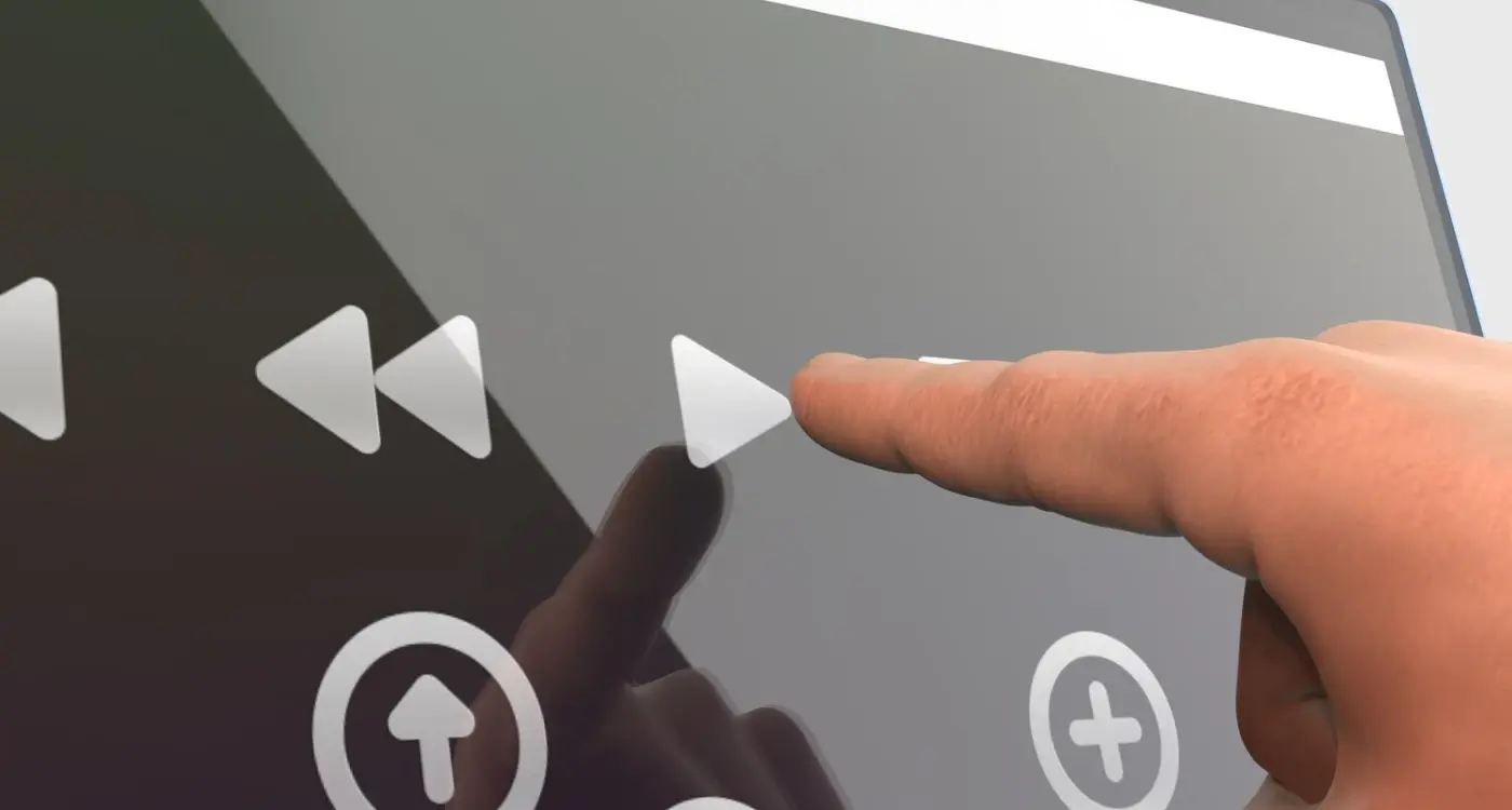
The touch targets in most consumer apps are designed for bare fingers on a clean screen—and that's a problem when you're building for construction sites. I've learned this the hard way after watching workers struggle with an app we'd designed perfectly to Apple's Human Interface Guidelines (44x44 pixels) only to see them miss buttons constantly because they were wearing work gloves. The fix? We increased all interactive elements to at least 60x60 pixels, and for primary actions like clocking in or marking tasks complete, we went even bigger at 72x72 pixels or more.
Here's what most designers miss though; its not just about size. Workers hands are often dirty, sweaty, or covered in materials like cement dust or paint. Capacitive touchscreens don't always respond well to gloved fingers, especially thick winter gloves or specialised safety gloves. We've had success using larger buttons with distinct spacing between them (at least 16 pixels of clear space) so accidental taps don't trigger the wrong action. That kind of mistake on a job site can be really frustrating when you're trying to log critical safety information.
One pattern that works well is using gestural controls sparingly. Swiping and pinching? Forget it when someone's wearing gloves. Stick to simple taps and consider adding alternative input methods like voice controls for hands-free interaction or barcode scanning where it makes sense for your workflow.
Key Design Specifications for Gloved Use
- Minimum touch target size of 60x60 pixels for all interactive elements
- Primary action buttons should be 72x72 pixels or larger
- Include at least 16 pixels of spacing between adjacent buttons
- Avoid swipe gestures and multi-touch interactions entirely
- Use high-contrast colours so buttons stand out against backgrounds
- Add haptic feedback so users feel when they've successfully tapped something
Test your app while wearing the actual gloves your users will have on site. I keep a pair of work gloves in my desk specifically for this—it catches usability issues immediately that you'd never spot with bare hands.
Common Mistakes to Avoid
The biggest mistake I see is developers treating construction apps like consumer apps with a different colour scheme. The interaction model needs to be fundamentally different. We built a workforce management app where the original design had a dropdown menu for selecting task types—sounds reasonable right? But try operating a dropdown with thick gloves and you'll see why we switched to large, clearly labeled buttons instead. Yeah, it took more screen space, but it actually worked in real conditions.
Another thing that catches people out is assuming everyone has the latest iPhone with the best touch sensitivity. Many construction companies issue older devices or ruggedised phones with less responsive screens, so you need even more generous touch targets and simpler interactions to compensate.
Making Apps Work in Bright Sunlight
I've built apps for logistics companies where drivers use their phones outdoors all day, and the complaints about screen visibility in sunlight were constant until we got the design right. Construction workers face the same issue—they're working in direct sunlight for hours, and if your app isn't designed for that, it becomes basically useless during the middle of the day. Sure, you can tell them to find shade, but that's not always practical when they're up on scaffolding or in the middle of a site.
The first thing to understand is that you cant actually control screen brightness through your app—thats a device setting. What you can control is contrast ratios and colour choices. I always push for dark text on light backgrounds with a contrast ratio of at least 7:1, which goes beyond the standard accessibility guidelines of 4.5:1. White or very light grey backgrounds work best because they reflect more light. And here's something that surprised me when we tested it—bright blues and greens that look great indoors become almost invisible in direct sunlight, so stick to blacks, dark greys, and high-contrast colours for text and important UI elements.
Practical Design Choices for Outdoor Visibility
Button sizes need to be larger than you'd normally design for—I'm talking 44 pixels minimum, but honestly 50-60 pixels works better for construction environments where people are wearing gloves. Shadow effects and gradients look nice but they actually reduce contrast, so I avoid them entirely on text and buttons in outdoor apps. One trick that worked well on a facilities management app we built was adding a subtle border around buttons and input fields; it helps define interactive elements when the glare makes everything wash out a bit.
- Use pure white (#FFFFFF) backgrounds instead of off-white or grey tones
- Choose dark text colours (#000000 or #1a1a1a) for maximum contrast
- Avoid relying on colour alone to convey information—use icons and text labels together
- Test your colour palette using a sunlight simulator or actually go outside at midday
- Include a high-contrast mode option in settings for users who need extra visibility
- Make tap targets larger and add more spacing between interactive elements
Its worth noting that OLED screens perform differently than LCD screens in bright conditions—OLED displays can actually boost brightness more effectively, but not all construction workers will have the latest devices. Design for the worst-case scenario, which is usually an older phone with a scratched screen protector in full midday sun.
Keeping Things Simple on Site
Construction sites are chaos, aren't they? Workers are juggling multiple tasks, coordinating with different teams, and dealing with constant interruptions. The last thing they need is a complicated app interface that requires three taps to log a simple measurement or submit a photo. I've worked on several field worker apps over the years and the biggest lesson I learned—usually the hard way—is that simplicity isn't just nice to have, its absolutely non-negotiable.
When we built a workforce management app for a large construction firm, our first prototype had all these features the project managers wanted: detailed timesheets, equipment tracking, safety checklists, incident reporting, document access. Looked great in the demo. But when we tested it on actual sites? Disaster. Workers were taking 5-6 minutes to complete tasks that should've taken 30 seconds. They'd start logging something, get interrupted by a foreman, come back and have no idea where they were in the process. We had to strip it right back to basics—one primary action per screen, massive buttons, and a persistent save state so interruptions didn't lose their work.
Every extra tap you add to your construction app is another opportunity for a worker to give up and go back to using a clipboard
Single-Purpose Screens Work Best
Here's what actually works on site: each screen should do one thing really well. Clock in/out screen. Photo capture screen. Safety checklist screen. Don't try to combine them or create fancy navigation systems. Construction workers aren't scrolling through your app during their lunch break—they're using it while standing on scaffolding or holding a power tool. Make it so simple that they can complete their task in under 30 seconds without reading any instructions. And for the love of all that's holy, don't hide important functions in hamburger menus; site workers wont find them and they certainly won't go looking.
Building for Offline Use
Construction sites have notoriously poor internet connectivity—I've worked on apps where workers were literally in underground car parks or steel-reinforced buildings that blocked every signal. And you know what? The app still needs to work. I learned this the hard way on a project management app we built where site supervisors couldn't log inspections because they'd lost connection. The data just... vanished. That project taught me that offline functionality isn't a nice-to-have for construction apps, its absolutely necessary.
The key is designing your app to sync data intelligently. When a user fills out a form, takes a photo, or marks a task as complete, that information needs to be stored locally on their device first. Then, when they're back in range of wifi or mobile data, the app syncs everything automatically in the background. We typically use local database solutions that can handle this—they basically create a temporary storage space on the phone that mirrors your main database structure. The tricky bit is handling conflicts; what happens if two people edit the same record offline? You need clear rules built into your system.
What to Make Available Offline
Not everything needs to work offline, and trying to make it all work without internet will make your development costs go through the roof. Focus on the core tasks people do on site daily:
- Viewing project plans, blueprints, and safety documents
- Logging inspections, incidents, or work completion
- Taking and storing photos with location data
- Checking schedules and task lists
- Recording time tracking and attendance
Real-time features like team messaging or live updates can wait until they're connected again. Be upfront with users about what works offline—show a clear indicator in your interface so they know their connection status and what they can actually do right now.
Safety Features That Matter
When you're building apps for construction sites, safety isn't just a nice feature to have—its the difference between an app that gets used and one that gets someone hurt. I've worked on several industrial apps over the years and the first thing I learned? Construction managers won't touch your app if it creates new safety risks, no matter how clever your design is.
The biggest safety feature we build into construction apps is emergency access. Workers need to report incidents or call for help without unlocking their phone, navigating menus, or even looking at the screen properly. In one workforce management app we developed for a large infrastructure client, we added a panic button that sat on the lock screen; just a long press triggered an alert with the worker's GPS location sent to site supervisors. Simple really, but it saved lives.
Location Awareness
GPS tracking is controversial I know, but on construction sites its a safety tool first and a management tool second. When an incident happens, knowing exactly where someone is matters more than privacy concerns—and workers get this. The key is being transparent about it. In our field worker apps, we always show users when location tracking is active and let them understand why it exists. Most construction workers actually want this feature because they know if something goes wrong, help will find them faster.
Incident Reporting
Quick incident reporting is another non-negotiable. We design these forms to work with voice input because trying to type out what happened while wearing gloves (or with injured hands) is basically impossible. The best industrial apps we've built let workers tap a few buttons, speak their report, and attach photos—all within 30 seconds. Speed matters because detailed incident reports filed immediately are worth ten times more than vague reports filed hours later.
Build your emergency features to work without an internet connection and sync later; construction sites often have patchy coverage and you can't wait for signal when someone needs help.
One thing that surprised me early on was how much construction workers value hazard logging features. Being able to photograph a unsafe condition and flag it in the system gives them agency over their own safety. It's not just about compliance either... workers genuinely want to protect their mates from risks they've spotted. The apps that let them do this easily get adopted fast.
Testing Your App in Real Conditions
You can test your construction app in a nice climate-controlled office all day long, but that's not where its going to live. I learned this the hard way years back when we built a facilities management app that worked perfectly in our studio but fell apart on actual building sites—turns out our testers had never tried using it while wearing work gloves in direct sunlight. Since then, I always insist on proper field testing before we even think about launching. Understanding how to properly test app performance becomes critical when your app needs to function in extreme conditions.
The best approach? Get your app onto real construction sites as early as possible. I mean actual sites, not just your mate's garden shed renovation. We typically arrange site visits during the beta phase and watch real workers use the app in their actual working conditions. You'll spot problems in five minutes of on-site testing that you'd never catch in weeks of office testing. Things like buttons that are fine indoors becoming impossible to tap with gloves on, or text that's readable on your desk but vanishes in bright sunlight.
What to Test in Real Conditions
Here's what we always check when testing construction apps on site:
- Can workers operate it with safety gloves, dirty hands, or wet fingers?
- Does the screen stay visible in direct sunlight and deep shadows?
- How does battery drain hold up during a full work day?
- Does offline mode actually work when there's no signal in basements or remote sites?
- Can workers hear audio alerts over construction noise?
- Does the camera function work in poor lighting conditions?
- How does performance handle when the device gets hot or cold?
One thing that's often overlooked is testing at different times of day. Morning conditions are completely different from late afternoon when everyone's tired and the light has changed. We once discovered that a time-tracking feature we'd built was causing problems specifically during the last hour of shifts because workers were rushing and making input errors—we only found that by being on site at knock-off time. Temperature matters too; I've seen apps slow to a crawl on phones that got too hot sitting in direct sun, something you'd never experience in an office environment. If you're finding serious performance issues during testing, you might need to reconsider whether your current development team is up to the task.
Conclusion
Building apps for construction sites isn't like building standard mobile apps, and honestly that's what makes this work so interesting. You cant just take your regular design patterns and hope they'll work when someone's wearing thick gloves in direct sunlight, standing next to heavy machinery. It doesn't work like that. Over the years I've learned that successful construction apps come down to a few non-negotiable principles—large touch targets (minimum 48x48 pixels but honestly go bigger), high contrast interfaces that work in any lighting, and offline functionality that doesn't break when you're three floors underground or in a remote location with no signal.
The testing phase is where most projects either prove themselves or fall apart. I mean, you can design the most beautiful interface in your office, but if it fails the moment someone tries to use it with dirty hands whilst balancing on scaffolding? You've wasted everyones time and money. That's why I always insist on field testing with actual construction workers, in actual conditions. Not just one afternoon either—proper testing across different weather, different times of day, different tasks. Its the only way to know if your app will actually survive on site.
The construction industry is slowly embracing digital tools, but workers will abandon your app instantly if it makes their job harder instead of easier. They don't have patience for complicated workflows or features they don't need. Keep it simple, make it reliable, ensure it works when everything else fails. If you can do that—and I've seen it work beautifully on projects ranging from small residential builds to major infrastructure developments—you'll create something people actually want to use every single day.
Frequently Asked Questions
From my field testing experience, you need at least 60x60 pixels for standard interactive elements, but I always recommend 72x72 pixels or larger for primary actions like clocking in or submitting forms. Standard mobile guidelines of 44x44 pixels are completely useless when workers are wearing thick safety gloves - I learned this the hard way on early projects where users constantly missed buttons.
Use pure white backgrounds with dark text at a minimum 7:1 contrast ratio - this goes beyond standard accessibility guidelines but it's essential for outdoor visibility. I always avoid gradients and subtle colours that wash out in bright light, and test designs outside at midday rather than relying on indoor screens to judge readability.
Absolutely - it's non-negotiable rather than a nice-to-have feature. Construction sites often have poor signal in basements, steel-reinforced buildings, or remote locations, and I've seen workers lose hours of logged data when connectivity failed. Focus offline functionality on core daily tasks like logging inspections, taking photos, and viewing documents, then sync everything automatically when connection returns.
Treating construction apps like office software that happens to be used outside - this approach fails every time. The interaction model needs to be fundamentally different: larger touch targets, simpler gestures (avoid swiping entirely), and single-purpose screens that workers can complete in under 30 seconds without instructions.
Safety features aren't optional - construction managers won't adopt apps that create new risks, regardless of other benefits. I always include emergency access from the lock screen, GPS tracking for incident response, and voice-enabled reporting since typing with gloves or injured hands is often impossible. These features often determine whether an app gets used or abandoned.
Get onto real construction sites during beta phase and watch actual workers use your app in proper working conditions - five minutes of field testing reveals problems you'd never catch in weeks of office testing. Test with safety gloves on, in direct sunlight, during different shifts, and in areas with poor signal to understand how your app performs when everything else is working against it.
Design for the least tech-savvy user while keeping interfaces fast for experienced users - this usually means big, clearly labelled buttons rather than hidden menus or complex navigation. On typical sites you'll have everyone from 19-year-old apprentices to supervisors in their 60s, so if your app takes more than 30 seconds to understand, it's probably too complex for the working environment.
Single-purpose screens work far better - each screen should do one thing really well rather than trying to combine multiple functions. Construction workers get interrupted constantly and need to complete tasks in 30 seconds or less, so attempting to build comprehensive multi-feature interfaces usually results in apps that are too slow and complex for the working environment.
Share this
Subscribe To Our Learning Centre
You May Also Like
These Related Guides
How Do I Design Apps for Gyms and Fitness Studios?

Should My App Look the Same on Every Screen?