
Should My App Look the Same on Every Screen?
A mobile gaming studio launches their new puzzle game with identical interfaces across every device. Looks beautiful on their test iPhone. But when players start downloading it on tablets, the interface elements are stretched and awkward—buttons designed for a thumb now require reaching across a 10-inch screen. Within weeks, the tablet version has a 2-star rating whilst the phone version sits at 4.5 stars. Same app, same code, completely different user experience.
I've spent years building apps that need to work on everything from small phone screens to massive tablets, and one question comes up constantly: should my app look exactly the same on every device? The short answer is no, not really. But here's where it gets interesting—the question itself reveals a common misunderstanding about how mobile design actually works.
Your app needs to feel consistent, sure. Users should recognise its the same app whether they're on their phone or tablet. But identical? That's a different thing entirely, and often a mistake. A button that's perfectly sized for a phone screen becomes tiny and fiddly on a tablet. Text that reads beautifully on a large display can feel overwhelming on a smaller one. The trick isn't making everything look the same—its making everything work equally well for the device its being used on.
The best mobile experiences adapt to their environment without losing their identity.
This guide is going to walk you through when consistency matters, when adaptation matters more, and how to balance the two without doubling your development costs or confusing your users. We'll look at the technical realities of screen sizes, the design decisions that actually impact user experience, and the testing approaches that catch problems before your users do. Because honestly? Getting this wrong is one of the fastest ways to tank your app's ratings.
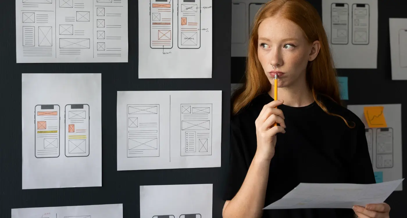
Understanding What Responsive Design Actually Means
Right, so responsive design gets thrown around a lot in meetings and honestly most people have only a vague idea what it actually means. In its simplest form, responsive design is about making your app adapt to different screen sizes automatically—the interface rearranges itself, text scales properly, buttons remain tappable, images resize without looking stretched or pixelated. Simple concept, but the execution? That's where things get interesting.
I've built apps that need to work on everything from an iPhone SE (which still has a surprisingly large user base, by the way) all the way up to iPad Pro 12.9-inch displays. The difference between those screens isn't just size—it's how people actually use them. Someone holding a phone uses their thumb to navigate; someone with an iPad on their lap uses different gestures entirely. Responsive design needs to account for all of this, not just make things bigger or smaller.
Here's what most developers get wrong though—they think responsive design means everything should look identical on every screen, just scaled proportionally. But that's not quite right, is it? A healthcare app I worked on had a dashboard that showed patient vitals. On a phone we displayed three key metrics prominently; on a tablet we could show eight metrics plus a graph without overwhelming the user. Same data, different presentation. That's proper responsive design—adapting the experience to match both the screen real estate and the usage context.
The technical side involves using flexible layouts (what we call constraint-based design on iOS and responsive layouts on Android), scalable image assets, and dynamic type sizing. But the real skill is knowing when to adapt the layout versus when to maintain consistency... and that comes from testing with actual users on actual devices.
When Perfect Consistency Makes Sense
I've built apps where keeping everything identical across screens was absolutely the right call—and honestly, its rarer than you might think. But when it works, it really works. The key is understanding that perfect consistency isn't about being lazy with design; its about meeting specific user needs or technical constraints that genuinely benefit from uniformity.
Banking and fintech apps are probably the best example here. When I worked on a mobile banking platform for a major financial institution, we deliberately kept the interface nearly identical across phone sizes and orientations. Why? Because users switching between their personal phone and their partner's device (or upgrading to a new model) needed to feel immediately confident they were tapping the right buttons when transferring money. That cognitive load of "where's the pay button now?" could mean the difference between completing a transaction and abandoning it out of uncertainty—or worse, making an expensive mistake.
When Consistency Actually Helps Users
Medical apps handling prescriptions or patient data benefit massively from this approach too. I worked on a healthcare app where nurses switched between tablets and phones constantly during their shifts, and they needed muscle memory to work in their favour. A button that moved positions based on screen size would've slowed them down during time-sensitive situations. Similar to designing apps for field workers, these users need interfaces that prioritise reliability over visual flexibility. Sure, we had to make some compromises—smaller tap targets on phones than I'd usually recommend—but the trade-off made sense for this particular use case.
Perfect consistency works best when your users frequently switch devices or when the consequences of interface confusion are genuinely serious. For most consumer apps though? You're better off adapting layouts to each screen size.
Where Pixel-Perfect Uniformity Makes Technical Sense
- Apps handling financial transactions where user confidence is paramount
- Medical or healthcare tools used by professionals switching between devices
- Enterprise software where employees use both company tablets and personal phones
- Tools with complex workflows that users need to memorise (like professional audio or video apps)
- Accessibility-focused apps where predictable button placement aids users with motor impairments
But here's the thing—even when you're aiming for consistency, you still need to account for physical screen dimensions. I mean, a button that's perfectly sized on a tablet might be impossibly tiny on a phone. So "consistent" usually means maintaining the same layout structure and interaction patterns while still scaling elements appropriately. Its a balancing act, and honestly, it takes more planning than adaptive layouts do because you're working within tighter constraints.
Why Different Screens Need Different Approaches
I'll be honest with you—trying to make your app look identical on every screen is a bit like trying to fit a square peg in a round hole. It just doesn't work. And I've seen so many projects struggle with this because clients come in wanting pixel-perfect consistency across their iPhone app and their tablet version, but the reality is that people use these devices completely differently.
Here's what I mean. When someone's using your app on their phone, they're usually on the go, holding it in one hand, maybe scrolling through whilst standing on the tube. Their thumb can only reach so far on the screen (there's actually a whole science behind thumb zones that affects where we place important buttons). But when that same person picks up their tablet? They're probably sitting down, using both hands, and they've got loads more screen space to work with. Why would you waste that extra space just trying to make it look like the phone version?
I worked on a healthcare app where we initially tried to keep the same layout across all devices—it was a disaster, honestly. On the tablet, we had this massive empty space because we'd just scaled everything up. Users were confused about where to look, and our testing showed they were taking longer to complete tasks. So we redesigned the tablet interface to show more information at once; we added a side panel for patient notes, displayed lab results alongside vital signs, and suddenly the app became actually useful on larger screens. The phone version stayed focused and simple because thats what it needed to be.
What Actually Changes Between Screen Sizes
Different screens require different thinking about these key areas:
- Navigation patterns—bottom tabs work great on phones but feel awkward on tablets where side menus make more sense
- Content density—you can show multiple columns on tablets without overwhelming users (think email apps with their inbox list and message preview)
- Touch targets—buttons need to be bigger on phones where precision is harder, but can be smaller on tablets where users have more control
- Orientation handling—tablets get rotated constantly whilst phones are mostly used in portrait mode
- Contextual features—adding split-screen support or drag-and-drop functionality on larger devices where these interactions feel natural
The Business Case for Adaptive Design
I know what you're thinking... doesn't this mean more development time and higher costs? Sure, it takes longer than just scaling everything up. But the engagement metrics tell a different story. We tracked user behaviour on that healthcare app I mentioned, and after implementing proper tablet-specific designs, session duration increased by 43% on larger devices. This kind of improvement is exactly what helps keep your app relevant as user expectations evolve. Clinicians were actually using the tablet version for their ward rounds instead of switching back to desktop computers.
The thing is, if your app doesn't feel right on someone's device, they'll just stop using it. I've seen apps with tens of thousands of downloads but terrible retention because they ignored tablet users (who, by the way, often have higher spending power and engagement rates than phone-only users). You need to meet users where they are, on whatever screen they're holding, and design for how they actually want to use that specific device.
The Technical Reality of Screen Sizes and Resolutions
Right, so lets get into the actual numbers because this is where a lot of app projects hit their first major roadblock. When I started building apps, we had maybe five or six iPhone models to worry about and a handful of popular Android devices. Now? I've got a spreadsheet with over 40 different screen configurations that we test against regularly, and that's not even covering tablets or foldable phones which are becoming more common in markets like South Korea and China.
The iPhone alone has gone from a single 320x480 pixel screen to everything from the iPhone SE at 375x667 points to the Pro Max models pushing 430x932 points—and that's before we even talk about pixel density. Android is honestly a bit mad really because you're dealing with screens from 4 inches to 7 inches, with pixel densities ranging from 1x to 4x. I worked on a banking app where users were complaining that buttons were too small, but only on certain Samsung devices; turns out the app wasn't properly handling the different DPI buckets Android uses (mdpi, hdpi, xhdpi, xxhdpi, xxxhdpi if you're keeping track). The evolution of high-resolution displays like Apple's Retina technology has made pixel density considerations even more critical for delivering crisp interfaces.
The difference between points and pixels trips up even experienced developers—points are the logical measurement your design system uses, while pixels are the actual physical dots on screen
You can't just scale everything proportionally either. I've seen apps where text becomes unreadable on small screens or where buttons end up so large on tablets they look ridiculous. The trick is using what Apple calls size classes and Android calls breakpoints; basically different layout rules that kick in at specific screen widths. On a healthcare app we built, we showed three items per row on tablets but only one on phones because medical information needs to be clearly readable, not just technically visible. This is part of planning for evolving device technologies that developers need to consider.
Making Your Interface Work Across Platforms
The reality of cross-platform development is messier than most agencies will admit. I've built apps that needed to work on iOS, Android, tablets, and even foldable devices—and let me tell you, its not just about resizing elements. Each platform has its own design language, interaction patterns, and user expectations that you cant ignore without frustrating your users.
Take navigation, for example. iOS users expect a tab bar at the bottom of the screen; Android users are comfortable with a hamburger menu or a navigation drawer. You could force the same navigation pattern on both platforms, but you'd be fighting against years of muscle memory. When we built a healthcare app for a large NHS trust, we initially tried to keep everything identical across platforms. The Android users were confused by the iOS-style navigation, and the feedback scores showed it—people struggled to find basic features because we'd ignored what they were used to.
Platform-Specific Elements That Need Different Treatment
- Navigation patterns—tab bars vs navigation drawers vs bottom sheets
- Button styles and placement—iOS uses borderless buttons, Android prefers contained buttons
- Typography—iOS uses San Francisco, Android uses Roboto, and they render differently
- Form inputs and keyboards—date pickers, dropdowns, and input styles all behave differently
- Loading states—iOS has pull-to-refresh, Android has swipe-to-refresh with different visual feedback
- Gesture controls—back gestures work completely differently between platforms
The key is knowing which elements should adapt to platform conventions and which elements need consistency for brand recognition. Your logo, colour scheme, and core brand elements? Keep those consistent. The way users navigate through your app or interact with forms? Adapt those to what feels natural on each platform. I've seen too many apps fail because developers prioritised visual consistency over functional usability, and it always costs more to fix later than it would have to do it properly from the start. Understanding whether your developer uses modern cross-platform tools can make a significant difference in managing these complexities.
Common Mistakes That Break User Experience
The biggest mistake I see, hands down, is forcing desktop patterns onto mobile screens. I worked on a fintech app where the original design team had created this beautiful tablet layout with three-column navigation and it looked gorgeous on an iPad. Absolutely stunning. But when we tested it on a standard iPhone? Bloody hell, the touch targets were so small users couldn't reliably tap the right button and the information density made it completely unreadable. We had to rebuild the entire navigation system using a bottom tab bar for phones while keeping the side navigation for tablets—which meant maintaining two completely different navigation patterns in the codebase.
Another killer is inconsistent touch target sizes across screen sizes. I've seen developers scale everything proportionally, which sounds logical until you realise that a button that's 44 pixels on an iPhone becomes 28 pixels on a smaller Android device. That's too small for reliable touch input and it breaks accessibility guidelines completely. Your touch targets need to be at least 44x44 points on iOS and 48x48 dp on Android, regardless of screen size. No exceptions really.
Here's one that trips up even experienced teams: assuming landscape mode is just a rotated portrait view. I learned this the hard way on an e-commerce project where product images looked perfect in portrait but got weirdly stretched in landscape because we hadn't created separate layouts. Landscape isn't just wider—its a fundamentally different space that needs its own considered design. Sometimes that means hiding certain elements, sometimes it means repositioning your entire layout. These interface problems often contribute to apps looking outdated surprisingly quickly.
Test your app's touch targets by asking someone with larger hands to use it. If they're constantly hitting the wrong buttons, your targets are probably too small or too close together.
Typography That Doesn't Scale Properly
Fixed font sizes will destroy your interface across different screen densities. I once inherited a healthcare app where all the text was set in absolute pixels and on high-DPI Android phones the text was so tiny it was literally unreadable for older users (which happened to be the target demographic!). We had to refactor the entire text system to use scalable units—sp on Android and Dynamic Type on iOS. The annoying bit? It broke our carefully designed layouts because text that was one line on the designer's screen suddenly became three lines on actual devices. That's the reality of multi-device design though; you cant control everything and you need to build flexibility into your layouts from day one.
Testing Your App on Real Devices
I'll be honest with you—emulators and simulators are brilliant for quick checks during development, but they will lie to you. Not intentionally, mind you, but they simply cannot replicate the real-world conditions your users will experience. I learned this the hard way on a fintech project where everything looked perfect in the iOS Simulator, but on actual iPhone 8 devices the colour contrast was completely off and several buttons were barely visible in bright sunlight. Cost us two weeks of rework and a very uncomfortable client call.
Real device testing shows you things you'd never catch otherwise—the way your app performs when the battery's at 15%, how it handles actual network conditions (not the simulated "slow 3G" that's nothing like actual slow 3G), and whether that gesture control you're so proud of actually works when someone's holding their phone with one hand on the bus. I keep a device lab with about 20 phones and tablets; some are ancient by tech standards but they represent what real people are actually using. This type of comprehensive testing is crucial for measuring real development progress beyond just code completion.
What You Actually Need to Test
You don't need every device ever made, but you do need strategic coverage. Here's what I prioritise based on the analytics from dozens of apps I've shipped:
- At least one low-end Android device (like a Samsung Galaxy A series)—these show performance issues immediately
- Current flagship iOS device and one that's 3-4 years old
- One tablet for each platform if your app supports them
- A device with a notch and one without
- Different screen aspect ratios (18:9, 19.5:9, 16:9)
The Testing Process That Actually Works
I test in actual environments, not just at my desk. Coffee shops with dodgy WiFi, outdoors in direct sunlight, in dim rooms—wherever users might actually use the app. Pay attention to things like how quickly the app responds to touch (it feels different on real hardware), whether text is readable in various lighting conditions, and if your carefully designed layouts actually make sense when someone's got large text enabled in their accessibility settings. That last one catches people out constantly. When you're ready to show off your responsive design, creating app preview videos that demonstrate cross-device compatibility can be particularly effective for showcasing your adaptive interface.
Conclusion
After building apps that work across everything from old Android tablets to the latest iPhones, I can tell you there's no one-size-fits-all answer to whether your app should look identical everywhere. It shouldn't, really—and that's not a cop-out answer, its just the reality of how people actually use mobile devices. The finance apps I've built need different approaches on a 6.7-inch phone versus a tablet where users might want to see multiple accounts side by side; forcing the same layout on both would be daft.
What matters is consistency of experience, not pixel-perfect matching across devices. Your users should feel like they're using the same app regardless of screen size, but the interface needs to adapt intelligently to whatever device they've got in their hands. I mean, a login screen can look pretty similar everywhere, but a dashboard with data visualisations? That needs proper thought about how information density changes across screen sizes. One healthcare app we worked on had to show patient records differently on phones (single column, swipeable cards) versus tablets (multi-column layout with side panels)—same data, different presentation, and users loved both versions.
The trick is understanding which elements of your app define its identity (colour scheme, typography, core interactions) and which need flexibility (layouts, navigation patterns, information hierarchy). Test on real devices, watch how people actually hold and use different screen sizes, and don't be afraid to make platform-specific decisions when they genuinely improve the experience. Building for multiple screens isn't about making everything identical; its about making everything feel right for wherever your users happen to be.
Frequently Asked Questions
No, and trying to force identical layouts often creates poor user experiences. Your app should feel consistent in terms of branding and core interactions, but the interface needs to adapt intelligently to different screen sizes and usage patterns—tablets can show more information density whilst phones need simpler, thumb-friendly layouts.
Based on shipping dozens of apps, I recommend testing on at least 5-6 key devices: a current flagship iPhone, an older iPhone (3-4 years old), a low-end Android device, a flagship Android phone, and tablets for each platform if you support them. This covers about 80% of real-world usage scenarios without breaking your budget.
Yes, adaptive design typically adds 20-30% to development time initially, but the engagement metrics justify it completely. On a healthcare app I worked on, proper tablet-specific layouts increased session duration by 43%—users actually preferred the app over desktop alternatives once we optimised for their device.
Forcing desktop or web patterns onto mobile screens, hands down. I've seen beautiful three-column tablet layouts become completely unusable on phones because developers scaled everything proportionally rather than rethinking the information hierarchy and navigation for smaller screens.
Embrace platform conventions rather than fighting them—iOS users expect bottom tab bars, Android users are comfortable with navigation drawers or hamburger menus. I learned this on an NHS project where forcing iOS navigation on Android users created confusion and poor feedback scores.
Absolutely not for final testing, though they're useful during development. Emulators can't replicate real-world conditions like actual network speeds, battery performance, or how colours appear in bright sunlight—I've had apps that looked perfect in simulators but had invisible buttons on actual devices.
Keep your brand elements consistent—logo, colour scheme, core typography, and key interactions—but adapt functional elements like navigation patterns, information density, and touch target sizes. Your login screen can look similar everywhere, but complex dashboards need completely different approaches on phones versus tablets.
Maintain minimum touch target sizes regardless of device—44x44 points on iOS and 48x48 dp on Android—rather than scaling everything proportionally. I've seen apps where buttons became 28 pixels on smaller Android devices, making them unusable for anyone without perfect precision.
Share this
Subscribe To Our Learning Centre
You May Also Like
These Related Guides

How Should I Design My App for One-Handed Use?

How Do I Design for One-Handed Phone Use?