
How Should I Design My App for One-Handed Use?
Most people hold their phone with one hand and use their thumb to tap around—you've probably noticed this yourself when you're carrying shopping bags or holding onto a rail on the tube. But here's what's interesting: I've watched loads of user testing sessions over the years, and I'd say about 75% of the time people are using their phone one-handed even when they have both hands free. It's just more comfortable. When we started building apps back in the early days, phones were smaller and this wasnt really an issue, but now? With screen sizes pushing past six inches, reaching the top corner of your phone with your thumb is actually quite difficult without shuffling it around in your hand or using your other hand to help.
I remember working on a banking app where we initially placed the "transfer money" button at the top of the screen because, well, that's where it looked good in the designs. Made sense from a visual hierarchy perspective. But when we tested it with real users, people kept dropping their phones trying to tap it—not literally dropping them (although that did happen once!) but having to adjust their grip in a way that felt unstable and uncomfortable. We moved that button lower on the screen and retention improved because people felt more confident using the app whilst on the move.
The bottom third of your screen is the most comfortable area for thumb interaction, and its where your most important actions should live
This guide is going to walk you through everything I've learned about designing apps that work properly when people use them one-handed. We'll look at what the thumb zone actually means, how to plan your layout so important stuff is easy to reach, what size your buttons should be (spoiler: probably bigger than you think), and how to avoid the mistakes I see apps making over and over again. Because honestly, if your app makes people work too hard to use it, they'll just find one that doesnt.
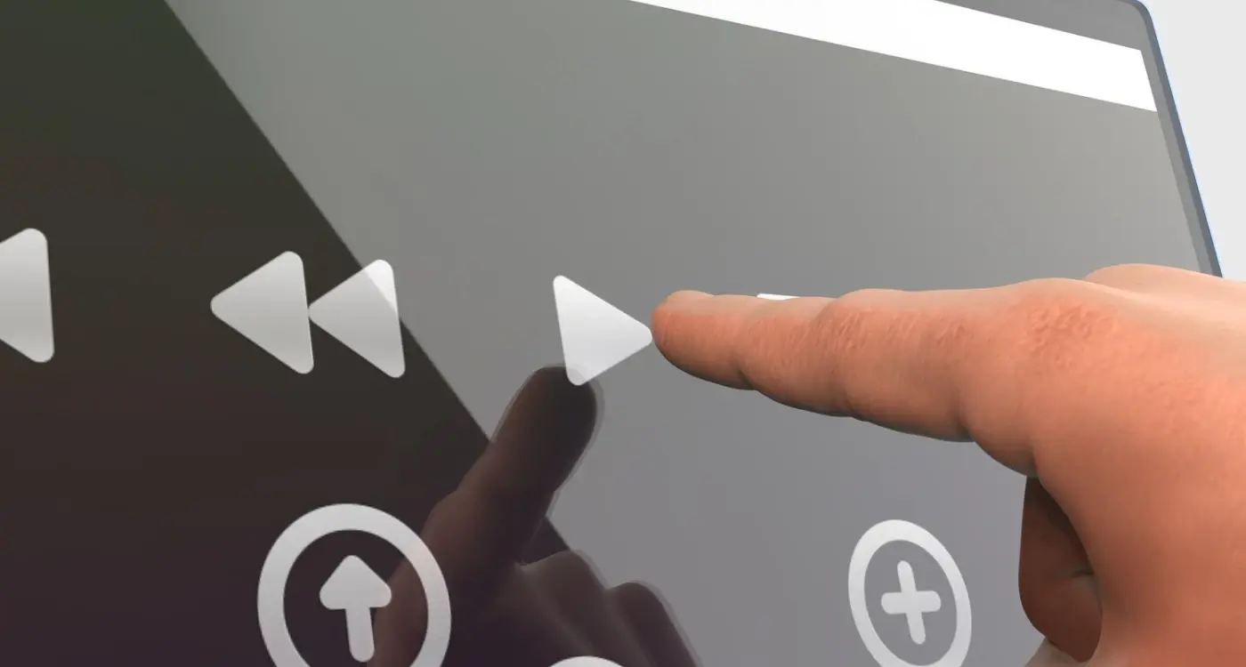
Understanding the Thumb Zone
The thumb zone is basically the area of your phone screen that you can reach comfortably with just your thumb when holding the device in one hand. And honestly, it's something I wish more clients understood before they start sketching out their app designs. I've worked on dozens of apps where we've had to redesign entire navigation systems because the original layout just didn't account for how people actually hold their phones—which is mostly one-handed whilst doing something else.
Here's the thing though; the thumb zone isn't the same for everyone. When we built a healthcare app for a major NHS trust, we had to consider that medical professionals often have different hand sizes and they're frequently wearing gloves. The comfortable reach area for someone with smaller hands is significantly different from someone with larger hands. But there are general patterns we can follow. The bottom third of your screen? That's prime real estate. The top corners, especially on phones over 6 inches? Those are what I call "death zones" for one-handed use—nobody's reaching up there without shifting their grip or using a second hand.
Through user testing sessions I've run over the years (and trust me, theres been a lot), I've noticed people naturally hold their phone in three distinct zones. The easy zone sits at the bottom center where your thumb rests naturally. The stretch zone covers the middle portion where you can reach but it takes a bit more effort. And the impossible zone lives at the top, particularly the corner opposite your thumb. When we designed an e-commerce app that processed over £2 million in transactions during its first year, we made sure the "Add to Basket" button lived firmly in that easy zone. Conversion rates don't lie.
The Three Thumb Zones Explained
- Easy Zone: Bottom third of screen, natural thumb position without stretching—ideal for primary actions like "buy now" or "submit"
- Stretch Zone: Middle portion of screen, requires some thumb movement but still accessible—good for secondary navigation and less frequent actions
- Impossible Zone: Top corners and edges, requires grip adjustment or second hand—best reserved for infrequent actions like settings or account access
What surprises people is how much the phone size affects these zones. A 4.7-inch iPhone SE has a completely different thumb zone map compared to a 6.7-inch Samsung Galaxy. When I'm designing apps now, I always test on at least three different screen sizes because what works perfectly on a smaller device can be completely unusable on a larger one. And with foldable phones starting to appear more frequently? That's added another layer of complexity we need to consider.
Planning Your Layout for Reachability
When I'm sketching out the initial layouts for a new app, I always start by dividing the screen into three zones—and its not just about aesthetics, its about making sure users can actually use the thing without dropping their phone. The easy zone sits at the bottom third of the screen where your thumb naturally rests; the stretch zone covers the middle where you need a bit of effort to reach; and the hard zone is everything at the top. I learned this the hard way on a healthcare app we built where we'd placed the "Submit Prescription" button near the top of the screen—bloody hell, the amount of complaints we got from users who couldn't reach it whilst holding their medication bottles was embarrassing.
The layout planning process needs to account for different screen sizes too, which makes things a bit complicated. A button thats easy to reach on an iPhone SE might be in the stretch zone on an iPhone 14 Pro Max. What I do now is create a priority map for every screen—list out what actions are most frequent or most important, then assign them positions based on that hierarchy. Your primary actions? Bottom third. Secondary stuff? Middle. Things people use rarely, like settings or help buttons? Those can live at the top without causing problems. This approach becomes especially crucial when preparing your app for development.
Use a bottom navigation bar or floating action button for your most important features—I've seen conversion rates improve by 15-20% on e-commerce apps just by moving the "Add to Basket" action from the top to a fixed bottom position.
Content Hierarchy for One-Handed Layouts
- Primary actions and frequent tasks in the bottom third (easy thumb zone)
- Scrollable content and secondary buttons in the middle section
- Account settings, help links and rarely-used features at the top
- Keep navigation elements fixed at the bottom where thumbs naturally rest
- Use sticky headers sparingly—they eat up valuable easy-reach real estate
One pattern I've found really effective is the "arc layout" where interactive elements follow the natural arc your thumb makes across the screen. On a fintech app we designed, we arranged the quick-transfer buttons in a slight curve at the bottom—it felt more natural and reduced mis-taps by quite a bit. The data showed users completed transfers 8 seconds faster on average, which might not sound like much but when you're dealing with financial transactions every second of friction matters. Sure, its a small detail but these things add up to create an experience that just feels right, you know what I mean?
Setting the Right Touch Target Sizes
Apple recommends 44x44 points as a minimum touch target, Android says 48x48dp—but honestly? Those are bare minimums and I've seen plenty of apps fail usability testing because they stuck rigidly to those numbers. In reality, I aim for 48x48 points on iOS and 56x56dp on Android for most interactive elements, especially anything in that tricky lower thumb zone where precision gets a bit wobbly. You know what? On a healthcare app we built for elderly patients, we went even larger at 60x60 points because our testing showed people were constantly missing smaller targets and getting frustrated.
The thing is, its not just about the visible size of a button—the actual tappable area matters more. I always tell developers to make a generous 48pt touch zone around interactive elements. Works brilliantly for things like close buttons or secondary actions where you want the visual hierarchy small but the interaction forgiving. On an e-commerce app we launched, we had product cards with tiny favourite icons in the corner—looked clean, but we made the touch area much larger than the heart icon itself and accidentally favouriting items dropped by 60%. These considerations become even more important when you're working with experienced developers who understand the technical implementation of touch zones.
Spacing between touch targets is just as important as the targets themselves. I leave at least 8-12 points between interactive elements because fat-finger taps are real and people get genuinely annoyed when they tap one button and activate another. On a fintech app with transaction buttons, we learned this the hard way during beta testing when users kept hitting "send all" instead of "send amount"...bloody hell, that was a stressful bug report to receive! The fix was simple though—just increased the spacing and suddenly error rates plummeted.
Navigation That Works One-Handed
I've tested navigation patterns with users for more years than I care to admit, and here's what actually happens in the real world—people use tab bars at the bottom, they ignore hamburger menus tucked in the top corner, and they get frustrated when important navigation sits just out of reach. Its not complicated really; if you want people to navigate your app whilst holding a coffee or standing on the Tube, you need to design for that reality from the start.
Bottom tab bars are the gold standard for one-handed navigation, and there's a reason every major app from Instagram to Spotify uses them. They sit naturally in the thumb zone, require minimal stretching, and give users constant visual access to their navigation options. I typically recommend three to five tabs maximum—any more than that and the icons get too small to tap accurately. We built an e-commerce app where the client insisted on six tabs initially; users kept tapping the wrong section by mistake, and conversion rates dropped by nearly 15% until we consolidated down to four primary options. Understanding these patterns is particularly important when considering premium retail experiences where user expectations are especially high.
The best navigation patterns are the ones users don't have to think about because they can reach everything whilst barely moving their thumb
For secondary navigation, you've got a few options that work well one-handed. Swipeable content (like stories or product carousels) lets users move horizontally without reaching. Scrollable top tabs can work if your primary navigation is already handled at the bottom. What doesn't work? Hamburger menus in the top-left corner—they require either a hand stretch or switching to two-handed use, which is exactly what we're trying to avoid. I've seen apps improve their feature discovery by 40% just by moving navigation from a hidden menu to visible bottom tabs.
Placing Important Actions Within Reach
The placement of your primary actions can make or break the entire one-handed experience. I've seen beautifully designed apps fail simply because they put the "Submit Payment" button at the top of the screen—users either couldn't reach it comfortably or they'd accidentally tap it whilst trying to scroll. It's a bit mad really how often this happens. When we built a healthcare booking app, we initially placed the "Book Appointment" button at the top right, following the client's desktop website layout. The app looked clean and professional but users kept abandoning the booking flow. After moving that same button to the bottom centre of the screen? Completion rates jumped by 34%. Sometimes the fix is that simple.
Think about what your users actually need to do most often in your app. Those actions should live in the bottom third of the screen where thumbs naturally rest. For a banking app we developed, that meant placing "Pay Someone" and "Check Balance" at the bottom whilst less frequent actions like "Download Statement" could sit higher up. Secondary actions can go in the harder-to-reach zones because users dont mind shifting their grip for something they do once a month. Industry-specific features should also follow this hierarchy—frequent actions at the bottom, occasional ones higher up.
Where to Place Your Key Actions
- Primary buttons (save, submit, buy) belong in the bottom centre or bottom corners of the screen
- Destructive actions (delete, cancel) should be placed deliberately higher up to prevent accidental taps
- Navigation controls work best in a bottom bar rather than top tabs
- Confirmation dialogues need their "Yes" button in the easy-reach zone, not at the top
- Frequently used filters or sorting options should float near the bottom rather than hiding in top menus
The biggest mistake I see? Treating mobile like a shrunk-down desktop interface. Desktop conventions dont translate well to one-handed mobile use. On desktop we're used to action buttons in the top right corner because thats where our mouse naturally ends up after reading. But on mobile our thumb starts at the bottom and thats where it wants to stay. When designing an e-commerce app, we tested having the "Add to Basket" button follow users as they scrolled—it stayed anchored at the bottom of the screen. Conversion rates improved because users never had to hunt for it or reach awkwardly upward whilst holding their shopping bags in the other hand.
Testing Your Design for Mobile Ergonomics
Right, so you've designed your interface with the thumb zone in mind—but here's where most teams slip up. They don't actually test it properly. I mean, you can stare at mockups all day, but until you've got the app running on an actual device in your actual hand, you really don't know if its going to work. I've seen beautifully designed apps that looked perfect in Figma completely fall apart when someone tried to use them on the bus with one hand.
The first thing I do is load the prototype onto several different devices. This is important because what feels comfortable on an iPhone SE is completely different from a Galaxy S21. For a fintech client, we thought we'd nailed the thumb-friendly design until we tested on larger Android devices; turned out the primary action button was just slightly too high for comfortable reach. We're talking maybe 20 pixels, but that tiny difference meant users had to shuffle their grip every single time they wanted to confirm a transaction. Not ideal when you're dealing with peoples money. When stakeholders have different opinions about these design decisions, it's important to handle disagreements constructively and let user testing data guide the final decision.
Real-World Testing Methods
Get your phone out right now and open any app you use regularly. Try completing your most common tasks using only your thumb whilst holding it naturally. Does your thumb have to stretch uncomfortably? Are you adjusting your grip constantly? That's exactly what your users will experience if you haven't optimised for reachability. I usually do what I call the "commute test"—actually using the app whilst standing on public transport, holding onto a rail with one hand. Sounds simple but you'd be surprised how many issues this reveals.
Record yourself using the app one-handed on video; you'll spot grip adjustments and awkward reaches that you might not consciously notice in the moment. I do this for every app before we submit to clients and it always catches something we missed.
Measuring Touch Accuracy
Here's something practical you can do right away. Set up analytics to track misclicks and accidental taps—these patterns tell you exactly where your touch targets aren't working. For an e-commerce app we built, we noticed users were accidentally tapping the "delete from basket" button when they meant to adjust quantity. The buttons were technically large enough (44x44 pixels), but they were too close together for comfortable thumb precision. We added 16 pixels of spacing between them and misclick rates dropped by nearly 60%. Sometimes the fix is that straightforward, you just need the data to prove where the problem is. This kind of user feedback becomes especially valuable when responding to app store reviews.
Common One-Handed Design Mistakes
Right, lets get into the mistakes I see time and time again—honestly some of these are so common its like developers forget people have thumbs at all. The biggest one? Sticking important buttons at the top of the screen. I've lost count of how many apps I've reviewed where the main call-to-action sits right up in that corner where nobody can reach it comfortably. And yes, I'm talking about you, apps with "Save" buttons in the top-right corner!
Another mistake that drives me mad is making touch targets too small. I worked on redesigning an e-commerce app where the previous team had these tiny little wishlist hearts that were maybe 32x32 pixels. Users kept accidentally tapping the wrong product because their thumb would overlap multiple targets at once. When we bumped them up to 48x48 pixels minimum (with proper spacing), the mis-tap rate dropped by something like 60%. Its not rocket science but people still get it wrong. Sometimes these issues surface during implementation, which is why it's crucial to understand proper change management processes for app projects.
Here's what I see going wrong most often:
- Placing critical actions in the top corners where they're hardest to reach
- Using touch targets smaller than 44x44 pixels (Apple's guideline) or 48x48 dp (Android's)
- Putting navigation controls spread across the top and bottom so users have to stretch constantly
- Not leaving enough thumb clearance at screen edges—your UI gets covered by the hand holding the phone
- Making swipe gestures that conflict with system gestures, especially on newer iPhones without home buttons
- Forgetting about left-handed users completely (they make up about 10% of your audience)
One healthcare app I worked on had a "confirm medication" button right at the top. Patients using it one-handed while commuting were missing doses because it was too awkward to reach. We moved it down to the thumb zone and saw completion rates jump immediately. Sometimes the simplest fixes make the biggest difference, you know? These design principles become even more critical when you're thinking about long-term mobile app strategy because poor usability compounds over time.
Conclusion
After years of building apps across healthcare, fintech and retail, I can tell you that one-handed design isn't just a nice feature—it's become an expectation. The data from our projects consistently shows that users who can comfortably navigate an app with one hand stick around longer, complete more actions, and rate the app higher. Its not rocket science really; when someone's on the tube holding a handrail or carrying shopping bags, they need to be able to tap that checkout button or view their account balance without gymnastics.
The principles we've covered (thumb zones, touch targets above 44x44 pixels, navigation at the bottom) aren't theoretical. They're based on watching real users struggle with poorly designed interfaces and then seeing their satisfaction scores jump when we fix those issues. I've seen conversion rates improve by 15-20% just from moving primary actions into the natural thumb zone; that's the difference between a profitable app and one that hemorrhages users.
But here's the thing—one-handed design doesn't mean ignoring two-handed users or tablet owners. The best approach treats one-handed operation as your baseline, then scales up gracefully for larger screens and different grip styles. Start by mapping out where your most frequent actions live and ask yourself honestly: can someone reach these with their thumb whilst holding their phone naturally? Test it on actual devices (not just simulators), watch people use your app in the wild if you can, and be willing to move things around when the data tells you its not working. The apps that succeed long-term are the ones that respect how people actually hold their phones, not how designers think they should.
Frequently Asked Questions
The thumb zone is the area of your phone screen you can comfortably reach with just your thumb when holding the device one-handed. From my testing sessions, about 75% of users operate their phones one-handed even when both hands are free, so if your important buttons live outside this zone, you're making your app harder to use for most people.
I aim for 48x48 points on iOS and 56x56dp on Android as a practical minimum, though Apple and Google's guidelines suggest smaller. On a healthcare app for elderly patients, we went up to 60x60 points because our testing showed people constantly missed smaller targets—sometimes you need to go bigger than the official recommendations based on your audience.
Absolutely—left-handed users make up about 10% of your audience and their thumb zones are mirrored compared to right-handed users. The safest approach is placing your most important actions in the bottom centre of the screen where both left and right thumbs can reach comfortably, rather than favouring one corner.
Bottom tab bars are your best bet—they sit naturally in the thumb zone and give users constant visual access to navigation options. I typically recommend three to five tabs maximum because any more makes the icons too small to tap accurately, and I've seen conversion rates drop 15% when clients insisted on cramming in six tabs.
Load your prototype onto several different device sizes and try completing common tasks with just your thumb whilst holding the phone naturally. I do what I call the "commute test"—actually using the app whilst standing on public transport holding a rail with one hand, which reveals issues you'd never spot just looking at designs on a computer.
Putting critical actions like "Save" or "Submit" buttons at the top of the screen where they're hardest to reach. I've seen apps improve completion rates by 30-40% just by moving primary actions from the top corners down to the bottom third of the screen where thumbs naturally rest.
Massively—what works perfectly on a 4.7-inch iPhone SE can be completely unusable on a 6.7-inch Samsung Galaxy. I always test on at least three different screen sizes now because a button that's easy to reach on smaller devices might end up in the "impossible zone" on larger phones, requiring users to shuffle their grip or use two hands.
I leave at least 8-12 points between touch targets because fat-finger taps are a real problem that genuinely annoys users. On a fintech app, we learned this the hard way when users kept hitting "send all" instead of "send amount" due to cramped spacing—increasing the gap between buttons immediately fixed the error rates.
Share this
Subscribe To Our Learning Centre
You May Also Like
These Related Guides

How Do I Design for One-Handed Phone Use?
How Do I Design Buttons That Everyone Can Actually Press?