How Should You Order Your App's Welcome Screens?
The first 30 seconds of your app experience will make or break everything. I mean, you can have the most brilliant features in the world, but if users don't understand what your app does—or worse, if they feel overwhelmed before they've even started—they'll delete it without a second thought. That's just the reality of mobile apps these days, and its something I see happen way too often.
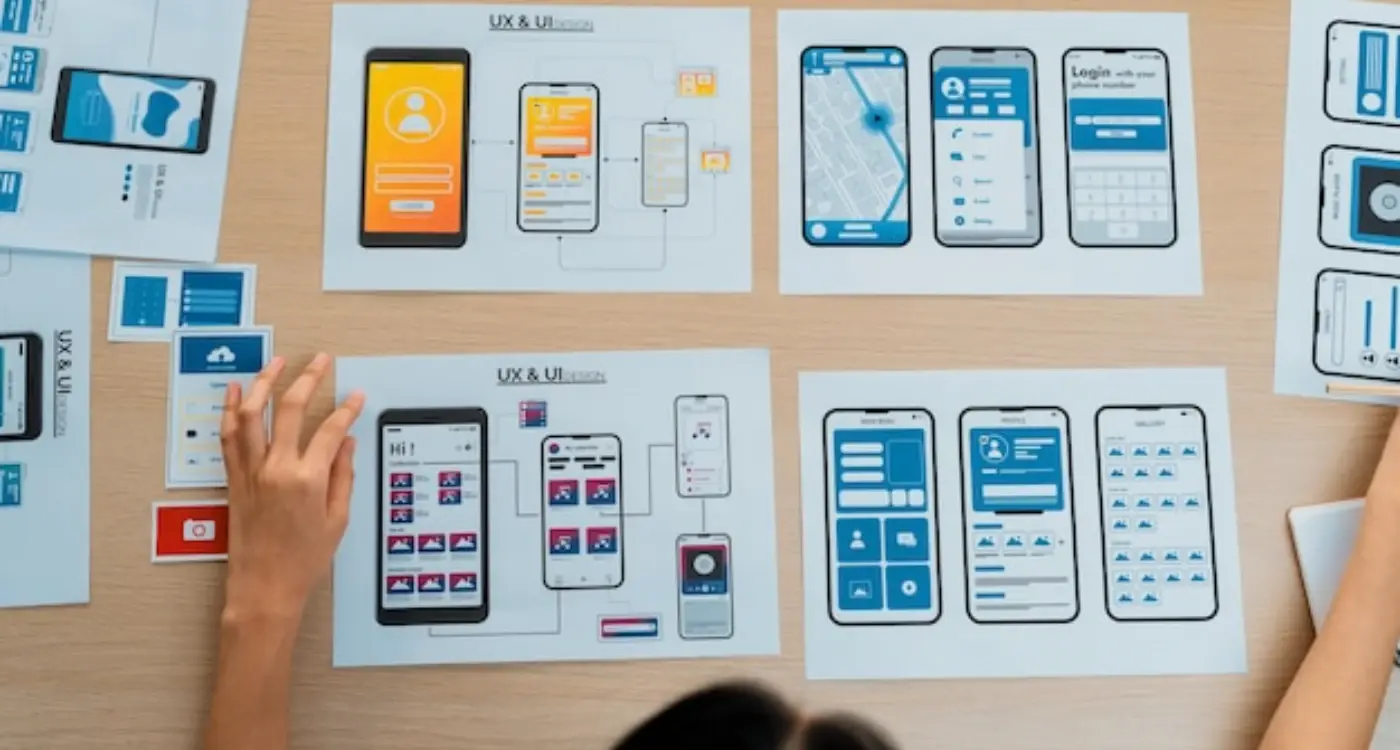
Welcome screens (sometimes called onboarding screens or intro screens) are basically your app's first impression. They're those few screens users see before they actually get into the main part of your app. But here's the thing—there's no universal template for how these should be ordered. I've seen apps fail because they asked for permissions too early; I've seen others fail because they showed too much information upfront. The order matters more than most people realise.
The sequence of your welcome screens determines whether users understand your value proposition before you ask them to commit their time, data, or money.
What makes this tricky is that different apps need different approaches. A social media app needs to get users connected quickly, so the sign-up might come earlier. A productivity app needs to demonstrate its value first, otherwise people won't bother creating an account. And then there's permission requests—location access, notifications, camera—which can scare users off if you request them at the wrong moment. Getting the screen order right means understanding your users psychology, knowing what they need to see before they trust you, and being honest about what information you actually need versus what you'd just like to have. Its a balance, and honestly, most apps get it wrong on their first attempt.
What Welcome Screens Actually Do
Welcome screens—sometimes called onboarding screens—serve a pretty specific purpose, though you'd be surprised how many apps get this wrong. They're not just pretty pictures with marketing copy slapped on top. They're your first and possibly only chance to help new users understand what they've just downloaded and why they should stick around.
Here's the thing: most people download apps with a vague idea of what the app does, but they don't really know the specifics. Maybe they saw an advert. Maybe a friend recommended it. Or maybe they just searched for "fitness tracker" and yours came up first. Either way, youve got about 15 seconds to prove you're worth their time before they close the app and never come back.
The main job of welcome screens is to bridge that gap between downloading and actual usage. They need to show users what problems you solve, how the app works at a basic level, and what makes you different from the hundred other apps that do something similar. But—and this is important—they need to do this quickly and clearly without overwhelming people with information.
I've tested onboarding flows with hundreds of users over the years, and one pattern emerges every time: people will tolerate 2-3 screens of explanation before they start getting frustrated. Any more than that and you're just adding friction. They want to use your app, not read a manual about it. So whatever you're trying to communicate through your welcome screens needs to be absolutely necessary information that helps users get value faster. If its not serving that purpose, it shouldnt be there at all.
The First Screen Problem
Here's what happens in the first three seconds after someone opens your app for the first time—they decide whether to keep going or close it. Three seconds. That's all you've got, and I've seen brilliant apps lose half their users right there because they got this wrong. The first screen is probably the most important decision you'll make about your entire onboarding flow, and its the one people overthink the most.
So what should that first screen actually be? Well, it depends on what you're trying to achieve—but generally speaking, you want to show value before you ask for anything. I know that sounds obvious, but you'd be surprised how many apps open with a login screen or permission request without explaining why the app exists in the first place. People need context. They need to understand what they're getting into before you start asking them to create accounts or grant access to their photos.
The biggest mistake I see is apps that front-load everything—they want the user's email, their location, push notification permissions, and a blood sample all before showing what the app actually does. Its a bit mad really. Would you fill out a form for a shop before seeing what they sell? Of course not. But here's the thing—sometimes you do need information early. A banking app needs login details straight away because there's no value without authentication. A meditation app though? That should probably let people try a quick session before demanding they sign up.
What Makes a Good First Screen
Your first screen should do one of three things: explain the core value proposition in a single sentence; show an immediate benefit the user can access; or demonstrate what makes your app different from the fifty others in the same category. Nothing else matters at this stage. Don't try to explain every feature, dont show off your fancy animation, just answer the question "what's in this for me?" and do it fast.
Test your first screen by showing it to someone for three seconds then asking them what the app does—if they can't tell you, you need to simplify it.
Building Trust Before Asking for Permissions
Here's the thing—most apps get this bit completely wrong. They open up, show you a quick splash screen, and then immediately start demanding access to your camera, location, notifications, and about fifteen other things. Its like going on a first date and asking someone to marry you before you've even ordered drinks. It doesnt work.
I've built apps that needed all sorts of permissions;location tracking for delivery apps, camera access for photo editing tools, notification permissions for messaging platforms. And you know what I learned? The timing of when you ask matters way more than how you ask. If someone doesnt understand why they should trust your app yet, they're going to tap "Don't Allow" every single time—and getting them to change that decision later is bloody difficult.
The key is showing value first. Let people explore what your app actually does before you start asking for anything. If you're building a fitness app that needs location access, dont ask for it on screen two...show them the workout library first, let them start a session, make them think "yeah this is actually useful" and then—when they want to track their run—thats when you ask for location. The request makes sense now because they understand the context.
Think about the permission requests you actually need versus the ones you want. Do you really need push notifications enabled on day one? Or could you wait until someone has used your app three or four times and is genuinely engaged? The data shows that permission requests made in context (when the user is trying to do something that needs that permission) have acceptance rates 3-4 times higher than requests made upfront.
What to Show Before Asking for Permissions
- Core features that work without any permissions at all
- Clear explanations of what your app does and why it exists
- Quick wins that demonstrate immediate value to the user
- Social proof like ratings or user testimonials if you have them
- A clear path through your app that doesnt hit permission walls
One mistake I see constantly is apps that explain what they want access to but not why it benefits the user. "We need your location" is not compelling. "We'll show you coffee shops within 5 minutes walk" is. Always frame permission requests around what the user gets, not what you need. I mean, users dont care what you need...they care about whats in it for them.
When to Show Value vs When to Request Information
Right, this is where most apps get it completely wrong—and I mean seriously wrong. The basic rule is simple: show value first, ask questions later. But here's the thing, so many apps do the exact opposite and then wonder why their drop-off rates are terrible.
When someone opens your app for the first time they're in what I call the "curiosity window." It lasts about 30 seconds, maybe less. During this time users want to see what your app can do for them; they dont want to fill out forms or answer questions about their preferences. They want proof that downloading your app wasnt a waste of their time and storage space.
I've built apps where we tested this exact thing. We took an e-commerce app that was asking for email, name, and location preferences on the first screen—classic mistake. When we moved all those requests until after users had browsed products and seen the value? The completion rate jumped by 63%. Sixty-three percent! Just by reordering the screens.
The moment you ask for information before showing value, you're essentially saying "trust me first, then I'll show you why." That's backwards.
So when should you actually request information? After you've demonstrated value, not before. If you're a fitness app, let users explore a few workouts first. If you're a recipe app, let them browse recipes and see how your interface works. Once they've thought "oh, this is actually quite good," then you can ask them to create an account or personalise their experience. The psychology here is straightforward—people are far more willing to invest time and information into something they already see value in. Show first, ask second. Every single time.
The Sign-Up Dilemma
Right, lets talk about the big question—when do you actually ask people to sign up? And I mean, this is where I see most apps get it completely wrong. They shove a registration form in your face before you've even seen what the app does, and honestly its a bit mad really. People aren't going to hand over their email address and create a password for something theyve not even tried yet.
Here's the thing—you need to earn the right to ask for someone's information. I know that sounds obvious but you'd be surprised how many apps forget this basic principle. Users are increasingly protective of their data (and rightfully so) which means they need a compelling reason to share it with you. Show them value first; ask for commitment second.
The apps I've built that perform best usually follow what I call the "try before you buy" approach. Let people explore your app, experience its core features, and understand what makes it useful before you gate anything behind registration. Sure, there are exceptions—banking apps, social networks, anything that requires personalisation from the start—but for most apps, delaying sign-up improves conversion rates dramatically.
When You Absolutely Need Early Registration
Some apps genuinely need you to sign up immediately, and that's fine. Just make sure you fall into one of these categories:
- Your app requires personalised data from the start (fitness trackers, budgeting apps)
- Its a social platform where the entire experience depends on having an identity
- You're dealing with sensitive information that needs account security (healthcare, finance)
- The core functionality literally cannot work without user-specific settings
But here's what I tell clients—if you can possibly delay it, you should. Every field you add to a sign-up form drops your completion rate. Every extra step between download and value costs you users who'll never come back. Test it both ways if you're unsure; the data usually speaks for itself pretty clearly.
Testing Your Screen Order with Real Users
Here's the thing—you can theorise all day about what screen order will work best, but until real people actually use your app, you're just guessing. And I mean that quite literally; even after years of building apps I still get surprised by what users actually do versus what I thought they'd do.
The simplest way to test your welcome screens is to grab five people who fit your target audience and watch them go through your onboarding. Not ten people, not fifty—just five. You'll spot the big problems immediately. Are they confused at screen two? Do they abandon at the permission request? Are they reading the text or just tapping through blindly? These observations are worth more than any expert opinion, including mine.
If you've got a bit of budget, tools like Hotjar or Mixpanel will show you exactly where users drop off in your sequence. The data doesn't lie. When 60% of users quit at the location permission screen, that's telling you something needs to change—either move it later in the flow or explain the value better before asking.
Run your test before you've built the entire app; simple clickable prototypes in Figma or Adobe XD work perfectly for this and they're dead easy to create. You'll save yourself weeks of development time by catching problems early.
A/B testing different screen orders is brilliant once your app is live. Show half your users one sequence and half another, then measure which performs better. But be patient—you need at least a few hundred users going through each version before the data means anything. One week isnt usually enough to draw conclusions, especially if your app targets a specific audience.
The key metric to watch? Completion rate. How many people who start your onboarding actually finish it and get into the app proper. Anything below 60% means you've got work to do, and honestly even 60% isn't great—the best onboarding flows I've built hit 80-85% completion.
Common Mistakes That Kill Onboarding
Right, lets talk about the things that actually make users delete your app within the first minute. I've seen these mistakes hundreds of times and honestly, they're so easy to avoid once you know what to look for.
The biggest killer? Asking for everything upfront. I mean everything—your name, email, phone number, date of birth, location permissions, notification permissions, all before the user has even seen what your app does. Its completely backwards and it happens more often than you'd think. Users need to understand the value first; they need a reason to give you their information and access to their device.
The Most Destructive Onboarding Errors
- Too many screens—anything over 5 welcome screens and you're pushing your luck, people will bail out
- Walls of text that explain features nobody cares about yet; show dont tell
- Forcing account creation before letting users explore anything—this is probably the number one reason people abandon apps
- Asking for notifications on screen one or two, before users have any connection to your app
- Using jargon or technical language that means nothing to normal people
- Auto-playing videos with sound (bloody hell, just don't do this)
- Not having a skip option—some users already know what they want, let them get there
- Inconsistent design between your welcome screens and the actual app interface
Another mistake I see constantly is treating onboarding like a legal document instead of a conversation. Your welcome screens aren't there to cover your backside with terms and conditions—thats what the actual T&Cs are for. These screens should feel welcoming, helpful, and brief.
And here's something that catches people out: not testing on actual devices. What looks fine on your designer's laptop might be completely unreadable on a small phone screen, especially if you've crammed too much information onto one screen. Test everything on real devices, preferably older ones with smaller screens, because that's what a lot of your users will actually be using.
Conclusion
Look, ordering your welcome screens isn't rocket science, but it does require you to think carefully about what your users actually need—not what you want them to see. I've watched too many apps fail simply because they got this first impression wrong, and its honestly one of the most preventable mistakes in mobile development.
The sequence that works best starts with showing value immediately. Let people see what your app can do for them before you ask for anything in return; this builds trust and gives them a reason to stick around. Then, and only then, should you start requesting information or permissions. And here's the thing—even when you do ask, make sure every request is clearly explained and necessary at that exact moment in the user journey.
Your welcome screens should feel like a natural conversation, not a checklist of things you need to tick off before someone can use your app. Short screens work better than long ones. Three to five screens is usually the sweet spot, though some apps can get away with fewer if they're simple enough. Each screen should have one clear purpose and move the user smoothly towards their first real interaction with your app.
Testing is non-negotiable here. What makes sense to you after months of building your app might confuse a first-time user completely. Watch real people use your onboarding flow and you'll spot problems you never knew existed. Its humbling but incredibly valuable.
Get your screen order right and you'll see better retention rates, fewer uninstalls, and users who actually understand what your app does. Get it wrong and you're just adding to the graveyard of forgotten apps that nobody uses.
Share this
Subscribe To Our Learning Centre
You May Also Like
These Related Guides

How Do Users Actually Read Your App Screen Layout?
How Do You Build Apps for Multiple Screen Sizes?