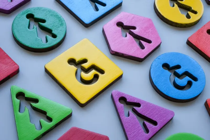
What Accessibility Features Should Wearable Apps Support?
Wearable accessibility isn't something most developers think about until they have to—and honestly, that's a problem. I've been building apps for smartwatches, fitness trackers, and other wearable devices for years now, and the number of times I've seen brilliant apps that completely exclude users with disabilities is genuinely disappointing. We're talking about devices that could be life-changing for people with visual impairments, motor difficulties, or hearing challenges, yet so many apps treat accessibility as an afterthought.
The thing is, wearable devices are actually perfect for inclusive design. They're already designed to work hands-free in many situations; they use vibration patterns, voice commands, and simple gestures. But here's where it gets tricky—the small screens, limited battery life, and reduced processing power create unique challenges that don't exist in traditional mobile apps. You can't just shrink down your smartphone accessibility features and call it job done.
Accessibility features on wearables aren't just nice to have—they're often the difference between a user being able to interact with technology or being completely shut out of the experience
What makes this particularly important is that many people who benefit most from wearable accessibility features are also the ones who need these devices most. Someone with Parkinson's disease might struggle with tiny touchscreen buttons but could benefit enormously from medication reminders delivered through haptic feedback. A person with low vision might find a smartwatch's voice commands and audio feedback more practical than constantly pulling out their phone.
The good news? Building accessible wearable apps isn't rocket science, but it does require understanding the specific needs and constraints we're working with. That's exactly what we'll cover in this guide.
Understanding Wearable Device Limitations
When I first started developing for wearables, I made the classic mistake of treating them like tiny smartphones. Bloody hell, was I wrong! Wearables have their own unique set of constraints that directly impact how we approach accessibility—and honestly, understanding these limitations is what separates apps that actually work from those that frustrate users to no end.
The most obvious constraint is screen size, but it goes deeper than you think. We're talking about displays that are often smaller than a postage stamp, which means traditional touch targets become nearly impossible for users with motor impairments. And here's the thing—even users without accessibility needs struggle with tiny buttons on a smartwatch. Battery life is another major factor; wearables need to sip power, not guzzle it, which affects how often we can use features like vibration feedback or voice recognition.
Key Hardware Constraints
- Screen sizes typically range from 1-2 inches diagonally
- Limited processing power compared to smartphones
- Restricted battery capacity requiring power-efficient design
- Minimal storage space for app data and assets
- Often lack full keyboards or complex input methods
Processing power is surprisingly limited too—your Apple Watch isn't running the same chip as an iPhone, and that affects everything from speech processing speed to how quickly haptic feedback can respond to user actions. I've seen apps crash simply because developers tried to cram too much functionality into a device that wasn't designed for it.
But here's what's interesting: these limitations actually force us to design better accessible experiences. When you can't rely on complex visual interfaces, you naturally turn to voice commands, haptic patterns, and audio feedback. The constraints push us toward more inclusive design solutions that benefit everyone, not just users with specific accessibility needs.
Voice Control and Audio Feedback
Right, let's talk about something that's absolutely crucial for wearable accessibility—voice control and audio feedback. I've worked on countless wearable projects over the years, and honestly? This is where most apps fall short. People assume that because the screen is tiny, voice becomes less important. Actually, its the complete opposite.
When you're dealing with a smartwatch or fitness tracker, voice control isn't just a nice-to-have feature—it's often the primary way users with motor difficulties or visual impairments will interact with your app. And here's the thing that surprises many developers: implementing good voice control on wearables is actually more challenging than on phones because of processing power limitations and background noise issues.
For audio feedback, you need to think beyond simple beeps and chirps. Users need clear, contextual audio cues that tell them exactly what's happening. When someone taps a button, they should hear confirmation of what action occurred. When they navigate through menus, audio should guide them through each step. I always tell my clients—if someone closed their eyes right now, would they still be able to use your app effectively?
Essential Voice Features for Wearables
- Wake word detection that works reliably in noisy environments
- Voice commands for all primary app functions
- Audio descriptions of visual elements and status updates
- Customisable speech rate and volume controls
- Voice-guided navigation through complex menus
- Audio confirmation for all user actions and inputs
Always provide multiple ways to trigger the same action. Voice control should complement, not replace, other input methods—some users prefer switching between different interaction modes depending on their environment or current needs.
The key is making voice feel natural within the wearable context. Users shouldn't have to memorise complex commands or speak in robotic phrases. Keep voice prompts short and actionable, because nobody wants to listen to lengthy explanations on a device that's meant for quick interactions.
Haptic Feedback and Vibration Patterns
Right, let's talk about something that's often overlooked but bloody important—haptic feedback. You know that little buzz you get when your smartwatch notifies you? That's haptic feedback, and it's genuinely one of the most powerful accessibility tools we have for wearable apps.
I've worked on wearable apps where haptic feedback made the difference between users actually noticing notifications and missing them completely. For people with hearing difficulties, vibration patterns become their primary way of receiving alerts. But here's the thing—not all vibrations are created equal.
Most developers just use the default vibration pattern, which is a mistake really. Different notification types should have distinct vibration signatures. A text message might get two short pulses, while an emergency alert could get a longer, more intense pattern. Users quickly learn to recognise these without even looking at their device.
Types of Haptic Patterns You Should Consider
- Short pulse - quick notifications like messages
- Double tap - calendar reminders or app alerts
- Long buzz - urgent notifications requiring immediate attention
- Escalating pattern - starts gentle and increases intensity
- Custom rhythms - unique patterns for specific apps or contacts
The key is giving users control over these patterns. Some people need stronger vibrations due to reduced sensitivity, while others prefer gentler feedback. I always include vibration intensity settings and let users customise patterns for different notification types.
One thing I've learned? Test your haptic patterns with actual users. What feels obvious to you might be confusing to someone else. And remember—wearables are often worn during physical activity when visual attention is limited, making haptic feedback absolutely critical for accessibility.
Visual Accessibility for Small Screens
Designing for wearable screens is bloody challenging even without considering accessibility—these displays are tiny, often viewed in bright sunlight, and users might be moving around while trying to read them. But when you factor in visual accessibility needs? That's where things get really interesting.
The biggest mistake I see developers make is treating wearable screens like miniature phone displays. They're not. A smartwatch face might be 40mm across—thats roughly the size of a large button on your shirt. Every pixel counts, and traditional mobile accessibility guidelines need serious adaptation for these constraints.
High Contrast Design
High contrast isn't just good practice for wearables; its absolutely essential. I've tested apps that looked fine on a phone but became completely unreadable on a watch screen outdoors. The WCAG contrast ratio of 4.5:1 should be your absolute minimum, but honestly? Go higher if you can. Dark backgrounds with bright text work particularly well on OLED displays—they save battery life too, which is always a win.
Users with visual impairments shouldn't have to squint at tiny text or struggle to distinguish between interface elements on a screen that's already challenging to read
Text Size and Typography
Font sizes that seem reasonable during development often prove inadequate in real-world use. I recommend starting with 16px as your minimum and testing extensively with actual users. System fonts usually work best—they're optimised for small screens and users are familiar with them. Custom fonts might look prettier in your design mockups, but they can become illegible when scaled down to wearable sizes. Support dynamic text sizing too; some users need text significantly larger than standard settings, and your app should accommodate this without breaking the interface layout.
Gesture Recognition and Motor Accessibility
Motor accessibility in wearable apps is something I see overlooked way too often—and it's bloody frustrating because these devices should work for everyone. When you're designing gesture controls for smartwatches or fitness trackers, you cant just assume everyone has the same range of motion or dexterity levels.
The biggest mistake I see developers make? Requiring precise pinching or complex swipe patterns that are impossible for users with limited hand mobility. Instead, your gesture system needs to be forgiving and offer alternatives. Large tap targets work better than tiny buttons, and single taps should always be an option alongside more complex gestures.
Alternative Input Methods
Here's the thing about motor accessibility—one size definitely doesn't fit all. Some users might struggle with traditional touch gestures but can easily use voice commands or even eye tracking on newer devices. Others might have tremors that make precise movements difficult, so your app needs to account for that variability.
I always recommend implementing these gesture alternatives:
- Adjustable gesture sensitivity settings
- Dwell-time selection (hovering over an item to select it)
- Simplified gesture shortcuts for common actions
- Voice command backup for all gesture controls
- External switch support where the hardware allows it
The key is giving users choice in how they interact with your app. What feels natural to one person might be completely inaccessible to another. And remember—motor accessibility isn't just about permanent disabilities. Someone wearing gloves, carrying shopping, or dealing with a temporary injury will benefit from these same considerations. It's not charity; its good design that expands your potential user base.
Health Monitoring Accessibility
Health monitoring is probably the biggest reason people buy wearables—but here's the thing, it's also where accessibility often gets forgotten. I've worked on fitness apps where the entire user experience relied on visual charts and graphs, completely ignoring users who might be visually impaired or have cognitive differences that make complex data hard to process.
The key is making health data understandable for everyone. Instead of just showing a heart rate graph, provide clear audio summaries: "Your average heart rate was 72 beats per minute, which is in the normal range." Use simple language, not medical jargon that confuses people. I've seen apps where users couldn't understand their own health data because it was presented like a doctor's report!
Making Health Data Inclusive
Different users need different ways to understand their health information. Some prefer numbers, others want simple good/bad indicators. Your app should cater to various cognitive abilities and health literacy levels.
- Provide multiple data formats—visual, audio, and haptic feedback
- Use colour coding with additional indicators (icons, patterns, text)
- Offer simplified summaries alongside detailed data
- Include trend explanations in plain English
- Allow customisable alert thresholds for different conditions
Always test your health monitoring features with users who have the actual conditions your app tracks. Their real-world needs often differ from what developers assume.
Emergency Situations
When someone's having a medical emergency, accessibility becomes life-or-death important. Your alerts need to work for users with hearing impairments (strong haptic feedback), visual impairments (clear audio), and motor difficulties (easy-to-activate emergency contacts). Don't make people navigate through menus when they need help immediately.
Remember, health apps aren't just tracking tools—they're often lifelines for people managing chronic conditions. Making them accessible isn't just good practice; it's the right thing to do.
Notification and Alert Systems
Getting notifications right on wearables is genuinely tricky. I've seen apps that buzz constantly and drive users mental, and others that are so subtle people miss important alerts completely. The key is understanding that wearables sit right on someone's body—every notification is felt immediately and personally.
For users with hearing difficulties, you can't rely on sound alone. The good news? Wearables are naturally built for this since haptic feedback is their primary alert method anyway. But here's where it gets interesting—you need to create distinct vibration patterns for different types of notifications. A gentle pulse for a text message should feel completely different from an urgent health alert.
I always recommend giving users control over notification intensity. Some people need strong vibrations to notice alerts, whilst others find even light buzzing overwhelming. And honestly? This isn't just about accessibility—it's about basic user experience. Nobody wants their smartwatch going mental during a meeting.
Visual and Audio Redundancy
Smart notification design uses multiple channels. When an alert comes through, combine a visual indicator with haptic feedback and optional audio cues. This way, if someone misses one type of alert, they'll catch another. For users with motor difficulties who might struggle to dismiss notifications quickly, include auto-dismiss timers and simple gesture alternatives.
The timing matters too. Space out non-critical notifications—bombarding someone's wrist with alerts is the fastest way to get your app deleted. Priority systems work well here; let users decide what deserves immediate attention and what can wait. This approach is particularly important for enterprise mobility solutions where different notification types might have varying levels of business urgency.
Testing Your Wearable App's Accessibility
Right, let's talk about testing—because honestly, you can design the most inclusive wearable app in the world, but if you don't test it properly, you'll never know if it actually works for real people. And I mean really works, not just works in theory.
Testing wearable accessibility is different from testing phone apps. You can't just run automated tools and call it a day. The small screens, limited interaction methods, and context of use make everything more complex. I always start with automated testing tools like Axe or WAVE to catch the obvious issues, but that's just the beginning.
Real User Testing
The most valuable testing happens when you put your app in front of actual users with disabilities. I've learned more from a 30-minute session with someone who uses VoiceOver daily than from hours of automated testing. Watch how they navigate your watch app—where do they get stuck? What gestures feel natural? Are your haptic patterns actually helpful or just annoying?
The best accessibility testing happens when developers stop assuming they know what users need and start listening to what they actually experience
Testing Across Contexts
Here's something people often miss—wearables get used in situations where accessibility needs change. Test your app while walking, in bright sunlight, with gloves on, or when someone's hands are full. A fitness app that works perfectly when you're sitting at your desk might be completely unusable during an actual workout.
Don't forget to test battery impact too. Accessibility features like haptic feedback and voice output can drain batteries faster, and there's nothing worse than an accessibility feature that stops working when you need it most.
Conclusion
Building accessible wearable apps isn't just about ticking boxes—it's about creating experiences that genuinely work for everyone. After years of developing for smartwatches and fitness trackers, I can tell you that accessibility considerations often reveal design improvements that benefit all users, not just those with specific needs.
The beauty of wearable accessibility lies in its simplicity. Voice commands that help visually impaired users navigate your app? They're also brilliant for users with wet hands during workouts. Haptic feedback patterns for deaf users? Perfect for noisy environments where audio alerts get lost. Clear, high-contrast interfaces for users with visual impairments? Everyone appreciates them when they're checking their watch in bright sunlight.
What I've learned is that the constraints of wearable devices actually make accessibility easier in some ways. You cant cram complex interfaces onto a tiny screen anyway, so you're forced to focus on the most important features and present them clearly. The challenge—and the opportunity—is making those core features work for users with different abilities and preferences.
Testing remains your best friend here. Real users will find issues your team never considered, and their feedback often leads to those "why didn't we think of that?" moments. Don't wait until your app is finished; start testing accessibility features early and often.
The wearable market is still growing, and users are becoming more aware of what good accessibility looks like. Building it in from the start isn't just the right thing to do—it's smart business. Your future users will thank you for it.
Share this
Subscribe To Our Learning Centre
You May Also Like
These Related Guides
Should My Music App Work Offline Or Only Stream Online?
What Design Features Do Shopping Apps Really Need?