
What Colour Schemes Work Best for Wearable App Interfaces?
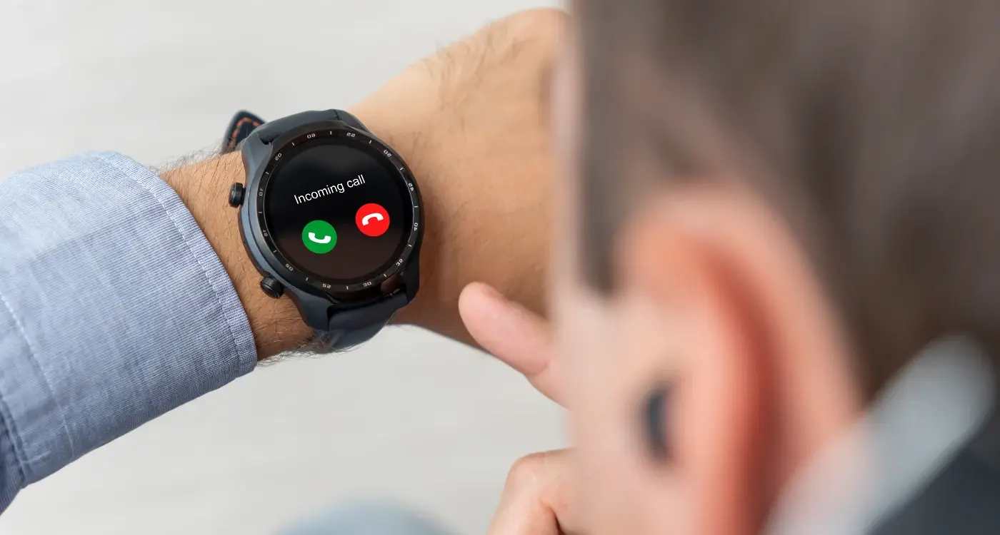
When was the last time you actually noticed the colours on your smartwatch screen? I mean really looked at them, not just glanced to check the time or dismiss a notification. Most people don't think twice about wearable colour design—they just expect everything to work perfectly on that tiny screen strapped to their wrist. But here's the thing: getting colours right for wearables is one of the trickiest challenges we face as app developers.
I've been designing interfaces for wearables since they first started gaining traction, and honestly, it's nothing like designing for phones or tablets. You're working with screens that are often less than two inches across, battling harsh sunlight one minute and complete darkness the next. Your users might be jogging, cycling, or trying to check their heart rate mid-workout—and they need to see everything clearly without squinting or stopping what they're doing.
The colour choices you make can literally determine whether your app gets used or abandoned. Too bright and you'll drain the battery faster than you can say "smartwatch." Too dark and users won't be able to read anything outdoors. Get the contrast wrong and you've just excluded a huge chunk of users who have colour vision difficulties. It's a proper balancing act.
The best wearable interfaces are the ones users never have to think about—they just work, regardless of lighting conditions or user context
What makes this even more complicated is that dark mode wearables have become the standard, but that doesn't mean you can just slap a black background on everything and call it done. Screen visibility, colour accessibility, and battery performance all need to work together. And that's exactly what we're going to explore in this guide—the practical, tested strategies that actually work in the real world.
Understanding Wearable Screen Constraints
Right, let's talk about the elephant in the room—wearable screens are tiny. I mean, really tiny. We're talking about displays that range from about 1.2 to 1.9 inches across, which is roughly the size of a large coin. After years of designing apps for smartphones and tablets, working with these constraints was honestly a bit of a shock to the system.
The pixel density on these devices is actually quite impressive; most modern smartwatches pack between 300-400 pixels per inch. But here's the thing—that doesn't automatically solve your colour problems. You've still got to deal with the fact that users are viewing your interface on a screen thats barely bigger than a postage stamp, often while they're moving around or in bright sunlight.
Ambient Light and Viewing Conditions
Unlike phones that we usually look at indoors or shield with our hands, wearables are constantly exposed to different lighting conditions. I've tested apps that looked perfect in the office but became completely unreadable the moment someone stepped outside. The screen technology matters too—OLED displays (which most premium wearables use) handle bright colours differently than LCD screens, and they can struggle with visibility in direct sunlight.
You know what I've learned? Colour choices that work brilliantly on a 6-inch phone screen can become muddy and indistinguishable on a 1.4-inch watch face. Text that seemed perfectly readable suddenly becomes a squinting exercise. And don't even get me started on trying to differentiate between similar shades when you're looking at the screen while jogging! The key is understanding these limitations from the start, not trying to retrofit a phone design onto a wearable device, especially when it comes to ensuring text remains readable on these miniature displays.
Dark Mode and Battery Performance
Right, let's talk about something that genuinely matters for wearable apps—battery life. I've built plenty of smartwatch apps over the years, and one thing I've learned is that users care more about their device lasting through the day than having the prettiest interface. It's a harsh reality, but it's true.
Dark mode isn't just trendy for wearables; its actually practical. OLED displays (which most modern smartwatches use) work differently than your phone screen—they literally turn off individual pixels to show black. That means a black background uses zero power for those pixels. When I'm designing for Apple Watch or Wear OS, I always start with dark backgrounds because the battery savings can be substantial.
Use pure black (#000000) backgrounds on OLED wearable displays—not dark grey. Every pixel showing true black consumes zero battery power.
The Science Behind Power Consumption
Here's what most developers don't realise: white text on a black background can use up to 60% less power than black text on white backgrounds on OLED screens. That's massive when you're working with a device that needs to last 18+ hours on a single charge. I've seen apps drain batteries simply because they used bright colour schemes.
Practical Implementation
But here's the thing—you can't just make everything black and call it done. Users still need to see your interface clearly, especially during quick glances. I use bright accent colours sparingly: whites, yellows, and vibrant blues for important information only. Everything else stays dark. The key is creating hierarchy through selective brightness rather than flooding the screen with light pixels.
This approach has saved my clients countless support tickets about battery drain. Trust me, a well-designed dark interface that preserves battery life will get you better reviews than a flashy design that dies by lunchtime.
High Contrast Colour Combinations
Right, let's talk about high contrast colour combinations—because honestly, this is where many developers get it completely wrong. I've seen countless wearable apps that look gorgeous on a laptop screen but become completely unreadable the moment you step outside into bright sunlight.
The thing is, wearable screens are tiny and often viewed in challenging lighting conditions. Your users might be checking their smartwatch while jogging at dawn, glancing at their fitness tracker during a sunny afternoon walk, or trying to read notifications in a dimly lit restaurant. That beautiful gradient you spent hours perfecting? It's useless if people can't actually read the text.
The Science Behind High Contrast
Contrast ratios matter more on wearables than any other platform. The Web Content Accessibility Guidelines recommend a minimum contrast ratio of 4.5:1 for normal text, but I always push for at least 7:1 on wearable interfaces. It's not just about accessibility—it's about basic usability.
White text on black backgrounds works brilliantly for dark mode interfaces, giving you excellent readability while preserving battery life on OLED displays. But don't limit yourself to just black and white. Deep navy blues with bright yellow text, or dark forest greens with white text can create striking interfaces that still maintain that all-important readability.
Colour Combinations That Actually Work
Here are the high-contrast combinations I've found most effective across different wearable projects:
- Pure white (#FFFFFF) on deep black (#000000) - classic and battery-friendly
- Bright yellow (#FFD700) on dark navy (#1a237e) - excellent for alerts and warnings
- White (#FFFFFF) on deep purple (#4a148c) - modern and professional
- Lime green (#32CD32) on charcoal (#36454f) - perfect for fitness applications
- Orange (#FF8C00) on dark grey (#2f2f2f) - great for call-to-action elements
The key is testing these combinations on actual devices in real-world conditions. What looks perfect in your design software might fall apart under direct sunlight or in low-light environments where your users actually live.
Accessibility and Colour Vision
Right, let's talk about something that's genuinely close to my heart—making wearable apps work for everyone. I've built apps that looked perfect on my screen but were completely unusable for users with colour vision differences. It's a humbling experience, honestly.
About 8% of men and 0.5% of women have some form of colour vision deficiency. On a tiny wearable screen where every pixel matters, relying solely on colour to convey information is basically shutting out millions of potential users. I learned this the hard way when building a fitness app where red meant "stop" and green meant "go"—but for users with red-green colour blindness? Complete confusion.
Beyond Just Colour Contrast
The WCAG guidelines call for a 4.5:1 contrast ratio for normal text, but on wearables I actually push for even higher contrast when possible. Bright sunlight, movement, and those tiny screens make standard contrast ratios feel inadequate. Dark mode wearables particularly benefit from white or very light text on deep black backgrounds—it's not just about battery life, it's about readability too.
The best wearable interfaces use colour as enhancement, not as the primary way to communicate information
What works brilliantly? Pairing colour with other visual cues. Icons, different shapes, text labels, or animation states. A heart rate zone indicator shouldn't just change from green to red—it should also change size, add a pulsing animation, or include a text warning. This redundancy isn't just good for colour accessibility; it makes your app more usable for everyone when they're jogging in bright sunlight or quickly glancing at their wrist during a meeting.
Colour Psychology for Quick Interactions
When you've got maybe three seconds to get someone's attention on a tiny screen, colour isn't just about looking pretty—it's about getting stuff done fast. I've seen apps fail because users couldn't quickly understand what they were supposed to do, and honestly, it often comes down to poor colour choices.
Red works brilliantly for urgent notifications or stop actions, but use it sparingly or people start ignoring it. Green signals "go" or "good" almost universally, which is why fitness apps love it for achievements. Blue feels trustworthy and calm—perfect for health data or settings. But here's the thing: on a watch face at 6am, bright blue can feel harsh. These principles of colour psychology can significantly impact user engagement even in these micro-interactions.
Quick Decision Colours
For wearable interactions, you need colours that trigger instant recognition. Users shouldn't have to think about whether that button means "yes" or "cancel." I always recommend using these psychological shortcuts:
- Orange or yellow for warnings that need attention but aren't emergencies
- White or light grey for neutral actions like "view more"
- Deep red for destructive actions like "delete" or "end workout"
- Soft green for confirmations and positive feedback
- Muted purple or blue for secondary actions
The key insight I've learned over the years? Don't fight against what people already expect. If you make your "confirm" button red and your "cancel" button green, users will make mistakes. Every single time.
Actually, context matters too. A red heart in a dating app means love, but a red button in a medical app suggests danger. The same colour can trigger completely different emotional responses depending on where it appears and what surrounds it.
Platform-Specific Design Guidelines
Here's where things get a bit tricky—each wearable platform has its own personality when it comes to colour handling. Apple Watch, Wear OS, and fitness trackers all display colours differently, and what looks brilliant on one device might appear washed out or overly saturated on another.
Apple Watch displays tend to be more vibrant and colour-accurate than most competitors. They handle subtle gradients well, so you can get away with more nuanced colour choices. But here's the thing—Apple's Human Interface Guidelines strongly recommend using pure black backgrounds for battery efficiency. Their own apps use deep blacks with white or bright accent colours like their signature blue (#007AFF) and green (#30D158).
Wear OS devices are all over the place in terms of screen quality. Some Samsung watches have gorgeous AMOLED displays that make colours pop, while budget options can make even the best colour schemes look muddy. I always test on multiple Wear OS devices because what works on a Galaxy Watch might look completely different on a cheaper alternative. Stick to high-contrast combinations and avoid relying on subtle colour differences to convey important information.
Fitness Tracker Considerations
Fitness trackers like Fitbit or Garmin present their own challenges. Many still use monochrome or limited colour displays. Even the colour ones often have restricted palettes—sometimes just 8 or 16 colours total. For these devices, you're basically working with primary colours and high contrast combinations. Think red, blue, green, white, and black.
Always check each platform's official design documentation before finalising your colour scheme. Apple, Google, and Samsung all publish specific colour recommendations that can save you hours of testing and revision.
The key is designing for the lowest common denominator while still taking advantage of better displays when available. Test early, test often, and don't assume your colour choices will translate perfectly across platforms. Before you submit, make sure you understand the specific approval requirements for each platform's app store.
Testing Colour Schemes on Real Devices
Here's the thing about wearable colour schemes—what looks perfect on your computer screen will often look completely different on an actual smartwatch. I can't tell you how many times I've seen developers get caught out by this; they spend ages perfecting their colour palette on a large monitor, only to discover it looks washed out or barely visible on the tiny watch screen they're actually targeting.
The biggest issue is brightness. Most wearables have automatic brightness adjustment that changes throughout the day. Your beautiful subtle colour gradients might work perfectly indoors but become invisible in bright sunlight. I always test colour schemes across different lighting conditions because thats when you discover whether your choices actually work in real-world situations.
Essential Testing Scenarios
Testing your colour schemes properly means putting them through their paces in various conditions. You need to check how they perform when users are actually wearing the device, not just when its sitting on your desk.
- Direct sunlight exposure—colours often appear completely different outdoors
- Low light conditions where screens automatically dim
- Different wrist angles and viewing positions
- During physical activity when the screen might be bouncing around
- Various skin tones as backgrounds (this affects how colours are perceived)
One thing that always surprises people is how much the bezels and surrounding materials affect colour perception. A black bezel makes colours appear brighter whilst silver ones can wash them out. I recommend testing on multiple device models if possible because each manufacturer calibrates their displays differently.
Battery level also plays a role—many wearables reduce display brightness and colour saturation when battery gets low. Your carefully chosen colour scheme needs to remain functional even when the device switches into power-saving mode. Otherwise, you'll have users struggling to read their watch when they need it most. This is why preparing thorough documentation of your testing scenarios is crucial for app store submissions.
Conclusion
After years of developing wearable apps across different platforms and devices, I can honestly say that getting the colour schemes right makes or breaks the user experience. It's not just about making things look pretty—though that certainly helps—it's about creating interfaces that people can actually use when they're rushing for a train or checking their heart rate during a workout.
The fundamentals we've covered aren't going anywhere anytime soon. Dark mode wearables will continue dominating because they simply make sense for battery life and outdoor visibility; high contrast combinations will always be your best friend for quick glances; and accessibility considerations aren't optional—they're table stakes for any serious wearable app.
What I find fascinating is how colour psychology plays such a massive role in these tiny interactions. You've got maybe two seconds to communicate information through your interface, and the right colour choices can make that communication instant and intuitive. Get it wrong? Users will struggle to parse information or worse, they'll just stop using your app altogether.
The platform-specific guidelines from Apple and Google exist for good reasons—they've done the hard work of testing what actually works on real wrists in real conditions. Sure, you can push boundaries and be creative, but understand the rules before you break them.
My biggest piece of advice? Test everything on actual devices in actual lighting conditions. Your beautiful design on a desktop monitor means nothing if users can't see it properly when they're standing in bright sunlight checking their notifications. Screen visibility under different conditions will make or break your wearable colour design, and there's simply no substitute for real-world testing.
Share this
Subscribe To Our Learning Centre
You May Also Like
These Related Guides
What Are the Key Principles of Wearable App Information Architecture?
What Are the Essential Gestures for Wearable App Interaction?