Nearly 70% of mobile apps fail within their first year of international launch due to cultural missteps—and most of these failures could have been avoided with proper planning. I've spent years helping brands expand their apps globally, and I can tell you that what works brilliantly in London might completely backfire in Tokyo or Delhi. The difference between success and failure often comes down to understanding one simple truth: culture shapes everything about how people interact with technology.
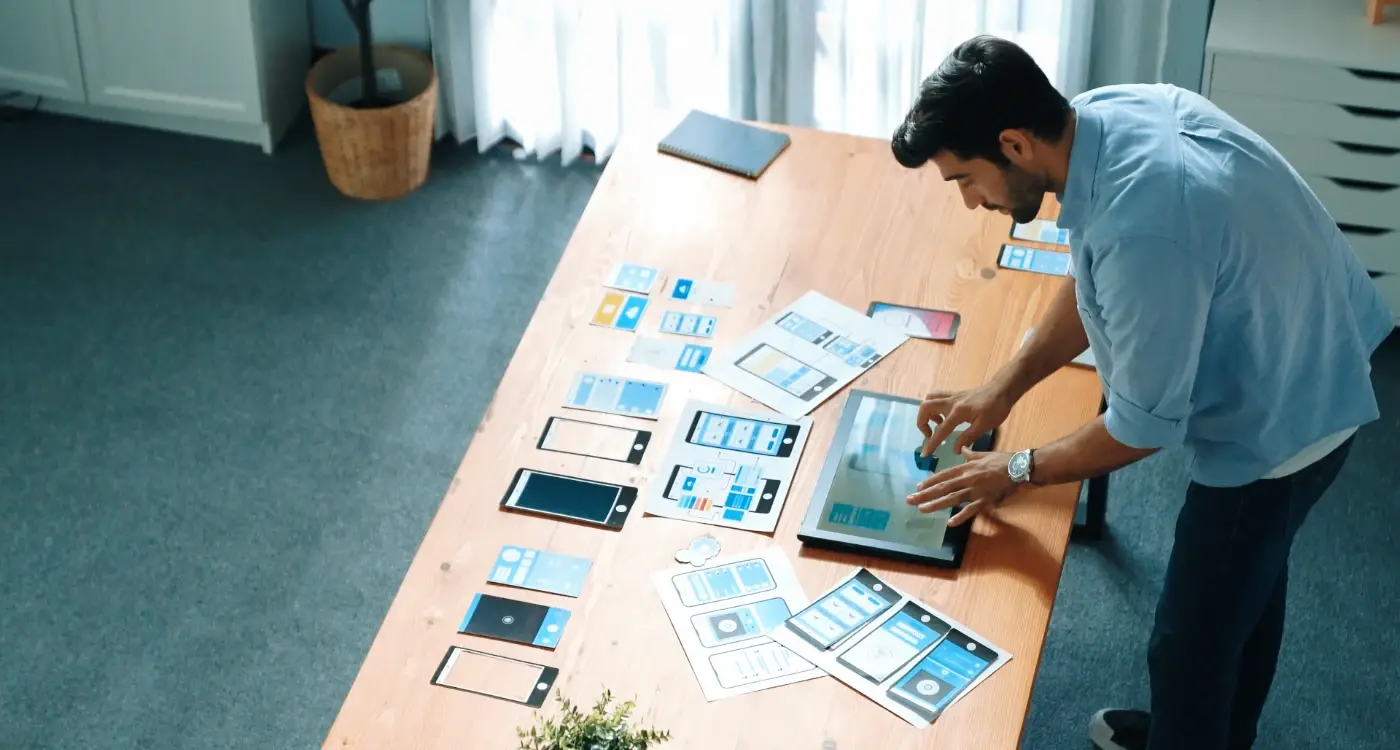
When we talk about building an international app, we're not just discussing translation. That's the easy bit, really. The real challenge lies in understanding the deeper cultural currents that influence how people perceive colours, symbols, navigation patterns, and even basic user interface elements. A thumbs-up icon might seem universally positive, but in parts of the Middle East, it's considered offensive. Red might symbolise luck in China, but in South Africa, it can represent mourning.
The most expensive mistake you can make is assuming that good design is universal—what delights users in one country can genuinely upset them in another.
This guide will walk you through the specific cultural pitfalls that can derail your app's international success. We'll explore everything from religious symbols that could cause serious offence to seemingly innocent design choices that might confuse or alienate users. App localisation isn't just about making your product accessible—it's about showing respect for the people who'll be using it. Get it right, and you'll build trust with new audiences; get it wrong, and you might find yourself dealing with negative reviews, poor adoption rates, and potentially lasting damage to your brand's reputation in key markets.
Understanding Cultural Sensitivity in App Design
Cultural sensitivity in app design isn't just about being polite—it's about creating products that actually work for people around the world. After years of developing apps for global markets, I can tell you that what seems perfectly normal in one country can be completely inappropriate or confusing in another. The difference between success and failure often comes down to understanding these cultural nuances.
When we talk about cultural sensitivity, we're really talking about respect. Respect for different ways of thinking, different traditions, and different values. This goes way beyond just translating your app into different languages; it's about understanding how people from different backgrounds interact with technology and what they expect from digital experiences.
Why Cultural Mistakes Matter
A single cultural misstep can destroy months of development work and marketing investment. Users will delete your app faster than you can say "cultural faux pas" if they feel offended or excluded. But here's the thing—most of these mistakes are completely avoidable with a bit of research and planning.
Key Areas to Consider
Cultural sensitivity touches every part of your app design. Here are the main areas where cultural differences can make or break your user experience:
- Religious symbols and imagery that might be sacred or forbidden
- Colour choices that carry different meanings across cultures
- Text direction and reading patterns that vary by language
- Social customs that affect how people interact with apps
- Visual elements that don't translate across cultural boundaries
Getting these right means doing your homework before you launch. It means testing with real users from your target markets and being willing to make changes based on their feedback. Trust me, it's worth the extra effort.
Common Religious and Cultural Symbols That Can Cause Problems
Religious and cultural symbols can make or break your international app before users even get past the loading screen. I've worked on projects where a simple icon choice caused massive backlash in certain markets—something that could have been avoided with proper research.
The cross is probably the most obvious example. Whilst it's widely recognised in Western countries, using it in your app's interface can alienate users in non-Christian regions or countries where religious symbols in commercial contexts are frowned upon. The same goes for the Islamic crescent moon and star, which might seem like a safe decorative element but can cause serious offence if used inappropriately.
Hand Gestures and Body Language
Hand symbols are particularly tricky territory for your international app localisation efforts. The thumbs-up gesture, commonly used for "like" buttons, is considered rude in parts of the Middle East. The "OK" hand sign means "money" in Japan and can be offensive in Brazil. Even something as simple as pointing fingers can cause problems—many Asian cultures find it disrespectful.
Animal Symbolism
Animals carry different meanings across cultures too. Owls represent wisdom in Western countries but are seen as bad omens in some parts of Africa and Asia. Pigs are obviously problematic in Islamic countries, whilst cows can cause issues in Hindu communities if portrayed inappropriately.
Always test your app's visual elements with local focus groups before launching in new markets. What seems innocent to you might carry deep cultural significance elsewhere.
The safest approach? Keep religious and cultural symbols out of your app design altogether, or work with local consultants who understand the nuances of each market you're targeting.
Colour Meanings Around the World
Colours carry different meanings across cultures, and what feels positive in one country might be deeply offensive in another. I've seen apps fail spectacularly because the designers assumed their colour choices would work everywhere—they don't.
Red is a perfect example of how tricky this gets. In China, red means luck, prosperity and celebration; it's the colour of joy and good fortune. But in South Africa, red represents mourning and death. Using a bright red interface for a financial app might work brilliantly in Beijing whilst completely alienating users in Johannesburg.
Religious and Cultural Context Matters
White seems safe, right? Wrong. Western cultures associate white with purity and cleanliness—think wedding dresses and medical environments. But across much of Asia, white is the colour of death and mourning. A health app with a white background might feel sterile and professional to European users but could make Asian users deeply uncomfortable.
Green faces similar challenges. Islamic cultures view green as sacred and holy, the colour of paradise. Using green carelessly in decorative elements or casual contexts could be seen as disrespectful. Meanwhile, green represents jealousy in some Western contexts but nature and growth in others.
Making Smart Colour Choices
Purple historically meant royalty and wealth because purple dye was expensive to produce. Some cultures still hold this association strongly. In Thailand, purple is reserved for mourning widows—not exactly the vibe you want for a dating app.
The safest approach is researching your target markets thoroughly before settling on a colour palette. Consider offering different themes for different regions, or stick to neutral colours that translate more universally. For detailed guidance on this topic, understanding how to localise images and colours for different cultures can help you avoid costly mistakes. Blue tends to be one of the safer choices globally, representing trust and reliability across most cultures.
Text Direction and Language Considerations
When you're developing an international app, text direction can make or break the user experience. It sounds simple enough—English reads left to right, so that's how we design everything. But here's where things get tricky: Arabic, Hebrew, Urdu, and Persian all read right to left. That means your entire interface needs to flip like a mirror image.
I've worked on apps where developers thought they could just translate the text and call it done. Wrong! The back button that sits in the top-left corner for English users? It needs to move to the top-right for Arabic users. Navigation menus, progress bars, even the way content flows down a page—it all changes direction.
More Than Just Translation
Language localisation goes deeper than swapping words. German text can be 30% longer than English, which means your beautiful button designs might break completely. Japanese uses different writing systems that stack vertically in traditional formats, though modern apps usually stick to horizontal layouts.
The biggest mistake companies make is treating localisation as a last-minute add-on rather than building it into the foundation of their app architecture
Technical Challenges You'll Face
Your app's code needs to handle bidirectional text properly—that's called BiDi support in developer circles. Phone numbers, dates, and addresses format differently across countries too. A UK postcode looks nothing like a US zip code, and don't get me started on how Europeans write their dates compared to Americans.
The smart approach? Build flexibility into your design system from day one. Use dynamic layouts that can expand and contract; test your interface with longer text strings; and remember that some languages need more vertical space for characters with accents or special marks.
Social Customs and User Behaviour Differences
The way people interact with their phones varies massively from country to country—and I mean massively. What feels natural and intuitive in one culture can feel completely wrong in another. These differences run much deeper than just language or colours; they're about how people actually behave and what they expect from technology.
Take gesture controls, for example. Swiping left might seem like a universal action, but in some cultures, the direction you swipe carries meaning. In many Middle Eastern countries, swiping right to left feels more natural because that's how they read. But it goes beyond reading direction—it's about what feels respectful and appropriate.
Personal Space in Digital Design
Different cultures have very different ideas about personal information and privacy. In some countries, people are happy to share lots of personal details right away. In others, asking for too much information too quickly feels invasive and rude. Your app's onboarding process needs to reflect these expectations, or users will simply delete it.
Social Interaction Patterns
The way people communicate also shapes how they use apps. Some cultures prefer direct, straightforward interactions—they want to get things done quickly. Others expect more formal, polite exchanges, even with an app. Your error messages, notifications, and help text all need to match these cultural expectations.
Age and hierarchy matter too. In some cultures, apps need to show respect for older users or people in positions of authority. This might affect how you design user profiles, review systems, or social features. Getting these social dynamics wrong won't just confuse users—it could genuinely offend them. Understanding how different age demographics interact with apps can provide valuable insights for this challenge.
Visual Design Elements That Don't Translate Well
When I'm working on an international app project, one of the trickiest parts is spotting visual elements that seem perfectly normal to us but could confuse or upset users elsewhere. It's not just about making things look pretty—it's about making sure they make sense to everyone who'll use your app.
Hand gestures are probably the biggest visual minefield you'll encounter. That thumbs-up icon we love so much? In parts of the Middle East, it's considered quite rude. The "OK" sign with your thumb and finger making a circle means "worthless" in France and can be offensive in Brazil. Even pointing fingers can cause problems; many cultures find it impolite or aggressive.
Icons That Create Confusion
Religious symbols pop up in design more often than you'd think. A simple cross might represent a hospital or first aid to Western users, but could be problematic in non-Christian countries. Stars can have religious meanings too—the Star of David, for instance, carries specific cultural weight that might not be appropriate for your app's context.
Always test your visual elements with native users from your target markets before launching. What seems harmless to you might have a completely different meaning elsewhere.
Common Visual Elements to Watch
- Hand gesture icons (thumbs up, pointing fingers, OK signs)
- Religious symbols used as general icons
- Animals that have negative cultural associations
- Facial expressions that don't translate universally
- Numbers with cultural significance (like 4 in East Asian countries)
The solution isn't to avoid all potentially problematic visuals—that would make for boring apps! Instead, research your target markets thoroughly and consider creating region-specific versions of your interface when localising your international app. If you're building for the travel sector specifically, ensuring your travel app works well in different countries requires additional considerations around cultural sensitivity.
Conclusion
Building apps for a global audience isn't just about translating text from one language to another—it's about understanding that different cultures see the world in completely different ways. We've covered quite a bit of ground here, from religious symbols that might upset users to colours that mean completely different things depending on where you live. The truth is, what works perfectly in your home country might be totally wrong somewhere else.
I've seen too many app launches go wrong because someone didn't think about these cultural differences beforehand. A simple colour choice or an innocent-looking symbol can turn potential users away before they even try your app. That's not just bad for business—it's completely avoidable if you plan ahead.
The good news? Most of these mistakes are easy to fix once you know what to look for. Simple things like checking what your chosen colours mean in different cultures, making sure your text works with different reading directions, and being careful with religious or cultural symbols can save you from major problems later on. Of course, implementing these changes properly requires investment—understanding the costs of proper mobile app localisation helps you budget effectively for success.
Testing with real users from your target markets is worth its weight in gold. You might think something looks fine, but actual users from that culture will spot problems you'd never notice. Don't skip this step—it's often the difference between an app that succeeds globally and one that crashes and burns in certain markets. Cultural sensitivity in app design isn't just nice to have anymore; it's absolutely necessary if you want to succeed worldwide.