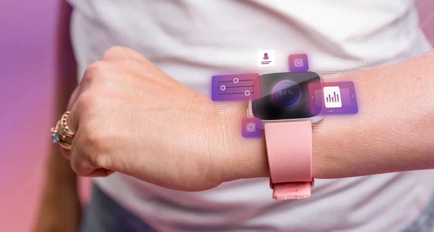
What Design Patterns Should You Avoid in Wearable Applications?
Wearable apps are failing left and right, and it's not because the technology isn't ready—it's because designers keep making the same bloody mistakes over and over again. I've seen brilliant concepts crash and burn because someone thought they could just shrink down their phone app and call it a day. The thing is, designing for wearables isn't just about making things smaller; its a completely different beast that requires rethinking how people interact with technology.
After building wearable apps for everything from fitness tracking to medical monitoring, I've watched teams waste months of development time because they didn't understand the unique constraints of wrist-based interfaces. The screen real estate is tiny, users attention spans are even tinier, and battery life? Well, that's always hanging over your head like a sword. But here's what really gets me—most of these problems are completely avoidable if you know what pitfalls to dodge from the start.
The biggest mistake in wearable design is assuming users will behave the same way they do with their phones, when in reality they want the exact opposite experience
The patterns that work brilliantly on smartphones often become complete disasters on smartwatches and fitness trackers. Complex navigation systems that feel intuitive on a 6-inch screen become exercises in frustration on a 1-inch display. Dense information layouts that users happily scroll through on their phones become unreadable messes on wearables. And don't even get me started on the apps that ignore context entirely—asking users to input detailed information while they're mid-workout or driving.
This guide walks through the most common design mistakes I see teams make when building wearable applications, and more importantly, how to avoid them before they torpedo your project.
Cramming Desktop Interfaces Into Tiny Screens
Right, let's talk about one of the biggest mistakes I see developers make when they're building wearable apps. They take their existing mobile interface—or worse, their desktop interface—and just shrink it down to fit a smartwatch screen. It's like trying to fit a three-course meal into a teacup; technically possible but absolutely miserable for everyone involved.
I've seen apps with dropdown menus, complex forms, and multi-column layouts all squeezed onto a 1.4-inch display. The result? Users end up stabbing at tiny buttons with their finger, accidentally triggering the wrong actions, and generally having a terrible time. Your smartwatch isn't a miniature phone—it needs its own design language that actually makes sense for the platform.
The Problems With Direct Interface Translation
When you directly port desktop or mobile interfaces to wearables, several issues immediately surface. First, touch targets become impossibly small; second, information density becomes overwhelming; and third, the cognitive load shoots through the roof because users cant process that much visual information on such a tiny screen.
- Touch targets smaller than 44 pixels become unusable
- Text that requires scrolling defeats the quick-glance purpose
- Multiple action buttons create decision paralysis
- Complex navigation patterns don't work with limited screen real estate
- Desktop hover states have no wearable equivalent
Instead of cramming everything in, focus on the one or two most important actions users need on their wrist. A fitness app doesn't need a full settings menu on the watch—it needs start, stop, and maybe pause. That's it. The detailed configuration can stay on the phone where it belongs, with a proper keyboard and screen space to make those choices comfortable.
Ignoring Battery Life in Your Design Choices
Battery life on wearables is absolutely critical—we're talking about devices that people need to charge every day or two at best. I've seen too many apps that look gorgeous but drain the battery so fast that users uninstall them within hours. It's honestly one of the quickest ways to kill your app's success.
The biggest culprits? Always-on displays with bright white backgrounds, constant GPS tracking, and animations that run continuously. Sure, that spinning loading icon looks nice, but it's basically telling the processor to work overtime for no good reason. Dark backgrounds aren't just trendy on wearables—they genuinely save power on OLED screens by keeping pixels off.
I mean, think about it from the user's perspective. They've got their smartwatch helping them through their day, tracking workouts, showing notifications, maybe even making payments. But if your app kills their battery by lunchtime? They'll blame your app first, not the ten others they're running.
Always test your wearable app's battery impact over a full day of typical use, not just during short development sessions.
Common Battery-Draining Design Mistakes
- Using bright white or light-coloured backgrounds instead of dark themes
- Keeping the screen active longer than necessary with complex animations
- Updating data too frequently when users aren't actively looking
- Using high-resolution images that require more processing power
- Implementing haptic feedback for every single interaction
The solution isn't to make boring apps—it's about being smart with your design choices. Use the watch's ambient mode properly, implement smart refresh rates, and remember that sometimes less really is more when you're working with a device that lives on someone's wrist.
Making Users Navigate Complex Menu Systems
Right, let's talk about one of the biggest mistakes I see in wearable app design—creating menu systems that belong on a desktop computer, not on someone's wrist. I mean, we're talking about screens that are barely bigger than a postage stamp here, yet I still see developers trying to cram in multi-level navigation menus that would make a website jealous.
The thing is, when someone glances at their smartwatch, they want information quickly. They don't want to tap through three different menu levels just to check their heart rate or start a workout. But here's what I see happening way too often: apps with hamburger menus, dropdown lists, and navigation patterns that require precise finger movements on a screen thats about the size of a biscuit.
Keep Navigation Simple and Direct
Your wearable app should follow what I call the "two-tap rule"—users should be able to reach any major function within two taps maximum. Any more than that and you're asking them to perform surgery with their fingertip whilst they're rushing to catch the bus.
The most successful wearable apps I've built use these navigation patterns instead:
- Single swipe gestures between main screens
- Large, thumb-friendly buttons for primary actions
- Voice commands for complex functions
- Digital crown integration where available
- Context-aware shortcuts that appear based on time or activity
Look, I get it—you want to pack loads of features into your app. But on wearables, less really is more. Focus on the three most important things your users need, make those dead simple to access, and hide everything else behind voice commands or companion phone apps. Trust me, your users will thank you for it.
Overlooking Accessibility for Different Abilities
This one's honestly a bit embarrassing for our industry. I've seen way too many wearable apps that completely ignore users with different abilities—and it's not just morally wrong, its also terrible business. We're talking about missing out on a huge market of potential users who genuinely need these devices more than anyone else.
Wearable accessibility isn't just about making text bigger (though that helps too). Think about users with motor impairments who might struggle with tiny touch targets, or people with visual impairments who rely on haptic feedback and voice commands. Your Apple Watch app might look sleek, but if someone can't actually use it because you've made all the buttons too small or ignored VoiceOver support, you've failed as a designer.
Common Accessibility Mistakes in Wearables
The biggest mistake? Assuming everyone interacts with their device the same way you do. I've worked on projects where the design team never considered that some users might not be able to raise their wrist to wake the screen, or that haptic feedback might be the primary way someone navigates your interface. Color-only indicators are another nightmare—if you're using red and green to show status without any other visual cues, you're excluding users with colour blindness entirely.
Good accessibility design benefits everyone, not just users with specific needs—it creates clearer, more intuitive interfaces that work better for all users
The solution starts early in your design process. Build in support for system accessibility features from day one, test your haptic patterns with actual users, and make sure your voice commands work properly. Most wearable platforms have solid accessibility frameworks—you just need to actually use them instead of treating them as an afterthought.
Creating Text That's Too Small to Read
Right, let's talk about something that drives me absolutely mental—tiny text on wearable screens. I mean, seriously? You've got a screen that's smaller than a biscuit, and designers are still trying to cram paragraphs of text onto it like it's a desktop monitor.
Here's the thing about wearable devices: people aren't sitting at a desk with perfect lighting when they use them. They're jogging at dawn, checking notifications in bright sunlight, or glancing at their watch whilst walking down the street. If your users need to squint or hold their wrist two inches from their face, you've failed before they even try to read what you've written.
The minimum font size for wearable text should be 14pt, but honestly? Go bigger when you can. Apple recommends 16pt as a comfortable baseline for Watch apps, and they know what they're talking about. Don't try to be clever with thin fonts either—they look elegant on paper but disappear on tiny screens.
Typography Best Practices for Wearables
- Use bold or medium font weights instead of light or thin
- Stick to 1-2 font sizes maximum per screen
- Keep line spacing generous—cramped text is harder to read
- Test readability in various lighting conditions
- Prioritise contrast over aesthetics
One client wanted to display entire email previews on their smartwatch app. The text was so small it looked like ant footprints! We redesigned it to show just the sender and subject line in large, readable fonts. User engagement went up by 40% because people could actually see what they were looking at.
Remember: if your grandmother can't read it whilst wearing her reading glasses, it's too small. Trust me on this one. Following proper mobile typography best practices becomes even more critical when dealing with wearable screens.
Forcing Too Many Features Into One Screen
This is probably the biggest mistake I see when reviewing wearable app designs. Developers get excited about all the cool things their app can do and try to cram everything onto one tiny screen. It's a bit mad really—you've got maybe 1-2 inches of screen real estate and you're trying to fit buttons, text, images, and navigation all at once.
I mean, think about it from the user's perspective. They're wearing your app on their wrist, probably checking it quickly while doing something else. Maybe they're running, cooking, or in a meeting. The last thing they want is to play "hunt the button" on a cluttered interface that requires a magnifying glass to use properly.
Here's the thing—wearable screens work best when they focus on one primary action per screen. That doesn't mean your app can only do one thing; it means each screen should have one clear purpose. Show the time. Display a notification. Start a workout. Pay for something. One thing at a time.
Follow the "thumb rule"—if users can't easily tap what they need with their thumb in under 3 seconds, you've got too much on screen.
The temptation is always there to add "just one more feature" to a screen because it seems convenient. But what actually happens is you create cognitive overload. Users end up tapping the wrong things, getting frustrated, and eventually abandoning your app altogether. I've seen this pattern destroy otherwise brilliant wearable apps because the team couldn't resist feature creep on individual screens.
Keep it simple. One screen, one job. Your users will thank you for it, and your app will actually get used instead of deleted after the first frustrating experience.
Designing Without Considering Context of Use
Here's the thing about wearable apps—people don't use them the same way they use their phones. I mean, when was the last time you sat down at a desk to carefully navigate through your smartwatch? Never, right? But I've seen countless designs that seem to expect exactly that kind of focused attention.
The context of wearable use is completely different from mobile or desktop. Your users might be jogging, cooking dinner, or sitting in a meeting when they glance at their device. They've got about 2-3 seconds of attention to give you, and their hands might be occupied or shaky. Yet so many apps I've reviewed act like users have all the time in the world to explore complex interfaces.
Quick Glances vs Deep Interactions
Wearables are glanceable devices, not interaction devices. The best wearable apps I've built focus on delivering the right information at the right moment without requiring input. Think about it—if someone needs to tap multiple buttons on their watch, wouldn't it be easier to just pull out their phone?
Context also means understanding when and where people use your app. A fitness tracker makes sense during workouts, and ensuring accurate exercise tracking data becomes crucial for these apps. But a complex productivity app? Not so much. I always ask clients to walk me through a typical day of their target user and identify the exact moments when they'd realistically interact with the wearable version.
Environmental Factors
Don't forget about lighting conditions either. That beautiful dark theme might look terrible in bright sunlight, and vibrant colours can be impossible to read in dim lighting. The physical context matters just as much as the situational one—and honestly, most designers completely overlook this until its too late.
Testing Only on Perfect Conditions
This is probably one of the biggest mistakes I see teams making when developing wearable apps—and honestly, its one that can completely destroy your user experience once people start using your app in the real world. You know what I mean? You test your fitness tracker app while sitting at your desk in perfect lighting, with a full battery and stable WiFi. But your users will be wearing it during their morning jog in the rain, with sweaty wrists and gloves on.
I've seen this play out so many times over the years. A team builds this gorgeous heart rate monitoring interface that works perfectly in their climate-controlled office. Then users start complaining that the screen is impossible to read in direct sunlight, the touch sensors don't work when their hands are wet, and the app crashes when the device gets too hot during outdoor workouts. It's a bit mad really—we're designing for devices that people wear everywhere, yet we only test them in ideal conditions.
The difference between lab testing and real-world usage is where most wearable apps fail to deliver on their promises
Your smartwatch app needs to work when someone's walking their dog at 6am in winter darkness, when they're cooking dinner with flour on their fingers, or when they're trying to check their schedule while carrying shopping bags. Test in bright sunlight, test with wet hands, test when the battery is at 10%. Test while walking, running, even while people are talking. Because that's when your users actually need your app to work—not when everything's perfect.
Once you've perfected your app through rigorous real-world testing, you'll want to navigate the smartwatch approval process to get your app into users' hands.
Conclusion
After years of building wearable apps—and honestly, making quite a few mistakes along the way—I can tell you that the patterns we've covered aren't just theoretical problems. They're the real issues that kill user adoption and drain your development budget faster than you'd expect.
The thing about wearable design is that it forces you to strip everything back to what actually matters. You can't hide poor decisions behind flashy animations or extra features. If your user cant complete their task in under 10 seconds while walking down the street, you've probably gone wrong somewhere.
I've seen too many teams spend months building beautiful wearable apps that nobody uses because they tried to cram a smartphone experience onto a watch face. Or they forgot that people wear these devices for 16 hours a day and wonder why users complain about battery life. The successful projects? They're the ones that embrace the constraints rather than fight them.
Sure, wearable development has its challenges—the screens are tiny, the interaction methods are limited, and the technical constraints can be frustrating. But that's also what makes it interesting. When you get it right, you're creating something that genuinely fits into people's lives without getting in the way.
My advice? Start simple, test early, and remember that less is usually more when it comes to wearables. Focus on solving one problem really well rather than trying to be everything to everyone. Your users will thank you for it, and your app store ratings will too.
Share this
Subscribe To Our Learning Centre
You May Also Like
These Related Guides
How Do You Make Wearable Apps Simple Enough for Anyone?
What Colour Schemes Work Best for Wearable App Interfaces?