What Drives First Impression Bias in App Store Discovery?
Most users make their download decision within the first seven seconds of viewing an app in the store. Seven seconds! That's barely enough time to read the app's description, let alone understand what it actually does. Yet in those precious moments, potential users are forming judgements that will determine whether your months of development work gets a chance to shine or gets scrolled past forever.
I've watched this happen countless times with clients' apps—brilliant products that solve real problems but struggle because their first impression doesn't match their actual value. It's honestly one of the most frustrating things about app marketing. You can build the most useful, well-designed app in the world, but if your icon looks outdated or your screenshots don't immediately communicate value, you're fighting an uphill battle from day one.
The human brain processes visual information 60,000 times faster than text, which means your app icon and screenshots are doing most of the heavy lifting before users even read your description.
What makes this even trickier is that first impression bias doesn't just affect whether someone downloads your app—it influences how they experience it once they've got it installed. If they downloaded expecting one thing based on your store listing, but the app delivers something slightly different, that disconnect creates immediate friction. And we all know how unforgiving mobile users can be when an app doesn't meet expectations right from the start. This guide will walk you through exactly how these split-second decisions happen and, more importantly, how you can influence them in your favour.
The Psychology Behind Split-Second App Decisions
When someone opens the App Store, they're not browsing leisurely like they would in a bookshop. They're making lightning-fast decisions—we're talking about 2-3 seconds per app listing. It's mad really, but that's how the human brain works when it's overwhelmed with choice.
I've watched countless user testing sessions over the years, and the pattern is always the same. People scan, judge, and move on before they've even read the app description. Their brain is doing this weird thing called "thin-slice judgement"—basically making complex decisions with minimal information. And honestly? Most of the time, these snap decisions are surprisingly accurate.
The Cognitive Shortcuts Your Users Take
Your potential users aren't being lazy; they're being efficient. When faced with thousands of apps, the brain uses shortcuts to filter options quickly. Here's what actually happens in those first few seconds:
- Visual pattern recognition kicks in immediately—they're looking for professional design cues
- Social proof scanning—their eyes dart straight to ratings and download numbers
- Brand familiarity assessment—do they recognise the developer or app name?
- Category expectation matching—does this look like what they were searching for?
But here's the thing that really gets me—people make emotional decisions first, then justify them rationally later. That initial gut reaction when they see your app icon? That's not logic talking, that's pure emotion. If your app doesn't trigger the right emotional response in those first milliseconds, all the features and benefits in the world won't matter.
Why Context Matters More Than You Think
The user's mental state when they discover your app changes everything. Someone frantically searching for a taxi app at midnight has completely different decision-making patterns than someone casually browsing games on Sunday morning. Understanding this context—and designing your app store presence accordingly—can make the difference between getting that download or being scrolled past forever.
When someone spots your app in the store, they're making judgements faster than you can blink. I'm talking milliseconds here—not enough time to read your description or check features, but plenty of time to decide whether your app looks trustworthy or amateurish.
The visual hierarchy of your app store listing works like a funnel. Your icon grabs attention first, then screenshots tell the story, and finally the description seals the deal. But here's the thing—most people never make it past those first two elements if they don't pass the visual test.
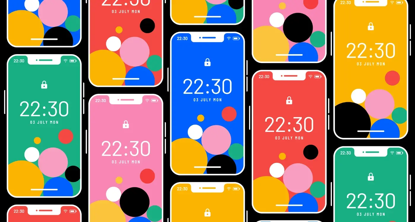
Icons That Actually Work
Your app icon needs to be readable at thumbnail size because that's how most people will first see it. I've seen brilliant apps with cluttered icons that try to show everything the app does; it's a mistake that costs downloads every single day. The best icons focus on one clear visual concept that represents the app's core function.
Colour psychology plays a huge role here too. Fitness apps often use energetic reds and oranges, while productivity apps lean towards calming blues and greens. It's not just about looking pretty—it's about fitting user expectations for your category whilst still standing out from the crowd.
Screenshots Tell Your Story
Your screenshots should work like a movie trailer, showing the most compelling parts of your app experience. The first screenshot is absolutely critical because it appears in search results. This isn't the place to show your login screen or onboarding—lead with the screen that demonstrates your app's main value.
Test your icon at actual App Store thumbnail size on different devices. If you can't instantly tell what it represents when it's tiny, neither can your potential users.
App Icons and Screenshots That Actually Convert
Right, let's talk about the visual stuff that actually matters. I've seen thousands of app icons over the years and honestly? Most of them are terrible. Not because they're ugly—though some definitely are—but because they don't do their job.
Your app icon has about 0.3 seconds to grab someone's attention. That's it. And in that tiny window, it needs to communicate what your app does, who its for, and why someone should care. No pressure, right?
The apps that convert best tend to follow a few simple rules. First, they're readable at tiny sizes. You know how your icon looks great at 1024x1024 pixels? Well, most people will see it at 60x60 pixels or smaller. If they cant tell what it is at that size, you've lost them.
Colour matters more than you think. Apps with high contrast icons perform better in search results because they stand out against the white background. I always tell my clients to test their icons in greyscale first—if it works without colour, it'll definitely work with it.
Screenshots That Tell a Story
Screenshots are where you can really show off what your app does. But here's the thing most people get wrong—they just show the interface. That's boring. Users don't care what your screens look like; they care what your app will do for them.
The best converting screenshots show the app solving real problems. Instead of just showing your login screen, show how quickly someone can get signed in. Instead of displaying your settings menu, show the customisation options that make the app theirs.
And please, for the love of all that's holy, put your most compelling screenshot first. You might get someone to swipe through two or three images, but probably not five.
How User Reviews Shape Perception Before Download
You know what's mad? Most people make their download decision within seconds of seeing an app's review section. Not from reading every single review—that would take forever—but from a quick glance at the star rating and maybe the first couple of comments that pop up.
I've watched this happen countless times when testing apps with real users. They scroll down, see 4.2 stars, and their brain has already decided whether this app is worth their time. If they see anything below 3.5 stars? Game over. They're back to scrolling through alternatives before you can say "but wait, read the actual feedback!"
The Power of Social Proof in Action
Here's the thing about reviews—people don't just read them for information; they use them as a shortcut for trust. When someone sees 200 five-star reviews, they're not thinking "I wonder what these people liked about the app." They're thinking "200 people can't be wrong, right?"
The first three reviews visible on your app store page carry more weight than the next 50 combined when it comes to download decisions
But it gets more interesting than that. Users scan for their own concerns in reviews. If they're worried about battery drain, they'll look for mentions of that specific issue. If someone's considering a fitness app but they're not very tech-savvy, they'll scan for words like "complicated" or "confusing" in the negative reviews.
Recent Reviews Matter Most
This is where many app developers get it wrong—they think overall rating is everything. Actually, users pay more attention to recent reviews than old ones. An app with 4.8 stars but recent complaints about crashes will perform worse than an app with 4.3 stars but glowing recent feedback. People want to know what the experience is like right now, not six months ago when you launched. Understanding how to handle negative reviews is crucial for maintaining a positive first impression.
The Role of App Store Positioning and Rankings
Here's something I've learned after years of watching apps rise and fall in the rankings—where your app sits in search results basically determines whether you exist or not. I mean, when did you last scroll to page three of App Store results? Exactly. Most users don't go beyond the first handful of apps they see, which means your position is make-or-break territory.
The psychology here is pretty straightforward actually. Higher rankings create what we call "social proof"—users assume that if an app is ranking well, it must be good. Its a bit like choosing the busy restaurant over the empty one; we trust the crowd's judgement without really thinking about it. But here's where it gets interesting—this creates a snowball effect that can work for or against you.
How Rankings Create Perception Cascades
When your app ranks in the top 10 for relevant searches, users see it as established and trustworthy before they even read the description. They're more likely to forgive minor issues in screenshots or overlook a few negative reviews. But if you're buried on page two? You need to work twice as hard just to get noticed, let alone downloaded.
The tricky bit is that App Store algorithms factor in user behaviour signals—so if your low ranking leads to fewer downloads, which leads to lower engagement, you get pushed down even further. It's genuinely frustrating to watch good apps struggle simply because they cant break through that initial visibility barrier.
What most people don't realise is that rankings aren't just about download numbers anymore. App stores now consider factors like retention rates, user reviews, and even how quickly people delete your app after installing it. This means your ranking is actually a reflection of your entire user experience, not just your marketing efforts.
Price Psychology and Its Impact on Download Decisions
The moment someone sees your app's price, their brain makes a snap judgement that goes way beyond just the numbers. I've watched this play out thousands of times—apps that should succeed get overlooked because of pricing psychology, whilst others with clever pricing strategies get downloads they probably don't deserve.
Free apps get the most downloads, obviously. But here's what's interesting—people actually expect less from free apps, so they're more forgiving of bugs and basic features. It's a bit mad really, but this lower expectation can work in your favour if you're just starting out. However, free apps also struggle with perceived value; users might download them but never actually open them because they've got no investment.
Premium apps face a different challenge entirely. That £2.99 price tag creates an expectation barrier—people expect your app to work perfectly from day one. No crashes, no confusing interfaces, no missing features. The upside? Users who pay for your app are much more likely to actually use it and become proper engaged users.
The sweet spot I've found for most apps is between £0.99 and £4.99. Anything under a pound feels almost free to most people, whilst anything over five pounds needs serious justification. Apps priced at £9.99 or higher are competing with full software packages, not mobile apps.
Test freemium models where the app is free to download but charges for premium features. This removes the initial barrier whilst still allowing you to monetise engaged users who see genuine value.
One thing that really affects download decisions is price anchoring. If your app sits next to a £9.99 competitor, your £2.99 price looks like brilliant value. But if its surrounded by free alternatives, that same price can feel expensive. Context matters more than the actual numbers. This is where understanding different marketing approaches can help you create compelling value propositions that justify your pricing.
Category Context and Competitive Positioning
Here's something that catches many app developers off guard—your app isn't judged in isolation. When someone searches for a productivity app, they're not just looking at your screenshots and reviews; they're comparing you to every other app in that category at the same time. It's a bit mad really, because you might have the best fitness tracking app in the world, but if you're buried on page three while mediocre competitors dominate the top spots, nobody will ever know you exist.
I've seen brilliant apps fail because their developers didn't understand the competitive landscape they were entering. Take food delivery apps, for instance. If you're launching in a market where the top three apps all show delivery times prominently in their screenshots, and you don't, users immediately assume you're slower. Even if you're actually faster! The context sets the expectation, and users make split-second judgements based on what they see from your competitors first.
Understanding Your Category's Visual Language
Each app category has developed its own visual language over time. Banking apps tend to use blues and whites to convey trust and security. Gaming apps go bold with bright colours and action shots. Dating apps? They're all about showing happy, attractive people having fun. Actually, it sounds obvious when you put it like that, but you'd be surprised how many apps ignore these unwritten rules and wonder why they struggle to gain traction.
The trick isn't to copy your competitors exactly—that's a recipe for mediocrity. But you need to understand the visual cues that users in your category expect to see, then find ways to stand out whilst still fitting in. It's about speaking the same language but having something unique to say.
Building Trust Through App Store Optimisation
Trust is the foundation of every download decision—and honestly, its harder to build than most people think. When someone stumbles across your app in the store, they're making a judgment about whether you're worth their time in about three seconds. That's not long enough to explain your features or your company history; it's barely enough time to scan your icon and maybe glance at a screenshot.
The apps that win this trust game aren't necessarily the best ones (though that helps), they're the ones that look professional and feel safe to try. I've seen fantastic apps with terrible store presentations get completely ignored, while mediocre apps with polished listings rack up thousands of downloads. It's a bit mad really, but that's human psychology for you.
The Trust Signals That Actually Matter
Your app's credibility starts with the basics. A professional icon that doesn't look like it was made in five minutes? That's table stakes. Screenshots that show real functionality instead of marketing fluff? Even better. But here's what really builds trust—consistency across all your visual elements and a developer name that doesn't look suspicious.
Users subconsciously assess an app's legitimacy within milliseconds of seeing it, making visual consistency the most powerful trust-building tool in your arsenal
The review score matters too, obviously, but not in the way most people expect. A 4.2 rating with 500 reviews often performs better than a 4.8 with 12 reviews because it feels more authentic. People know that nothing is perfect, so suspiciously high ratings actually trigger doubt rather than confidence. Focus on getting volume alongside quality—a steady stream of genuine reviews beats a handful of five-star ratings from your mates.
After years of building apps and watching how users behave in app stores, one thing has become crystal clear to me—first impressions aren't just important, they're everything. We're talking about decisions made in milliseconds, often before someone even realises they've made them. It's a bit mad when you think about it; months of development work can be dismissed with a single glance at an icon or screenshot.
The psychology behind these snap judgments runs much deeper than most developers realise. Your app icon needs to work as hard as your entire marketing team—it's doing the selling before anyone reads a single word of your description. Screenshots tell a story in seconds, and if that story doesn't resonate immediately, you've lost them. And here's what really gets me: the best technical app in the world can fail miserably if it looks unprofessional or confusing at first glance.
But here's the thing—understanding this bias isn't about manipulation; it's about respect for your users time and attention. When you design your app store presence with first impression bias in mind, you're actually being more honest about what your app offers. Clear icons communicate purpose. Good screenshots show real value. Thoughtful positioning helps the right users find you.
I've seen brilliant apps struggle because their creators didn't take app store optimisation seriously, and I've watched mediocre apps succeed because they understood this psychological game. The developers who get this right don't just build better apps—they build sustainable businesses. Your app deserves to be discovered by the people who need it most, and that starts with making an incredible first impression.
Share this
Subscribe To Our Learning Centre
You May Also Like
These Related Guides
How Do I Improve App Store Rankings Using Psychology?