How Do App Icons Shape What Users Think Before Downloading?
You've got about three seconds—maybe less—to convince someone your app is worth downloading. That's it. Three seconds of scrolling through dozens of options in the App Store or Google Play before they've made up their mind about whether your app looks trustworthy, professional, or even relevant to what they need. And here's the thing; in those three seconds, they aren't reading your description or checking your reviews or looking at your screenshots. They're looking at your icon.
I've watched this happen thousands of times. An app with brilliant functionality gets ignored because its icon looks like it was designed in five minutes on a free design tool. Meanwhile, a competitor with a mediocre product gets downloaded because their icon just...works. It catches the eye, communicates clearly what the app does, and feels like something you can trust. Its a bit mad really, but that tiny square image—usually just 1024x1024 pixels—can make or break your entire app before anyone even knows what it does.
Your app icon isn't just decoration; it's the single most important piece of marketing real estate you'll ever own
The mobile app market is crowded—properly crowded. There are millions of apps out there competing for attention, and users have become incredibly picky about what they'll even consider downloading. They've been burned by apps that looked promising but turned out to be rubbish, so they've developed a sixth sense about which apps are worth their time. And that judgement? It starts with your icon. Understanding how users perceive and react to app icons isn't just nice to know—it's the difference between an app that gets discovered and one that dies in obscurity.
Why Your App Icon Is The First Interview
Think about the last time you browsed through an app store—how long did you spend looking at each icon before deciding whether to tap for more info or just scroll past? Probably about two seconds, maybe three if something caught your eye. That's all the time your icon gets to make an impression, and honestly, its brutal out there.
I've watched countless app projects succeed or fail based partly on their icon design, and its always a bit mad when clients underestimate this. They'll spend months perfecting their app's functionality (which is great, don't get me wrong) but then slap together an icon in an afternoon. But here's the thing—your icon is literally the first thing potential users see about your app. Its your handshake, your first impression, your chance to signal what you're about before anyone reads a single word of your description.
Your icon needs to work hard in a very small space. We're talking about a tiny square that needs to communicate your app's purpose, feel trustworthy enough for a download, and stand out among dozens of competitors all fighting for the same eyeballs. And it needs to do all this whilst looking good at multiple sizes; from the massive preview in the App Store to the tiny version sitting on someone's home screen between Instagram and WhatsApp.
What Your Icon Actually Communicates
When someone glances at your icon, they're unconsciously asking themselves several questions in rapid succession:
- Does this look professional or does it look like someone made it in five minutes?
- What type of app is this—productivity, game, social, shopping?
- Can I trust this company with my data and my time?
- Does this feel modern or outdated?
- Is this aimed at me or someone else entirely?
You see, an icon isn't just decoration. Its a visual promise about what users will find inside your app, and if that promise doesn't match the reality they're going to feel misled—even if they can't quite articulate why. I've seen apps with genuinely useful features struggle because their icon made them look amateur or untrustworthy. The app itself was fine; the first impression killed it before anyone gave it a proper chance.
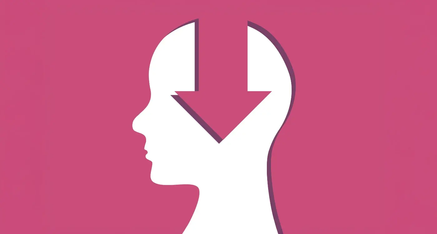
The Psychology Behind Split-Second Judgements
Right, so here's the thing—when someone scrolls through an app store, their brain is making decisions faster than they even realise. We're talking about 50 milliseconds. Thats less time than it takes to blink. Its honestly quite mad when you think about it, but this is the reality of how users evaluate your app icon before they've even registered what they're looking at.
I've watched this play out in countless user testing sessions; people make snap judgements based purely on visual information before any conscious thought kicks in. Their brain is doing this automatic processing, deciding whether something looks trustworthy, professional, fun, or worth their time—all before they've read a single word of your apps description. Understanding how users really behave during these split-second decisions is crucial for creating effective icons. The visual cortex is incredibly fast at pattern recognition, and it uses shortcuts based on previous experiences to make these lightning-quick decisions.
Colour plays a massive role here. Certain colours trigger specific emotional responses that are pretty much hardwired into us. Blue suggests trust and reliability, which is why you see it everywhere in finance apps. Red creates urgency and excitement. Green often signals health or money. But—and this is important—context matters hugely. A red icon might work perfectly for a food delivery app but feel all wrong for a meditation app.
Test your icon in greyscale first; if it doesnt communicate clearly without colour, you need to rework the design before adding any visual polish.
Shape and symmetry also matter more than most people realise. Our brains prefer balanced, symmetrical designs because they're easier to process quickly. Thats not to say every icon needs to be perfectly symmetrical, but there should be some visual logic that makes sense at first glance. Complex icons with too many elements force the brain to work harder, and when users are scrolling through dozens of options, they simply won't bother.
What Makes Users Stop Scrolling
When someone's browsing through the App Store, they're moving fast. Really fast. You've got maybe half a second to catch their attention before they scroll past your icon and onto the next one—and that's not me being dramatic, that's just how people behave when they're looking at dozens of options.
So what actually makes them stop? After building apps that have collectively been downloaded millions of times, I can tell you its not what most people think. It's not about being the prettiest or the most detailed. Its about being different in the right way. Your icon needs to stand out from the apps around it whilst still looking like it belongs in its category. Understanding what makes competitor pages convert better can give you valuable insights into effective visual strategies. Tricky balance, right?
Contrast Is Your Best Friend
The apps that get noticed use colour and shape in ways that create immediate visual contrast. If you're making a fitness app and everyone else in that space is using bright red or orange icons, maybe yours should be a deep blue or green? But here's the thing—you cant just pick a random colour and hope for the best; it needs to make sense for what your app does and who its for.
Simple geometric shapes work better than complex illustrations when it comes to stopping the scroll. Think about apps like Spotify (a circle with sound waves), Uber (a simple geometric mark), or WhatsApp (a speech bubble in a circle). These icons are instantly recognisable even at tiny sizes, and they dont require your brain to work hard to understand what you're looking at. The human eye is drawn to simplicity, especially when we're making quick decisions about what deserves our attention and what doesn't.
Common Design Mistakes That Kill Downloads
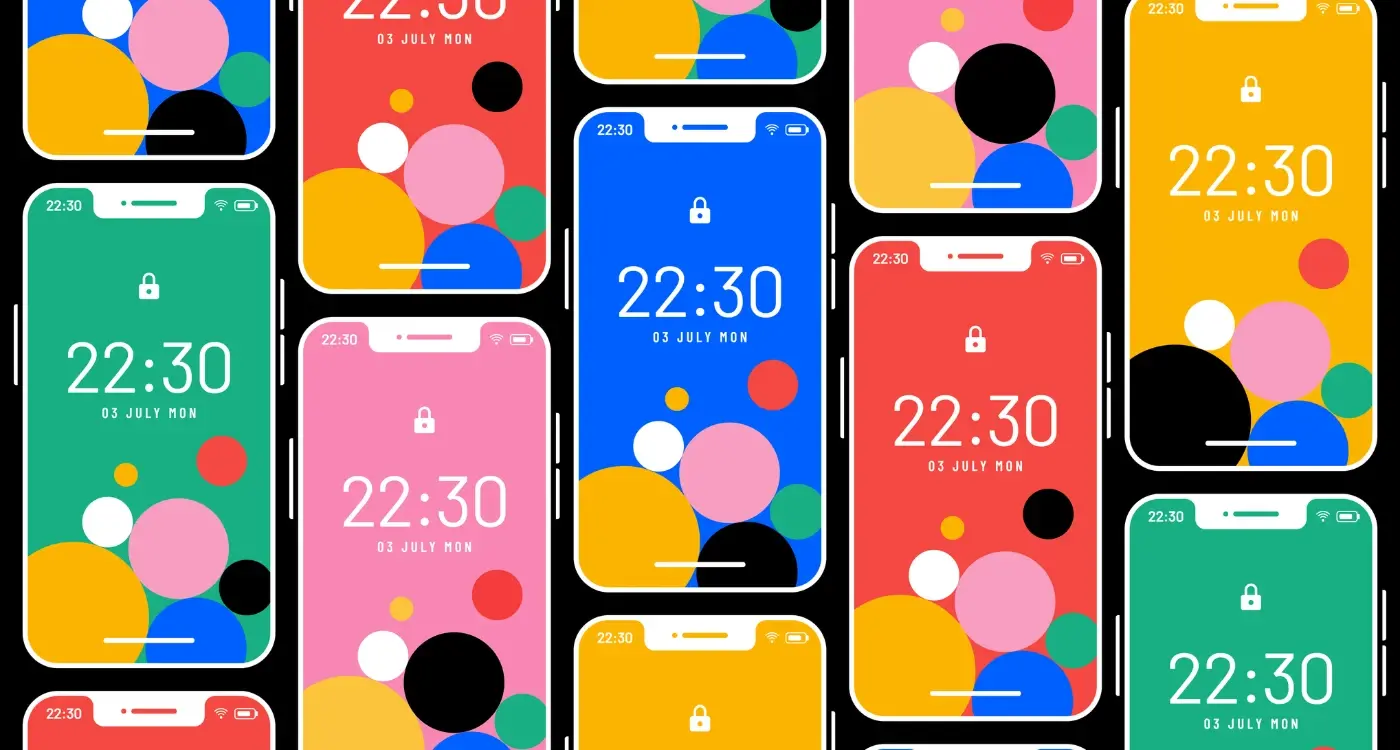
I've reviewed thousands of app icons over the years and honestly—the same mistakes keep appearing. Its not that designers are careless; they just don't understand how different their icon looks at 1024x1024 pixels compared to the tiny version users actually see in the App Store. That beautiful gradient you spent hours perfecting? It turns into muddy grey at actual size. The clever wordplay in your typography? Completely illegible.
Too much detail is probably the biggest killer I see. Designers try to cram their entire app's feature set into one tiny square and what happens? Nothing reads clearly. Your icon needs to communicate one clear idea, maybe two if you're really clever about it. When I'm working with clients I often ask them to view their icon at 60x60 pixels—that's roughly what people see when scrolling through search results. If you cant tell what it is at that size, you've got a problem. This is where proper design spacing rules become crucial for maintaining clarity at small sizes.
The Text Trap
Adding your app name to the icon itself is almost always a mistake. Sure, it works for established brands like Netflix or Spotify, but they earned that recognition over years. Your new app? People cant read 8-point text on their phone screen whilst they're scrolling. The App Store already shows your name below the icon anyway; you're just wasting valuable visual space.
An icon that tries to say everything ends up saying nothing at all—and users scroll right past it without a second thought.
Colour Choices That Backfire
Another thing—using trendy colours just because they're popular right now. I mean, if every health app uses the same shade of mint green, how does yours stand out? You need to look at your category and deliberately choose something different. But here's the catch: different doesn't mean garish. I've seen icons that use six or seven colours trying to be eye-catching and they just look chaotic. Stick to two or three colours maximum and make sure they work together properly.
And please, test your icon against both light and dark mode backgrounds because what looks great on white might completely disappear on black.
Testing Your Icon Before Launch
Right, so you've designed what you think is a brilliant icon—but here's the thing, what you think looks good and what actually performs well in the real world can be two completely different things. I've seen beautiful icons that tested terribly because they just didn't connect with the target audience, and I've seen icons I personally didn't love that absolutely crushed it in terms of downloads.
The smart move? Test before you commit. Its really that simple. Effective research methods for mobile apps can help you gather meaningful data about icon performance before launch.
A/B testing your icon doesn't need to be complicated or expensive. You can run simple tests on platforms like Facebook or Instagram ads, showing different icon designs to similar audience segments and measuring which one gets more engagement. The data you collect will tell you more than any design award ever could; people vote with their taps, not their opinions.
Getting Real Feedback That Matters
I also recommend showing your icon options to people who match your target user profile—not just your team or your mates. Show it to them on an actual phone screen, preferably within a row of competitor icons because that's the real environment where your icon needs to perform. Ask them which app they'd tap on first and why. You'll be surprised how often their reasoning doesn't match what you expected.
One test I always run is the five-second test. Show someone your icon for five seconds, take it away, then ask them what they remember about it. If they cant describe it or recall what the app might do, you've got a problem. The best icons communicate their purpose almost instantly, and if yours doesn't do that its probably worth going back to the drawing board before launch rather than after. Making user research findings actually useful requires asking the right questions and interpreting responses correctly.
How Icons Work Differently Across Categories
Here's something I wish more developers understood—what works brilliantly for a gaming app will absolutely tank a banking app. Its just the nature of how people's expectations shift based on what they're looking for. When I'm designing icons for clients, the category dictates so much of the approach that you really can't use a one-size-fits-all strategy.
Gaming apps? They need energy. Bright colours, bold characters, action-oriented imagery. Users expect something fun and a bit over the top because thats the whole point of games—they want to escape reality for a bit. But flip that to finance or healthcare apps and suddenly that same approach makes you look unprofessional or worse, untrustworthy. I've seen fintech apps try to be "fun" with their icons and it just confuses people; they want to know their money is safe, not that the app is trying to entertain them. Understanding which app store categories work best for your specific type of app can help inform your icon design choices.
Category Expectations Users Actually Have
Social apps lean heavily on recognisable symbols—chat bubbles, people icons, connection imagery. Productivity apps need clean, minimal designs that suggest organisation and efficiency. Shopping apps work well with shopping bags, tags, or product imagery. But here's the thing—these aren't strict rules, they're more like user expectations that have built up over time.
Educational apps benefit from using colours that suggest learning without being childish (unless they're actually for children, obviously). Health and fitness apps do well with organic shapes, heart symbols, or activity indicators. The biggest mistake I see is when developers try to stand out by completely ignoring category conventions; sure you'll be different, but you'll also confuse potential users who wont understand what your app does at first glance.
What Each Category Actually Needs
Let me break down what works based on what I've seen perform well in app store optimisation:
- Games: Characters, action scenes, vibrant gradients, high contrast
- Finance: Blues and greens, geometric shapes, graph elements, security imagery
- Social: Warm colours, speech bubbles, stylised people, connection symbols
- Productivity: Minimal designs, checkmarks, organised layouts, cool colour palettes
- Shopping: Shopping bags, price tags, recognisable brand elements
- Health: Hearts, activity rings, organic shapes, calming colours
- Education: Books, lightbulbs, growth symbols, approachable but professional
The key is understanding that users have mental shortcuts for each category. They've downloaded hundreds of apps before yours and theyve built up expectations about what certain types of apps should look like. You can push boundaries a bit—and sometimes you should—but completely ignoring these conventions means you're making users work harder to understand what you offer, and honestly most won't bother.
Research the top 20 apps in your specific category before designing your icon; look for patterns in colour choices and imagery that successful apps use, then find a way to fit those expectations whilst still standing out.
App Store Rules You Need to Follow
Right, lets talk about the boring stuff—the rules. I know its not the most exciting part of designing an app icon, but trust me, getting rejected by Apple or Google after months of work is genuinely gutting. I've seen it happen more times than I care to remember, and it's always avoidable if you know what to look for.
Both Apple and Google have strict guidelines about what you can and cant do with your icon. Breaking these rules means your app gets rejected, which delays your launch and costs you money. Not fun. The thing is, some of these rules seem a bit arbitrary at first, but they exist to keep the app stores looking professional and to protect users from misleading apps.
Apple's Main Icon Rules
Apple is particularly strict about this stuff. Your icon cannot include rounded corners because iOS adds those automatically—if you add your own, you'll end up with weird double-rounding that looks terrible. You also cant use screenshots or photos of the app interface itself, which I see people try all the time. No transparent backgrounds either; your icon needs to fill the entire space.
Heres where people really trip up though: you cannot use Apple's own UI elements or icons in your design. No using their camera icon, their settings gear, or anything that looks like it came from iOS itself. Apple will reject you faster than you can say "but Samsung does it." You also cant make claims in your icon like "Best" or "#1" unless you've got documentation to back it up.
Google Play's Requirements
Google is a bit more relaxed but they still have rules. Your icon needs to be 512x512 pixels and 32-bit PNG format. They dont want you using their own product icons either, and—this is important—your icon cant be misleading about what your app actually does. If you make a weather app, dont use a calculator icon just because you think it looks nice.
Both stores will check for trademark violations too. Using someone elses logo or brand imagery without permission? Thats a quick rejection right there. I've had clients who wanted to use a famous characters likeness in their icon and its just not worth the legal headache, even if you think you can get away with it.
The other thing people forget is that your icon needs to work at multiple sizes. Both Apple and Google display your icon at different dimensions throughout their stores and on devices. If your design has tiny text or intricate details that disappear when the icon is small, you're going to have problems. Test your icon at 40x40 pixels—if you cant tell what it is at that size, go back to the drawing board.
One more thing: both stores reserve the right to reject icons they consider offensive, discriminatory, or inappropriate. This is subjective, which makes it tricky. What seems fine to you might not pass their review team. When in doubt, keep it professional and avoid anything controversial.
When and Why to Redesign Your Icon
Right, so you've launched your app and things are going OK—but here's the thing; your icon isn't set in stone forever. I've redesigned icons for clients multiple times over the years, and its usually because the market has shifted or the app has evolved beyond what that original icon represented. But you need to be really careful about when you do this.
The worst time to redesign? When your app is doing well and users recognise your icon instantly. Changing it can genuinely confuse people who've been using your app for months or even years. They'll scroll past your new icon thinking its something different, and that's a problem. I mean, think about how many times you've opened an app just by recognising its shape or colour without even reading the name?
But there are good reasons to redesign. If your download rate has plateaued and you've tried everything else—app store optimisation, new screenshots, better descriptions—then maybe its time to test a new icon. Or if your app has completely changed its purpose (say you started as a photo editor but now you're a full social platform), keeping that old icon doesn't make sense anymore. When considering major changes, think carefully about which features users actually want versus cosmetic updates.
A redesign should solve a specific problem, not just give your app a fresh coat of paint
Signs You Actually Need a Redesign
Your icon looks dated compared to competitors in your category; this happens more often than you'd think. Design trends in app icons change every few years, and what looked modern three years ago might look tired now. Or maybe you built your first icon on a tight budget and it shows—plenty of successful apps started with basic icons and upgraded later when they had the resources to invest properly. The key is being honest about whether the icon is holding you back or if other factors are affecting your downloads. Test it, measure it, and don't change things just because you're bored of looking at it.
Conclusion
Your app icon isn't just a tiny piece of artwork—its the very first conversation you have with potential users. And honestly, that conversation happens in less time than it takes to blink. We've covered a lot of ground here, from understanding how people make those split-second decisions to avoiding the design mistakes that can sink your download rates before anyone even reads your app description.
Here's what I've learned after years of watching apps succeed and fail based largely on their icons: the best ones don't try to be clever for the sake of it. They dont cram in every feature or use gradients just because they can. Instead, they focus on being clear, recognisable, and honest about what the app actually does. Its that simple really.
The app stores have changed so much since I started in this industry; there's more competition than ever, and users have become incredibly picky about what they download. Your icon needs to work harder than it used to—it needs to stand out in search results, look good at every size, follow platform guidelines, and somehow communicate your apps value in a 1024x1024 pixel square. That's a tall order, but when you get it right? The difference in your conversion rates can be massive.
Don't rush this part of your app development. Test your icon with real people (not just your team who've been staring at it for weeks), check how it looks next to your competitors, and be prepared to iterate. Sometimes the difference between a good icon and a great one is just a few tweaks—but those tweaks can mean thousands more downloads. And that's worth the effort every single time.
Share this
Subscribe To Our Learning Centre
You May Also Like
These Related Guides
How Does User Psychology Drive App Store Downloads?
How Does Colour Psychology Impact App Store Performance?