Nothing kills an app faster than users who can't figure out how to get around it. I've watched brilliant apps with genuinely useful features get one-star reviews because people couldn't find what they were looking for; it's honestly heartbreaking when you see months of development work go to waste over something so fundamental.
The thing is, most app developers focus so much on the flashy features that they forget about the basics—how people actually move through their app. You might have the most powerful functionality in the world, but if users can't reach it without getting frustrated, you're basically invisible. And trust me, mobile users are ruthless; they'll delete your app faster than you can say "hamburger menu" if the navigation doesn't make sense.
Good navigation should be like a good waiter—there when you need it, invisible when you don't, and always helping you get exactly what you came for
After building apps for healthcare companies, fintech startups, and major retailers, I've learned that intuitive navigation isn't about following the latest design trends or copying what everyone else is doing. It's about understanding how people think, how they hold their phones, and what they expect when they tap on something. The best app navigation systems feel so natural that users don't even notice them—they just work. That's what we're going to explore: the psychology, patterns, and practical techniques that separate apps people love from apps people delete.
Understanding Navigation Psychology
When I started building apps, I thought navigation was just about putting buttons in the right places. Wrong! It's actually about understanding how people's brains work when they're trying to find something on a tiny screen whilst probably doing three other things at once.
The human brain is wired to look for patterns and shortcuts—its how we've survived for thousands of years. When someone opens your app, their brain immediately starts scanning for familiar visual cues. They're not reading every word; they're hunting for shapes, colours, and positions that match what they already know. This is why apps that follow established patterns feel "natural" while those that don't can feel confusing, even if they're technically well-designed.
Users develop what we call "muscle memory" incredibly quickly. After using an app just a few times, they stop thinking about where to tap and start moving on autopilot. But here's the thing—if you move a button or change how something works, you break that automatic behaviour and force people to think again. That friction? That's where you lose users.
How Mental Models Shape Expectations
Everyone who picks up your app already has mental models about how mobile interfaces should work. These come from using other apps, websites, and even physical objects. When your navigation aligns with these existing mental models, everything feels smooth. When it doesn't, people get frustrated fast.
- Tab bars belong at the bottom (thanks to iOS conventions)
- Hamburger menus hide secondary options
- Back buttons should always take you to the previous screen
- Search icons universally mean "find something"
- Shopping carts appear in the top right corner
The most successful apps I've built respect these patterns whilst still maintaining their unique personality. You don't need to reinvent the wheel to create something special—you just need to understand why the wheel works so well in the first place.
Core Navigation Patterns
Right, let's talk about the bread and butter of mobile navigation—the patterns that actually work in the real world. I've tested dozens of navigation approaches over the years, and honestly? There are really only five patterns that consistently deliver good user experiences. Everything else is just designers trying to be clever (and usually failing).
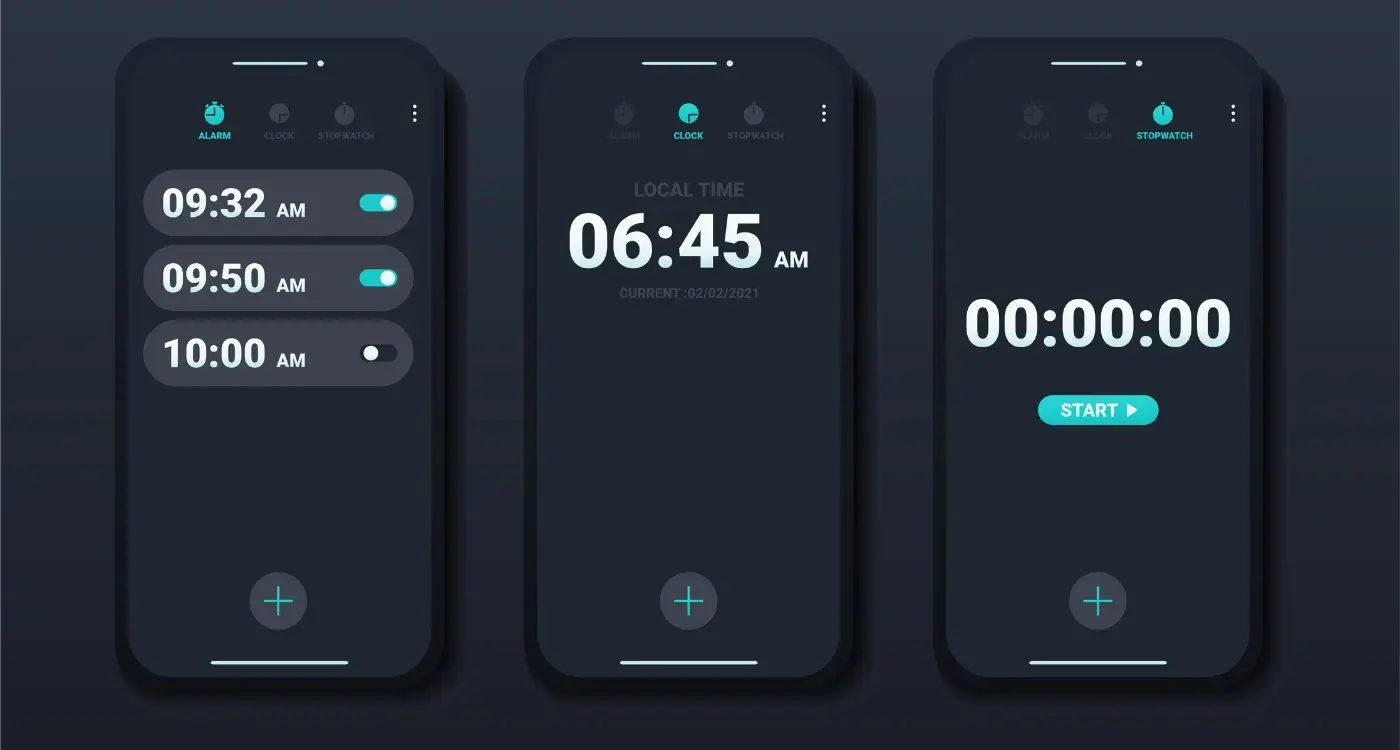
Tab bars are the gold standard for a reason. They sit at the bottom of your screen where thumbs naturally rest, show up to five main sections, and let users jump between areas without losing their place. Instagram, Facebook, Twitter—they all use tab bars because they work. Simple as that. But here's what most people get wrong: they try to cram too many options in there or use confusing icons that need labels to make sense.
Keep your tab bar icons recognisable without text labels. If users need to read what an icon does, it's probably the wrong icon.
Hamburger menus get a lot of hate, but they're perfect when you have loads of navigation options that don't all deserve prime real estate. The trick? Don't hide your most important features behind that menu. Users are lazy (aren't we all?) and if they can't see it immediately, they might not bother looking for it.
When to Use Each Pattern
- Tab bars: 3-5 equally important sections that users switch between frequently
- Hamburger menus: Apps with complex hierarchies or secondary navigation
- Bottom navigation with overflow: More than 5 sections but still need quick access
- Gesture-based: Media apps where screen space is precious
- Modal navigation: Temporary workflows like checkout or onboarding
The key thing I've learned? Don't try to reinvent navigation patterns unless you have a bloody good reason. Users have spent years learning how these patterns work, and fighting against that muscle memory is usually a losing battle.
Visual Design Elements
When it comes to navigation design, the visual elements are what users actually see and interact with—and honestly, they make or break the entire experience. I've seen brilliant navigation systems ruined by poor visual choices, and I've seen mediocre structures saved by smart design decisions.
The key is making navigation elements instantly recognisable. Users shouldn't have to think about whether something is clickable or not; it should be obvious at a glance. This means using consistent styling for all your navigation elements, proper contrast ratios, and visual cues that clearly indicate interactivity.
Colour and Contrast
Your navigation needs to stand out from the rest of your content without being overwhelming. I always recommend using your brand's primary colour for active states and a neutral colour for inactive elements. But here's the thing—you need to test this on actual devices, not just your computer screen. What looks perfect on a desktop monitor might be completely invisible in bright sunlight on a phone.
Text needs to meet accessibility standards too (at least 4.5:1 contrast ratio for normal text). It's not just about compliance; it genuinely makes your app easier to use for everyone.
Icons and Typography
Icons should be universally understood—stick to common conventions rather than trying to be clever. A house icon means home, three lines mean menu. Don't reinvent the wheel unless you absolutely have to. Typography needs to be large enough to read easily (minimum 16px on mobile) and your navigation labels should be concise but clear.
- Use familiar icon conventions (home, search, profile)
- Maintain consistent spacing between elements
- Ensure touch targets are at least 44x44 pixels
- Test colour combinations in different lighting conditions
- Keep navigation labels short but descriptive
Remember, users scan rather than read—your visual hierarchy needs to guide their eyes naturally to the most important actions first.
Touch Targets and Gestures
Right, let's talk about something that drives me absolutely mad when I see it done wrong—touch targets that are too small. You know what I mean? Those tiny buttons that make you feel like you need a stylus from 2005 just to hit them properly. Apple's Human Interface Guidelines suggest a minimum touch target of 44x44 points, and there's a bloody good reason for that.
I've watched countless user testing sessions where people get frustrated because they keep missing buttons or accidentally tapping the wrong thing. It's not their fault—it's poor design. Your thumb pad is roughly 10-14mm wide, which translates to about 44-57 pixels on most screens. Give people some breathing room around interactive elements; trust me, they'll thank you for it.
Common Gesture Patterns
The beauty of modern mobile apps lies in how intuitive gestures have become. Swipe to delete, pull to refresh, pinch to zoom—these aren't just fancy interactions, they're part of users' muscle memory now. But here's the thing: don't reinvent the wheel unless you absolutely have to. When you create custom gestures, you're asking users to learn something new, and that creates friction.
The most successful apps feel like extensions of users' natural hand movements rather than interfaces they need to consciously think about
I always tell my clients to consider the context of use too. Someone using your app on a crowded train has different needs than someone lounging on their sofa at home. Single-handed operation should be possible for core functions—keep frequently used actions within easy thumb reach, typically the bottom third of the screen. And for goodness sake, make sure your gesture areas don't conflict with system-level swipes like back navigation or control centre access.
Information Architecture
Right, let's talk about information architecture—basically how you organise all the stuff in your app so people can actually find what they're looking for. I've seen so many apps fail not because they had bad features, but because users couldn't figure out where anything was. It's a bit mad really, spending months building great functionality only to bury it three levels deep in a confusing menu structure.
Think of information architecture as the invisible skeleton that holds your app together. Users shouldn't have to think about it, they should just feel like everything is exactly where it ought to be. When I'm working on this with clients, I always start by asking: what are the top three things users want to do in your app? Those need to be front and centre, ideally accessible within one tap from your main screen.
Organising Your Content
Here's how I structure content in most apps, from most to least important:
- Primary actions (what users do most often)
- Secondary features (useful but not daily)
- Settings and account stuff (important but rarely accessed)
- Help and support (there when needed)
The biggest mistake I see? Treating all features equally. Just because you spent ages building that reporting feature doesn't mean it deserves prime real estate if only 5% of users need it weekly. Be ruthless about prioritising based on actual user behaviour, not your personal attachment to features.
And here's something that catches people out—your information architecture needs to make sense to your users, not your internal team. What seems logical to someone who knows your business inside out might be completely baffling to a first-time user trying to complete a simple task.
Testing Your Navigation
Here's the thing about testing app navigation—most people skip it because they think they know what works. But honestly, I've lost count of how many times I've been wrong about what users would find intuitive. That feature I thought was obvious? Users couldn't find it. That gesture I assumed everyone would understand? Half the test group tried tapping instead of swiping.
The best testing happens early and often. I mean, you don't need a fancy lab or expensive equipment to get started. Grab five people who've never seen your app before—friends, family, random people from the coffee shop (with permission, obviously). Give them specific tasks like "find the settings" or "add a new item" and watch what they do. Don't help them. Don't explain anything. Just observe.
Its painful to watch sometimes. You'll see people struggle with navigation that seemed perfectly clear to you and your team. But this is gold—these struggles show you exactly where your navigation breaks down. Pay attention to where people hesitate, where they tap the wrong things, and what they say out loud while they're trying to figure things out.
Remote Testing Tools
If you can't get people in the same room, tools like Maze or UserTesting let you set up remote navigation tests. Users complete tasks on their own devices while the software records their screen and audio. You get to see exactly where people get confused without being there to accidentally influence their behaviour.
Test your navigation with people who aren't familiar with your industry or product. They'll spot confusing elements that domain experts miss completely.
The key is testing throughout development, not just at the end. Quick five-minute tests with paper prototypes can save you weeks of development time later on.
Common Navigation Mistakes
Right, let's talk about the navigation mistakes that keep popping up in apps I review. After years of fixing these same issues over and over, I can spot them from a mile away—and more importantly, I know how they kill user engagement.
The biggest mistake I see? Hidden navigation that requires users to guess where things are. You know those hamburger menus that hide everything behind three lines? They reduce discoverability by about 20%. Users simply don't explore hidden options as much as visible ones. I always tell clients: if it's important, make it visible.
The Most Damaging Navigation Errors
- Too many top-level menu items (more than 5 gets overwhelming)
- Inconsistent navigation between screens
- Generic labels like "More" or "Other" that don't tell users what they'll find
- Missing breadcrumbs in complex apps
- Touch targets smaller than 44x44 pixels
- No visual feedback when users tap navigation elements
Here's something that drives me mad—apps that change their navigation structure based on context without warning users. I worked on fixing an e-commerce app where the main menu would completely reorganise itself when users logged in. Bloody confusing! Users had to relearn the entire interface just because they signed up.
Another classic mistake is burying the search function. If your app has more than 20 pieces of content, search should be prominently displayed. Users expect it in the header or as a dedicated tab—not hidden three levels deep in settings.
The key is consistency and predictability. Users shouldn't have to think about how to navigate your app; they should just know. When navigation feels natural, users can focus on your content instead of fighting your interface. This is where using competitive analysis software can help you see how industry leaders structure their navigation patterns and avoid these common pitfalls.
Building intuitive app navigation isn't just about following design trends or copying what the big players are doing—it's about understanding how people actually use their phones. After years of watching users interact with the apps I've built, one thing has become crystal clear: good navigation should feel invisible.
The best navigation systems are the ones users never think about. They just work. People open your app, find what they need, and get on with their day. That's the goal we should all be aiming for, not flashy animations or clever UI tricks that confuse more than they help.
You know what's interesting? Most navigation problems aren't technical issues—they're human ones. We get so caught up in what's possible that we forget to ask what's practical. I've seen apps with brilliant functionality fail because users couldn't figure out how to access half the features. It's heartbreaking really, all that development time wasted because the navigation wasn't tested properly.
The patterns we've covered in this guide aren't just suggestions; they're based on how millions of people have learned to use mobile devices. Tab bars work because they're predictable. Hamburger menus can work when used thoughtfully. Gesture navigation feels natural when it builds on what users already know.
But here's the thing—rules are meant to be broken, just not recklessly. If you're going to try something different, make sure you've got a good reason and test it with real users first. Your app's success depends on people actually being able to use it, and good navigation is what makes that possible. Keep it simple, keep it consistent, and always put your users first.
