
What Should I Consider When Choosing App Colour Palettes?
A local plumbing company launched their new app with a bright red colour scheme—red buttons, red headers, red everything. They thought it would grab attention and look bold. Within weeks, users started complaining that the app felt "aggressive" and "stressful to use." The company had accidentally triggered associations with danger and emergency situations, making people anxious every time they opened the app. They ended up spending thousands redesigning with calming blues and greens, which immediately improved user satisfaction scores.
Colour choices in mobile apps aren't just about making things look pretty—they directly impact how people feel when using your app, whether they trust your brand, and even whether they complete important actions like making purchases or booking appointments. I've seen apps succeed or fail based purely on their colour decisions, and it's one of those areas where small changes can have massive effects on user behaviour.
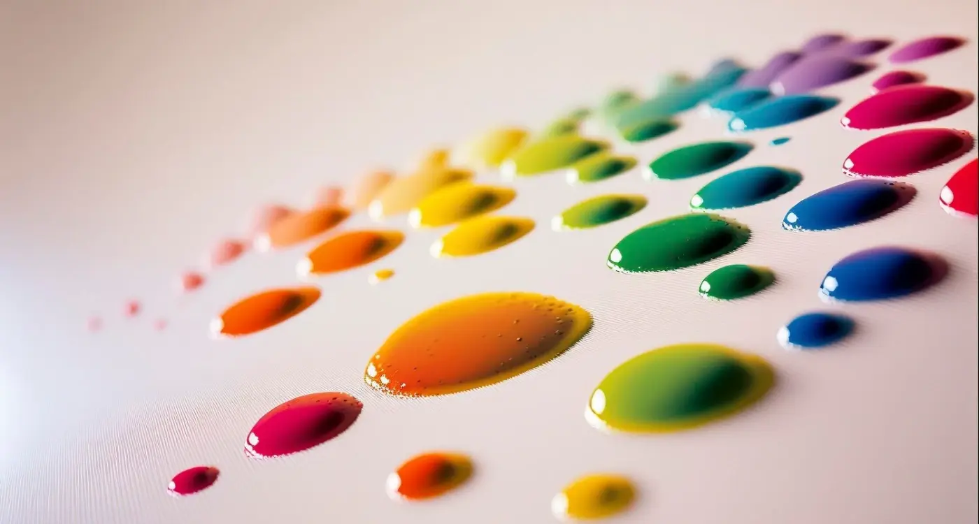
When you're choosing colours for your app, you're essentially speaking a silent language that your users understand on a subconscious level. Different colours trigger different emotional responses, and these responses can either support your app's goals or work against them. A banking app using bright orange might feel unprofessional, while a fitness app in the same colour could feel energetic and motivating.
The right colour palette doesn't just look good—it makes your users feel the way you want them to feel and guides them towards the actions you want them to take
But here's the thing—colour psychology is just the starting point. You also need to consider accessibility requirements, platform guidelines, your target audience's cultural background, and how your colours will look on different devices and screen brightness levels. It's more complex than most people realise, but getting it right can transform your app's user experience.
Understanding Colour Psychology in Mobile Apps
Colour isn't just about making your app look pretty—it's one of your most powerful tools for influencing user behaviour. After years of building apps across different industries, I can tell you that the right colour psychology choices can boost conversion rates by up to 80%. But here's the thing: most people get it completely wrong.
Different colours trigger specific emotional responses in users brains. Red creates urgency and excitement (perfect for call-to-action buttons), while blue builds trust and reliability—that's why you see it everywhere in banking apps. Green suggests growth and positivity, which is why fitness and finance apps love it. Orange feels friendly and approachable, making it great for social platforms.
But wait—it gets more complex than that. Cultural background plays a huge role too. In Western markets, white represents cleanliness and simplicity, but in some Asian cultures it can symbolise mourning. I learned this the hard way when launching an app in multiple regions and seeing completely different user engagement patterns.
The Context Matters More Than You Think
What really matters isn't just the colour itself, but how you use it within your apps context. A bright red might work brilliantly for a food delivery app (it stimulates appetite), but could feel aggressive and overwhelming in a meditation app where users are seeking calm.
I always tell clients to think about their users emotional state when they're using the app. Are they stressed? Excited? Focused? Your colour palette should complement and guide those emotions, not fight against them. Getting this right early in your design process will save you months of user testing and tweaks later on.
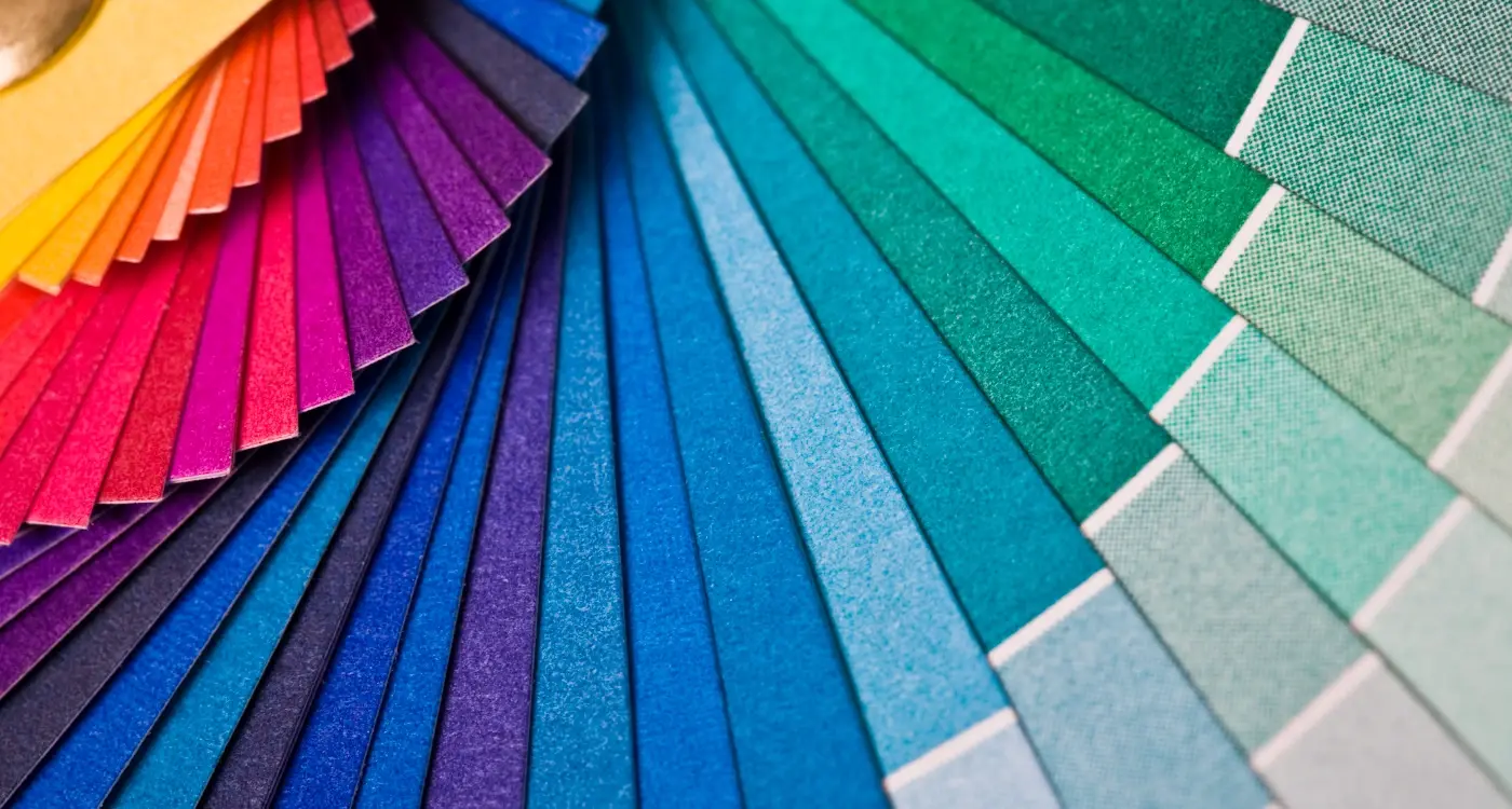
Choosing Your Primary Brand Colours
Right, let's get down to business. Your primary brand colours are going to be the backbone of your entire app design—they'll appear everywhere from your logo to your navigation bars to your call-to-action buttons. I've seen too many clients get this wrong and then wonder why their app feels disjointed or unprofessional.
Your primary colour should reflect your brand's personality and connect with your target audience. If you're building a meditation app, that electric neon green might not send the right message (unless you're going for an edgy, modern approach—which could work actually!). But here's the thing: don't just pick colours because you like them. I mean, I love a good burgundy, but that doesn't mean it belongs in every app I design.
Key Factors for Primary Colour Selection
When choosing your main brand colour, you need to consider several practical factors that go beyond just looking nice:
- How it displays across different screen types and lighting conditions
- Whether it meets accessibility contrast requirements
- How it photographs for app store screenshots
- Its psychological associations in your target markets
- Whether it works with both light and dark interface modes
Test your primary colour on actual devices, not just your computer monitor. Colours can look completely different on an iPhone screen versus an Android tablet, and you want to make sure your brand maintains its impact across all platforms.
One mistake I see constantly is choosing colours that are too similar to major competitors. Sure, blue works great for productivity apps, but if every other task management app uses the same shade of blue, you're not going to stand out in the app store. Do your homework—check what colours your main competitors are using and find a way to differentiate yourself while still appealing to your audience's expectations.
Creating Effective Colour Schemes
Right, so you've picked your primary brand colours—now comes the fun part. Building out a complete colour scheme that actually works across your entire app. I'll be honest, this is where I see most people go wrong; they get so excited about their brand colour that they forget apps need a whole family of colours to function properly.
Your colour scheme needs to do more than just look pretty. It needs to guide users through your app, show them what's clickable, indicate errors, and create a clear hierarchy of information. That bright blue you love might work for buttons, but what happens when you need to show success messages? Or error states? You can't just wing it.
The 60-30-10 Rule
Here's something that's served me well over the years: the 60-30-10 rule. Your neutral colour (usually greys or whites) should dominate about 60% of your interface. Your secondary colour gets 30%, and your primary brand colour—the star of the show—gets just 10%. Sounds backwards, doesn't it? But trust me on this one.
When your primary colour appears sparingly, it has much more impact. Users know exactly where to look and what actions they can take. I've seen apps where everything is bright blue or green, and honestly? It's exhausting to use. Your eyes don't know where to focus.
Building Your Complete Palette
You'll need several categories of colours, and each one serves a specific purpose:
- Primary colours (1-2 maximum) - your main brand colours
- Neutral colours (3-5 shades) - greys, whites, and off-whites for backgrounds and text
- System colours - red for errors, green for success, yellow/orange for warnings
- Accent colours (1-2) - supporting colours that complement your primary palette
The trick is making sure all these colours play nicely together. I usually start with my primary colour and build everything else around it, checking contrast ratios as I go. And here's a tip that's saved me countless revisions: always test your colour scheme in both light and dark modes from the start, even if you're only planning to launch with one.
Accessibility and Colour Considerations
Right, let's talk about something that's genuinely close to my heart—making apps that everyone can actually use. I mean, what's the point of having beautiful brand colours if a chunk of your users can't see them properly? Its one of those things that gets overlooked way too often, but honestly, accessibility should be baked into your colour choices from day one.
Colour blindness affects about 8% of men and 0.5% of women, which means if you've got a decent user base, some of them are experiencing your app completely differently than you intended. Red-green colour blindness is the most common type; so if your app relies on red and green to show success and error states (like so many do), you're potentially confusing a lot of people. I always tell clients to test their colour schemes with colour blindness simulators—there are loads of free tools online that'll show you exactly what your app looks like to someone with different types of colour vision.
Good design is accessible design. When we create inclusive experiences, we don't just help users with specific needs—we make better products for everyone.
But here's the thing—accessibility goes way beyond colour blindness. Contrast ratios are massive. The Web Content Accessibility Guidelines recommend a contrast ratio of at least 4.5:1 for normal text and 3:1 for large text. That might sound technical, but there are simple tools that'll check this for you in seconds. I've seen too many apps with gorgeous, subtle colour schemes that are basically unreadable in bright sunlight or for users with visual impairments. And don't even get me started on grey text on white backgrounds—it drives me mad! Your visual design needs to work for everyone, not just people with perfect vision viewing your app in ideal conditions.
Right, let's talk about something that catches a lot of people off guard—iOS and Android handle colours very differently. I mean, really differently. And if you're not paying attention to these platform guidelines, your app can end up looking like it belongs on the wrong operating system entirely.
Apple's got its Human Interface Guidelines, and they're pretty strict about colour usage. iOS loves clean, vibrant colours but expects them to work seamlessly with both light and dark modes. That's the big one actually—your colour palette needs to automatically adapt when users switch between these modes. Apple's system colours are designed to do this automatically, which is why so many successful iOS apps stick close to their recommended palette. Blues, greens, and reds that shift intensity based on the user's preference.
iOS vs Android: The Key Differences
Android's Material Design takes a completely different approach. Google wants you to pick a primary colour and then build your entire palette around it using their colour system. They're big on bold, saturated colours that create clear visual hierarchies. The interesting thing is Android users actually expect more colourful, varied interfaces compared to iOS users who prefer subtlety.
Here's something I've learned from testing apps on both platforms; what looks perfect on an iPhone can appear washed out on a Samsung Galaxy, and vice versa. The screen technologies are different, the default brightness settings vary, and even the way users hold their phones affects colour perception.
My advice? Design your core palette first, then create platform-specific variations. It's a bit more work upfront, but it ensures your app feels native on both systems rather than like a lazy port from one to the other.
Testing Colours with Your Target Users
Right, so you've picked your colour schemes and think they look brilliant—but here's the thing, what you think looks good and what your users think can be completely different things. I've seen apps with colour choices that looked perfect in the design studio but fell flat when real people started using them. That's why testing your colour decisions with actual users is so important.
User testing for colours isn't as complicated as it sounds. You don't need a fancy lab or expensive equipment; you just need real people who match your target audience. Start by creating mockups of key screens using different colour variations and show them to potential users. Ask specific questions like "Which version feels more trustworthy?" or "Which one would you be more likely to tap?" Don't just ask if they like the colours—that's not helpful. Focus on how the colours make them feel and whether they support the actions you want users to take.
Create A/B tests with two different colour schemes for your call-to-action buttons and measure which one gets more taps. Sometimes a simple colour change can boost conversions by 20% or more.
What to Test and How
Focus your testing on the most important elements first. Test your primary action buttons, navigation colours, and any warning or success messages. These are the colours that directly impact how people use your app. You can run simple tests by showing people screenshots and timing how quickly they identify important buttons or information.
Remember that different groups of people might react differently to the same colours. A colour scheme that works well for young adults might not resonate with older users, and cultural backgrounds can influence colour preferences too. If your app targets a specific audience, make sure your test group matches that demographic.
- Test key interactive elements like buttons and navigation
- Ask about emotional response, not just preference
- Include people from your actual target market
- Test on real devices, not just computer screens
- Check readability in different lighting conditions
Common Colour Mistakes to Avoid
Right, let's talk about the mistakes I see time and time again—and honestly, some of these are so common that I've started keeping a mental checklist when reviewing client designs. The biggest one? Using too many colours. I get it, you want your app to look exciting and vibrant, but there's a fine line between engaging and overwhelming. Stick to three or four main colours maximum; anything more and your app starts looking like a rainbow exploded.
Another mistake that drives me mad is ignoring contrast ratios completely. I've seen beautiful apps that are basically unusable because the text is grey on light grey—sure, it looks minimal and modern, but users can't actually read anything! Your text needs to have enough contrast against its background, especially for accessibility compliance.
Platform Confusion Issues
Here's something that trips up loads of clients: using iOS blue on Android or Android green on iOS. Each platform has its own colour language, and mixing them up makes your app feel foreign to users. iPhone users expect certain blues for interactive elements, while Android users are used to material design colours.
- Don't use more than 4 main colours in your palette
- Avoid poor contrast ratios (aim for at least 4.5:1 for normal text)
- Don't mix platform-specific colours inappropriately
- Never choose colours based solely on personal preference
- Don't forget to test colours on actual devices, not just computer screens
- Avoid using red and green together without additional indicators
The last big mistake? Not testing your colours on real devices. What looks great on your laptop screen might look completely different on a phone in bright sunlight. I always tell clients to view their colour choices on the actual devices their users will be using—it can save you from some proper embarrassing oversights down the line.
Conclusion
Getting your app's colour palette right isn't just about making things look pretty—it's about creating an experience that feels natural, trustworthy, and memorable for your users. After years of working with clients who've both nailed this and gotten it spectacularly wrong, I can tell you that colour choices genuinely impact how people interact with your app.
The key things to remember? Start with your brand and what you want people to feel when they use your app. Use colour psychology as a guide, not a rulebook—red might signal urgency in banking apps, but it's perfect for food delivery when you want to trigger appetite and quick decisions. Always, and I mean always, test your colours with real users; what looks good on your designer's monitor might be completely different on a phone screen in bright sunlight.
Don't forget about accessibility either. Making sure your colour schemes work for users with visual impairments isn't just good practice—it's good business. You're potentially excluding millions of users if you ignore contrast ratios and rely solely on colour to communicate important information.
Platform guidelines exist for good reasons. iOS and Android users have different expectations, and fighting against these conventions usually backfires. Work with them, not against them.
Most importantly, keep it simple. I've seen too many apps fail because they tried to use every colour in the rainbow. Stick to a focused palette that serves your users' needs and supports your app's core functionality. Your colour choices should fade into the background, letting users focus on what really matters—getting things done.
Share this
Subscribe To Our Learning Centre
You May Also Like
These Related Guides

What Colour Psychology Tricks Help Users Love My App?
What Colours Psychology Should I Use in My App Design?