
What Spacing Rules Create Better Mobile App Layouts?
You download a new app that looks promising, open it up, and immediately feel overwhelmed. Text is crammed together, buttons are too close to each other, and everything just feels... messy. Within seconds, you've closed it and moved on to something else. Sound familiar? This happens to millions of users every day, and it's usually not because the app lacks good features—it's because the spacing is completely wrong.
After years of building apps for everything from fintech startups to major retail brands, I can tell you that spacing is the invisible foundation that makes or breaks user experience. It's not the flashy animations or clever features that keep users engaged; it's whether they can actually use your app without getting frustrated. And honestly, most developers get this completely wrong.
The thing is, mobile spacing isn't just about making things look pretty. It's about creating clear visual paths, ensuring buttons are easy to tap, and giving users' eyes a place to rest. When spacing works well, users don't even notice it—they just know the app feels good to use. But when it's off, even by a few pixels, the entire experience falls apart.
Good spacing in mobile design is like good timing in comedy—when it's right, you don't notice it, but when it's wrong, everything feels uncomfortable
The rules for mobile spacing aren't the same as desktop design, and they certainly aren't the same as print. Mobile screens are small, fingers are chunky, and attention spans are short. Understanding how to work within these constraints while creating layouts that feel spacious and organised? That's where the real skill lies, and that's exactly what we'll cover in this guide.
The Foundation of Mobile Spacing Systems
When I first started designing mobile apps, I thought spacing was just about making things look nice. Boy, was I wrong! Spacing is actually the invisible framework that holds your entire app together—and getting it wrong can make even the most brilliant app feel clunky and confusing to use.
Mobile spacing systems work differently than desktop design because our canvas is so much smaller. Every pixel counts, and you're dealing with fingers instead of precise mouse cursors. That tiny screen real estate means you can't just shrink down a desktop layout and hope for the best. Trust me, I've seen that approach fail more times than I can count.
Base Units and Multipliers
The secret to good mobile spacing lies in choosing a base unit and sticking to it religiously. Most designers use either 4px or 8px as their foundation—I personally favour 8px because it works beautifully across different screen densities. Once you've got your base unit, everything else becomes a multiple of that number.
- Small spacing: 8px (for tight elements like icon and text pairs)
- Medium spacing: 16px (between related content sections)
- Large spacing: 24px or 32px (separating major sections)
- Extra large spacing: 48px or 64px (creating clear visual breaks)
This systematic approach might seem rigid at first, but it actually gives you incredible consistency across your app. Users subconsciously pick up on these patterns, which makes your interface feel more cohesive and professional. Plus, it makes life easier for developers when they're implementing your designs—no more arguments about whether something should be 13px or 15px apart!
Density and Breathing Room
Here's something that took me years to properly understand: mobile apps need more breathing room than you think they do. When you're designing on a large monitor, everything looks spacious. But squeeze that same layout onto a 5-inch phone screen, and suddenly everything feels cramped and overwhelming.
The key is finding the sweet spot between information density and usability. You want to show enough content to be useful without making people feel like they're trying to read an eye chart. I always test my spacing decisions on an actual device—what looks perfect on my computer often needs adjustment once it hits real hardware.
Understanding Visual Hierarchy Through Spacing
When you look at your phone screen, your eyes don't just wander around randomly—they follow a path. And that path? It's controlled by how we use spacing in mobile app layouts. I've spent years watching users interact with apps, and the patterns are always the same; people's attention goes exactly where the spacing tells it to go.
Think about it this way: white space isn't empty space, it's active space. It pushes elements apart to show they're different, or pulls them together to show they belong as a group. When I'm designing an app layout, I'm basically having a conversation with users through spacing—telling them what's important, what comes next, and what they can safely ignore.
Creating Clear Information Groups
The biggest mistake I see in mobile spacing is treating every element like its equally important. But here's the thing—if everything's important, nothing is. Users need to understand the pecking order of information, and spacing is how we show that hierarchy.
For headlines, I typically use 24-32px of space above and 12-16px below. This creates breathing room that makes the headline feel important whilst keeping it connected to the content that follows. For body text paragraphs, 8-12px between them works well—enough to separate thoughts but not so much that the content feels disconnected.
Use the "squint test" when reviewing your app layout. Squint at your screen and see which elements group together visually. If your spacing is working properly, related items should blur together whilst unrelated items stay separate.
Guiding User Attention
Mobile spacing also controls the flow of attention down the screen. Larger gaps create natural stopping points where users pause and process information. Smaller gaps keep the eye moving smoothly from one element to the next. When I want users to focus on a call-to-action button, I'll give it generous spacing on all sides—usually 20-24px. This isolation makes it feel clickable and important.
Grid Systems and Layout Containers
Right, let's talk about grid systems—the invisible framework that stops your app from looking like someone threw design elements at a wall and hoped for the best. I've seen too many apps where developers wing it with spacing, and honestly? It shows.
A proper grid system is basically your app's skeleton. Most mobile apps work brilliantly with either a 4-column or 6-column grid, depending on your content needs. The 4-column setup works well for simpler layouts, while 6 columns give you more flexibility for complex interfaces. But here's the thing—whatever you choose, stick to it religiously.
Setting Up Your Grid Foundation
Your grid margins (the space between your content and screen edges) should typically be 16px or 20px on mobile. This creates breathing room and prevents that cramped feeling users hate. The gutters between columns? Keep them consistent—usually 16px works perfectly.
Layout containers are where things get interesting. Think of them as boxes that hold your content groups together. A card component, for example, is a container that keeps related information organised and visually connected.
Common Grid Applications
- Product listings work beautifully in 2-column grids within your main grid
- Form fields should align to your grid for that professional polish
- Navigation elements need consistent spacing that follows your grid rules
- Image galleries benefit from strict grid alignment
One mistake I see constantly? Developers create a grid system then ignore it when things get tricky. Your grid isn't a suggestion—it's the foundation that makes everything else work. When users can unconsciously predict where elements will appear, your app feels intuitive and professional.
The grid keeps everything aligned, creates natural reading patterns, and makes your spacing decisions feel deliberate rather than random. Trust me, users notice the difference even if they can't explain why your app feels "right".
Content Spacing and Reading Flow
When users open your app, their eyes need to move smoothly from one piece of content to the next. This isn't magic—it's careful spacing. After working on countless apps where users complained about feeling "lost" or finding text "hard to read," I've learned that content spacing makes or breaks the user experience.
Reading flow starts with your line height. Most developers stick with the default, but that's often too cramped for mobile screens. I typically use 1.4 to 1.6 times the font size for body text. So if your text is 16px, your line height should be around 22-25px. It sounds like a lot, but trust me—users will thank you for it.
Paragraph and Section Spacing
Between paragraphs, I use about 16px of space. Between different sections? That jumps to 32px or more. The rule here is simple: related content stays close, unrelated content gets pushed apart. When users scroll through your app, they should instantly know which bits belong together.
The space between elements is just as important as the elements themselves—it tells users how to think about your content
Lists and Content Groups
Lists need breathing room too. I give each list item 12-16px of padding, with 8px between individual items. For card-based layouts, 16px between cards works well, but bump that up to 24px if your cards contain lots of information.
Here's something most people get wrong: they make everything the same size. Your spacing should vary based on importance. Main headings get more space above them than subheadings. Key actions get more space around them than secondary options. This hierarchy guides users naturally through your content without them even realising it.
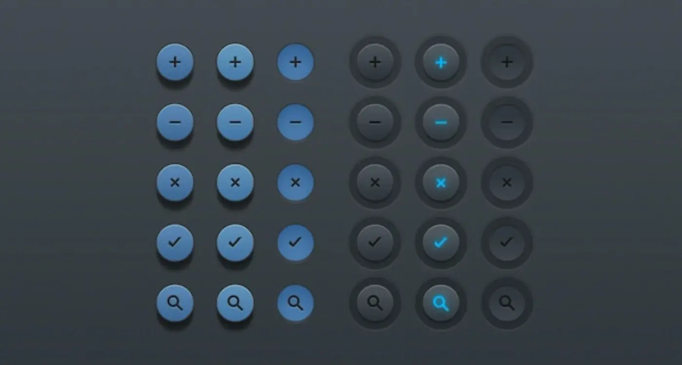
Interactive Elements and Touch Targets
Here's where things get properly technical—and where I see most apps falling flat on their faces. Touch targets aren't just about making buttons big enough; they're about creating an interface that feels natural and responds exactly where users expect it to.
Apple's Human Interface Guidelines recommend a minimum touch target size of 44x44 points, while Google suggests 48dp for Material Design. But honestly? I always go bigger when space allows. There's nothing more frustrating than trying to tap a tiny button and hitting the wrong thing instead. I've lost count of how many times I've seen beautifully designed apps that are basically unusable because someone thought aesthetic appeal was more important than actual usability.
Spacing Around Interactive Elements
The space around your buttons, links, and form fields is just as important as the elements themselves. I typically use at least 8-16px of padding around touch targets, but this depends on the surrounding content. Menu items need more vertical spacing than you think—users' fingers aren't precision instruments, and we need to account for that reality.
Form elements are particularly tricky. Input fields should have enough internal padding so text doesn't feel cramped (12-16px is my go-to), plus adequate spacing between fields so users don't accidentally tap the wrong one. Nothing kills conversion rates like a frustrating form experience.
Common Touch Target Spacing Rules
- Minimum 44px height for all tappable elements
- 8-12px spacing between related interactive elements
- 16-24px spacing between unrelated groups of buttons
- 12-16px internal padding for form inputs
- 24px minimum spacing around primary action buttons
Remember, users often interact with apps one-handed while walking, on public transport, or in less-than-ideal conditions. Your spacing decisions should account for these real-world scenarios, not just perfect laboratory conditions.
Platform-Specific Spacing Guidelines
Here's something that trips up loads of developers—thinking iOS and Android handle spacing the same way. They don't. Not even close! After years of building apps for both platforms, I can tell you that ignoring these differences will make your app feel "off" to users, even if they can't pinpoint why.
iOS follows Apple's Human Interface Guidelines pretty religiously. They love their 8-point grid system, which means your mobile spacing should work in multiples of 8 pixels. Navigation bars sit at 44 points minimum for touch targets, and there's this lovely breathing room around everything. Apple's design language is all about generous white space—it's part of their premium feel. Your app layout needs to respect this; cramped interfaces scream "amateur" on iOS.
Android's Material Design Approach
Android takes a different route with Material Design. They use a 4-point baseline grid, but here's where it gets interesting—they're much more flexible with density and spacing variations. Android users expect information to be more tightly packed, and the platform handles different screen densities brilliantly. You can get away with slightly smaller touch targets (48dp minimum) and closer content spacing without users feeling overwhelmed.
The Reality Check
But here's the thing—most of my clients want to build once and deploy everywhere. Fair enough! In those cases, I usually go with the more generous iOS spacing and it works fine on Android. Users adapt. The reverse? Not so much. iOS users will notice cramped design grid systems immediately, and not in a good way.
Always test your UI spacing on actual devices, not just simulators. What looks perfect on your laptop screen might feel completely wrong when you're holding the phone in your hand.
Remember, these aren't just arbitrary rules—they're based on how people actually use their phones on each platform. Respect that, and your app will feel native no matter where it lives.
After years of reviewing app designs—both the good ones and the absolute disasters—I've noticed the same spacing mistakes crop up again and again. These errors can make even the most beautifully designed app feel clunky and unprofessional; honestly, some of them make me wince when I see them in the wild.
The biggest culprit? Inconsistent spacing units. I've seen apps where buttons are spaced 8px apart on one screen, 12px on another, and 16px on a third. It creates this subtle feeling that something's not quite right, even if users can't put their finger on it. The fix is simple: pick a base unit (usually 4px or 8px) and stick to multiples of that number throughout your entire app.
Text Spacing That Breaks Reading Flow
Another common mistake is cramming text together or spreading it too far apart. Line height that's too tight makes text feel suffocating—particularly problematic on smaller screens where mobile typography and readability are already challenging. Too much line height, and users lose track of which line comes next. A good rule of thumb is 1.4 to 1.6 times your font size for body text.
Touch Target Confusion
But here's what really gets me: inadequate spacing around interactive elements. I've tested apps where buttons are so close together that users constantly tap the wrong thing. Apple recommends 44px minimum for touch targets, but I prefer 48px—gives people a bit more breathing room, especially those with larger fingers or accessibility needs.
- Use consistent spacing units (4px or 8px multiples)
- Test line height on actual devices, not just desktop screens
- Leave adequate space around all tappable elements
- Check spacing across different screen sizes and orientations
- Avoid spacing that changes based on content length
The best spacing feels invisible—users shouldn't notice it at all. When they do, it's usually because something's gone wrong.
Testing and Refining Your Spacing Decisions
Right, so you've got your spacing system sorted and you think it looks brilliant on your design screens. But here's the thing—what looks good in Figma doesn't always translate perfectly to real devices. I've learned this the hard way over the years, watching carefully crafted layouts fall apart when users actually started tapping around.
The first thing I do with any new spacing system is test it on actual devices. Not just the simulator, mind you—real phones and tablets with different screen sizes and resolutions. Your 8px spacing might look perfect on an iPhone 14, but feel cramped on a smaller Android device. I usually grab three or four different devices and just spend time navigating through the app, paying attention to how the spacing feels when I'm actually using it.
Getting Real User Feedback
User testing is where the magic happens, honestly. I'll set up simple tasks and watch people interact with the interface—are they struggling to tap buttons? Do they seem confused about what elements belong together? Sometimes users will actually tell you "this feels too crowded" or "there's too much empty space here" and that's gold.
The best spacing decisions are invisible to users—they just make everything feel right without drawing attention to themselves
Iterating Based on Data
Analytics can tell you loads about spacing problems too. High bounce rates on specific screens? Might be a readability issue with your content spacing. Low conversion on forms? Could be that your input fields are too close together. I've seen conversion rates jump by 15% just from increasing the spacing between form elements—users felt less overwhelmed and actually completed the signup process.
Don't be afraid to make small adjustments after launch either. Mobile spacing isn't something you get perfect on the first try; it's an ongoing process of refinement based on real user behaviour.
Getting spacing right in mobile apps isn't just about making things look pretty—it's about creating experiences that actually work for real people using real devices in real situations. After building apps for nearly a decade, I can tell you that proper spacing is one of those things that separates amateur designs from professional ones.
The rules we've covered aren't just theoretical guidelines; they're battle-tested principles that come from watching users struggle with poorly spaced interfaces and celebrating when they flow effortlessly through well-designed ones. When you nail the 8-point grid system, respect platform conventions, and give your interactive elements enough breathing room, something magical happens—your app just feels right.
But here's the thing: spacing rules are meant to guide you, not constrain you. I've seen designers get so caught up in perfect mathematical spacing that they forget about the human using their app. Sometimes you need to break the rules slightly to accommodate real content or solve specific user problems. That's fine. What matters is that you understand why the rules exist in the first place.
The mobile landscape keeps evolving—new screen sizes, different input methods, changing user expectations. But good spacing principles remain constant because they're based on how human perception and interaction work. Master these fundamentals, test them with real users, and you'll build apps that not only look professional but actually serve people better. And honestly, that's what we're all here for, isn't it? Creating digital experiences that make people's lives a little bit easier, one well-spaced interface at a time.
Share this
Subscribe To Our Learning Centre
You May Also Like
These Related Guides

What Spacing Rules Should I Follow in App Interface Design?
What Button Design Principles Improve App Usability?