What Typography Choices Make Mobile Apps More Readable?
Typography in mobile apps isn't just about making text look pretty—it's about making sure people can actually read and use your app without squinting, getting frustrated, or giving up entirely. After years of building apps for companies ranging from small startups to major corporations, I've seen how the wrong font choices can absolutely kill user engagement; whilst the right ones make everything feel effortless and natural.
The thing is, mobile typography is fundamentally different from web or print design. You're working with tiny screens, varying lighting conditions, and users who are often distracted or moving around. What looks perfect on your desktop monitor might be completely unreadable on a phone screen in bright sunlight. And here's the kicker—users make snap judgements about your app's quality based on how easy it is to read within seconds of opening it.
Good typography is invisible; bad typography screams at you from every screen, demanding attention for all the wrong reasons.
I've watched apps with genuinely useful features fail because the developers chose fancy fonts that looked great in their design mockups but were impossible to read at small sizes. On the flip side, apps with solid typography choices see better user retention, higher engagement rates, and fewer support complaints about usability issues. The difference between readable and unreadable text can literally make or break your app's success—and it's one of those details that users notice immediately, even if they can't articulate why something feels "off" about your interface.
Understanding Mobile Typography Basics
Right, let's start with the fundamentals here—mobile typography isn't just about picking a nice font and calling it a day. When I first started building apps, I honestly thought any readable font would do the job. How wrong I was! Mobile screens present unique challenges that desktop typography simply doesn't have to deal with.
The biggest difference? Screen real estate. You've got maybe 4-6 inches to work with, and users are often viewing your app in less than ideal lighting conditions. They might be on a bumpy bus, walking down the street, or squinting in bright sunlight. Your text needs to perform under all these conditions, not just in your perfectly lit office.
Size Matters More Than You Think
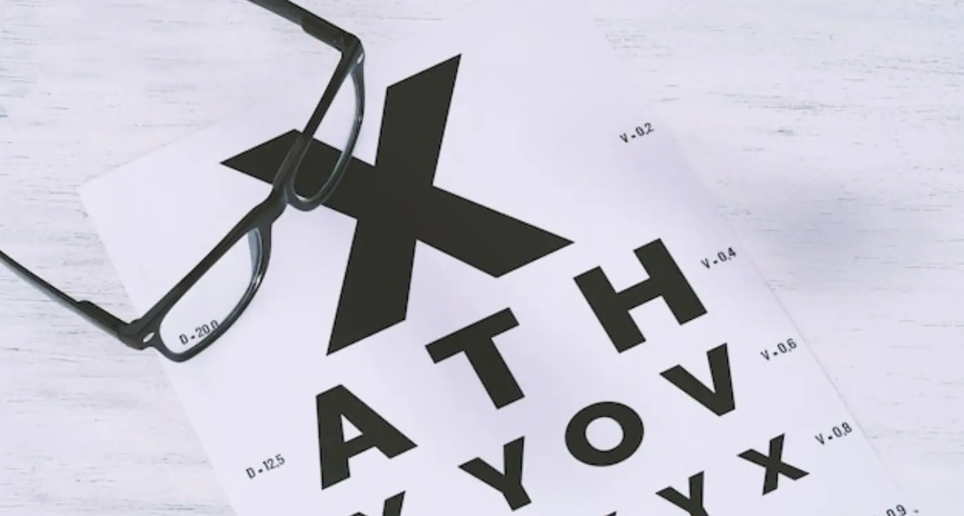
Here's something that trips up a lot of developers—what looks perfectly readable on your laptop screen becomes tiny and illegible on a phone. I've seen apps with beautiful 14px body text that users simply can't read without zooming in. That's an instant delete for most people.
The golden rule I follow? Never go below 16px for body text on mobile. Sure, it might look a bit large when you're designing, but trust me on this one. Your users will thank you when they can actually read your content without straining their eyes.
Context Changes Everything
Mobile users consume content differently than desktop users do. They're scanning, not reading carefully. They want information quickly and they want it to be obvious. This is particularly true for transport and logistics apps where users need quick access to critical information while on the move. This means your typography needs to create clear visual hierarchies that guide the eye naturally through your content. Think of your text as signposts—each element should clearly indicate its importance and relationship to other elements on the screen.
Font Size and Hierarchy
Getting font sizes right on mobile is honestly one of those things that looks dead simple until you actually try to do it. I've lost count of how many apps I've seen where the text is either so small you need a magnifying glass or so massive it feels like you're using an app designed for toddlers.
The sweet spot for body text on mobile sits between 16-18px. Any smaller and people start squinting—any larger and you're wasting precious screen space. But here's where it gets interesting: its not just about picking one size and calling it a day. You need to create a proper hierarchy that guides users through your content.
Think of font hierarchy like a roadmap for people's eyes. Your main heading might be 24px, subheadings at 20px, body text at 16px, and smaller labels at 14px. The key is maintaining consistent ratios between these sizes so everything feels connected but distinct.
Creating Visual Flow
When I'm building an app, I always start with the most important text first. What do users absolutely need to read? That gets the biggest, boldest treatment. Secondary information gets smaller, tertiary info gets smaller still. Its like creating a visual conversation where the loudest voice is the most important one.
Never go below 12px for any text that users need to read regularly. Even if it looks fine on your designer's 27-inch monitor, it'll be practically invisible on a phone screen in bright sunlight.
One mistake I see constantly is using too many different font sizes. Stick to 4-5 sizes maximum across your entire app. More than that and everything starts looking chaotic. Your users shouldn't have to work to figure out whats important—the typography should make it obvious at first glance.
- Main headings: 24-28px
- Section headings: 20-22px
- Body text: 16-18px
- Secondary text: 14-16px
- Labels and captions: 12-14px minimum
Right, let's talk about typefaces—because honestly, this is where I see so many apps go wrong. You'd think choosing fonts would be straightforward, but there's actually quite a bit to consider when you're designing for mobile screens.
First thing I always tell clients: stick to system fonts whenever possible. I know, I know, it sounds boring. But here's the thing—iOS and Android have spent years perfecting their default typefaces (San Francisco and Roboto respectively) specifically for mobile readability. They're optimised for different screen sizes, they load instantly, and users are already familiar with them. Plus, you won't have any licensing headaches down the line.
If you absolutely must use a custom font, make sure it's designed with mobile in mind. Some typefaces that look gorgeous on desktop turn into illegible messes on a 5-inch screen. I've seen apps where the text looks like tiny ants marching across the display—not exactly what you want for your user experience!
Sans-serif fonts generally work better than serif fonts on mobile screens. The clean lines render more clearly on smaller displays, and they maintain their readability even at lower resolutions. That said, serif fonts can work for headlines or branding elements, just be careful with body text.
Here's something I've learned from years of testing: always check your typeface choices on actual devices, not just your computer monitor. What looks perfect on your 27-inch screen might be completely different on a phone in bright sunlight. I keep a collection of different devices specifically for this kind of testing—it's saved me from some embarrassing mistakes over the years.
Weight variation is your friend too. Having light, regular, medium, and bold weights available gives you flexibility in creating hierarchy without changing fonts entirely.
Line Spacing and Text Density
Getting line spacing right on mobile is where most apps go wrong—and I mean really wrong. I've seen apps with text crammed together so tightly it looks like someone's trying to fit a novel onto a business card! The technical term is "leading" but let's just call it line spacing because that's what it actually is.
For mobile apps, you want your line spacing to be about 1.4 to 1.6 times your font size. So if you're using 16px text, your line spacing should be around 22-25px. This gives your text room to breathe without making it feel too spaced out. And here's something many developers don't realise—mobile screens are viewed much closer to our faces than desktop monitors, which means cramped text feels even more claustrophobic.
Text Density That Actually Works
Text density is basically how much information you're trying to squeeze into each screen. I've worked on apps where clients wanted to fit everything "above the fold" as if mobile screens work like newspaper front pages. They don't! Mobile users are perfectly happy scrolling if the content is well-spaced and easy to read.
The best mobile typography feels invisible—users should never have to work to read your content, they should glide through it effortlessly
A good rule of thumb? If you can't comfortably read your app's text while holding your phone at arm's length, your spacing needs work. I always test this with actual devices, not just desktop previews, because what looks fine on a 27-inch monitor can be absolutely unreadable on a 6-inch phone screen. Trust me, your users will notice the difference—and they'll either love you or delete your app because of it.
Contrast and Colour Considerations
Getting contrast right on mobile screens is absolutely critical—and I mean that in the most literal sense. Poor contrast doesn't just make your app look unprofessional; it makes it completely unusable for millions of people. I've seen apps with beautiful designs that nobody could actually read because the contrast ratios were terrible.
The WCAG guidelines recommend a minimum contrast ratio of 4.5:1 for normal text and 3:1 for large text. But here's the thing—those are bare minimums. On mobile devices, where people are often using their phones outdoors in bright sunlight or in dimly lit environments, you want to aim higher. I typically shoot for 7:1 contrast ratios whenever possible.
Common Contrast Mistakes to Avoid
- Grey text on white backgrounds that's too light to read comfortably
- Coloured text on coloured backgrounds without checking actual contrast values
- Relying solely on colour to convey information (think error messages)
- Forgetting about dark mode—your contrast needs work in both themes
- Using low contrast for "less important" text that users actually need
Colour choice goes beyond just making text readable though. Different colours can affect reading speed and comprehension. Blue light, for instance, can strain users eyes during extended reading sessions—something to consider if your app involves lots of text consumption.
One trick I've learned over the years: test your contrast on actual devices, not just your computer monitor. Phone screens vary dramatically in brightness and colour reproduction. What looks fine on your MacBook might be completely unreadable on someone's phone in direct sunlight. Always test with real users in real environments; you'll be surprised how often perfectly good contrast ratios still cause problems in practice.
Text Layout for Touch Interfaces
When you're designing text for mobile apps, you can't just think about how it looks—you need to think about how people will actually interact with it. I mean, users aren't just reading your text; they're tapping around it, scrolling through it, and trying to select specific bits of it with their fingers.
Here's the thing that catches loads of developers out: touch targets need proper spacing around text elements. If you've got clickable text links or buttons sitting too close to regular text, users will accidentally tap the wrong thing. Its basically a nightmare for user experience. I always make sure there's at least 44 pixels of tappable area around any interactive text element—this gives people's thumbs enough room to work with.
Text blocks need breathing room too. When you're laying out paragraphs, don't cram them together like you might on a desktop site. Mobile users are often reading whilst walking, on the tube, or in poor lighting conditions. They need clear visual breaks between sections to help their eyes follow the content properly.
Managing Text Selection and Input Fields
One thing I see apps get wrong all the time is making text selectable when it doesn't need to be. Sure, you want people to be able to copy important information like addresses or phone numbers, but making every bit of UI text selectable just creates confusion. Users end up accidentally selecting text when they meant to scroll or tap something else.
For input fields, give them proper padding and make sure the tap target extends beyond just the text area itself. Nothing's more frustrating than trying to edit text in a tiny input box that barely responds to your taps.
Always test your text layout on actual devices, not just in simulators. The way text feels under your thumb is completely different from how it looks on your computer screen.
Platform-Specific Typography Guidelines
After years of building apps for both iOS and Android, I can tell you that ignoring platform-specific typography guidelines is one of the quickest ways to make your app feel out of place. Sure, you might think users won't notice—but they absolutely do, even if they can't quite put their finger on why something feels "off".
iOS has its own set of rules that work beautifully within Apple's ecosystem. The system fonts—San Francisco for iOS—are specifically designed to be readable at all sizes and weights. When you're building for iPhone or iPad, stick with the native font stack unless you have a really compelling reason not to. The Dynamic Type system lets users adjust text sizes based on their preferences, which is brilliant for accessibility; if you override this with custom fonts, you're making life harder for users who need larger text.
Android Typography Standards
Android takes a different approach with Roboto as its primary typeface. It's designed to feel friendly and open, which matches Google's design philosophy perfectly. Material Design guidelines are quite specific about font weights and sizes—regular weight for body text, medium for buttons, and you'll want to pay attention to their recommended line heights.
Cross-Platform Considerations
Here's where things get tricky. If you're using React Native or Flutter, you might be tempted to use the same fonts across both platforms to maintain consistency. While this can work, I've found that apps feel more native when they respect each platform's typography conventions. Users have spent years getting comfortable with how text looks and behaves on their chosen platform—why fight against that muscle memory?
The key is finding the right balance between your brand identity and platform expectations. Sometimes that means making small adjustments to font sizes or line spacing between iOS and Android versions.
Conclusion
Getting mobile typography right isn't just about picking a pretty font and calling it a day—it's about understanding how people actually use their phones and tablets. I've seen too many apps fail because the developers thought desktop typography rules would work on a 5-inch screen. They don't.
The fundamentals we've covered really do make the difference between an app people enjoy using and one they delete after five minutes. Font size matters more than you think; line spacing can make or break readability; contrast isn't optional—it's accessibility. And honestly, if your users can't read your content comfortably, nothing else you've built matters.
What I find fascinating after all these years is how mobile typography keeps evolving. Variable fonts are opening up new possibilities; dark mode has changed how we think about text contrast; and different screen densities mean we need to be smarter about our choices. But the core principles remain the same—readability first, hierarchy second, everything else comes after.
Here's the thing though: you can follow every guideline perfectly and still end up with poor mobile typography if you don't test with real users on real devices. I always tell my clients to hand their phones to their mum, their teenager, their colleague who needs reading glasses. If they struggle to read your content, you've got work to do.
Typography might seem like a small detail in the grand scheme of app development, but it's one of those details that users notice immediately—even if they can't articulate why something feels right or wrong. Get it right, and you're setting your app up for success.
Share this
Subscribe To Our Learning Centre
You May Also Like
These Related Guides

How Do I Choose the Right Font Size for My Mobile App?

What Are the Benefits of Implementing Dark Mode in Mobile Apps?


