A major airline recently launched their new mobile app with all the right features—flight booking, check-in, boarding passes, the works. But users kept complaining that it felt "cramped" and "hard to use" even though everything functioned perfectly. The problem wasn't the functionality; it was the spacing. Text was squashed together, buttons were too close to each other, and important information got lost in the visual clutter. After redesigning with proper spacing rules, user satisfaction jumped by 40% and booking conversions improved dramatically.
This isn't unusual, actually. I've seen brilliant apps fail because the developers focused entirely on features and forgot about the space between them. Spacing in app interface design isn't just about making things look pretty—it's about creating interfaces that people can actually use without getting frustrated.
When we talk about spacing, we're really talking about two things: the space between elements (margins and padding) and the strategic use of white space to guide users through your app. Get it right, and users will flow through your app naturally, finding what they need without thinking about it. Get it wrong? Well, you end up like that airline before their redesign.
Good spacing is invisible to users, but bad spacing makes every interaction feel like work
The thing is, spacing rules aren't just arbitrary guidelines—they're based on how people actually interact with mobile devices. Your thumb needs enough space to tap accurately, your eyes need breathing room to process information, and your brain needs visual separation to understand what belongs together. That's what we'll cover in this guide: the specific rules and measurements that separate professional app interfaces from amateur ones.
Understanding Visual Hierarchy Through Spacing
Visual hierarchy is basically how users scan and understand your app interface—and spacing is the secret weapon that makes it all work. I've seen too many apps where everything feels cramped together or weirdly spaced out; it's like trying to read a book where all the words run together. Not fun, right?
When I'm designing an app interface, I think of spacing as the invisible guide that tells users where to look first, second, and third. Tighter spacing groups related elements together—like keeping a heading close to its paragraph. Wider spacing creates separation between different sections or ideas.
Creating Relationships Through Proximity
Here's something that really matters: elements that are close together feel related, whilst elements with more space between them feel separate. It's that simple, but the impact is huge. A form field and its label need to be closer to each other than they are to the next form field, otherwise users get confused about what belongs to what.
The Three Levels of Spacing Hierarchy
I typically work with three main spacing levels to create clear hierarchy:
- Tight spacing (4-8px) for closely related elements like labels and input fields
- Medium spacing (16-24px) for separating different sections within the same component
- Loose spacing (32-48px) for creating distinct sections and major content breaks
The key is consistency—once you establish these relationships, stick to them throughout your app. Users will subconsciously learn your spacing language, making your interface feel more intuitive and professional. And honestly, when you get this right, everything just feels more polished and easier to use.
The 8-Point Grid System
Right, let's talk about the 8-point grid system—honestly, this is one of those things that sounds way more complicated than it actually is. The basic idea? You base all your spacing measurements on multiples of 8 pixels. So instead of randomly choosing 7px here and 13px there, you stick to 8, 16, 24, 32, and so on.
Why 8 pixels specifically? Well, it's divisible by loads of common screen densities and works brilliantly across different devices. I mean, you could use 4 or 6, but 8 gives you that sweet spot between flexibility and constraint. It's big enough to create meaningful spacing differences but small enough to give you proper control over your layout.
Here's how it works in practice: your margins might be 16px, your padding between elements could be 24px, and larger sections might have 40px or 48px spacing. The beauty of this system is that everything feels connected and intentional—users can't put their finger on why, but the interface just feels more polished.
Start with 16px as your base spacing unit for most elements, then scale up or down using the 8-point system (8px, 24px, 32px) depending on the hierarchy you want to create.
Now, you don't need to be absolutely rigid about this. Sometimes you'll need 4px for fine-tuning or 12px for specific elements. But having the 8-point system as your foundation means you're making deliberate choices rather than just eyeballing everything. And trust me, when you're working with developers, having consistent spacing values makes their job so much easier—no more "is that 15px or 16px?" conversations.
Spacing Between Text Elements
Getting text spacing right is where good apps separate themselves from the mediocre ones. I've seen brilliant app concepts fail because the text feels cramped or scattered—users just can't focus on what they're supposed to read.
Line height is your first concern when dealing with text spacing. For body text on mobile, I typically use a line height that's 1.4 to 1.6 times the font size. So if you're using 16px text, your line height should be around 22-26px. Headlines can get away with tighter spacing—usually 1.2 to 1.3 times the font size—because they're meant to feel more compact and punchy.
But here's where it gets interesting: the space between different text elements matters just as much. When you have a headline followed by body text, that gap needs to feel intentional. Too close and they blur together; too far apart and they feel disconnected.
Standard Text Element Spacing
- Headline to body text: 8-16px depending on text sizes
- Paragraph breaks: 16-24px for comfortable reading flow
- Caption text to images: 8px minimum to avoid crowding
- Button text to surrounding elements: 24-32px for clear separation
- Form labels to input fields: 4-8px keeps them visually connected
One mistake I see constantly? Treating all text spacing the same. Your app's hierarchy depends on varied spacing—related elements should feel closer together than unrelated ones. When users scan your interface, proper text spacing guides their eye naturally from one piece of information to the next.
Test your text spacing on actual devices, not just your computer screen. What looks perfect on a 27-inch monitor might feel suffocating on a phone. The smaller the screen, the more each pixel of spacing matters for readability.
Button and Interactive Element Spacing
Getting button spacing right is bloody important—and I mean that literally. I've seen apps fail user testing simply because people couldn't tap the right buttons reliably. Your interactive elements need enough breathing room to function properly, but not so much that they feel disconnected from their related content.
For buttons themselves, I always stick to a minimum of 16px internal padding (top, bottom, left, right). This gives your text enough room to breathe and makes the button feel substantial. Smaller padding makes buttons look cramped and cheap. Trust me on this one—I've A/B tested it more times than I can count.
Spacing Between Multiple Buttons
When you've got multiple buttons together, like a "Cancel" and "Save" pair, keep them 16px apart horizontally. For stacked buttons (which work better on mobile anyway), use 12px vertical spacing. This prevents accidental taps whilst keeping the buttons visually connected as a group.
The space around your buttons is just as important as the buttons themselves—it's what helps users navigate your app confidently
Buttons and Surrounding Content
Here's where many designers go wrong: they place buttons too close to other interactive elements. Give your primary action button at least 24px of space from any other tappable element. Secondary buttons can be closer (16px minimum) but never less than that.
For buttons at the bottom of forms or screens, I typically use 32px from the screen edge—this accounts for the natural way people hold their phones and prevents accidental navigation gestures. It might seem like a lot of space, but your users will thank you for it when they're not constantly hitting the wrong button.
Container and Card Spacing Rules
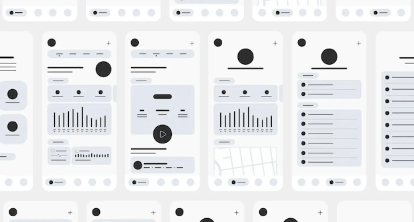
Cards and containers are the backbone of most modern app interfaces—they group related content together and create clear visual boundaries. But here's the thing: get the spacing wrong and your beautifully designed content turns into a cluttered mess that users can't navigate properly.
I've seen too many apps where cards are crammed together like sardines in a tin, making it impossible to tell where one piece of content ends and another begins. Users end up tapping the wrong things, getting frustrated, and ultimately deleting your app. Not exactly the user experience we're going for!
Internal Card Spacing
Inside each card, you want consistent padding on all sides—usually 16px or 24px depending on your overall design scale. This gives your content room to breathe and prevents text from butting right up against the card edges. It looks cleaner and reads better.
When you've got multiple elements inside a card (like a title, description, and button), space them 12px to 16px apart vertically. This creates clear separation without making the card feel disconnected internally.
Card-to-Card Spacing
Between cards, I typically use 12px to 16px of spacing. Any less and they start to feel cramped; any more and you lose that sense of related content flowing together. The key is consistency—pick a spacing value and stick with it throughout your app.
- Use 16px or 24px internal padding for cards
- Apply 12px to 16px spacing between card elements
- Maintain 12px to 16px gaps between cards
- Keep container margins at least 16px from screen edges
- Test spacing on different screen sizes to ensure readability
Remember, containers need breathing room from the screen edges too—never let your content touch the very edge of the display. Users need that visual buffer zone to feel comfortable interacting with your interface.
Mobile Touch Target Guidelines
When I'm designing mobile interfaces, touch targets are where theory meets reality—and honestly, getting them wrong can make users want to throw their phones across the room. The basic rule is simple: make touch targets at least 44x44 points (that's about 9mm on most devices). But here's the thing, bigger is often better, especially for primary actions.
I've tested apps where buttons were technically the right size but felt impossible to tap accurately. The problem? Not enough spacing around them. Your touch targets need breathing room—at least 8 points of space between interactive elements. This prevents the dreaded "fat finger" problem where users accidentally tap the wrong button.
Test your touch targets with your thumb, not your index finger. Most people use thumbs for mobile navigation, and thumbs are less precise than fingers.
Primary vs Secondary Touch Targets
Primary actions like "Buy Now" or "Send Message" should be larger than secondary ones. I typically make primary buttons 48x48 points minimum, while secondary actions can stick to the 44x44 rule. It's about creating a natural hierarchy that guides users through your app without them having to think about it.
Context Matters
Touch target sizing isn't one-size-fits-all. Navigation tabs can be smaller since they're used frequently and users expect their location. But destructive actions like "Delete Account"? Make them big enough that there's no accidental tapping, but not so prominent that they dominate the interface. The goal is confident interaction—users should never hesitate before tapping because they're worried about hitting the wrong thing.
Common Spacing Mistakes to Avoid
After years of reviewing app designs and fixing spacing issues, I can tell you the same mistakes crop up again and again. The good news? They're all fixable once you know what to look for.
The biggest mistake I see is inconsistent spacing throughout an app. One screen might have 16px margins while another uses 20px, and suddenly your app feels disjointed. Users might not consciously notice it, but they'll sense something feels "off". Stick to your grid system religiously—if you've chosen 8px increments, use them everywhere.
Cramped Touch Targets
Here's a mistake that drives users mad: tiny buttons with no breathing room. I've seen beautiful designs where buttons are barely 40px tall with text elements squashed right above them. Your users will struggle to tap accurately, especially if they have larger fingers or accessibility needs. Give your interactive elements at least 44px of height and decent spacing around them.
Another spacing disaster? Ignoring text line height completely. When developers don't specify proper line spacing, text becomes nearly unreadable—especially in longer paragraphs. Your line height should typically be 1.4 to 1.6 times your font size for body text.
Overcrowded Information
I often see apps trying to cram too much information into small screens without proper spacing. Cards touching each other, text running into images, form fields with no visual separation. Remember, white space isn't wasted space—its actually helping users process information more easily.
The fix for most spacing problems is surprisingly simple: step back and look at your design with fresh eyes. Better yet, test it on real devices with real people. What looks perfect on your computer screen might feel cramped on an actual phone.
Getting spacing right in your app interface isn't just about following rules—it's about creating experiences that feel natural and effortless to your users. I've seen apps with incredible functionality fail because their spacing was off, making everything feel cramped and confusing. On the flip side, I've watched simple apps succeed because they nailed the fundamentals of white space and layout design.
The spacing rules we've covered aren't arbitrary suggestions; they're based on years of testing what actually works in real apps with real users. The 8-point grid system gives you consistency, proper text spacing makes content readable, and adequate touch targets prevent user frustration. But here's the thing—rules are meant to guide you, not restrict your creativity.
Every app is different, and what works for a banking app might not work for a gaming app. The key is understanding why these spacing principles exist in the first place. Once you grasp that spacing creates visual hierarchy, guides user attention, and improves usability, you can adapt these guidelines to fit your specific needs.
My advice? Start with the fundamentals we've discussed, then test with real users. Watch how people actually use your app interface. Do they struggle to tap buttons? Are they squinting to read text? Do their eyes know where to look first? User behaviour will tell you more about your spacing decisions than any design theory ever could.
Remember, good spacing in app design is invisible—users shouldn't notice it, they should just feel comfortable using your app. When you get it right, everything flows naturally and your app feels polished and professional. That's the difference between an app people use once and an app they keep coming back to.