A promising food delivery app launches with great fanfare, backed by millions in funding and months of development. The interface looks polished, the features are comprehensive, and the marketing campaign generates thousands of downloads on launch day. Yet within 72 hours, most users have deleted the app entirely. The reason? They couldn't figure out how to place their first order without jumping through multiple registration screens, location permissions, and payment setup requirements.
This scenario plays out thousands of times across app stores every single day. User abandonment during the onboarding process has reached staggering levels—we're talking about 9 out of every 10 users who download an app never making it past their first experience. That's not a typo. The statistics are genuinely that brutal.
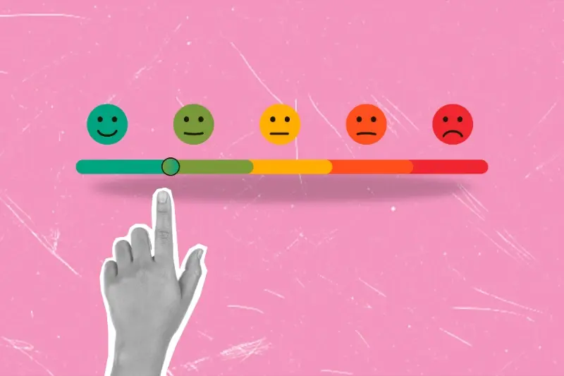
The onboarding process is where apps either win users for life or lose them forever, and there's rarely a second chance to make that first impression count.
What's particularly frustrating is that most of these abandoned apps aren't fundamentally broken. They often solve real problems and offer genuine value. The issue lies in those critical first moments when users are trying to understand what your app does and whether it's worth their time. Mobile app retention rates have become the ultimate measure of success, yet many developers still treat onboarding as an afterthought rather than the make-or-break moment it truly represents. The apps that understand this survive; those that don't join the graveyard of forgotten downloads. Understanding why user drop-off rates are so high—and more importantly, how to fix them—can mean the difference between building a successful app and creating expensive digital waste.
What Makes Users Delete Apps So Quickly
The numbers don't lie—most people will delete your app within minutes of downloading it. After building mobile apps for years, I've seen this pattern repeat itself over and over again. Users are ruthless when it comes to their phone storage and attention span.
The main culprit? Poor first impressions. When someone opens your app for the first time, they're making split-second judgements about whether it's worth keeping. If the app crashes, loads slowly, or confuses them straight away, they're gone. No second chances.
The Permission Problem
Apps that immediately ask for access to your camera, location, contacts, and notifications before explaining why they need them are setting themselves up for failure. Users feel overwhelmed and suspicious—they haven't even seen what the app does yet! This aggressive approach pushes people away faster than you can say "allow access".
Information Overload
Another major reason users abandon apps is being bombarded with too much information at once. Long registration forms, multiple tutorial screens, and complex interfaces make people's brains hurt. They wanted to try your app, not sit through a university lecture about how to use it.
Here's what really gets me—some apps don't even show their core value before asking users to create an account. Would you buy a car without seeing it first? Of course not. Yet many apps expect users to hand over their email address before proving they're worth the effort. Users see through this immediately and hit the delete button without hesitation.
The Critical First Three Minutes
Right, let's talk about those make-or-break first three minutes. This is where the magic happens—or where everything falls apart. Research shows that users form their opinion about your app within the first 180 seconds of opening it. That's less time than it takes to make a cup of tea!
During these precious moments, users are asking themselves three questions: Does this app do what I expected? Is it easy to use? Will it solve my problem quickly? If any of these answers come back as "no" or "maybe," you're in trouble. The user's finger is already hovering over that delete button.
What Happens During These Three Minutes
Users don't just sit there passively absorbing your beautiful design. They're actively judging every single element they encounter. The loading time, the welcome screen, the sign-up process, the first few steps—all of it gets scrutinised. One confusing button or unnecessary step can trigger an immediate exit.
The trickiest part? Users aren't patient anymore. They've got dozens of other apps they could try instead, so why should they stick around if yours isn't working for them straight away? This is where user drop-off rates spike dramatically; most apps lose about 25% of users after the first use.
Keep your app's initial value proposition crystal clear and deliverable within the first three minutes. If users can't see immediate benefit, they won't stick around to discover it later.
The Three-Minute Checklist
- App loads in under 3 seconds
- Purpose is immediately obvious
- Sign-up process takes less than 30 seconds
- Users can complete one meaningful action
- No confusing navigation or unexpected screens
Remember, you only get one chance to make this first impression count. Those three minutes determine whether you'll have a loyal user or just another statistic in your mobile app retention reports.
Common Onboarding Mistakes That Drive Users Away
After working with hundreds of apps over the years, I've spotted the same onboarding blunders time and time again. The worst part? These mistakes are completely avoidable if you know what to look for.
The biggest killer is asking for too much information upfront. Nobody wants to fill out a lengthy form before they've even seen what your app can do. I've watched users abandon apps within seconds when faced with endless registration fields asking for their life story—name, email, phone number, birthday, favourite colour, pet's maiden name. You get the picture.
The Most Damaging Onboarding Errors
- Forcing registration before users can explore any features
- Creating tutorials that are too long or complex
- Bombarding users with permission requests immediately
- Overwhelming new users with every single feature at once
- Using confusing navigation or unclear buttons
- Failing to explain the app's main benefit within seconds
Another major problem is the dreaded permission avalanche. Your app might need access to the camera, location, contacts, and notifications—but asking for all of these at launch feels invasive and suspicious. Users will often deny everything or delete the app entirely rather than grant permissions they don't understand.
The Tutorial Trap
Long, boring tutorials are app killers. People don't want to sit through five minutes of explanations when they could be using the app. The best onboarding teaches while users actually interact with real features, not through static screens filled with text that nobody reads anyway.
Skip screens are your friend—but if most users are skipping your entire onboarding flow, that's a red flag that something needs fixing.
Signs Your App Has an Abandonment Problem
Spotting user abandonment isn't always obvious—sometimes the signs are hiding in plain sight. I've worked with clients who thought their app was performing well, only to discover that their user drop-off rates were through the roof. The good news? There are clear warning signals you can watch for.
Your Analytics Tell the Story
Start by looking at your session duration data. If users are spending less than two minutes in your app during their first visit, that's a red flag. Short sessions during onboarding usually mean people are getting frustrated and giving up. Another telltale sign is a high percentage of single-session users—people who open your app once and never return.
App store reviews can be brutal, but they're goldmines for understanding abandonment. Look for complaints about confusing interfaces, too many permission requests, or lengthy registration processes. When multiple users mention the same problems, you've found your culprits.
The Numbers Don't Lie
Most successful apps see at least 25% of users return within the first week, so anything significantly lower suggests an onboarding issue
Your mobile app retention rates during the first three days are particularly telling. If you're losing more than 75% of users in this timeframe, your app onboarding process needs immediate attention. Check your funnel analytics too—where exactly are people dropping off? Is it during account creation? When you ask for permissions? Or right after they complete the tutorial?
Don't ignore crash reports either. Technical problems during those first few minutes can instantly destroy a user's confidence in your app. Even minor bugs feel major when someone's trying to figure out if your app is worth their time.
How to Keep Users Engaged From Day One
Getting users to stick around after downloading your app isn't rocket science, but it does require some careful planning. The trick is making those first few moments feel worthwhile—not overwhelming or confusing. I've seen countless apps lose users simply because they tried to show off every feature at once, leaving people feeling lost before they even got started.
The secret lies in progressive disclosure. Show users one thing at a time, let them master it, then introduce the next feature. Think of it like learning to drive—you don't start on the motorway! Begin with the core action that delivers immediate value. If it's a fitness app, get them logging their first workout. If it's a productivity tool, help them create their first task.
Quick Wins That Work
Here are the tactics that consistently keep users coming back after their first session:
- Give users a meaningful achievement within 30 seconds of opening the app
- Use progress indicators to show how close they are to completing setup
- Personalise the experience with their name and preferences immediately
- Send a welcome message that explains what happens next
- Offer skip options for non-critical steps—don't force everything
- Show real examples instead of placeholder text wherever possible
The most successful apps I've worked on all share one thing: they make users feel smart, not stupid. When someone completes an action and thinks "that was easy," you've won half the battle. The other half is giving them a reason to come back tomorrow—but that's a story for another day. Focus on nailing that first experience and the rest becomes much easier to solve.
Conclusion
After working with hundreds of apps over the years, I can tell you that user abandonment during the onboarding process isn't just a numbers game—it's a user experience problem that can make or break your entire app. Those staggering drop-off rates we see aren't inevitable; they're preventable if you know what you're doing.
The thing is, most developers and business owners focus on building features instead of building experiences. They spend months perfecting the core functionality but then rush through the onboarding design in a few days. That's backwards thinking, and it shows in their user retention numbers.
Your onboarding process is your first impression, your sales pitch, and your user education all rolled into one. Get it wrong and people will delete your app faster than you can say "swipe right". Get it right and you'll see your mobile app retention rates climb whilst your user drop-off rates plummet.
The good news? Every single mistake that drives users away during onboarding can be fixed. Whether it's asking for too much information upfront, having unclear value propositions, or making users jump through unnecessary hoops—these are design decisions, not technical limitations.
Start by looking at your own app onboarding process with fresh eyes. Time yourself going through it. Count how many steps it takes. Ask yourself if you'd stick around if this was your first time using the app. Be honest about what you find, because your users certainly will be.