
How Do I Design for Users with Colour Blindness?
About 1 in 12 men and 1 in 200 women have some form of colour vision deficiency, which means right now theres a good chance that a significant portion of your users cant see your app the way you intended. And here's the thing—most developers dont realise this until someone complains or leaves a bad review. I've worked on apps where we thought we'd nailed the design, only to discover during testing that our green "success" buttons and red "error" messages looked almost identical to users with deuteranopia. Its a bit mad really, because we spent weeks perfecting the colour scheme without considering that roughly 8% of our male users couldnt actually distinguish between our carefully chosen shades.
Designing for colour blindness isnt just about being nice; its about making sure your app actually works for everyone who downloads it. When I built a healthcare app a few years back, we had colour-coded medication reminders that seemed perfectly clear to us. Green meant take now, amber meant upcoming, red meant overdue. Simple, right? Except for the significant number of users who couldnt tell the difference between those colours at all. They were missing their medication schedules because our design assumed everyone saw colours the same way we did. Healthcare apps need to be especially careful about accessibility since patient safety can be affected by design choices.
The most accessible designs dont rely on colour alone—they use multiple visual cues working together to communicate meaning
What I've learned is that accessible design actually makes apps better for everyone, not just users with colour blindness. When you add icons, patterns and clear text labels alongside colour coding, you create redundancy that helps all users understand your interface faster. The apps I build now perform better across the board because we design with accessibility from day one, not as an afterthought. This approach is part of what makes successful apps stand out from their competition.
Understanding Different Types of Colour Blindness
Most people don't realise there isn't just one type of colour blindness—there's actually several different kinds, and they all affect how users see your app in different ways. I've built apps for healthcare companies where getting this wrong could literally mean a patient misreading important health data, so understanding these variations isn't just nice to have, its genuinely critical.
The most common type is red-green colour blindness, which affects around 8% of men and 0.5% of women. Within this category you've got two main variants: protanopia (where red appears more dim and greenish) and deuteranopia (where greens look more reddish). I remember working on a fintech app where we'd used red for negative account balances and green for positive ones—seemed obvious right? But for users with deuteranopia, those colours looked almost identical. We had to add icons and different shades to make it work properly.
Blue-yellow colour blindness (tritanopia) is much rarer, affecting about 1 in 10,000 people. These users struggle to distinguish between blue and green, and between yellow and red. Then there's achromatopsia (complete colour blindness) which is extremely rare but means users see everything in shades of grey.
The Main Types You Need to Design For
- Protanopia (red-weak): Reds appear darker and more brown, can confuse reds with greens
- Deuteranopia (green-weak): Most common type, greens look more red, struggles with red-green combinations
- Tritanopia (blue-weak): Blues appear greener, yellows look pink or light grey
- Achromatopsia: Complete absence of colour vision, sees only in greyscale
The thing is, when you're designing for colour blindness you're actually making your app better for everyone. High contrast and clear visual distinctions help users in bright sunlight, older users with declining vision, and anyone who's just tired or distracted. That's a lot of people benefiting from one design decision. Understanding these nuances is also crucial when evaluating whether your app investment is on track.
Why Colour Alone Isn't Enough
I've reviewed hundreds of app designs over the years and one mistake keeps popping up—designers relying only on colour to communicate important information. Red for errors, green for success, blue for links. Seems logical, right? But here's the thing: if you've got deuteranopia (the most common type of colour blindness affecting about 5% of men), red and green look pretty much identical. That "successful payment" notification in green? Looks exactly like the error message in red.
I worked on a healthcare app where the original design used colour coding for medication dosages—orange for morning, blue for evening, red for "take with food". Looked great in the mockups. But when we tested it with users who had colour vision deficiencies, they couldn't distinguish between the doses at all. That's genuinely dangerous in a healthcare context. We had to rebuild the system using icons, patterns and explicit text labels alongside the colours. Added maybe three days to development time but made the app usable for millions more people.
The issue isn't just about colour blindness either. What about users in bright sunlight where screen contrast drops? Or older users whose colour perception naturally diminishes? If your app communicates "your account is overdrawn" only through red text, you're excluding a massive chunk of your potential users. And in fintech apps where I spend a lot of my time, that kind of accessibility failure can actually breach regulatory requirements. These design decisions directly impact how natural and easy the purchasing experience feels for users.
Before finalising any design, ask yourself: if I printed this in greyscale, could users still understand what's happening? If not, you need more than just colour doing the heavy lifting.
Information That Needs More Than Colour
- Error states and validation messages (add icons and descriptive text)
- Status indicators like "pending" vs "complete" (use patterns or badges)
- Charts and graphs (label directly, don't just use colour legend)
- Interactive elements like buttons or links (underlines, borders, hover states)
- Progress indicators (add percentage or step numbers)
- Category distinctions in lists (icons or tags work better)
The good news? Adding these extra indicators usually improves the experience for everyone, not just users with colour blindness. Text labels are clearer than colours alone. Icons speed up recognition. Patterns add visual interest. Its basically win-win—you make your app more accessible and more usable at the same time.
Testing Your App's Colour Contrast
Right so you've designed your app and picked your colours—now comes the part where you actually test if anyone can read the bloody thing. I can't tell you how many times I've had clients show me designs that look gorgeous on a big monitor in a bright office, only to discover that half their users struggle to read the text on an actual phone screen. Testing contrast isn't optional; it's the difference between an accessible app and one that excludes millions of potential users.
The Web Content Accessibility Guidelines (WCAG) set the standard here, and its pretty straightforward once you get the hang of it. Normal text needs a contrast ratio of at least 4.5:1 against its background, whilst larger text (18pt or 14pt bold and above) can get away with 3:1. These aren't arbitrary numbers either—they're based on actual research about readability for people with various vision impairments including colour blindness. When I worked on a healthcare app a few years back, we thought our grey-on-white interface looked clean and modern...until our contrast testing revealed it was sitting at 2.8:1. We had to darken that grey considerably, and you know what? It looked better and worked better for everyone. This relates closely to choosing appropriate font sizes for optimal readability.
Here are the testing tools I actually use on projects, not just the ones I've heard about:
- WebAIM's Contrast Checker for quick spot checks during design
- Stark plugin for Figma or Sketch which tests directly in your design files
- Colour Oracle which simulates different types of colour blindness on your actual screen
- iOS and Android's built-in accessibility settings to test on real devices
- Lighthouse in Chrome DevTools for automated accessibility audits
But here's the thing—don't just test once and forget about it. I test at multiple stages because colours that pass in your design mockup might fail when rendered on actual device screens with different brightness levels. One fintech app I built needed emergency contrast adjustments after beta users reported they couldn't read transaction amounts in sunlight, even though it had passed our desktop testing. Now I test on actual phones, outdoors if possible, before any app goes live. This is exactly the kind of issue you should address during your beta testing phase.
Using Patterns, Icons and Text Labels
Here's what I've learned from building accessible apps over the years—colour should never be the only way you communicate information to users. I mean, it sounds obvious when you say it out loud, but you'd be surprised how many apps still rely solely on red and green to show success and error states. Its a massive problem for anyone with colour vision deficiency.
When we built a healthcare app for tracking medication adherence, we initially used colour-coded pills to show which ones had been taken and which hadnt. Green for taken, grey for missed. Simple, right? Wrong. During testing with users who had deuteranopia, they couldn't tell the difference at all. We had to redesign the entire system to include patterns—diagonal stripes for missed doses, solid fills for completed ones—and added small tick icons next to taken medications. The change took about two days of development time but made the app usable for millions more people.
Patterns Work Where Colour Fails
Adding textures and patterns alongside colour gives users multiple ways to interpret information. In a fintech app we developed, transaction categories used both colour and distinct patterns (dots, lines, grids) so users could quickly scan their spending regardless of their colour vision. Text labels are your safety net though; they remove all ambiguity and work for everyone including screen reader users.
The best accessible design doesnt look like accessible design—it just works better for everyone
Combining Multiple Indicators
Sure, using all three elements—patterns, icons, and text—might seem like overkill. But heres the thing: each one serves different users in different contexts. Bright sunlight washes out colour. Small screens make patterns hard to see. Icons without labels confuse some users. When you combine them all, you're building redundancy into your design, which is exactly what accessibility requires. I always tell clients that if removing colour from your app breaks the user experience, you've got work to do. This approach also contributes to making apps feel intuitive and easy to use.
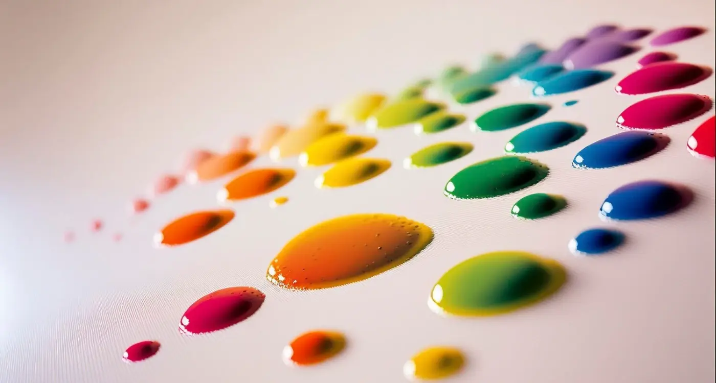
The Right Colour Palettes for Accessibility
Choosing colours for your app isn't just about making things look pretty—it's about making sure everyone can actually use what you've built. I've worked on healthcare apps where getting this wrong could mean someone misreads their medication schedule, and fintech projects where poor colour choices made it impossible for users to distinguish between positive and negative account balances. The stakes are higher than most people think.
Here's what I've learned works: stick with high-contrast pairings and test them against different types of colour blindness before you commit. Blue and orange is one of my go-to combinations because it works well for pretty much everyone, including people with red-green colour blindness (which affects about 8% of men). Dark blue text on a light background, or vice versa, gives you that contrast you need whilst being universally accessible. For an e-commerce project we used deep navy (#1A3A52) paired with burnt orange (#E67E22) for calls-to-action, and our user testing showed zero issues across all colour vision types.
Colour Combinations That Actually Work
Through years of testing—and yes, some failures—I've built up a mental library of safe combinations. Purple and yellow is brilliant for alerts and warnings. Teal and coral works well for data visualisation. But you know what? Sometimes the safest bet is to avoid relying on colour temperature altogether. In a recent education app, we used blue-grey (#546E7A) for inactive states and a vivid cyan (#00BCD4) for active ones, then added icon changes as backup. Users with protanopia couldn't tell the difference in hue, but the lightness contrast was strong enough that it didn't matter. These thoughtful design decisions align with creating professional-feeling apps.
When Standard Palettes Fall Short
The tricky bit comes with brand colours. I've had clients with brand guidelines that use red and green together—proper nightmare for accessibility. In those cases, you need to adjust the luminosity significantly or add texture overlays. For a food delivery app stuck with their red-green branding, we darkened the red to almost burgundy and used a lime green instead of forest green, pushing the contrast ratio above 4.5:1. It wasn't perfect, but it passed WCAG AA standards and kept the brand police happy.
- Blue (#0066CC) and Orange (#FF6600) - works for deuteranopia and protanopia
- Purple (#7B1FA2) and Yellow (#FDD835) - high contrast across all colour blindness types
- Teal (#009688) and Coral (#FF5252) - good for charts and data visualisation
- Dark Grey (#424242) and Bright Cyan (#00E5FF) - excellent for UI states
- Navy (#1A237E) and Amber (#FFC107) - works well in both light and dark modes
One more thing—and this is something I wish I'd known earlier in my career—your colour palette needs to work in both light and dark mode these days. That blue-orange combination I mentioned? In dark mode, you need to flip it: use lighter shades of blue and tone down the orange, or it'll burn peoples eyes out. I learned this the hard way on a productivity app where our vibrant palette looked great in light mode but was absolutely brutal when users switched to dark mode in the evening.
Real World Examples That Get It Right
When I built a health tracking app for a client in the medical space, they wanted bright red alerts for critical readings and green for normal ranges. Simple enough, right? But then we tested it with colour blind users and realised that red-green combinations were completely useless for about 8% of their potential users. We ended up using icons—a warning triangle for high readings and a tick for normal ones—plus the colours. Problem solved, and honestly, it made the app better for everyone.
Monzo's banking app is one I point clients towards all the time. They use colour sparingly and never rely on it alone to convey important information. Their spending categories have both colours and distinct icons, so whether you can see that transport is blue or not doesn't matter—you'll still recognise the little bus icon. Its the same with their notifications; urgent alerts combine colour with clear text and symbols. They've also got brilliant contrast throughout, which means text is readable even in bright sunlight.
Google Maps deserves a mention too, even though its not perfect everywhere. They've moved away from relying purely on colour coding for traffic conditions. Now you get those little dots and patterns along routes, plus they show estimated times which gives you the information you need without having to distinguish between red and orange. The iOS Weather app does something similar—they use icons and text alongside their coloured elements, so you're never left guessing whether that blob means rain or sun just from colour alone. These apps understand that performance and clarity directly impact user retention.
Look at how successful apps handle forms and validation. Duolingo doesn't just turn answer boxes red or green; they add crosses and ticks. Stripe's payment forms use text labels alongside colour states. These small additions take minutes to implement but make your app usable for millions more people.
Apps That Lead the Way
- Monzo—clear icons paired with every colour-coded category
- Google Maps—patterns and time estimates alongside traffic colours
- Duolingo—symbols that reinforce right/wrong states
- Slack—status indicators that use both colour and text labels
- Spotify—high contrast mode option with clear visual hierarchy
Common Mistakes That Block Users
I've reviewed dozens of apps that completely failed accessibility audits, and honestly, its almost always the same handful of mistakes that cause the problems. The most common one? Using colour-coded status indicators without any backup system. I worked on a healthcare app a few years back where the original design used red, amber and green dots to show patient priority levels—looked beautiful in the mockups but absolutely useless for about 8% of the medical staff who couldn't distinguish between red and green. We had to retrofit the entire system with icon overlays and text labels, which could have been avoided if we'd thought about it from day one.
Another massive issue I see is low contrast text on coloured backgrounds. Designers love putting grey text on light blue backgrounds or vice versa, and it fails contrast ratios every single time. The WCAG guidelines recommend a minimum contrast ratio of 4.5:1 for normal text and 3:1 for large text, but I've seen apps launch with ratios as low as 2:1 because nobody actually tested it. Your design might look "clean" and "modern" but if users cant read it, whats the point? These issues often stem from positioning mistakes that kill apps before they launch.
Then there's the reliance on hover states for critical information. I worked with an e-commerce client who used colour changes on hover to indicate which items were in stock—completely invisible to users with protanopia who couldn't see the red-to-green shift. We added a small "In Stock" badge instead, which solved the problem and actually improved conversion rates for everyone, not just colour blind users.
Form validation is another minefield. Those red error messages that appear when someone fills out a form incorrectly? If thats your only indicator, you're blocking users. I always insist on pairing colour with an icon (like a warning symbol) and clear text that explains what went wrong and how to fix it. These accessibility issues are part of what makes some apps more complex to build than others.
Conclusion
Look, designing for colour blindness isn't about ticking a compliance box—its about making sure your app actually works for everyone who needs it. I've rebuilt interfaces for clients after they launched and realised they'd locked out a chunk of their users (roughly 8% of men, if you want the numbers). Expensive lesson? Absolutely. But here's the thing: most colour blindness issues are surprisingly simple to fix if you catch them early.
The biggest takeaway from everything we've covered is this—dont rely on colour alone to communicate anything important. I mean it. Status indicators need icons, error messages need clear text, interactive elements need distinct shapes or labels. When we built a fintech app that handled transactions, we made sure every status had a unique icon alongside its colour; users with deuteranopia could navigate just as easily as anyone else. That redundancy might feel like overkill when you're designing, but it makes all the difference in real use.
Testing is where most teams fall short. They'll check contrast ratios once and call it done. Actually, you need to test with proper simulation tools, get feedback from users who have colour vision deficiencies, and verify your designs across different lighting conditions. I keep a set of colour blindness filters open whenever I'm reviewing interface work because catching issues at the design stage saves weeks of development time later.
The tools and techniques we've discussed—proper contrast ratios, meaningful patterns, descriptive labels, thoughtful palette choices—they all work together. You don't need to choose between making your app look good and making it accessible. Some of the best-designed apps I've worked on are also the most inclusive because accessibility constraints actually force you to think more carefully about your design decisions. Start implementing these practices now, test thoroughly, and you'll build something that works brilliantly for everyone.
Frequently Asked Questions
About 1 in 12 men (roughly 8%) and 1 in 200 women have some form of colour vision deficiency, with red-green colour blindness being by far the most prevalent. Within that group, deuteranopia (where greens look more reddish) is the most common type I encounter when testing apps, affecting around 5% of men.
I use a combination of tools including WebAIM's Contrast Checker for quick tests, Stark plugin directly in Figma, and Colour Oracle which simulates different types of colour blindness on your screen. The key is testing on actual devices in different lighting conditions—I've had apps pass desktop testing but fail when users tried to read them outdoors in bright sunlight.
Normal text needs at least a 4.5:1 contrast ratio against its background, whilst larger text (18pt or 14pt bold and above) can get away with 3:1 according to WCAG guidelines. I've seen apps launch with ratios as low as 2:1 because nobody tested properly, and they inevitably get complaints from users who can't read the interface.
You can use red and green, but never rely on them alone to communicate important information since they look nearly identical to users with deuteranopia. When I built a healthcare app that needed red/green status indicators, we kept the colours but added distinct icons and text labels—problem solved, and it actually improved usability for everyone.
Blue and orange is one of my go-to combinations because it works well for pretty much all types of colour blindness, plus purple and yellow for high-contrast situations. I avoid red-green combinations entirely for critical functions, and always test any palette with colour blindness simulation tools before committing to the design.
Not necessarily—most colour accessibility issues can be fixed by adding icons, patterns, or text labels alongside your existing colours rather than completely changing your palette. I've retrofitted apps by simply adding tick marks to success states and warning icons to errors, which solved the accessibility problems without touching the visual design.
Design for everyone from the start—it's much more efficient and creates a better experience overall. Separate "accessibility modes" often feel like afterthoughts and require users to actively discover and enable them, whilst inclusive design from day one benefits all users without any extra steps.
Using colour as the only way to communicate critical information, especially in forms and status indicators. I've seen countless apps where error messages are just red text, or success states are only shown through colour changes—if you printed the interface in greyscale and users couldn't understand what's happening, you've got work to do.
Share this
Subscribe To Our Learning Centre
You May Also Like
These Related Guides

How Do I Make My Wellness App Accessible For People With Disabilities?
How Do Colours Change What People Buy in Your App?