How Do I Create Accessible Mobile App Interfaces?
Most app developers build interfaces that work perfectly for themselves—but here's the thing, we're not actually representative of all our users. I've lost count of how many beautifully designed apps I've reviewed that become completely unusable the moment someone tries to navigate them with a screen reader or struggles with small touch targets because of arthritis. It's genuinely frustrating because making apps accessible isn't some massive technical challenge; it's mostly about understanding what different users need and building with those needs in mind from the start.
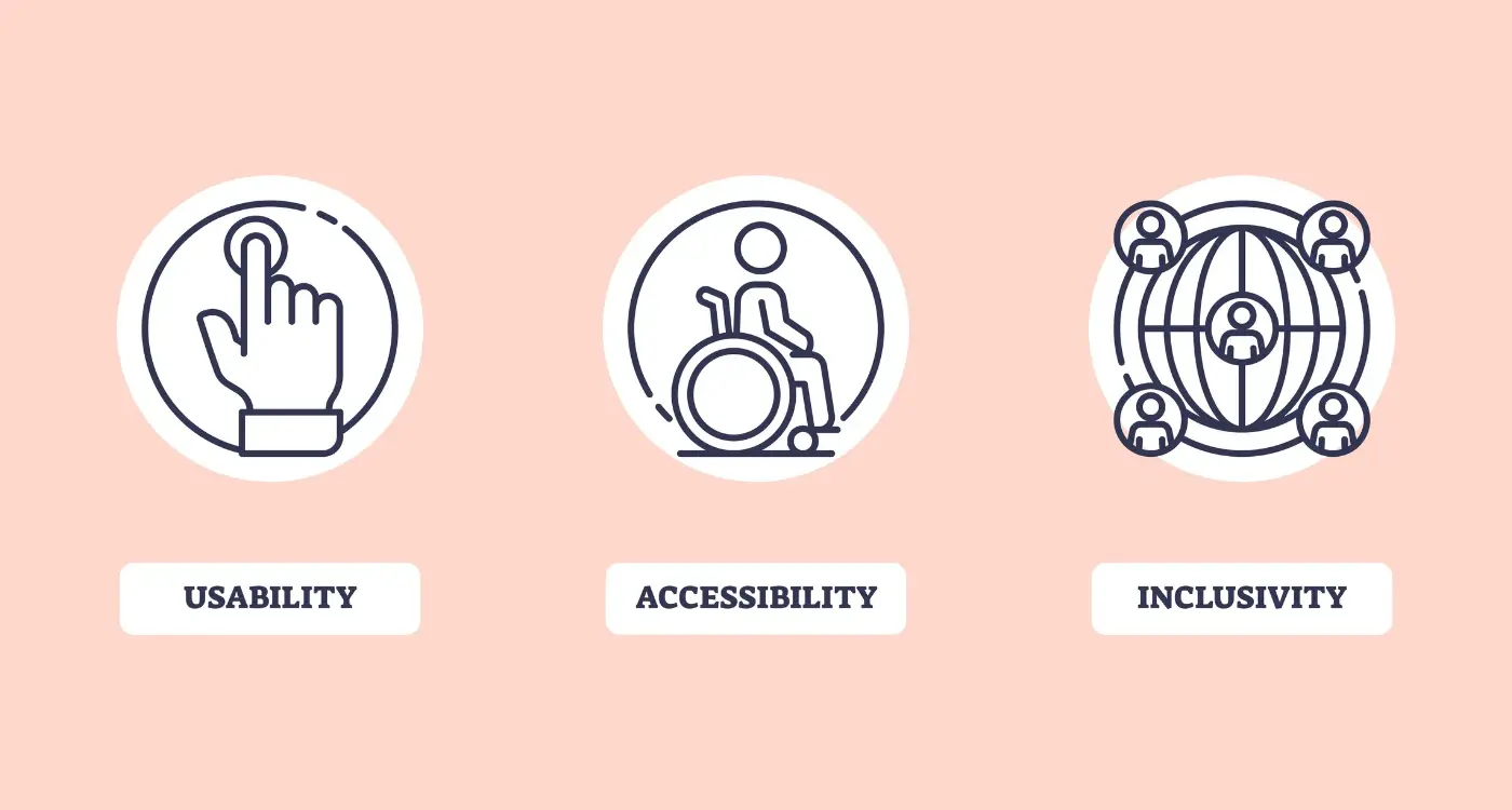
When we talk about accessible design and mobile accessibility, we're really talking about creating app interfaces that work for everyone—not just the mythical "average" user. This includes people who are blind or have low vision, users with hearing impairments, folks with motor disabilities that affect how they interact with touchscreens, and people with cognitive differences that change how they process information. The thing is, accessible apps aren't just better for disabled users; they're better for everyone.
Accessibility is not a feature you add on at the end—it's a mindset you adopt from the very first wireframe
Throughout my years building apps, I've learned that following accessibility guidelines isn't about ticking boxes or meeting legal requirements (though those matter too). It's about recognising that inclusive design makes our apps more usable, more intuitive, and frankly, more successful. When you design for the edges—the users who might struggle with conventional interfaces—you end up creating better experiences for everyone in between. And honestly? Once you understand the basics, building accessible interfaces becomes second nature.
Understanding Accessibility Basics
Right, let's start with something that honestly should be at the heart of every app we build—making sure everyone can actually use the bloody thing. I mean, what's the point of creating something beautiful if a huge chunk of your potential users cant access it? Accessibility isn't just about being nice (though it is that too); its about good business sense and, frankly, doing the right thing.
When I talk about mobile accessibility, I'm referring to designing and developing apps that work for people with disabilities. We're talking about visual impairments—everything from complete blindness to colour blindness; hearing impairments; motor disabilities that affect how people interact with touchscreens; and cognitive disabilities that impact how someone processes information. The thing is, you're not just helping people with permanent disabilities here. Think about it—temporary injuries, situational limitations (like trying to use your phone in bright sunlight), and age-related changes all benefit from accessible design.
The Business Case for Accessibility
Here's something that might get your attention if the moral argument doesn't: accessible apps reach more people, which means more potential revenue. We're talking about roughly 15% of the global population living with some form of disability. That's over a billion people who might struggle with—or completely abandon—your app if its not designed with them in mind.
Legal Requirements
And then there's the legal side of things. Laws like the Americans with Disabilities Act in the US and similar legislation worldwide are increasingly being applied to digital products. I've seen companies face lawsuits over inaccessible apps—it's not worth the risk, honestly. Plus, both Apple and Google have accessibility guidelines that can affect your app store approval and ranking.
Designing for Visual Impairments
When I first started building mobile apps, I'll be honest—I didn't give much thought to users who couldn't see the screen clearly. It wasn't until I watched someone with severe visual impairment navigate an app I'd built that it really hit me how much we take for granted. The way they relied on screen readers, the frustration when buttons weren't labelled properly... it was a proper wake-up call.
Visual impairments aren't just about complete blindness, though that's often what people think of first. We're talking about colour blindness, low vision, light sensitivity, and everything in between. Actually, about 8% of men have some form of colour vision deficiency—that's a huge chunk of your potential users right there.
Colour and Contrast Guidelines
The biggest mistake I see? Using colour as the only way to communicate information. Red text for errors, green for success—seems logical, right? But what happens when someone cant distinguish between red and green? You've just made your app completely unusable for them.
Contrast ratios matter more than you might think. The WCAG guidelines recommend a minimum of 4.5:1 for normal text and 3:1 for large text. But here's the thing—these are minimums, not targets. I always aim higher because real-world conditions (bright sunlight, dim lighting) can make even "compliant" text hard to read.
- Use icons alongside colour coding
- Test your app in greyscale mode
- Provide alternative text descriptions for all images
- Make touch targets at least 44x44 pixels
- Support dynamic text sizing
Screen Reader Support
Screen readers are brilliant pieces of technology, but they need your help to work properly. Every interactive element needs a clear, descriptive label. "Button" tells the user nothing; "Save document" tells them exactly what will happen when they tap it.
Always test your app with VoiceOver (iOS) or TalkBack (Android) turned on. It's the fastest way to spot accessibility issues you never knew existed.
Supporting visual impairments isn't just about following guidelines—it's about understanding that great design works for everyone, regardless of how screen readers interact with your app.
Supporting Motor Disabilities
When I design apps for people with motor disabilities, I'm thinking about those who might struggle with precise finger movements, have tremors, or use assistive devices like switch controls. The truth is, making apps more accessible for motor disabilities often makes them better for everyone—I mean, who hasnt tried to use their phone with cold hands or while walking?
The biggest thing to get right is touch target size. Apple recommends 44x44 points minimum, but I usually go bigger when possible. Those tiny close buttons on pop-ups? They're a nightmare for anyone with limited dexterity. I space interactive elements far enough apart so accidental taps don't happen constantly—theres nothing more frustrating than hitting the wrong button because everything's cramped together.
Making Touch Interactions Work Better
Here's something most developers miss: not everyone can perform complex gestures like pinch-to-zoom or multi-finger swipes. I always provide alternative ways to access the same functionality. That photo gallery that requires pinching? Add zoom buttons. That swipe-to-delete feature? Include an edit mode with clear delete buttons too.
Timing is another big consideration. Some users need more time to interact with elements, so I extend timeout periods and avoid interactions that require quick responses. Auto-dismissing notifications should stick around longer, and if something absolutely must timeout, I provide clear warnings beforehand.
Voice Control and Switch Support
iOS and Android both have built-in assistive technologies like Voice Control and Switch Control, but they only work well if your app is properly structured. Every interactive element needs clear labels, and the navigation order should make logical sense. I test with these tools regularly—its quite eye-opening to see how your app behaves when someone's controlling it entirely through voice commands or external switches.
Creating Audio-Accessible Interfaces
Right, let's talk about audio accessibility—something that honestly trips up more developers than you'd expect. When most people think about mobile app accessibility, they focus on visual elements. But what about users who rely on sound to navigate your app? This isn't just about screen readers (though they're massively important); it's about creating an audio landscape that actually makes sense.
Screen readers like VoiceOver on iOS and TalkBack on Android are basically your app's voice. They read out everything on screen, but here's the thing—they can only work with what you give them. If you haven't properly labelled your buttons, images, and interactive elements, the screen reader will either say nothing at all or blurt out something completely useless like "button button button." Not exactly helpful, is it?
Making Every Element Speak Clearly
The secret sauce here is proper semantic markup and meaningful labels. Every interactive element needs a clear, descriptive label that explains what it does—not what it looks like. So instead of labelling a button "red circle," you'd call it "play music" or "start recording." I've seen apps where developers label things based on their appearance rather than their function, and it creates a proper mess for anyone using assistive technology.
Audio feedback isn't just about compliance; it's about creating an experience where every user can understand and interact with your app confidently
Don't forget about audio cues and haptic feedback either. A subtle sound when someone completes an action or a gentle vibration when they make an error can make the difference between confusion and clarity. These little touches show you've thought about the whole user experience, not just the visual bits.
Building for Cognitive Accessibility
When people talk about accessibility, they often focus on the obvious stuff—screen readers, voice controls, bigger buttons. But honestly? Some of the most important accessibility work happens behind the scenes, in places users can't even see. I'm talking about cognitive accessibility, and its something that affects way more people than you might think.
Cognitive disabilities cover a massive range of conditions—everything from dyslexia and ADHD to memory issues and learning difficulties. The thing is, these users don't need completely different interfaces; they just need the same interfaces designed more thoughtfully. And here's the brilliant part—when you design for cognitive accessibility, you make your app better for everyone.
Keep Things Simple and Predictable
Your app should work the way people expect it to work. If your back button is in the top left on one screen, don't put it somewhere else on the next screen. Users with cognitive disabilities rely heavily on patterns and consistency—but actually, we all do. Breaking these patterns creates confusion for everyone.
I always tell clients to use familiar icons and standard navigation patterns. Don't reinvent the wheel just because you can. That hamburger menu icon? People know what it does. That shopping cart symbol? Universal. When you get creative with basic navigation, you're not being innovative—you're creating barriers.
Give People Time and Space
Some users need more time to process information or complete tasks. Auto-advancing carousels, pop-ups that disappear quickly, session timeouts—these features can make your app completely unusable for people with cognitive disabilities. Always provide controls to pause, extend, or replay content. And please, for the love of all that's good, let people dismiss notifications and pop-ups at their own pace.
Clear headings, bullet points, and white space aren't just nice design touches—they're accessibility features. They help users understand where they are and what they need to do next.
Testing Your App's Accessibility
Right, so you've built what you think is an accessible app—but how do you actually know if it works for everyone? Testing accessibility isn't just a nice-to-have anymore; it's absolutely necessary if you want to reach all your users. I've seen too many apps launch with good intentions but terrible real-world accessibility because nobody properly tested them.
The thing is, accessibility testing is different from regular app testing. You can't just run through your user flows with your eyes and hands and call it done. You need to test with actual accessibility tools and, ideally, with real users who rely on these features daily.
Automated Testing Tools
Start with automated testing—it catches the obvious stuff quickly. iOS has the Accessibility Inspector built right into Xcode, and Android has similar tools in Android Studio. These tools will flag missing labels, poor colour contrast, and elements that screen readers can't access properly.
But here's the thing: automated tools only catch about 30% of accessibility issues. They're brilliant for finding technical problems like missing alt text, but they can't tell you if your app actually makes sense to someone using a screen reader.
Turn on your phone's built-in screen reader (VoiceOver on iOS, TalkBack on Android) and try to complete your app's main tasks without looking at the screen. If you get stuck or confused, your users will too.
Manual Testing Methods
Manual testing is where the real work happens. Test with different input methods, adjust text sizes to maximum, and navigate using only keyboard controls if your app supports them. I always test in different lighting conditions too—what looks fine on your desk might be unreadable in bright sunlight.
The best approach combines both automated scanning and hands-on testing with real accessibility features enabled:
- Test with screen readers active on both iOS and Android
- Navigate using only voice commands or switch controls
- Check colour contrast in various lighting conditions
- Verify all interactive elements have proper labels
- Test with maximum text size and bold text enabled
- Ensure all content is reachable via keyboard navigation
User testing with people who actually use accessibility features is the gold standard, though I know it's not always possible for smaller projects. When you can manage it, even a short session with one or two users who rely on screen readers will teach you more than weeks of automated testing.
Common Accessibility Mistakes to Avoid
Right, let's talk about the mistakes I see time and time again. After building apps for nearly a decade, I can tell you that most accessibility problems aren't caused by malicious intent—they're just oversights that happen when teams are rushing to meet deadlines or simply don't know what to look out for.
The biggest mistake? Forgetting about focus indicators entirely. I've seen beautiful apps where you literally cannot tell where you are when navigating with a keyboard or switch control. Users get completely lost because there's no visual indication of which element is currently selected. It's maddening for anyone who relies on assistive technology.
Another classic error is using colour alone to convey important information. Sure, that red error message looks obvious to you and me, but what about users who can't distinguish red from green? I always tell my team: if you removed all colour from the interface right now, would users still understand what's happening?
The Most Common Mistakes I See
- Missing or meaningless alt text for images and icons
- Buttons and links with vague labels like "Click here" or "Read more"
- Forms without proper labels or error descriptions
- Text that's too small or has poor contrast ratios
- Auto-playing videos or audio without user control
- Gesture-only navigation with no alternative input methods
- Time limits on forms without warning or extension options
- Pop-ups and modals that trap keyboard focus
The good news? Most of these issues are dead easy to fix once you know about them. The key is building accessibility checks into your development process from day one, not treating it as an afterthought. Trust me, retrofitting accessibility is always more expensive and time-consuming than getting it right the first time around.
Building accessible mobile app interfaces isn't just about ticking boxes or meeting compliance requirements—it's about creating apps that genuinely work for everyone. And honestly? That makes for better apps across the board. When you design with accessibility in mind from the start, you end up with cleaner interfaces, clearer navigation, and more thoughtful user experiences that benefit all your users, not just those with specific needs.
I've seen too many development teams treat accessibility as an afterthought, something to bolt on at the end of a project. But here's the thing—accessible design principles actually make your app more robust and user-friendly for everyone. Those clear colour contrasts you implement for users with visual impairments? They make your app easier to use in bright sunlight. The voice commands you add for motor accessibility? They're perfect for hands-free use while driving or cooking.
The mobile accessibility landscape keeps evolving, with new assistive technologies and updated guidelines appearing regularly. What matters most is building a foundation that's flexible enough to adapt. Focus on semantic markup, logical navigation flows, and clear visual hierarchy. Test early and test often—not just with automated tools, but with real users who rely on assistive technologies.
Remember that accessibility isn't a destination; it's an ongoing commitment to inclusive design. Every feature you add, every interface update you make, should consider how it affects users with different abilities. Start small if you need to, but start somewhere. Your users will notice the difference, and you'll create apps that truly serve everyone in your audience.
Share this
Subscribe To Our Learning Centre
You May Also Like
These Related Guides
How Do I Make My App Accessible for Users With Disabilities?
How Do I Make My Mobile App Accessible for Users With Disabilities?