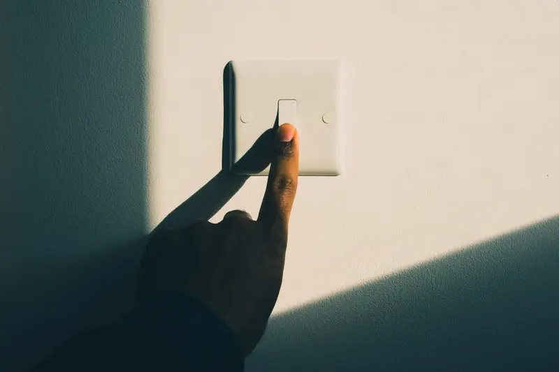
You've spent months perfecting your mobile app—the features work brilliantly, the interface looks clean, and users love what it does. Then you launch dark mode and suddenly the feedback changes. People complain about headaches, tired eyes, and difficulty reading text. Sound familiar? You're not alone in this struggle.
Creating a dark theme that actually reduces eye strain rather than causing it is trickier than most developers expect. Simply inverting your colours or slapping a black background behind white text won't cut it. In fact, doing dark mode wrong can make eye strain worse than if you'd stuck with a light theme altogether.
The thing is, our eyes work differently in various lighting conditions, and what feels comfortable during the day might cause discomfort at night. Plus, everyone's visual preferences are different—some people genuinely find dark interfaces harder to read, whilst others can't stand bright screens.
The best dark mode designs don't just look good; they actively support user comfort across different environments and usage patterns
That's exactly why we've put together this guide. Over our years building mobile apps for all kinds of clients, we've learned that getting dark mode right requires understanding both the science behind visual comfort and the practical design decisions that make or break the user experience. We'll walk you through everything from colour choices and typography to testing methods that help you spot problems before your users do. No guesswork, just proven techniques that work.
Understanding Eye Strain in Mobile Apps
Eye strain isn't just something that happens when you've been staring at screens for too long—it's a real problem that affects millions of mobile app users every single day. When we talk about digital eye strain (sometimes called computer vision syndrome), we're looking at symptoms like dry eyes, headaches, blurred vision, and that general feeling of tiredness that creeps in after extended screen time.
The thing is, mobile apps present unique challenges compared to desktop screens. We hold our phones much closer to our faces, often at awkward angles, and we tend to blink less frequently when we're focused on small text or detailed interfaces. The blue light emitted from screens can also disrupt our natural sleep patterns, making us feel more tired than we should.
What Makes Mobile Eye Strain Worse
Poor contrast ratios are one of the biggest culprits—when there isn't enough difference between text and background colours, our eyes work overtime trying to distinguish between elements. Tiny fonts don't help either; squinting to read microscopic text puts unnecessary stress on our eye muscles.
Bright white backgrounds can be particularly harsh, especially in low-light conditions. That's why dark mode has become so popular—it reduces the amount of bright light hitting our eyes and can provide relief for many users.
The User Experience Impact
When users experience eye strain from your app, they don't just close it and carry on with their day. They associate that discomfort with your brand and are much less likely to return. Some will delete the app entirely rather than put themselves through that discomfort again. This isn't just about user comfort—it's about retention, engagement, and the long-term success of your product in an increasingly competitive market.
The Science Behind Dark Mode and Visual Comfort
Let's get straight to the point—dark mode isn't just a trendy design choice that looks cool. There's proper science backing why it can reduce eye strain in your mobile app, though it's not quite the magic bullet many people think it is.
Your eyes work harder when they're constantly adjusting to bright light, especially in low-light conditions. When you're scrolling through a bright white app screen in bed or on a dimly lit commute, your pupils are doing gymnastics—contracting to protect your retina from the harsh light. This constant adjustment creates fatigue, and over time, that translates to the uncomfortable feeling we call eye strain.
How Dark Mode Actually Helps
Dark mode flips this problem on its head by reducing the amount of blue light your screen emits. Blue light is the main culprit that tricks your brain into thinking it's daytime, which can mess with your sleep patterns and make your eyes work overtime. When you use darker backgrounds with lighter text, you're asking less of your users' visual system—their pupils don't need to constrict as much, and the overall light hitting their retina decreases significantly.
The biggest eye strain reduction happens when users switch to dark mode in low-light environments—during evening use or in dimly lit rooms where the contrast between a bright screen and dark surroundings is most jarring.
It's Not Always Better Though
Here's what many people don't realise: dark mode can actually be harder to read in bright environments. Your eyes are designed to read dark text on light backgrounds—it's called positive contrast, and it's been the standard for good reason. In bright sunlight or well-lit rooms, switching to dark mode might make your app harder to use, not easier.
Choosing the Right Colours for Your Dark Theme
Getting your dark mode colours right isn't just about making everything black—that's actually one of the worst things you can do. Pure black (#000000) creates too much contrast with white text, making your users' eyes work harder than they need to. Instead, you want to use what we call "dark greys" as your primary background colours.
The sweet spot for dark backgrounds sits somewhere between #121212 and #1E1E1E. These colours give you that dark feel without the harsh contrast that comes with true black. Google's Material Design guidelines recommend #121212 as their primary dark surface colour, and there's solid research backing this up.
Building Your Dark Colour Palette
When you're picking colours for your dark theme, you need to think about elevation and hierarchy. Lighter elements should appear closer to the user, whilst darker ones recede into the background. This creates depth without relying on shadows, which don't work well in dark modes.
- Primary background: #121212 or similar dark grey
- Secondary surfaces: #1E1E1E to #2D2D2D range
- Elevated elements: #2D2D2D to #383838 range
- Text colours: #FFFFFF for primary, #B0B0B0 for secondary
- Accent colours: Desaturated versions of your brand colours
The Desaturation Rule
Here's something most developers get wrong—you can't just use your normal brand colours in dark mode. Bright, saturated colours that look great on white backgrounds become eye-searing on dark ones. Take your brand's primary colour and reduce its saturation by 20-30%. This maintains brand recognition whilst keeping things comfortable for your users' eyes.
Remember that colours behave differently on dark backgrounds. What looks like a subtle blue on white might appear electric on dark grey. Test your colour choices on actual devices, not just your computer screen.
Getting Your Typography Right in Dark Mode
Typography in dark mode isn't just about making text white on a black background—that's actually one of the worst things you can do for eye strain in your mobile app. Pure white text creates harsh contrast that makes users squint and can cause headaches after extended use. The trick is finding that sweet spot where text remains readable without being aggressive on the eyes.
Start with off-white colours instead of pure white. Think light greys like #E0E0E0 or #F0F0F0 for your primary text. These softer tones provide excellent readability whilst reducing the stark contrast that causes user comfort issues. For secondary text, you can go even softer with colours around #B0B0B0—perfect for captions or less important information.
Font Weight Makes All the Difference
Here's something that catches many developers off guard: font weight becomes more important in dark mode than it ever was in light themes. Thin fonts practically disappear against dark backgrounds, making your app frustrating to use. Bump up your font weights by at least one level—if you were using light, switch to regular; if you were using regular, try medium.
The biggest mistake I see is developers treating dark mode as a simple colour swap without considering how typography behaves differently in low-light environments
Size and Spacing Need Attention Too
Dark backgrounds can make text appear smaller than it actually is, so consider increasing your font sizes by a point or two. Line spacing becomes your friend here—generous spacing between lines helps prevent that cramped feeling that contributes to eye strain. Don't forget about letter spacing either; a tiny bit of extra space between characters can make text feel more comfortable to read in your mobile app's dark theme.
Creating Proper Contrast Without Going Too Far
Getting contrast right in dark mode is like walking a tightrope—you need enough difference between your text and background so people can actually read what's on screen, but not so much that it feels harsh or causes eye strain. The Web Content Accessibility Guidelines recommend a contrast ratio of at least 4.5:1 for normal text and 3:1 for large text, but these numbers are just your starting point.
Pure white text on a pure black background might seem like the obvious choice—after all, it gives you maximum contrast. But here's the thing: it's actually too harsh for most users, especially in low-light conditions when people are most likely to use dark mode. That stark contrast creates what we call "halation," where bright text seems to bleed or glow against the dark background, making it harder to read and more tiring for your eyes.
Finding the Sweet Spot
Instead of pure white (#FFFFFF), try using slightly off-white colours like #E8E8E8 or #F0F0F0 for your main text. Similarly, avoid pure black (#000000) for your backgrounds—dark greys like #121212 or #1A1A1A work much better. Google's Material Design actually recommends #121212 as the baseline dark surface colour, and there's good science behind this choice.
Different Elements Need Different Treatment
Not every piece of text needs the same contrast level. Your main headings and body text should have strong contrast for readability, but secondary information like timestamps or helper text can use lower contrast colours. This creates a visual hierarchy that helps users focus on what matters most whilst keeping everything readable. The key is testing with real users—what looks perfect on your design monitor might not work so well on a phone screen in actual use.
Testing Your Dark Mode with Real Users
The best way to know if your dark mode actually reduces eye strain is to test it with real people. This isn't about gathering opinions on whether people like the colours—it's about measuring actual user comfort during extended use of your mobile app.
Start by recruiting a mix of users who regularly use dark mode and those who don't. Ask them to complete typical tasks in your app for 20-30 minutes whilst paying attention to any discomfort. Watch for signs like squinting, rubbing their eyes, or adjusting their screen brightness multiple times.
What to Look For During Testing
Eye strain shows up in predictable ways. Users might complain about text being hard to read, colours appearing washed out, or feeling like they need to concentrate harder than usual. Some will unconsciously lean closer to the screen or hold their device at odd angles.
Ask users to switch between light and dark modes during the same session. The contrast in comfort levels will quickly reveal if your dark theme is working properly.
Getting Honest Feedback
Don't ask leading questions like "Does this feel comfortable?" Instead, have users perform real tasks and observe their behaviour. After 15 minutes of use, ask them to rate their eye comfort on a scale of 1-10. Compare these scores between your light and dark modes.
Pay special attention to users over 40—they're more sensitive to contrast issues and will spot problems younger users might miss. If your dark mode passes their comfort test, you're on the right track. Testing with real users takes the guesswork out of creating a truly comfortable dark mode experience.
Common Mistakes That Hurt User Comfort
After years of helping clients fix their dark mode implementations, I've noticed the same problems cropping up again and again. These aren't big technical failures—they're small oversights that add up to tired, strained eyes and frustrated users.
The biggest culprit? Pure black backgrounds. I know it seems logical—if you're making something dark, go as dark as possible, right? Wrong. Pure black (#000000) creates such harsh contrast against white text that your users' eyes have to work overtime to process the information. Instead, use dark greys around #121212 or #1a1a1a; your users will thank you for it.
Design Choices That Backfire
Low contrast ratios trip up more designers than you'd think. Some teams get so worried about making things "too bright" in dark mode that they end up with grey text on slightly darker grey backgrounds. The result? Text that's practically invisible and users squinting at their screens.
Coloured text presents another challenge—that bright blue link that looks great in light mode suddenly becomes a retina-burning nightmare against your dark background. What works in one mode rarely works in the other without adjustment.
Testing Oversights That Cost You Users
Here's where most teams fall down: they test their dark mode on expensive, high-end devices with perfect screens, then wonder why users complain. Different devices handle dark colours differently, and what looks smooth on your premium laptop might look patchy on a budget smartphone.
- Skipping tests in bright sunlight conditions
- Not checking how colours appear on OLED versus LCD screens
- Forgetting to test with users who wear glasses
- Ignoring accessibility tools like screen readers
The fix isn't complicated—test early, test often, and test with real devices that your actual users own. This attention to detail can help you avoid common development oversights and create a better user experience overall.
Conclusion
After working on countless mobile app projects over the years, I can tell you that getting dark mode right isn't just about flipping colours from light to dark—it's about understanding how your users' eyes actually work. The best dark modes are the ones you don't notice; they just feel comfortable and natural to use.
We've covered a lot of ground in this guide, from the science behind eye strain to the nitty-gritty of colour choices and typography. But here's what I want you to remember most: there's no one-size-fits-all solution. What works beautifully for a reading app might be completely wrong for a photo editing tool or a gaming platform.
The key to reducing eye strain in your mobile app comes down to three main things—choosing colours that don't fight against each other, making sure your text is readable without being harsh, and testing everything with real people who'll actually use your app. That last bit is probably the most important; you can follow every guideline perfectly, but if your users are still squinting or getting headaches, something needs to change.
Don't forget that dark mode should be an option, not a punishment. Some people prefer light themes, others love dark ones, and many switch between both depending on the time of day or their environment. Give them that choice and make sure both options prioritise user comfort above everything else. Your users' eyes will thank you for it.
