
Can Dark Mode Actually Help With App Accessibility?
You spend weeks perfecting your app's interface, making sure every button is in the right place and every animation feels just right. Then someone switches to dark mode and suddenly half your carefully chosen colours look wrong, text becomes harder to read, and you start wondering if you've actually made things worse for some of your users. It's a proper headache because dark mode has become one of those features that users just expect now—iOS made it a system-wide setting and Android followed suit, which means we can't really ignore it anymore.
I've been working with clients on this exact issue for the past few years and honestly, the answer to whether dark mode helps with accessibility isn't as straightforward as people think. Sure, it sounds good in theory. Darker screens mean less bright light blasting into your eyes, which should help with eye strain, right? Well... sort of. The thing is, I've built apps for healthcare clients where patients with certain visual conditions actually found dark mode made their symptoms worse, not better. And then I've worked on fintech apps where users with light sensitivity told us dark mode was the only way they could use the app comfortably for extended periods.
The reality is that dark mode is neither universally good nor universally bad for accessibility—it depends entirely on the individual user's needs and the specific visual impairment they're dealing with.
What I've learned through building apps across different industries is that treating dark mode as just a trendy feature misses the point entirely. Its about giving users control over their visual experience, which is actually a fundamental accessibility principle. But here's where it gets tricky: implementing dark mode properly means rethinking your entire colour system, not just inverting your backgrounds. Get it wrong and you'll fail accessibility contrast requirements; get it right and you'll support a much wider range of users than you might expect.
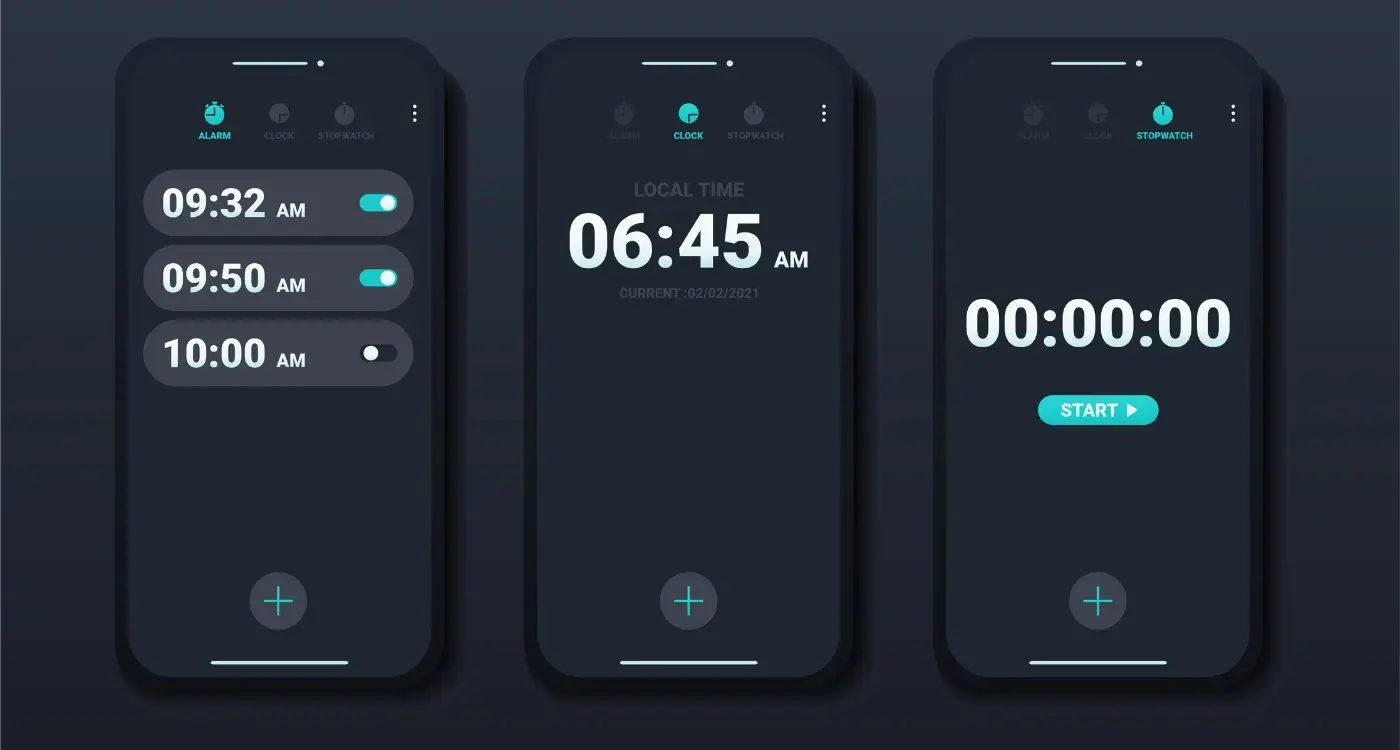
What Dark Mode Actually Does on a Technical Level
When you flip that dark mode toggle in your app settings, something fairly simple happens under the hood—the system swaps out the colour palette your app uses to render its interface. I know, doesn't sound all that complicated does it? But here's where it gets interesting; its not just about inverting colours or making everything dark grey. The operating system actually provides a completely different set of UI elements and colour values that your app can reference. On iOS this is handled through semantic colours in UIKit (or SwiftUI if you're building with Apple's newer framework), whilst Android uses Material Design's theme attributes to achieve the same thing.
What actually happens is your app checks the system-wide appearance preference—light or dark—and then applies the corresponding colour scheme you've defined. So when I build an app, I'm essentially creating two versions of every colour in my design system. Background colours, text colours, button states, all of it needs a light mode variant and a dark mode variant. The tricky bit? Making sure both versions maintain proper contrast ratios whilst still feeling like the same app. I've worked on healthcare apps where we had to be particularly careful about this because medical professionals were using them in all sorts of lighting conditions; bright hospital wards during the day, dimly lit rooms at night.
The display itself doesn't fundamentally change how it works when you enable dark mode—it still emits light from the same pixels. But because you're now rendering predominantly dark colours, fewer pixels need to be fully illuminated. On OLED screens this makes a noticeable difference because black pixels are actually turned off completely, but on LCD screens (which have a backlight that stays on regardless) the power savings are minimal at best. I mean, its still nice to look at, but don't expect your battery life to suddenly double on an older iPhone with an LCD display.
The Science Behind Eye Strain and Display Brightness
Right, so here's where things get interesting from a technical standpoint. When you stare at a bright white screen—especially in a dimly lit environment—your pupils need to constantly adjust to regulate the amount of light entering your eye. Its basically like forcing your eyes to work overtime, and that constant muscle tension in the iris is a big part of what causes eye strain. I've built apps for healthcare clients where ophthalmologists explained that this pupil dilation response is what leads to that burning sensation after a long day of screen time.
The thing is, its not just about brightness levels; its about contrast ratios and how much work your eyes need to do to distinguish elements on screen. When I was building a fintech app that users needed to check constantly throughout the day, we measured the luminance differences between display modes. A white background at full brightness can emit around 200-300 cd/m² (candelas per square metre, basically a measure of light intensity), whilst a dark mode interface might only emit 20-50 cd/m². Thats a massive reduction in light output your eyes need to process.
What Actually Happens to Your Eyes
Your retina contains photoreceptor cells—rods and cones—that respond differently to various light levels. In bright conditions, your cone cells work harder and can become fatigued over time. Dark mode reduces this photoreceptor fatigue, but (and this is a big but) only in specific lighting conditions. If you're using dark mode in a brightly lit office, you're actually creating a different problem because now your screen has poor contrast with the ambient light.
- Pupil size changes constantly with screen brightness, causing ciliary muscle fatigue
- High brightness levels increase blink rate suppression, leading to dry eyes
- Blue light wavelengths (465-495 nm) scatter more easily, reducing visual clarity
- Contrast adaptation requires more cognitive processing when switching between bright and dark elements
- Ambient lighting mismatches with screen brightness create additional strain
When building apps, I always test display modes in different lighting conditions—not just in our office. What works perfectly at your desk might be completely unreadable on a sunny train platform, and you wont know unless you actually test it there.
The Blue Light Debate
You've probably heard people bang on about blue light being terrible for your eyes? Well, its a bit more complicated than that. Blue light wavelengths do contribute to digital eye strain, but not in the way most people think. The real issue is that blue light suppresses melatonin production, which affects your circadian rhythm and sleep patterns. When we built a meditation app that people used before bed, implementing dark mode wasn't just about comfort—it was about reducing that blue light exposure in the evening hours when melatonin production should naturally increase. Dark backgrounds emit less blue light overall simply because they're emitting less light full stop.
How Dark Mode Affects Different Visual Impairments
Dark mode doesn't affect everyone the same way—and honestly, this is something I had to learn through building apps for healthcare clients who needed proper accessibility compliance. People with different visual impairments can have completely opposite reactions to dark interfaces, which makes it tricky to get right. Someone with cataracts will often find dark mode harder to use because their lens clouding means they need more light to see clearly. The white text on dark backgrounds can appear fuzzy or create halos around letters. Its not what you'd expect really.
For users with astigmatism (which affects about 30% of people actually), dark mode can make things worse. The way light scatters through their irregularly shaped corneas means white text on black backgrounds tends to blur more than the reverse. I've tested this extensively with user groups for a medical records app we built—patients with moderate to severe astigmatism consistently struggled with our initial dark theme until we adjusted the contrast ratios and increased font weights slightly.
Visual Conditions That Benefit From Dark Mode
- Light sensitivity (photophobia)—common in migraine sufferers and post-surgery patients
- Blepharospasm and other conditions causing involuntary eye muscle contractions
- Some forms of retinal disorders where bright light causes discomfort
- Nystagmus in low-light conditions (though this varies person to person)
Conditions Where Dark Mode Often Creates Problems
Macular degeneration users typically need higher brightness levels; dyslexia can be affected by the contrast polarity (some readers find dark mode harder); glaucoma patients might struggle with dark interfaces depending on their specific vision loss pattern. The key thing I've learned? Never force one mode on users. Always provide both options and make the toggle easy to find—we usually put it right in the main settings menu rather than buried three levels deep. Test with actual users who have these conditions if you're building something for healthcare or education where accessibility really matters.
Colour Contrast Requirements and Accessibility Standards
The WCAG (Web Content Accessibility Guidelines) sets the bar for colour contrast, and I've spent countless hours making sure apps meet these standards—trust me, it's not always straightforward. The minimum contrast ratio is 4.5:1 for normal text and 3:1 for large text, but here's where dark mode gets tricky; what works perfectly in light mode can completely fall apart when you flip the colour scheme. I learned this the hard way on a healthcare app where our beautiful blue CTAs that passed contrast checks in light mode suddenly became nearly invisible in dark mode because we simply inverted the colours without testing.
Dark mode actually makes achieving proper contrast more challenging than people think. In light mode, you're working with dark text on light backgrounds—the contrast is naturally strong. But in dark mode, you cant just use pure white text on pure black backgrounds (even though that technically gives you maximum contrast) because it creates something called "halation" where the white text seems to bleed into the dark background, making it harder to read. Most of the apps I build now use off-white text (around #E1E1E1) on dark grey backgrounds (#121212 is pretty standard) to maintain good contrast ratios whilst avoiding that harsh, eye-straining effect.
Testing your colour contrast in both display modes separately is non-negotiable, not optional extra work you can skip when deadlines get tight
I use tools like the Colour Contrast Analyser constantly during development, checking every text colour, every button, every icon. And honestly? Its tedious work, but skipping it means some users simply won't be able to use your app properly. One fintech client I worked with had to redesign their entire colour palette after launch because their red warning messages failed contrast requirements in dark mode—an expensive lesson that could've been avoided with proper testing upfront.
When Dark Mode Makes Things Worse Not Better
Here's something most designers don't want to admit—dark mode can actually make accessibility worse for certain users, and I've seen this play out in real projects more times than I'd like to remember. We built a healthcare app a few years back where the client was adamant about having dark mode as the default because it "looked modern and professional". Problem was, their primary users were older patients with cataracts and age-related vision conditions. The feedback we got during testing was brutal; people couldn't read the text, they were making mistakes with medication tracking, and several testers said the app gave them headaches.
The issue comes down to something called halation, which is basically when light text on dark backgrounds creates a blurring effect for people with astigmatism (and that's about 30-40% of the population by the way). The light letters appear to "bloom" into the dark background, making text harder to read rather than easier. For users with certain visual impairments like cataracts, dark mode reduces the overall luminance contrast they need to distinguish interface elements properly.
When to Avoid Dark Mode as Default
I've learned to be really careful with apps that require precise reading or detailed visual work. Financial apps where users need to review transaction details? Dark mode can make numbers blur together. Educational apps for children learning to read? Light mode usually performs better because its what they're used to from books and classroom materials. The key is understanding your actual user base, not just following design trends because they look good in Dribbble screenshots.
The Text Rendering Problem
Another thing that catches people out—and I mean experienced developers too—is that text rendering behaves differently on light versus dark backgrounds at the system level. On iOS especially, the font weight and anti-aliasing adjustments mean that if you've carefully crafted your typography for light mode, it might look completely wrong in dark mode without manual adjustments. I've seen apps where body text becomes virtually unreadable in dark mode because the developers didn't account for this and just inverted the colour scheme thinking that would be enough. It wasnt.
Light Sensitivity and Photophobia Considerations
I've worked on several healthcare apps where photophobia wasn't just a nice-to-have consideration—it was the entire reason for the project. One app was specifically for migraine sufferers, and we learned pretty quickly that standard dark mode wasn't enough. People with severe light sensitivity need much more than just a black background; they need careful control over every light-emitting element on screen. Even small details like loading animations or notification badges can trigger discomfort if they're too bright or flashy.
Here's what actually helps for users with photophobia: true black backgrounds (not dark grey), the ability to reduce interface contrast, and complete removal of white or bright elements. We built a "photophobia mode" that went beyond standard dark mode by reducing all UI elements to muted tones and eliminating any sudden brightness changes. The feedback was... honestly quite moving. People told us they could finally use their phones during migraine episodes without making things worse.
Key Features for Light-Sensitive Users
- True black (#000000) backgrounds rather than dark grey (#1a1a1a or similar)
- Adjustable screen brightness controls within the app itself
- Reduced animation speeds or the option to disable animations completely
- Warm colour temperature options that filter out blue light
- Gradual transitions between screens instead of sudden changes
But there's a catch—and its important to be honest about this. Making everything super dim and low-contrast can actually hurt accessibility for users with low vision or certain types of colour blindness. You cant just slap a dim filter over everything and call it accessible. I've seen apps try to serve both audiences with a single mode and fail at both. Sometimes you need separate options: a standard dark mode for general use, and a specific low-luminance mode for photophobia that users can activate when needed.
Add a "reduce brightness" slider directly in your app's settings that works independently from the device brightness. This gives photophobic users fine-grained control without affecting their system-wide settings, which they might need to keep higher for other apps.
Best Practices for Implementing Both Display Modes
When we built a healthcare app for patient monitoring a few years back, one of our biggest challenges was making sure both light and dark modes worked properly across all the medical data visualizations. The graphs and charts needed to maintain their readability in both modes, which meant we couldn't just invert colours and call it a day. I learned pretty quickly that supporting both modes properly requires planning from the start—not as an afterthought.
The most important thing is to use semantic colour tokens rather than hardcoded values. What I mean by this is instead of setting something to #FFFFFF for white, you create a token called "background-primary" that changes based on the user's mode preference. Sounds simple, but you'd be surprised how many developers I've seen skip this step and then spend weeks going back through thousands of lines of code to fix it. Testing is where most teams fall down too; you need to check every single screen in both modes, not just the main ones. I once found a critical error message that was completely invisible in dark mode because nobody thought to test the edge cases.
Give Users Real Control
Let people choose their preference independently of their system settings. Some users want their phone in dark mode but prefer certain apps in light mode (or vice versa). We implemented this in a fintech app where users were checking their accounts late at night but still wanted transaction details in light mode during the day. Also worth noting—save their preference locally so it persists between sessions. Nothing's more annoying than having to switch modes every time you open an app.
Test With Actual Users Who Need It
Work with people who have visual impairments or light sensitivity. Their feedback will reveal issues you'd never spot yourself. In one project, we thought our dark mode was perfect until a user with astigmatism told us the grey-on-black text was causing massive problems with ghosting. We adjusted the contrast ratios and suddenly everything worked better for everyone, not just users with specific conditions.
Conclusion
After building apps for healthcare providers, fintech platforms, and e-commerce brands over the years, I can tell you that dark mode is neither a magic accessibility solution nor a useless gimmick—it's somewhere in between. The answer to whether it helps depends entirely on who's using your app and in what context. I've seen users with photophobia absolutely love dark mode implementations, whilst others with astigmatism found it made text harder to read. Both groups were right for their specific needs.
The real takeaway here is that offering both display modes isn't just good practice; its become an expectation for modern apps. But here's what matters more than simply having the feature—you need to implement it properly. That means maintaining WCAG contrast ratios in both themes (we aim for 4.5:1 minimum for normal text), testing with actual users who have different visual impairments, and making sure the toggle is easy to find. I've worked on apps where the dark mode option was buried three levels deep in settings...what's the point of that?
One thing I always tell clients is that accessibility work is never truly finished. User needs change, operating systems update their guidelines, and what worked brilliantly two years ago might need refinement today. The apps that get this right are the ones that treat both colour themes as first-class citizens from the design phase onwards, not as an afterthought. Test your dark mode with people who have light sensitivity, yes, but also test it with older users, people with various forms of colour blindness, and anyone using assistive technologies. Their feedback will tell you more than any technical spec sheet ever could.
Frequently Asked Questions
In my experience, it's better to respect the user's system-wide preference rather than forcing a default. I've worked on healthcare apps where making dark mode default actually hurt usability for older patients with cataracts, whilst fintech apps saw better engagement when users could choose based on their usage patterns throughout the day.
Not for everyone—it depends on the individual's visual conditions and environment. I've built apps where users with astigmatism found dark mode made text blur more, whilst those with photophobia couldn't use the app comfortably without it. The key is offering both options rather than assuming one works universally.
Test your colour contrast ratios separately for both modes using tools like Colour Contrast Analyser—what passes in light mode often fails in dark mode. I've seen apps where beautiful blue buttons that worked perfectly in light mode became nearly invisible when the colour scheme was inverted without proper contrast testing.
Definitely not—that's a recipe for accessibility failures and poor user experience. You need to create a proper semantic colour system where each colour has light and dark variants that maintain contrast ratios. I learned this the hard way when a healthcare app's error messages became completely unreadable after a simple colour inversion.
Only on OLED screens where black pixels are completely turned off—LCD screens with backlights see minimal battery savings. From testing across different devices, the battery benefits are often overstated, so focus on user comfort and accessibility rather than promising significant power savings.
Standard dark mode often isn't enough—these users need true black backgrounds (#000000) and the ability to reduce interface contrast further. We built a specific "photophobia mode" for a migraine app that went beyond normal dark mode by eliminating all bright elements and sudden brightness changes, which made a massive difference for users during episodes.
Not testing text rendering properly—fonts behave differently on dark backgrounds due to anti-aliasing and weight adjustments. I've seen apps where carefully crafted typography became virtually unreadable in dark mode because developers didn't account for how the system renders text differently on light versus dark backgrounds.
Absolutely essential if accessibility matters for your app. Testing with users who have conditions like astigmatism, cataracts, or light sensitivity reveals issues you'd never spot yourself. In one project, feedback from a user with astigmatism led us to adjust contrast ratios that improved readability for everyone, not just those with specific conditions.
Share this
Subscribe To Our Learning Centre
You May Also Like
These Related Guides

How Do I Make Sure My App's Dark Mode Doesn't Strain Users' Eyes?

What Colours Should I Use For Dark Mode In My App?