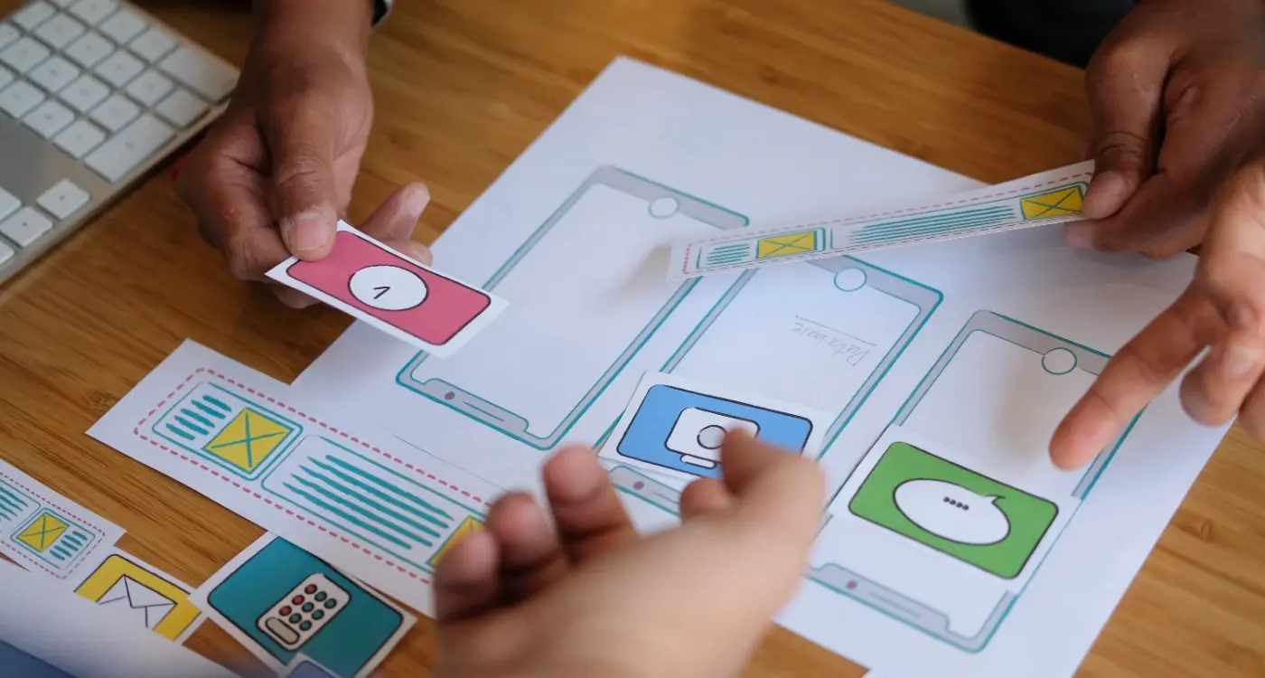
How Do I Pick the Perfect Images for My Mobile App?
You spend months perfecting your app's functionality, getting the user flow just right, and making sure everything works smoothly—then you realise you need images. Lots of them. And suddenly you're staring at a blank screen wondering whether that stock photo of a smiling person pointing at their phone is really going to cut it for your fintech app.
I've seen brilliant apps fail because their visual design looked like it was thrown together in five minutes, and I've watched mediocre apps succeed because they nailed their image selection. It's a bit mad really, but users make snap judgements about app quality within seconds of opening it, and your images are doing most of the heavy lifting in that first impression.
The thing is, picking images for mobile apps isn't like choosing photos for a website or brochure. You're working with tiny screens, limited attention spans, and users who are often multitasking or using your app in less-than-ideal conditions. That beautiful high-resolution image that looks perfect on your laptop? It might be completely illegible on a phone screen in bright sunlight.
The best app images don't just look good—they communicate your app's purpose and guide users toward taking action, all while loading fast enough that nobody gets frustrated waiting
Over the years working with startups and major brands, I've learned that successful image selection comes down to understanding your users, your platform constraints, and your app's specific goals. Sure, aesthetics matter, but functionality and performance matter more. This guide will walk you through the practical steps to choose images that actually work for your mobile app, not just ones that look nice in your design mockups.
Understanding Image Requirements for Different App Categories
Right, let's talk about something that catches loads of people off guard—different types of apps need completely different approaches to images. I mean, what works for a fitness app would look absolutely bonkers in a banking app, wouldn't it?
E-commerce apps are probably the most image-heavy category I work with. These apps live or die by their product photos; users need to see exactly what they're buying since they can't touch or try things on. High-resolution product shots from multiple angles, lifestyle images showing products in use, and detailed close-ups are non-negotiable. But here's the thing—you also need placeholder images for when products are out of stock, loading states, and empty basket screens that don't make users feel rubbish about not buying anything yet.
Visual Requirements by App Type
Social media apps are a different beast entirely. Sure, you need great user-generated content capabilities, but you also need default avatars, empty state illustrations, and background images that work with any type of content users might post. The images need to be neutral enough not to clash with user content but engaging enough to keep the app feeling lively.
Healthcare and finance apps? Completely different rules. Users want to feel safe and trust your app with sensitive information, so stock photos of people in white coats or handshake images aren't going to cut it. These apps work best with clean, simple illustrations, subtle icons, and images that convey security without being intimidating. Actually, I've found that too many images in these categories can make users nervous—like you're trying too hard to distract them from something.
Gaming and Entertainment Considerations
Gaming apps can go wild with visuals—bright colours, dynamic illustrations, character art—but they need to maintain performance. Entertainment apps sit somewhere in the middle; they need personality and visual appeal while staying professional enough for broad audiences.
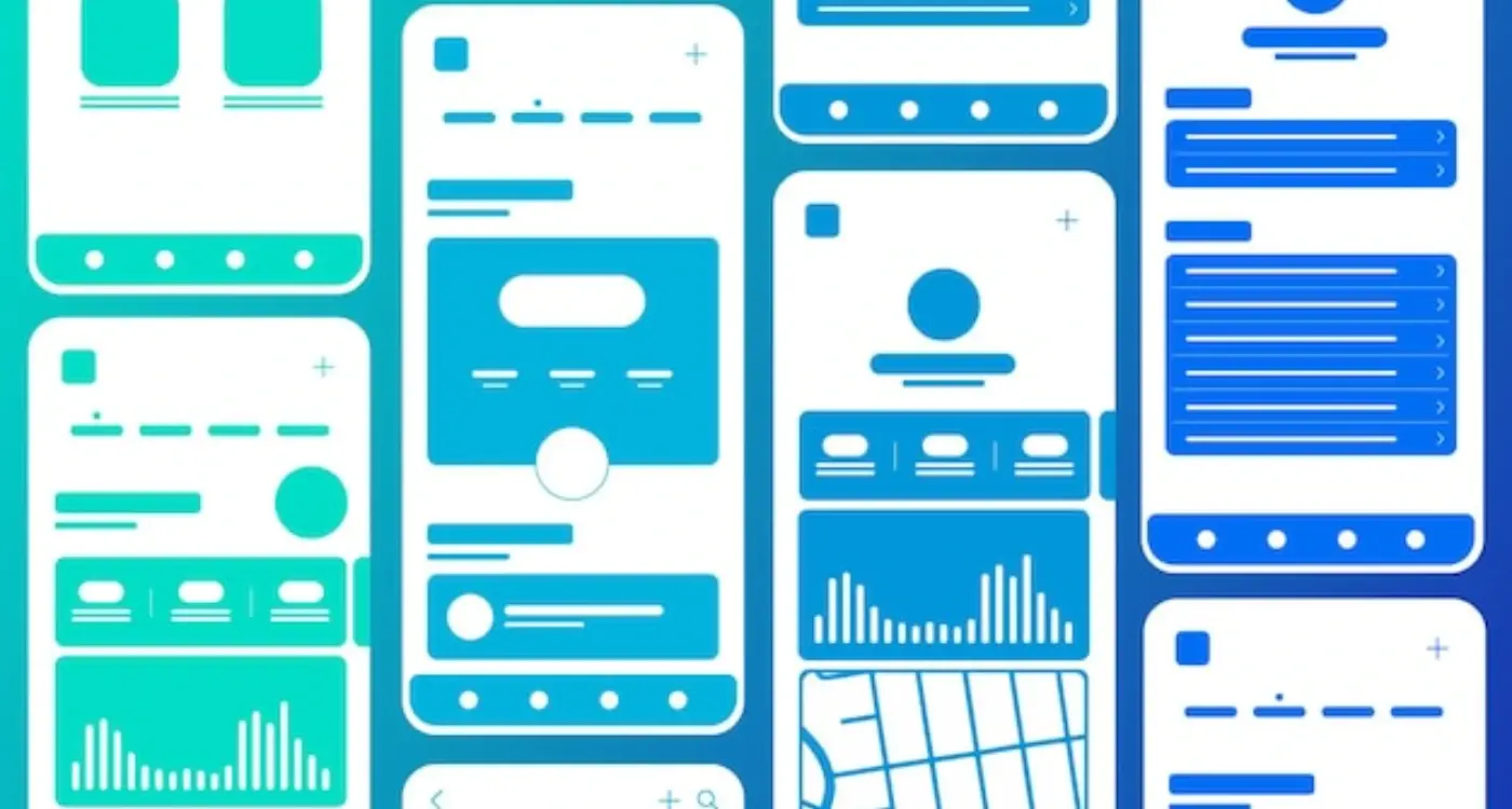
Choosing the Right Image Formats and Sizes
Right, let's talk about the technical side of app images—formats and sizes. This is where a lot of people get stuck, and honestly? I don't blame them. The mobile world throws so many different requirements at you that it can feel overwhelming.
First things first: format matters more than you might think. For mobile apps, you've got three main players to consider. PNG is your go-to for anything with transparency or sharp edges—think icons, logos, buttons. JPEG works brilliantly for photographs and complex images where file size matters more than pixel-perfect quality. And then there's WebP, which is becoming increasingly popular because it gives you the best of both worlds: smaller file sizes without compromising too much on quality.
Always create your original assets at 3x resolution (the highest density you'll need) then scale down. Going the other way—scaling up—will make your images look terrible.
Size-wise, you need to think about screen densities. Modern phones have different pixel densities, which means the same image needs to exist in multiple sizes. iOS uses 1x, 2x, and 3x versions; Android uses ldpi, mdpi, hdpi, xhdpi, xxhdpi, and xxxhdpi. Sounds mad, doesn't it?
Standard Image Sizes for Common Elements
- App icons: 1024×1024px (master), then generate smaller versions
- Background images: Match your target screen sizes (375×812px for iPhone X-style screens)
- Button icons: 24×24dp base size, scaled appropriately
- Profile pictures: 200×200px minimum for crisp display
- Product images: 800×800px minimum for zoom functionality
The key is planning ahead. Create a systematic approach to your image assets from day one, and you'll save yourself hours of frustration later when your developer asks for seventeen different versions of the same icon!
Right, let's talk about visual consistency—because honestly, this is where I see so many apps fall apart. You know what happens when your app looks like it was designed by five different people who never spoke to each other? Users notice. And they don't stick around.
After building apps for everything from healthcare startups to retail giants, I can tell you that visual consistency isn't just about making things look pretty. It's about creating trust. When users see consistent imagery throughout your app, their brain relaxes a bit—it knows what to expect.
Building Your Visual Language
Start with a simple rule: pick one photography style and stick to it. If you're using bright, airy photos with lots of white space, don't suddenly throw in dark, moody shots halfway through your app. I've seen teams do this because they found a "really good photo" that didn't match their style. Don't do it.
Your colour palette should work across all images too. This doesn't mean every photo needs the same filter (please, no!), but they should feel like they belong in the same family. Think about brands like Airbnb or Spotify—you can spot their imagery from a mile away because its consistent.
The Technical Bits That Matter
Keep your image treatments consistent as well. If you're using rounded corners on profile photos, use them everywhere. Same corner radius, same drop shadows, same border styles. These little details add up to create that polished feel that separates professional apps from amateur ones. The principles from effective mobile spacing and layout design apply to your image positioning too.
And here's something most people forget—your placeholder states and empty screens need to follow the same visual rules. They're still part of your app's personality, even when there's no content to show.
Finding and Sourcing Quality Images
Right, let's talk about where to actually get your images from. This is where I see a lot of app projects go sideways—people think they can just grab anything from Google Images and call it a day. That's a recipe for copyright trouble and honestly? The quality usually shows.
Stock photography sites are your best friend here. Unsplash and Pexels offer brilliant free options, but don't overlook paid platforms like Shutterstock or Adobe Stock when you need something specific. I've found that investing £20-50 in the right image can make your app look like it cost thousands more to develop. The quality difference is genuinely noticeable.
Free vs Paid: What's Worth Your Money
Free stock sites are perfect for generic lifestyle shots or backgrounds, but they have their limitations. You'll often see the same images across multiple apps—which isn't great for standing out. Paid sites give you access to more unique content and better search filters. Plus, the licensing is usually clearer, which saves you headaches down the line.
The right image can communicate your app's value proposition faster than any amount of text ever could
Custom Photography: When It Makes Sense
Sometimes you need something that simply doesn't exist in stock libraries. If your app has a specific use case or serves a niche market, custom photography might be worth considering. I've worked with clients who hired photographers for a day to capture exactly what they needed—it's not as expensive as you'd think, especially when you factor in how much visual consistency matters for user trust.
One last tip: always check the licence terms, even on free sites. Some require attribution, others don't allow commercial use. Getting this wrong can cause serious problems later on.
Optimising Images for Performance
Right, let's talk about something that can make or break your app's performance—image optimisation. I've seen too many apps that look gorgeous but perform terribly because nobody thought about how those beautiful images would actually load on a users phone. And trust me, users will delete your app faster than you can say "loading screen" if it's sluggish.
The biggest mistake I see? People throwing high-resolution images straight into their apps without any compression. You don't need a 4K image for a 200x200 pixel profile picture! Your app will be massive, slow to download, and eat up peoples data allowances. Not good.
File Size and Compression
Here's what works: compress your images without making them look rubbish. For photos, JPEG at 70-80% quality usually does the trick—you get decent file sizes without obvious quality loss. For graphics with solid colours, PNG or WebP can be better choices; they handle sharp edges without the compression artifacts you get with JPEG.
I always tell clients to aim for images under 100KB where possible. Sounds restrictive? It really isn't when you know what you're doing. Modern compression tools can work miracles.
Smart Loading Strategies
But here's the thing—optimisation isn't just about file size. It's about when and how you load images too. Progressive loading, where you show a blurred version first then sharpen it up, keeps users engaged while the full image loads. Lazy loading means images only download when they're about to be viewed, which saves bandwidth and speeds up your apps initial load time.
Multiple resolution versions are your friend too. Serve smaller images to older phones and crisp ones to newer devices. Your users (and their battery life) will thank you for it.
Testing Images with Real Users
Right, so you've spent ages picking out what you think are the perfect images for your app. They look great on your screen, your team loves them, and everything seems spot on. But here's the thing—what looks good to you might not work for your actual users. I've seen this happen countless times where developers fall in love with their image choices, only to discover users are confused, frustrated, or completely missing the point.
Testing your app images with real people is probably one of the most eye-opening experiences you'll have during development. Users will interact with your visual design in ways you never expected; they'll tap on things that aren't buttons, miss important information, or interpret your carefully chosen icons completely differently than intended.
Simple Testing Methods That Actually Work
You don't need a fancy testing lab or massive budget to get valuable feedback on your images. I usually start with basic user testing sessions where I watch people navigate through the app whilst thinking out loud. It's amazing what you learn when someone says "I don't know what this picture is supposed to mean" or clicks repeatedly on an image thinking its a button.
Show your app images to at least 5-10 people who fit your target audience before finalising them. Even informal feedback from friends or family can reveal major issues you've overlooked.
A/B testing different image options is another approach that works well, especially for key screens like onboarding or checkout flows. You can test different hero images, icon styles, or photo treatments to see which ones actually drive better user engagement and completion rates.
- Test images in context, not in isolation
- Watch for user confusion or hesitation
- Ask specific questions about what images communicate
- Test on actual devices, not just desktop mockups
- Pay attention to accessibility concerns from diverse users
The goal isn't to get everyone to love your images—it's to make sure they actually help users accomplish their goals without getting in the way.
Common Image Selection Mistakes to Avoid
After years of reviewing app designs and watching projects succeed or fail, I can spot image-related problems from a mile away. The mistakes I see aren't usually technical ones—they're more about understanding what actually works in the mobile world versus what looks good on a designer's monitor.
The biggest mistake? Using images that are way too complex for mobile screens. I've seen countless apps with beautiful, detailed photographs that turn into muddy blurs on a phone screen. What works on a desktop website rarely translates well to a 5-inch display that someone's viewing whilst walking down the street.
Stock Photo Red Flags
Generic stock photos are another trap that catches even experienced teams. You know the ones I mean—overly polished images of people pointing at laptops with massive grins. These images scream "fake" to users and can actually damage trust in your app. Real people can spot stock photography immediately, and it makes your app feel less authentic.
Here are the most common mistakes that'll hurt your app's success:
- Using images with inconsistent lighting or colour temperatures across screens
- Choosing photos with too much text overlay that becomes unreadable when compressed
- Selecting images that don't represent your actual user base
- Forgetting to test how images look on older devices with lower resolution screens
- Using watermarked images or forgetting to check licensing requirements
- Picking images that clash with your app's overall colour scheme
The worst mistake though? Not testing your image choices with real users before launch. What makes sense to you and your team might confuse actual users—and by the time you realise this, you've already lost potential customers to poor first impressions.
Conclusion
Right then, we've covered a lot of ground here—from understanding how different app categories need different types of images, to getting the technical bits sorted with formats and sizes. But here's the thing that matters most: your images aren't just decoration. They're working hard to communicate with your users, guide them through your app, and ultimately determine whether someone loves using what you've built or deletes it after five minutes.
I've seen too many apps fail not because the core functionality was rubbish, but because the visual design made users feel confused or frustrated. Your images need to earn their place in your app. Every single one should have a purpose—whether its helping someone understand a feature, making them feel more confident about a purchase, or simply creating that moment of delight that keeps them coming back.
The mobile space moves fast, and what worked two years ago might look dated now. But the fundamentals don't change: use high-quality images that load quickly, maintain consistency across your entire app, and always test with real users before you launch. Don't guess what works—measure it.
Your app images are one of the first things people notice and one of the last things they forget. Get them right, and you're setting yourself up for success. Get them wrong, and you're making your job much harder than it needs to be. The good news? You now have the knowledge to make smart choices about every image that goes into your app.
Share this
Subscribe To Our Learning Centre
You May Also Like
These Related Guides
How Should I Structure Navigation for Complex Mobile Apps?

How Do I Ensure My App Matches Our Brand?