What App Store Assets Do You Need Before Launch Day?
Getting an app ready for launch isn't just about finishing the code and hitting submit—there's a whole collection of materials you need to prepare before the app stores will even let you publish. I've watched countless clients scramble at the last minute to create screenshots or realise they don't have the right icon sizes, and it always adds unnecessary stress to what should be an exciting moment. The thing is, app store requirements have become increasingly strict over the years, and both Apple and Google now reject submissions for missing or incorrect assets way more than they used to.
When I first started building apps, you could get away with pretty basic screenshots and a simple description; these days the app stores expect polished, professional assets that actually show users what your app does and why they should care. Its not just about meeting technical requirements either—your app store presence is your shop window, and if it looks rushed or unprofessional, people will scroll right past no matter how good your app actually is. I've seen brilliant apps struggle because they treated their store listing as an afterthought, whilst mediocre apps succeed purely because they nailed their presentation.
Your app store assets are the first impression most users will ever have of your product, and you don't get a second chance at that.
What makes this tricky is that the requirements change between platforms—iOS and Android have different specifications for everything from icon dimensions to video lengths—and both stores update their guidelines regularly. Plus, you're not just preparing assets for today; you need to think about how you'll update them as you add features, run promotions, or localise for different markets. Getting organised now saves you from repeatedly going back to designers or scrambling to create new materials every time you want to update your listing.
App Store Screenshots and Preview Videos
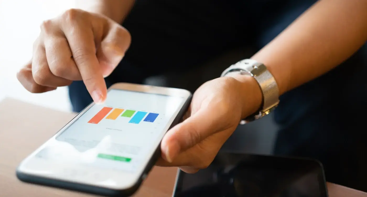
Screenshots are probably the most underestimated asset in your entire app store listing, and I'll be honest, it's mad how many clients come to me with an app that cost £50,000 to build but screenshots that look like they were made in Paint. The data on this is pretty clear—most users make their download decision within the first 8 seconds of viewing your app page, and your screenshots are doing most of the heavy lifting during that time. Apple's own research shows that people rarely scroll past the first three screenshots, which means you've got about 2.5 seconds per image to convince someone your app is worth their time and phone storage.
I've tested countless screenshot variations across different industries and here's what actually works. Your first screenshot needs to show the apps core value, not your login screen. Sounds obvious? You'd be surprised how many apps lead with authentication or onboarding—nobody cares about that yet. For a fitness app I worked on, we tested leading with the workout tracking interface versus leading with a progress chart showing results. The results-focused screenshot increased conversions by 23% because it showed the outcome people wanted, not just the feature they'd use to get there.
Screenshot Sizes You'll Actually Need
This is where it gets a bit tedious, but you need to prepare different sizes for each device type. Apple requires screenshots for the largest device in each family, and those get scaled down automatically. Right now that means you need 6.7-inch (iPhone 14 Pro Max) and 12.9-inch (iPad Pro) as your base sets. Android is even more fragmented—you'll need different assets for phones, 7-inch tablets, and 10-inch tablets.
One thing I always tell clients is to design for the actual device dimensions, not just export from your design files. A screenshot that looks perfect in Figma can look cluttered and hard to read when it's scaled down to a thumbnail in search results. I usually create two versions—one with more visual breathing room for smaller displays and one with additional detail for tablets. It's extra work upfront but it makes a genuine difference in conversion rates.
Preview Videos: Worth the Investment?
App preview videos are interesting because they can boost conversions by 20-30% when done right, but they can also hurt you if done poorly. The key thing to understand is that preview videos autoplay without sound when someone lands on your app page, so your video needs to communicate value visually within the first 3 seconds. I've seen too many preview videos that start with a logo animation or splash screen—that's 3 seconds of wasted attention.
For a healthcare app I built, we tested a preview video against just screenshots. The video showed the app in action with text overlays explaining the benefits, and it increased conversions by 18%. But here's the thing—it only worked because we showed real app functionality, not fancy motion graphics or promotional content. Users want to see what they're getting; they can smell marketing fluff from a mile away.
The technical requirements are quite specific: videos need to be between 15-30 seconds, uploaded as .mov or .mp4 files, and you need different resolutions for each device size (just like screenshots). Apple recommends using the H.264 codec with at least 20 Mbps for good quality. I usually aim for 25-30 Mbps because compression can make UI elements look fuzzy, and you want text to be crisp and readable. If you want detailed guidance on technical specifications and approval requirements, check out our comprehensive guide on creating app preview videos that get approved.
One mistake I see constantly is apps that create these elaborate preview videos but dont update them when the app design changes. I worked with an e-commerce client whose preview video still showed their old checkout flow six months after we'd completely redesigned it. Users would download the app expecting one experience and get confused when it looked different—that's a quick path to bad reviews and uninstalls.
Budget-wise, you can create decent preview videos in-house if you know what you're doing. I use screen recording tools and simple video editing software for most projects. The most expensive preview video I've produced cost about £2,500 and included custom animations and voiceover, but honestly? It didn't perform much better than the £200 version we made by just recording the app with good text overlays. Sometimes simple is better, especially if your app interface is already well-designed.
- Lead with your strongest value proposition in the first screenshot—show outcomes, not features
- Design screenshots specifically for mobile viewing, not just exports from your design files
- Prepare assets for iPhone 6.7" and iPad 12.9" as your base sizes for Apple's App Store
- Keep preview videos under 20 seconds and make sure the first 3 seconds work without sound
- Use real app footage in preview videos; avoid logo animations or promotional content
- Update your screenshots and videos whenever you make significant UI changes to the app
- Test different screenshot variations—small changes in copy or layout can significantly impact conversion
- Include text overlays on screenshots to explain benefits, especially for complex functionality
- Remember that Android requires separate screenshot sets for different device categories
App Icon Design and Specifications
Your app icon is the first thing people see when they find your app in the store, and honestly it carries more weight than you might think. I've seen perfectly good apps fail because their icon looked like it was designed in five minutes on a lunch break. And I've seen average apps perform better than they probably should have done because they nailed their icon design. Its that simple really—people do judge apps by their icons, whether we like it or not.
The technical requirements aren't difficult but you need to get them right. Both Apple and Google require a 1024x1024 pixel icon at minimum, but here's the thing—that's just for the store listing. Your app bundle needs multiple sizes for different devices and contexts; iOS alone requires about 20 different icon sizes for various use cases like notifications, settings, spotlight search. Most developers don't realise this until submission day which is a bit mad when you think about it. Your development tools can handle the resizing automatically but you need that source file to be perfect because any compression artefacts or blurriness will get magnified when scaled down to the tiny sizes used in notifications. If you're working with a development team, it's worth understanding what quality tools your developer uses to ensure they can handle these requirements properly.
Design-wise, keep it simple. Really simple. I've worked on healthcare apps where clients wanted to cram a stethoscope, heart rate monitor, and medical cross into a tiny icon—it just doesn't work. The best icons use a single, bold element with strong contrast. Look at Spotify's green circle or Instagram's gradient camera... they're recognisable even at 29x29 pixels on an iPhone notification. Avoid text entirely if you can; it becomes unreadable at smaller sizes and doesn't translate well internationally. Also worth noting that rounded corners are applied automatically by iOS so don't build them into your design or you'll end up with weird double-rounding effects.
Test your icon by shrinking it down to actual size on your phone's home screen before finalising it. What looks great at full size often falls apart when rendered small, and you won't know until you see it in context alongside other apps.
Colour choice matters more than most people think. You're competing with dozens of other icons on someone's home screen, so you need something that stands out but doesn't look garish. I typically advise clients to avoid colours that dominate their category—if you're making a finance app, maybe don't go with the same blue that 90% of banking apps use? Background transparency isn't supported on either platform so you'll need a solid colour or gradient, and remember that dark mode is now standard so your icon needs to look good against both light and dark backgrounds.
Descriptions That Actually Convert
Your app description has about three seconds to convince someone they should keep reading. Maybe less if they're tired or distracted. I've seen so many developers write descriptions like they're filling out a technical specification document—listing features, rattling off capabilities, talking about "robust frameworks" and "seamless integration." Its boring. And worse, it doesn't tell people why they should care.
The first sentence matters more than you think. I learned this the hard way with an early e-commerce app we built; we spent the opening paragraph explaining our payment processing technology when what users actually wanted to know was "can I save money shopping with this?" Once we flipped that around and led with the benefit (average savings of £47 per month), our conversion rate jumped by about 30%. The technical stuff? We buried it further down where the detail-oriented users could find it if they wanted.
Here's how I structure descriptions now after years of testing what actually works:
- Opening hook that addresses the users main pain point or desire in plain language
- Three to four concrete benefits (not features) that show what life looks like after using the app
- Social proof if you have it—user counts, ratings from other platforms, media mentions
- Feature list for the scanners who want to see what's under the bonnet
- Clear call to action that acknowledges any commitment (free trial, subscription cost, whatever)
One thing that catches people out is writing for the wrong audience. If you're building a fintech app for day traders, your description needs different language than a budgeting app for students. I mean, they're both finance apps technically, but the tone and focus should be worlds apart. And please, for the love of all things mobile, don't stuff your description with keywords thinking it'll help your rankings—Apple and Google have been wise to that for years now. Write for humans first; the algorithms will follow.
Keywords and Metadata Strategy
This is where most people mess up, honestly. They spend weeks perfecting their app icon and screenshots but then throw together their keyword strategy in about ten minutes before submission. Its a bit mad really because your keywords are what actually help people find your app in the first place—no matter how gorgeous your screenshots are, they're useless if nobody sees them. If your app isn't showing up in search results at all, you might need to improve your app's search visibility with better keyword targeting.
The App Store gives you 100 characters for your keyword field (on iOS) and Google Play works differently, pulling keywords from your description. I've seen clients waste half their character count on words like "app" or "free" which Apple already knows, or they'll repeat the same keyword three times thinking it helps. It doesn't. Every character counts, and you need to be strategic about it; separate keywords with commas but no spaces, think about how people actually search (not how you describe your product), and focus on terms with decent search volume but manageable competition.
The difference between an app that gets discovered organically and one that relies entirely on paid acquisition often comes down to smart keyword research done before launch, not after.
I worked on a fitness app where the founder insisted on targeting "best workout app" as their primary keyword. Problem was, that phrase had maybe 50 apps already ranking for it with millions of downloads. We shifted to more specific terms like "hiit timer" and "bodyweight exercises" which had less competition but still solid search volume—within three weeks they were ranking in the top 10 for both. Your subtitle on iOS (30 characters) is also indexed for search, so use it wisely... don't just make it a tagline, pack it with relevant search terms that feel natural. Test your keyword ideas using App Store search suggestions to see what autocompletes, because that shows you what real people are actually typing in. When you're stuck between similar options, here's how to pick between similar app store keywords based on competition and search volume.
Privacy Policy and Legal Requirements
Right, this is the bit that most people find boring but trust me—its absolutely crucial and can delay your launch by weeks if you don't get it sorted early. I've had clients who built entire apps only to realize days before launch they didn't have proper legal documentation in place. Not fun.
You need a privacy policy. Full stop. Both Apple and Google require one, and if your app collects any user data (which, lets be honest, most apps do), you need to be transparent about what you're collecting and why. We're talking email addresses, location data, device identifiers, analytics, push notification tokens—basically anything that could identify or track a user. I've worked on healthcare apps that needed GDPR compliance, fintech apps requiring specific financial regulations documentation, and even simple e-commerce apps collecting payment information; each one needed a tailored privacy policy that covered their specific data practices.
Here's what you actually need to cover in your privacy policy:
- What data you collect (personal info, usage data, device information)
- Why you're collecting it and how you'll use it
- Who you share it with (third-party services, analytics providers)
- How users can request their data be deleted
- Your contact information for privacy concerns
- GDPR compliance if you have European users
- CCPA compliance for California residents
Don't just copy someone else's privacy policy—I've seen apps rejected for this. You need one that reflects your actual practices. If you use Firebase for analytics, mention it. If you're storing user data on AWS servers, say so. Both app stores check these during review, and inconsistencies between what your policy says and what your app does will get you rejected. I always recommend getting a proper legal review, especially if you're handling sensitive data like health information or financial details. Yes, it costs a few hundred quid, but its cheaper than dealing with regulatory fines or app rejections later. If you need help writing user-friendly legal documents, our guide on creating terms of service that protect you covers the essential elements without overwhelming users.
Developer Account Setup
Right, before you can even think about uploading your app to the stores, you need a developer account set up—and this isn't something you can rush through the night before launch. I've watched clients get caught out by this more times than I can count, especially with Apple's enrollment process which can take anywhere from 48 hours to two weeks if theres any hiccup with your documentation. For the App Store, you'll need an Apple Developer Program membership at £99 per year; for Google Play, its a one-time fee of around £20. Seems straightforward enough, right?
Here's where it gets a bit tricky though. If you're launching under a company name rather than as an individual developer, Apple requires a D-U-N-S number for your business—this is a unique identifier from Dun & Bradstreet that can take 5-14 days to obtain if your company doesn't already have one. I've seen this delay launches more than any other single factor. Google's verification process is generally quicker, but they've tightened up their requirements recently and now ask for business registration documents that match your developer account details exactly. One mismatched address and you're back to square one.
The financial setup matters too. You need to configure your tax information correctly (Apple uses tax interviews, Google requires W-8BEN forms for non-US developers) and set up your banking details for receiving payments if your apps paid or includes in-app purchases. Getting these wrong means you cant receive money, which I've seen happen to a fintech client who launched successfully but couldn't collect revenue for three weeks whilst sorting out their tax forms. Also worth noting: both platforms require two-factor authentication on your developer accounts now, so make sure whoever manages the account has access to the registered phone number and email.
Set up your developer accounts at least three weeks before your planned launch date—not because the process should take that long, but because you need buffer time for any verification issues, documentation requests, or banking setup problems that might crop up.
Beta Testing Documentation
Look, I'll be honest with you—beta testing documentation is one of those things people treat as an afterthought, and it shows. But here's the thing, both Apple and Google want to see that you've actually tested your app before unleashing it on millions of users. And they're right to ask for it. I've had apps rejected because the review team could tell we hadn't done proper testing, and trust me, scrambling to create documentation after the fact is not fun.
The documentation you need isn't complicated, but it does need to exist. For TestFlight (Apple's beta testing platform), you'll want records of your beta testing period—who tested it, what feedback you received, what bugs were found and fixed. I usually keep a simple spreadsheet with tester emails, device types, iOS versions, and major issues reported. Nothing fancy. Google Play Console has its own internal beta track system, and whilst they're a bit more relaxed about formal documentation, having it ready shows you know what you're doing.
What Your Beta Documentation Should Include
Here's what I typically prepare for every app launch, based on projects ranging from fintech apps handling sensitive transactions to healthcare platforms managing patient data:
- List of beta testers (minimum 10-15 external testers who aren't on your team)
- Device and OS coverage—you need to test on different screen sizes and system versions
- Bug tracking log showing issues found and resolved
- User feedback summary highlighting major usability concerns addressed
- Performance metrics like crash rates and load times from your beta period
- Screenshots of your testing dashboard from TestFlight or Firebase
The Practical Side Nobody Talks About
You know what? Getting good beta testers is harder than building the app sometimes. Family and friends will download it and say "looks great!" without actually using it properly. What you need are people who will genuinely use your app for its intended purpose. For a food delivery app we built, we recruited beta testers who actually ordered meals multiple times per week; for a meditation app, we found people who had existing mindfulness practices. The feedback quality difference was night and day. While you're preparing for launch, it's also worth building an email list of potential users who might become your early beta testers or day-one adopters.
One thing that's caught out several of my clients—Apple's review team can request your TestFlight data during the review process. They want to see that real people tested your app on real devices. So dont fake this part. Run a proper beta test for at least two weeks (longer for complex apps), get genuine feedback, and document everything. Its not just about passing review; its about launching an app that actually works when thousands of people start using it on day one.
Age Ratings and Content Guidelines
I'll be honest, age ratings are one of those things that seem straightforward until you actually start filling out the questionnaire. Both Apple and Google have these content rating systems—Apple's is built into App Store Connect and Google uses the IARC (International Age Rating Coalition) system—and they ask you loads of questions about violence, sexual content, profanity, gambling, that sort of thing. The questions can be a bit vague sometimes which makes it tricky.
Here's where I see developers mess up; they think their app is completely innocent and rush through the questionnaire without really thinking about it. I worked on a fitness app once where the client insisted it was suitable for 4+ because "its just exercise videos". But the app had social features where users could post photos and comment on each others workouts. That bumped the rating up to 12+ automatically because of user-generated content and mild social elements. They weren't happy about it but thats just how the stores work—you cant control what users might post. If you're planning social features that could get people talking about your app, check out our guide on making your app worth discussing online.
If your app includes any user-generated content, links to social media, or unrestricted web browsing, you're looking at a higher age rating regardless of how innocent the rest of your content is
The thing about age ratings is they affect your discoverability. Parents use these ratings to filter what their kids can download, so getting it wrong means missing your target audience. But equally, trying to game the system and selecting a lower rating than you should? The app stores will reject you during review or worse, pull your app after launch. I've seen that happen with a casual gaming app that had optional in-app purchases for gambling-style mechanics—they tried for 12+ but Apple flagged it and demanded they change to 17+. That killed their user base overnight because most their players were teenagers. Answer the questions honestly, review them twice, and accept whatever rating you get.
Conclusion
Look, I'm not going to pretend that getting all these assets together is quick or easy—it's not. Over the years, I've seen so many apps rushed to launch with placeholder screenshots or last-minute descriptions written at 2am, and it never ends well. The app stores are brutal places; you get one shot at a first impression, and if your listing looks thrown together or unprofessional, users will scroll right past you. Its that simple really.
What I always tell clients is this: treat your app store presence as seriously as you treat the app itself. You could have built the most brilliant fintech app with incredible security features and seamless user experience, but if your screenshots don't communicate that value in the first three seconds? Nobody's downloading it. I've worked on healthcare apps where we spent weeks perfecting the user interface, only to nearly launch with generic screenshots that showed none of the app's unique diagnostic capabilities. We caught it just in time, redid the entire asset package, and saw a 40% increase in conversion compared to our initial projections.
The good news is that once you've done this properly, you've got a solid foundation you can build on. Sure, you'll tweak your keywords based on performance data and update screenshots when you add new features, but the heavy lifting is done. My advice? Start gathering these assets at least three weeks before your planned launch date—give yourself breathing room for revisions, feedback, and those inevitable last-minute changes. And honestly, if something doesn't feel quite right, trust that instinct; its usually correct.
Frequently Asked Questions
I always tell clients to start at least three weeks before their planned launch date, though I'd recommend even longer for complex apps. This gives you proper time for revisions, beta testing documentation, and dealing with unexpected issues like Apple's D-U-N-S number requirements or developer account verification delays.
Leading with login screens or onboarding flows instead of showing the app's core value proposition. I've tested this countless times—a fitness app I worked on saw a 23% conversion increase when we switched from showing the workout interface to showing actual results and progress charts that users wanted to achieve.
Preview videos can boost conversions by 20-30% when done right, but they'll hurt you if done poorly. The key is showing real app functionality within the first 3 seconds since they autoplay without sound—I've seen too many waste that crucial time with logo animations instead of demonstrating actual value.
Focus on terms with decent search volume but manageable competition rather than obvious phrases like "best workout app" that already have millions of downloads competing. I helped a fitness app rank in the top 10 by targeting specific terms like "hiit timer" instead of broad, oversaturated keywords.
The app stores will reject you during review or potentially pull your app after launch, which can kill your user base overnight. I've seen a gaming app forced to change from 12+ to 17+ because of gambling-style mechanics, losing most of their teenage audience—answer the questionnaire honestly rather than trying to game the system.
Absolutely not—I've seen apps rejected for this exact reason. Your privacy policy needs to reflect your actual data practices, mentioning specific services like Firebase for analytics or AWS for storage. Both app stores check these during review and inconsistencies will get you rejected.
I typically aim for 10-15 external testers who aren't on your team, but quality matters more than quantity. For a food delivery app, we recruited people who actually ordered meals multiple times per week rather than friends who'd just say "looks great" without properly testing the core functionality.
Keep it simple with a single, bold element and avoid text entirely—it becomes unreadable at smaller sizes like the 29x29 pixels used for iPhone notifications. I always test icons by shrinking them down to actual phone size because what looks perfect in Figma often falls apart when rendered small alongside other apps.
Share this
Subscribe To Our Learning Centre
You May Also Like
These Related Guides
How Should You Price Your App for Maximum Downloads?

How Do I Create App Preview Videos That Get Approved?