What Makes Travel Apps Easy to Use on Holiday?
A nurse in an emergency department opens a medical staffing app at 3am to check her shift pattern for the week ahead, but the interface takes six taps just to reach the calendar view and another four to request a swap with a colleague. The whole process, which should take seconds, stretches into minutes whilst patients wait and phones ring in the background. This same problem plays out differently when you're standing in a Spanish airport trying to find your hotel booking confirmation, or attempting to work out which train platform you need whilst dragging a suitcase through a crowded station. Travel apps need to be designed for people who are tired, distracted, possibly stressed, and definitely not sitting comfortably at a desk with perfect WiFi.
The best travel apps are the ones you forget you're using because everything just appears when you need it
After building apps for the travel sector over the past ten years, I've learnt that the difference between an app people recommend and one they delete comes down to how it performs in real situations rather than testing environments. Your users aren't calmly browsing from home, they're checking booking details whilst walking to a gate, searching for restaurant recommendations with 12% battery remaining, or trying to access tickets when they've just stepped off a plane into a foreign country with patchy mobile data. The technical side of building these apps is straightforward enough, but creating mobile apps for businesses requires thinking about dozens of small moments where everything could go wrong.
Why People Struggle With Travel Apps While on Holiday
The main reason travel apps fail isn't because they lack features, it's because they were designed for people who have time and attention to spare. I worked on a hotel booking app where users reported problems finding their confirmation emails, and when we looked at the session recordings we discovered people were opening the app an average of seven times per booking just to check basic details. The information was there, buried three screens deep in a menu that made perfect sense to the design team but meant nothing to someone standing outside a locked hotel at midnight.
Battery life creates enormous pressure on app design decisions. Every animation, every auto-refresh, every background process drains power that your users desperately need when they're away from chargers for hours at a time. People switch apps constantly whilst travelling, checking maps then switching to booking confirmations then back to maps, and each context switch costs time and mental energy when they're already dealing with unfamiliar environments. Screen glare becomes a problem too, particularly with apps that rely on subtle colour differences or low-contrast text that looks lovely on an office monitor but completely disappears in Mediterranean sunlight.
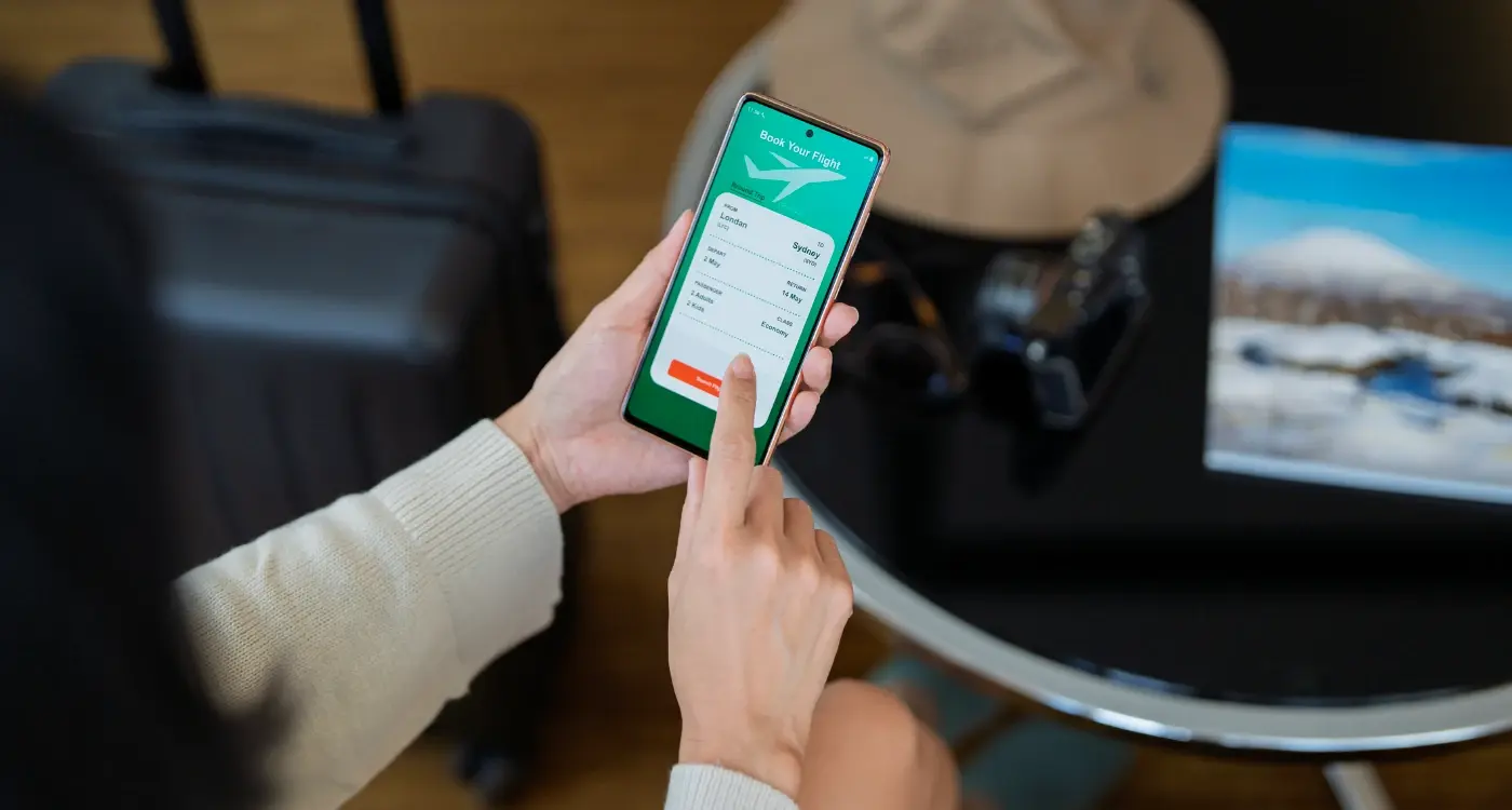
The Booking Flow That Actually Works
The booking process needs to collect information in the same order that people naturally think about their trip, which sounds obvious but gets overlooked constantly. When someone searches for flights, they're thinking about dates first, then destination, then price, but many apps force users through elaborate filters before showing any actual options. I've tested booking flows where we reduced the initial search form from eight fields to three, and conversion rates went up by 23% just because people could see results faster and refine their search afterwards rather than trying to predict all their preferences upfront. Building these systems often involves integrating flight and hotel booking APIs that can handle this streamlined approach.
Save payment information and passport details securely after the first booking so users never have to type them again, but always show what's stored so people can verify the details are correct before confirming.
- Show total price including all fees before asking for any personal information
- Allow users to complete booking as a guest without forcing account creation
- Pre-fill form fields using device location and saved preferences where appropriate
- Provide a clear progress indicator showing how many steps remain
- Save partial progress automatically so people can resume if they get interrupted
Payment handling deserves special attention because this is where most booking flows fall apart. People abandon purchases when they're surprised by additional fees on the payment screen, when they have to re-enter information they already provided, or when the payment processor looks different from the rest of the app and makes them worry about security. Understanding the best payment options for mobile apps can significantly improve conversion rates. The confirmation screen should show everything about the booking in one place with the option to add it directly to the device calendar, download a PDF, or forward details to someone else without leaving the app.
Maps and Navigation Without the Headache
Maps inside travel apps need to work differently from dedicated navigation apps because people use them for orientation and decision-making rather than turn-by-turn directions. When I built a tourism app for a heritage site, we initially embedded a full interactive map with zoom controls and layers, but users just wanted to see where they were relative to the entrance and the nearest toilets. Simplifying the map to show only relevant landmarks and services made it far more useful than providing comprehensive geographic detail.
Integration With External Apps
The best approach is letting users open directions in their preferred navigation app with one tap rather than trying to replicate those features inside your own interface. This saves development time, provides better navigation, and reduces battery drain from running GPS tracking in your app. When users tap an address, give them clear options to open it in Google Maps, Apple Maps, or whatever navigation app they prefer, and remember their choice for next time.
Location Services That Respect Privacy
Location permissions have become a trust issue rather than a technical one. People worry about apps tracking their movements constantly, so be explicit about when and why you need location access. Request permission only when the feature requires it, offer approximate location rather than precise coordinates where possible, and explain clearly how the data gets used without storing it longer than needed. Understanding privacy law compliance for mobile apps is crucial when handling location data across different countries.
Making Apps Work When the Internet Doesn't
Network connectivity on holiday ranges from perfect hotel WiFi to completely offline, often within the same day. I learnt this the expensive way when building an early version of an itinerary app that required constant internet access to display any information at all. Users would lose access to their entire trip plan the moment they stepped onto a plane or went underground on a metro system. The app became useless exactly when people needed it most.
If your app shows a spinning loader for more than two seconds when someone opens it, you've already lost that session
The approach that works involves downloading all booking confirmations, tickets, and trip details as soon as they're created, then storing them locally on the device in a way that doesn't require internet access to view. This means thinking carefully about what information people actually need versus what's nice to have. A hotel booking needs the address, check-in time, confirmation number, and contact phone number to be available offline, whilst user reviews and photos of the lobby can wait until connectivity returns. Learning how to design effective offline functionality can make the difference between an app that works reliably and one that fails when users need it most. Image assets need compressing properly because downloading a dozen high-resolution photos over a hotel's slow WiFi will take forever and potentially cost users money on roaming data plans.
Quick Access to What Matters Most
The home screen of a travel app should change based on context and timing. Before a trip, show the booking summary and countdown. On the day of travel, display boarding passes and directions to the airport. During the trip, feature hotel details and local recommendations. After returning home, present the receipt and option to leave reviews. This contextual approach requires tracking where users are in their journey and surfacing relevant content automatically rather than making them hunt through menus.
| Trip Phase | Primary Information | Secondary Actions |
|---|---|---|
| Pre-departure | Booking confirmations, countdown | Add to calendar, share itinerary |
| Travel day | Tickets, gate info, directions | Contact support, report delays |
| During stay | Hotel address, local tips | Book activities, find restaurants |
| Post-trip | Receipts, memories | Leave reviews, plan next trip |
Widgets and lock screen shortcuts make information accessible without even opening the app properly. A countdown widget showing days until departure keeps your app visible on the home screen, whilst a boarding pass displayed on the lock screen means people can reach it with one swipe rather than unlocking their phone, finding the app, navigating to bookings, and selecting the right flight. These small conveniences matter when you're juggling bags and passports whilst walking through security. If you're planning to launch a travel app, consider building an email list before launch to notify potential users when these features become available.
How to Handle Multiple Languages and Currencies
Language switching needs to happen automatically based on device settings and user location, but with an obvious manual override for people travelling in groups or helping family members who speak different languages. The mistake I see most often is translating interface elements but leaving crucial information like booking terms and cancellation policies in the original language, which creates confusion and breaks trust when users need to understand important details.
Display prices in both the booking currency and the user's home currency at the same time, showing the exchange rate and when it was last updated, so people understand exactly what they're spending without doing mental calculations.
Currency Display That Builds Confidence
Currency conversion should be live where possible but still functional offline using the last known exchange rate. Show both currencies side by side during booking so users see the local price and their home currency equivalent. This matters for expense tracking and budget management, particularly for business travellers who need accurate records. Always complete transactions in the original currency to avoid additional conversion fees from payment processors, but display the estimated home currency amount so people understand the real cost.
Offline Features That Save Your Trip
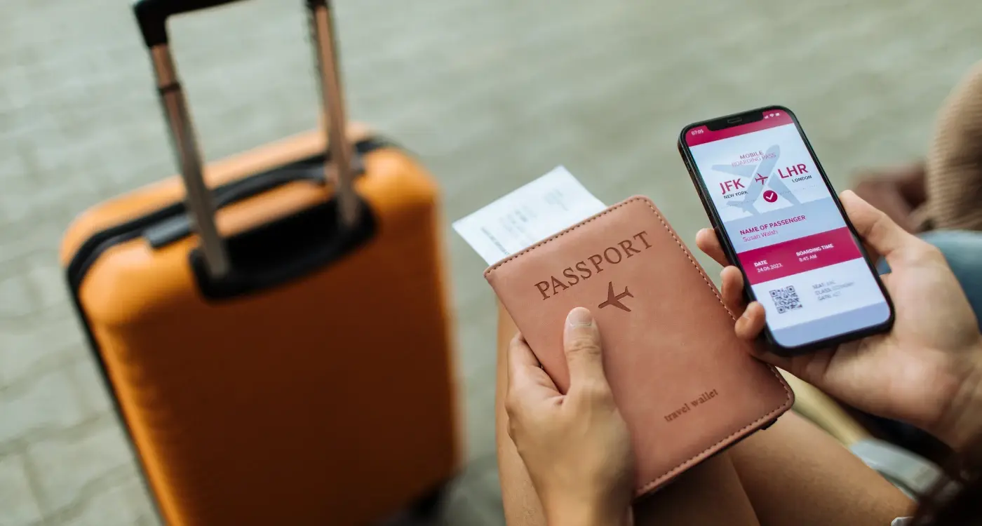
Building proper offline functionality means storing booking data locally in a structured way that doesn't depend on server access. This goes beyond just caching the last screen someone viewed, it requires thinking about which features provide real value without connectivity. Boarding passes should display as QR codes that work for scanning even with a completely dead internet connection. Hotel addresses need to be stored as coordinates that can open in offline map apps. Contact phone numbers should be formatted correctly for the local country so people can actually ring them if needed. Similar principles apply to handling offline functionality in automotive applications, where connectivity can be equally unreliable.
The technical challenge comes from keeping offline data synchronised when connectivity returns without creating conflicts or overwriting newer information. I prefer a system where the app attempts to sync changes whenever it detects network access but continues functioning if the sync fails, rather than blocking features until connection is restored. Users should see a subtle indicator showing when their data was last updated without alarming them or preventing them from accessing their information.
What Happens After the Booking
The relationship with your app shouldn't end the moment someone completes a purchase. Sending useful notifications before the trip starts keeps your app relevant without being annoying. A reminder 24 hours before check-in with the hotel address and local weather forecast provides value. A notification when online check-in opens for a flight helps users avoid queues. A message suggesting what to pack based on the destination weather shows you're thinking about their needs beyond just taking their money. Research shows that reward messages work better than reminder messages for encouraging user engagement.
Post-trip engagement determines whether someone keeps your app installed or deletes it the moment they get home
During the trip itself, notifications need to be timely and actionable rather than promotional. Flight delay alerts, gate changes, or messages that a hotel room is ready early all justify interrupting someone's day. Marketing messages about future destinations whilst someone is actively on holiday just create annoyance. Wait until they're home and settled before suggesting their next adventure.
Review Requests That People Actually Complete
Asking for reviews should happen at a specific moment when someone has just had a positive experience and has time to respond. The sweet spot is usually two or three days after returning home, when the trip is still fresh but the person isn't exhausted from travel anymore. Make leaving a review simple by pre-filling details about their booking and asking specific questions rather than presenting a blank text box. A rating scale for cleanliness, location, and value takes seconds to complete, whilst writing a full review feels like homework. When handling user data from reviews and feedback, ensure you understand how to delete user data permanently when users request removal.
Conclusion
Travel apps succeed when they make complicated logistics feel simple, which requires understanding the dozens of small stressful moments that happen during a trip and smoothing each one out. The apps people keep installed are the ones that have proved reliable when things went wrong, that showed them their boarding pass when the internet died, that remembered their preferences without asking twice, that got out of the way and let them enjoy their holiday instead of fighting with technology. Building apps like this takes more thought than code, more testing in real conditions than feature additions, and more honesty about what people actually need versus what seems impressive in a demo.
If you're working on a travel or tourism app and want input from people who've built them before, get in touch with us and we can talk through what would work for your specific situation.
Frequently Asked Questions
A well-designed travel app should use minimal data by downloading all your booking confirmations, tickets, and essential trip details when you first make reservations on WiFi. Most core functions like viewing boarding passes, hotel details, and saved itineraries work offline, so you'll only use data when actively searching for new information or syncing updates.
Travel apps need location access to show you relevant nearby services, provide directions, and display contextual information based on where you are in your journey. Look for apps that request permission only when you're actually using location features and explain clearly how they use this data - reputable apps will offer approximate rather than precise location tracking where possible.
Yes, properly built travel apps store all your essential booking information locally on your device, including confirmation numbers, addresses, check-in times, and digital tickets. This means everything remains accessible even with no internet connection or when your phone is in airplane mode.
This happens when apps don't include all fees and taxes in their initial price display, then add booking fees, service charges, or resort fees at checkout. Quality travel apps show the total price including all mandatory fees before asking for your payment details, so you're never surprised at the final step.
The key is downloading all your trip information before you travel using reliable WiFi at home or in your hotel. Turn off automatic app updates and background refresh for non-essential apps to preserve bandwidth, and look for apps that compress images and data efficiently for slower connections.
Booking as a guest is fine for one-off trips, but creating an account saves significant time on future bookings by storing your payment details, passport information, and preferences securely. The best travel apps let you complete your first booking as a guest, then offer to save your details afterwards without forcing account creation upfront.
Wait about two to three days after returning home from your trip - you'll have had enough time to reflect on the experience without the immediate fatigue of travel, but the details will still be fresh in your memory. Apps that ask for reviews immediately after checkout or while you're still travelling are asking at the wrong moment.
Check if the app handles local currencies, works with international payment methods, and stores information offline since internet connectivity can be unreliable abroad. Read recent reviews from other users who've travelled to similar destinations, and test core features like viewing bookings and accessing tickets before you leave home.
Share this
Subscribe To Our Learning Centre
You May Also Like
These Related Guides

Can Your App Work When the Internet Goes Down?
What's Different When Building a Travel Guide App and a Booking App?