
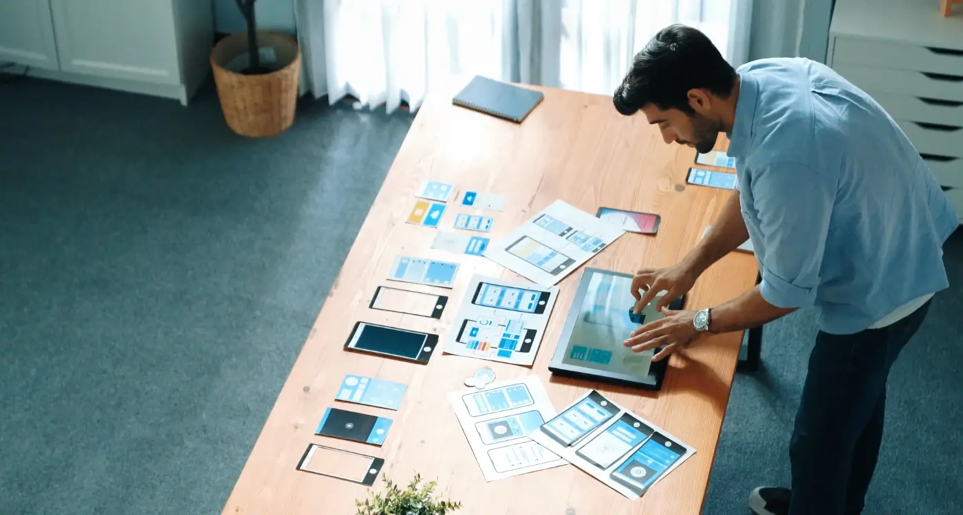
How Do I Create App Layouts That Feel Natural to Use?
Most users abandon an app within three minutes if they can't figure out how to use it properly. That's not because people are impatient—well, they are a bit—but it's mainly because good app layouts should feel so natural that users don't have to think about them at all. When someone opens your app, their brain is making split-second decisions about where to look, what to tap, and how to get what they want. If your layout fights against these natural instincts, you've lost them before they've even started.
I've been designing and building mobile apps for years, and honestly? The biggest mistake I see isn't technical complexity or flashy animations gone wrong. It's layouts that make users work too hard. Your app's layout is like the foundation of a house—if it's wonky, nothing else matters. The colours could be perfect, the features could be brilliant, but if people can't navigate naturally through your interface, they'll delete your app and find something that makes more sense.
Good design is invisible; people should be able to accomplish their goals without ever thinking about your interface.
The thing is, creating natural-feeling layouts isn't about following the latest design trends or copying what the big tech companies are doing. It's about understanding how human brains actually process visual information and how our thumbs naturally want to move across a screen. When you get this right, users will describe your app as "intuitive" without being able to explain why. And that's exactly where you want to be—creating something that feels so natural, it's almost forgettable in the best possible way.
Understanding How People Actually Use Their Phones
Right, let's start with the basics—and I mean really basic. Most people hold their phones one-handed about 75% of the time. Shocking, isn't it? Well, not really, but it's something a lot of app designers seem to forget when they're creating layouts.
I've watched thousands of users interact with apps over the years, and honestly, the patterns are pretty predictable. People scan screens in a Z-pattern, they use their thumb for almost everything, and they get frustrated when buttons are placed in awkward spots. Its human nature, really.
But here's the thing—people don't use phones the way we think they do. They're often distracted, walking around, or multitasking. They might be holding a coffee, pushing a pram, or trying to text whilst watching TV. Your app needs to work in all these scenarios, not just when someone's sitting at a desk giving it their full attention.
The Thumb Zone Reality
The thumb zone is where most interactions happen on a phone screen. This area covers roughly the bottom two-thirds of the screen when holding a phone naturally. Anything outside this zone requires users to shift their grip or use their other hand—and that's when things get awkward.
- Easy reach: Bottom third of the screen
- Stretch zone: Middle third (doable but less comfortable)
- Hard to reach: Top third (requires grip adjustment)
- Impossible zone: Top corners (seriously, don't put important buttons here)
Most users won't tell you when something's hard to reach; they'll just stop using your app. That's the difference between understanding user behaviour and just assuming you know what works.
The Psychology Behind Natural Touch Interactions
When someone picks up a phone, their brain doesn't need a manual to know how to use it. That's not magic—it's psychology. Our minds are wired to expect certain behaviours from touch interfaces, and when app layouts work with these expectations rather than against them, everything just clicks.
Think about how you naturally tap, swipe, and pinch on your phone. You don't consciously think "I'll use my index finger to press this button"—you just do it. This happens because touch interactions tap into something called affordances. Basically, our brains look at objects and immediately understand what we can do with them. A button looks pressable. A list looks scrollable. When your app layouts respect these mental shortcuts, users feel comfortable straight away.
The Science of Touch Expectations
There's proper research behind this stuff. Studies show that people expect touch targets to respond within 100 milliseconds of contact—any longer and the interaction feels broken. We also naturally expect larger objects to be more important than smaller ones, which is why your main action buttons should be bigger than secondary ones.
Make your primary buttons at least 44x44 points on iOS and 48dp on Android. Anything smaller feels fiddly and creates frustration.
Here's what users instinctively expect from different gestures:
- Tapping - immediate action or selection
- Swiping horizontally - moving between pages or dismissing items
- Swiping vertically - scrolling through content
- Pinching - zooming in or out
- Long pressing - revealing additional options
When your layouts honour these expectations, users don't have to learn how to use your app—they already know. But here's the thing: break these rules without good reason and you'll confuse people. I've seen apps where swiping left deletes items instead of revealing options, and honestly, it drives users mad because it goes against what feels natural.
Essential Layout Patterns That Just Work
Right, let's talk about the layout patterns that I keep coming back to in my projects. After building apps for everything from banking to food delivery, certain patterns just... work. They feel natural to users because they've become part of our muscle memory.
The tab bar at the bottom is probably the most reliable pattern I use. People's thumbs naturally rest there, and it gives you four or five main sections without overwhelming anyone. But here's the thing—don't put your most important action in the middle tab. I know it seems logical, but users actually tap the leftmost tab most often. That's where your primary content should live.
The Patterns I Use Most Often
- Bottom navigation for main sections (never more than five tabs)
- Card-based layouts for browsing content—they're scannable and work on any screen size
- Master-detail patterns for lists that lead to detailed views
- Floating action buttons for the primary action users need to take
- Pull-to-refresh for updating content—users expect it now
Cards are honestly my go-to for most content. They work because they mimic real-world objects that we can mentally "pick up" and examine. Each card contains just enough information to help users decide if they want to dig deeper. No more, no less.
One pattern that trips people up is the hamburger menu. I rarely use them anymore because they hide your navigation. If users can't see their options, they won't use them. Its better to show your main sections upfront, even if it means making some tough decisions about what really matters in your app.
When to Break the Rules
Sometimes you need to create something unique. That's fine, but do it deliberately. If you're building a creative app or a game, users might expect something different. Just make sure your unique approach still follows basic usability principles—like keeping important actions within thumb reach and maintaining visual consistency throughout.
Creating Visual Flow That Guides Users
Visual flow is basically the invisible path your users' eyes follow when they look at your app screen. Get it right and people naturally know what to do next; get it wrong and they'll stare at your app like its written in a foreign language. I've seen brilliant apps fail because their visual flow was all over the place—users couldn't figure out where to look or what to tap first.
The secret is understanding that people's eyes move in predictable patterns. On Western apps, users typically scan from top-left to bottom-right in a Z-pattern. But here's where it gets interesting—mobile screens are different from websites. People hold their phones closer to their faces, which means they process information differently. They scan in smaller chunks, looking for visual anchors that tell them "this is important" or "tap here next".
Using Size and Contrast to Create Hierarchy
Size matters more than you think. Your most important element—whether that's a search bar, main action button, or key piece of content—should be the biggest thing on screen. But don't go mad with it. I've seen apps where everything is huge, which defeats the point entirely.
Contrast works hand-in-hand with size. Dark text on light backgrounds, bright buttons against neutral colours, bold headings followed by lighter body text. These visual cues create a natural reading order that guides users through your interface without them even realising it.
People don't read apps, they scan them looking for the next thing that matches what they want to do
White space is your best friend for creating flow. It gives users' eyes a place to rest and makes important elements stand out. Don't try to cram everything onto one screen—let your content breathe, and users will thank you for it.
Making Content Easy to Scan and Digest
People don't read apps—they scan them. I've watched hundreds of users interact with apps during testing sessions, and honestly? Most people spend less than three seconds deciding whether they understand what's on their screen. If they can't quickly find what they're looking for, they'll either tap somewhere random or just close the app entirely.
The secret is designing for scanners, not readers. Your users are probably walking down the street, sitting on a bus, or multitasking at work when they open your app. They're not settling in for a careful read like they would with a book—they want information fast.
Structure Content for Quick Understanding
Start with the most important information at the top of each screen. I know this sounds obvious, but you'd be surprised how many apps bury their key content below the fold. Users shouldn't have to scroll to understand what a screen is for.
Break up text into small chunks. Long paragraphs feel overwhelming on mobile screens, even when the content is actually quite simple. Use short sentences and give each idea its own line or section.
Visual Hierarchy Makes Everything Clear
Different text sizes, colours, and weights help users understand what's important without thinking about it. Your main heading should be the biggest text on screen, followed by subheadings, then body text.
- Use plenty of white space between sections—it helps separate ideas
- Keep related information grouped together visually
- Make buttons and interactive elements stand out from regular text
- Use consistent spacing throughout your app
- Avoid walls of text that look intimidating to read
Remember, scanning isn't lazy—it's smart. When you design for scanners, you're respecting your users' time and mental energy. That's the kind of consideration that keeps people coming back to your app.
Designing for Thumbs and Fingers
Right, let's talk about the most important design tools your users have—their hands. I've watched thousands of people interact with apps over the years, and honestly? Most designers still get this wrong. They create beautiful layouts that look great in screenshots but feel clumsy the moment someone actually tries to use them.
The thumb zone is your best friend when designing app layouts. Most people hold their phones with one hand and navigate primarily with their thumb; this creates a natural arc of easy-to-reach areas on the screen. The bottom half is prime real estate, whilst the top corners are basically no-mans land for comfortable interaction.
Touch targets need to be at least 44 pixels square—that's not just Apple being fussy, its based on actual finger pad sizes. But here's what most people miss: spacing between touchable elements matters just as much. I've seen apps where buttons are technically big enough but placed so close together that users constantly tap the wrong thing. It's maddening.
Place your most important actions in the bottom third of the screen where thumbs naturally rest. Save the top area for content that users read rather than tap.
Finger-Friendly Layout Principles
- Keep primary navigation at the bottom of the screen
- Make buttons at least 44x44 pixels with 8-pixel spacing
- Position destructive actions away from common tap areas
- Use the centre-bottom area for your main call-to-action
- Leave extra space around small interactive elements
One thing I always tell clients: test your layouts by using your phone with one hand whilst walking. If you find yourself stretching your thumb or needing to adjust your grip, your users will too—and they'll probably just close your app instead.
Common Layout Mistakes That Frustrate Users
After building apps for nearly a decade, I've seen the same layout mistakes crop up time and time again—and honestly, some of them make me want to throw my phone across the room! The worst part? These errors are completely avoidable if you know what to look for.
The biggest culprit is putting important buttons too close to the screen edges. I mean, how many times have you accidentally triggered the back gesture when trying to tap a menu button? It's maddening. Your primary actions need breathing room—at least 44 pixels from any edge where system gestures might interfere.
Cramming Too Much Into One Screen
I see this constantly with clients who want to show everything at once. But here's the thing—mobile screens are small, and users can only focus on one task at a time anyway. When you pack too many elements together, everything becomes harder to use. Buttons get accidentally tapped, text becomes unreadable, and users just give up.
Another killer mistake? Inconsistent spacing between elements. One section has loads of white space, the next is crammed together like sardines. This creates a choppy, unprofessional feel that screams "we didn't think this through properly."
Ignoring Platform Conventions
Look, I get it—you want your app to stand out. But putting navigation at the top on Android or using completely custom icons that nobody recognises isn't clever design, its just confusing. Users have learned patterns from the thousands of apps they've used before yours.
The most frustrating mistake of all? Making clickable areas too small. If someone needs a magnifying glass to tap your button accurately, you've lost them. Keep touch targets at least 44x44 pixels, and give them proper spacing so fat fingers don't accidentally hit the wrong thing.
Testing Your Layouts with Real Users
Right, so you've built what you think is a brilliant app layout. It looks good on your screen, it makes sense to you, and your team loves it. But here's the thing—you're not your user. I've seen countless apps that looked perfect in design mockups but completely fell apart when real people got their hands on them.
The only way to know if your layout actually works is to watch real people use it. Not your mum, not your best mate, but actual strangers who have never seen your app before. You want to see them struggle, get confused, make mistakes. That's where the gold is.
Getting Started with User Testing
You don't need a fancy lab or expensive equipment. Five users will catch about 85% of usability problems—honestly, that's all you need for most projects. Give them your phone, ask them to complete a simple task like "find the settings page" or "add an item to your basket," then shut up and watch.
The moment you start explaining how something works, you've already identified a layout problem
Pay attention to where they tap first, how long they hesitate, and what they say out loud. If someone's poking around for more than a few seconds looking for something that should be obvious, your layout needs work. The beauty of mobile testing is that problems show up immediately—there's nowhere to hide when someone's thumb can't reach a button or they keep tapping the wrong thing.
What to Look For
Watch for the small stuff. Are they holding the phone differently than you expected? Do they scroll past important content? Are they using landscape mode when you designed for portrait? These little details will tell you more about your layout's effectiveness than any design review ever could.
Look, after eight years of building apps that people actually stick with, I can tell you this much—creating layouts that feel natural isn't about following every design trend or cramming in the latest features. It's about understanding that your users are real people with fat thumbs, short attention spans, and about a million other things competing for their time.
The apps that succeed (and I mean really succeed, not just get downloaded and deleted) are the ones that make people feel smart when they use them. They're predictable without being boring. They guide users naturally without making them think too hard about where to tap next.
Sure, you could spend months perfecting pixel-perfect designs that look gorgeous on Behance. But honestly? That's not what keeps users coming back. What works is layouts that respect how people naturally hold their phones, content that scans quickly when someone's rushing between meetings, and interactions that feel so obvious users don't even notice them.
The beauty of natural app layouts is that they become invisible—users focus on what they want to achieve rather than fighting with your interface. That's when you know you've got it right. When someone can accomplish their goal without cursing at their screen, you've done your job.
Building apps isn't just about code and design systems; it's about creating something that fits seamlessly into someone's daily routine. Get the layout right, and everything else—user retention, app store ratings, word-of-mouth recommendations—tends to fall into place. It really is that simple, and that difficult.
Share this
Subscribe To Our Learning Centre
You May Also Like
These Related Guides
How Do I Make My App Intuitive For First-Time Users?
How Do I Know When My Design Has Too Much Going On?