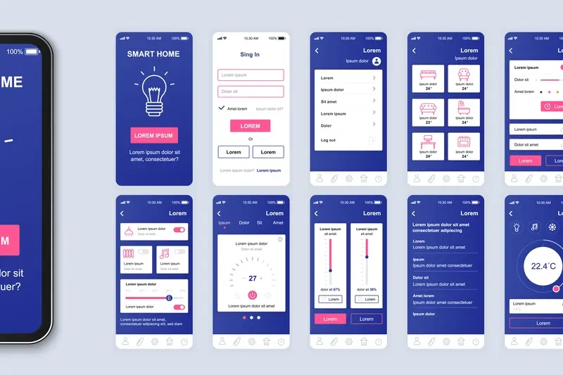
How Do I Know When My Design Has Too Much Going On?
A dating app I worked on had everything—profile badges, compatibility scores, icebreaker suggestions, personality tests, mutual friend indicators, activity status dots, message read receipts, and about fifteen other features the product team thought were "must-haves". Users opened it once, got overwhelmed, and deleted it within minutes. The conversion rate was terrible. We stripped away two-thirds of those features in the redesign and suddenly people actually started using the thing; sometimes less really is more.
Here's the thing—knowing when your design has crossed the line from helpful to chaotic isn't always obvious when you're the one building it. You've spent weeks or months working on every element, and each piece feels important because you know the story behind why its there. But your users? They don't have that context. They just want to get something done without feeling like they need a manual to navigate your interface.
I mean, it's a bit mad really how often I see talented designers and product managers fall into this trap. They start with a clean, simple concept and then slowly—feature by feature, button by button—they add complexity until the whole thing becomes a cluttered mess. And the worst part? It happens so gradually that nobody notices until user feedback starts coming in or the analytics show people abandoning the app at alarming rates.
The best designs aren't about showing everything you can do—they're about hiding everything users don't need to see right now.
This guide is going to help you spot the warning signs before you launch something that confuses people. We'll look at practical ways to test whether your design has gone too far, what actually matters to users versus what just takes up space, and how to make those tough decisions about what stays and what goes. Because honestly? Learning to say no to features is one of the most valuable skills you can develop as a designer or product owner.
Signs Your Design is Overloaded
Right, let's talk about the warning signs that your app design has gone off the rails. I see this constantly—clients come to me with designs that try to do everything at once, and honestly? It never works out the way they hope.
The first sign is pretty obvious: if users need more than three seconds to understand what they're looking at, you've got a problem. I mean, mobile screens are tiny. People are distracted. They're on the bus or waiting for a coffee or half-watching telly. If your interface makes them think too hard, they'll just close the app and move on to something else. Its that simple really.
Another dead giveaway? When you cant immediately identify the primary action on a screen. Every screen should have one main thing you want users to do—sign up, add to basket, take a photo, whatever. If you're showing five equally-prominent buttons, three different calls to action, and a bunch of competing elements all screaming for attention, users will freeze up. They literally won't know what to do first, so they'll do nothing at all.
Here's what I tell clients: open your app and count how many colours you see on the home screen. If you're past five or six, you're probably overdoing it. Same goes for fonts—if you're using more than two or three different typefaces, things start looking messy fast. And don't even get me started on apps that try to squeeze in every possible feature onto the main navigation. I've seen apps with eight tabs at the bottom. Eight! Nobody needs that.
You know what else? If your users keep asking "where do I find X?" during testing, that's your design telling you its too cluttered. People shouldn't have to hunt for basic functions.
The Real Cost of Visual Clutter
Right, lets talk about what actually happens when your design gets too busy—and I'm not just talking about aesthetics here. Visual clutter costs you real money, real users, and real opportunities. I've watched brilliant app ideas fail because their interfaces looked like someone threw every feature at the screen and hoped for the best. Its a painful thing to see, honestly.
When users open a cluttered app, their brain has to work harder to process whats on screen. We're talking milliseconds here, but those milliseconds add up to confusion, frustration, and ultimately? They close your app. Studies show that people make judgements about your app in less than 50 milliseconds—thats faster than a blink. If their first impression is "bloody hell, where do I even start?" you've already lost them. And here's the thing—you paid good money to acquire that user, probably somewhere between £2-10 depending on your industry, and they're gone before they even tried your core features.
The Hidden Performance Issues
But it gets worse. Visual clutter doesn't just confuse users; it actually slows down your app. More elements on screen means more rendering work for the device, more memory usage, more battery drain. I've seen apps with overcrowded interfaces crash more often simply because theres too much happening at once. And you know what the App Store algorithms care about? Crash rates, loading times, user retention. A cluttered design hurts all of these metrics. Understanding why app complexity affects development costs can help you make better decisions about feature prioritisation.
What You're Actually Losing
Let me break down the real costs of design clutter in ways that affect your bottom line:
- Higher bounce rates—users leave before completing key actions like signing up or making a purchase
- Lower conversion rates—confused users don't convert, its that simple really
- Increased support costs—when people cant find what they need, they contact support instead
- Poor app store ratings—frustrated users leave 1-star reviews mentioning "too complicated" or "hard to use"
- Wasted development time—you built features nobody can find or use because theyre buried in clutter
- Higher user acquisition costs—poor retention means you need to constantly acquire new users to replace the ones who left
I mean, think about it this way; every unnecessary button, every extra piece of text, every decorative element that doesnt serve a purpose is actively working against your apps success. Sure, someone on your team might have fought hard for that feature to be prominently displayed, but if it makes the interface harder to navigate? Its costing you users and revenue. The most successful apps I've built over the years have been the ones where we were ruthless about cutting clutter—even when it meant disappointing stakeholders who wanted their pet features front and centre.
Track your analytics before and after removing visual clutter; you'll often see improved time-on-app, higher completion rates for key actions, and better overall retention numbers within just a few days of launching a cleaner design.
Testing Your Design With Fresh Eyes
Right, so you've been staring at your app design for weeks now and honestly—you can't tell if its brilliant or a complete mess. This happens to all of us. I mean, I've lost count of how many times I've been so deep into a project that I genuinely couldn't see the problems anymore. Your brain starts filling in the gaps, making connections that seem obvious to you but are completely invisible to everyone else.
Here's the thing though; the only way to really know if your design is too cluttered is to test it with people who haven't seen it before. And I'm not talking about showing it to your team or your business partner—they're just as deep in it as you are. You need proper fresh eyes, people who represent your actual users and have zero context about what they're looking at. Testing location-based features requires special approaches too, and there are efficient ways to test GPS functionality without leaving your office.
The Five Second Test Actually Works
One of my favourite testing methods is dead simple: show someone your screen for five seconds, then hide it and ask what they remember. If they can't tell you the main purpose of that screen or what action they should take? That's your answer right there. Your design has too much going on. When we test designs this way, its amazing how quickly the problems become obvious—buttons that seemed prominent suddenly disappear, important text gets lost in the noise, and the whole hierarchy falls apart.
Watch People Use It (Without Helping)
But the real test comes when you sit someone down and watch them actually try to use your app. Don't give them instructions. Don't help them when they get stuck. Just watch. Its painful, I know, but this is where you learn everything. If people are tapping the wrong buttons, missing key features, or looking confused? Your design needs simplifying. The best apps guide users naturally without requiring any explanation at all.
Knowing What to Keep and What to Cut
Right, so you've looked at your design and realised its probably got too much going on. Now comes the hard part—deciding what stays and what goes. This is where I see clients struggle the most, because every element feels important to someone. The marketing team wants the promotional banner, the product team needs that extra feature button, and the CEO thinks the company logo should be bigger. I get it.
Here's my process: start by asking what each element does for the user, not what it does for your business. If a button or image or block of text doesnt help someone complete their main task, it needs to earn its place through really compelling justification. And "we've always had it there" isnt compelling, trust me. I've seen apps with features that literally no one used but they stayed in the design for years because removing them felt risky. Before you start cutting features, it's worth researching whether similar concepts exist in the market to understand what really matters to users.
Actually, I use a simple scoring system with clients—we rate each design element from 1 to 5 based on how often users need it and how much value it provides. Anything scoring below a 3 gets removed or moved to a secondary screen. Its brutal but it works; you'd be surprised how quickly design clutter disappears when you force yourself to quantify the value of each piece.
The best designs arent about what you include, theyre about what you have the courage to leave out
And look, cutting features is scary. But here's the thing—users can always find additional features through menus or settings if they need them. What they cant do is unsee visual complexity or unlearn a confusing interface. Your main screen should focus on the one or two things people do most often, everything else is secondary. When in doubt, cut it out and see if anyone actually notices its gone.
White Space is Your Best Friend
I know it sounds counterintuitive—you've got all this screen space to work with, why wouldn't you use every pixel of it? But here's the thing, white space (or negative space if you want to get technical about it) isn't wasted space. Its actually one of the most powerful design tools you have at your disposal.
Think about the last time you opened an app that felt calm and easy to use. I bet it had plenty of breathing room around its elements. Now think about an app that made you feel overwhelmed the second you opened it—probably everything was crammed together, fighting for your attention all at once. White space gives your users visual breaks, it helps them process information without feeling like they're drowning in content.
When I design mobile apps, I spend just as much time thinking about what shouldn't be on the screen as what should be. Every element needs room to breathe. Buttons need padding. Text needs line spacing. Images need margins. Without these gaps, everything blends together and users cant tell what's important anymore. This principle becomes even more critical when designing for different screen sizes, where space management affects usability across devices.
Why White Space Actually Works
White space does three really important jobs in your app design. First, it creates hierarchy—more space around something makes it feel more important. Second, it improves readability because your eyes need those breaks between sections. And third, it makes interactive elements easier to tap accurately (which is bloody important on mobile where fingers aren't exactly precision instruments).
How Much White Space is Enough
There's no magic formula here, but I generally follow these principles when working on mobile designs:
- Keep at least 8-12 pixels of padding around touchable elements
- Use 1.5x line height for body text to improve readability
- Leave generous margins at screen edges (16-24 pixels minimum)
- Group related items together and separate different sections with clear spacing
- Don't feel pressured to fill empty areas just because they're empty
The best apps I've built over the years are often the ones where we removed stuff rather than added it. White space gives your design confidence—it says "we know what matters here and we're not afraid to let it stand on its own."
When More Features Mean Less Usability
Here's something I see all the time—clients come to me excited about their app and they want to add everything. Social sharing, gamification, AR features, live chat, video calls, you name it. And I get it, right? You want your app to do more than your competitors. But here's the thing—every feature you add makes your app harder to use, not easier.
I mean, think about the apps you use most often. WhatsApp. Instagram. Uber. They do one thing really well. Sure, they've added features over the years, but their core function is dead simple. That's not an accident; thats a deliberate design choice because they understand that people don't want to learn how to use your app...they just want it to work. Understanding what drives user loyalty through brain chemistry can help you focus on features that truly matter to retention.
When you pack in too many features, several things happen. First, your interface gets crowded because you need buttons and menus for everything. Second, your app gets slower because its doing more things in the background. Third—and this is the killer—people get confused about what your app actually does. I've seen apps fail not because they had bad features, but because they had too many good ones competing for attention.
What Happens When You Overload Your App
The numbers tell a pretty clear story. Apps with cluttered interfaces see higher uninstall rates, lower session times, and worse reviews. But its more than just metrics—its about user frustration. When someone opens your app and sees ten different options, they don't feel empowered; they feel overwhelmed.
Each feature you add also increases development time and costs. It means more bugs to fix, more edge cases to handle, and more support requests to manage. I've worked on apps where removing features actually improved user satisfaction because people could finally understand what the app was for.
How to Decide What Features Make the Cut
Start by asking: does this feature support the main reason people use our app? If someone can't explain what your app does in one sentence, youve probably got too much going on. The best apps have a clear primary function and maybe—maybe—two or three supporting features that directly enhance that main use case. When evaluating features for wearable versions, you'll need to be even more selective about what functionality translates well to smartwatch interfaces.
- List every feature in your current design
- Mark which ones users actually need versus what you think looks impressive
- Remove anything that doesn't directly support your core purpose
- Test with real users and see what they gravitate towards naturally
- Be brutal about cutting features that seem cool but dont get used
Every feature you add creates maintenance work forever. If a feature isn't used by at least 20% of your active users regularly, seriously consider removing it or moving it to a less prominent place in your interface.
The hardest part of design isn't adding things—its taking them away. But I promise you, your users will thank you for showing restraint. A focused app that does three things brilliantly will always beat a confused app that does thirty things poorly. Always.
Mobile Screens Demand Extra Discipline
Here's the thing—when you're designing for mobile, you're working with roughly a fifth of the screen space you'd have on a desktop. Maybe less if you factor in thumbs and how people actually hold their phones. I've seen so many designs that looked brilliant on a 27-inch monitor but turned into a cluttered mess the moment they hit an iPhone screen; its a bit mad really how often this happens even with experienced teams.
Mobile users are typically doing something else when they're using your app. Walking. Commuting. Waiting in a queue. They're not sat at a desk giving you their full attention. This means every extra element you add is fighting harder for their already-divided focus. And you know what? Most of the time, those extra elements lose that fight. They just become noise that makes it harder for users to find what they actually need. If you're building a PWA, optimising loading times becomes even more critical when screen space is limited.
What Actually Works on Small Screens
I've learned through building apps for years that mobile design requires ruthless prioritisation. You simply cannot fit everything on one screen, and trying to do so is one of the fastest ways to create a terrible user experience. The apps that succeed are the ones that make hard choices about what matters most.
Consider these mobile-specific constraints:
- Text needs to be larger—minimum 16px for body copy or people will struggle to read it
- Touch targets must be at least 44x44 pixels because fingers aren't precise like mouse cursors
- Navigation should be reachable with one thumb, which means bottom placement works better than top
- Loading times matter more because mobile connections are less reliable than wifi
- Every scroll adds friction, so putting your key actions above the fold is critical
The One Screen, One Purpose Rule
One approach I always recommend is giving each screen a single primary purpose. Sure, you can have secondary actions available, but there should be one clear thing that screen is designed to help users accomplish. When you start adding multiple competing purposes to a single screen, that's usually when design complexity spirals out of control. Your home screen isn't your only chance to show users everything your app can do—it's the entry point to a journey, not the entire destination.
Balancing Business Goals With User Needs
Here's where things get tricky—you've got stakeholders pushing for every feature under the sun, marketing wants their banners front and centre, and the sales team swears that extra form field is absolutely necessary. I mean, I get it. Everyone has their reasons and they're all valid from their perspective. But here's the thing—if you try to please everyone on the business side, you'll end up with an interface that pleases nobody on the user side. Proper stakeholder mapping for app projects can help manage these competing priorities from the start.
I've seen this play out dozens of times; a client comes to us with a design that's been through committee after committee, and by the time it reaches actual users its completely overloaded with competing priorities. The home screen has promotional banners, upsell prompts, notification requests, newsletter signups and three different call-to-action buttons all fighting for attention. And users? They just close the app and never come back. When you do create something focused and valuable, those satisfied users can become powerful marketing champions for your app.
The most successful apps I've built aren't the ones that crammed in every stakeholder request—they're the ones that had the courage to say no to good ideas in favour of great user experiences.
What I've learned is that business goals and user needs aren't actually at odds—they just need proper prioritisation. Sure, you want to promote your premium features, but not if it means cluttering the interface so badly that users can't complete their primary task. That premium upsell can wait until the user has experienced value from your app first. You know what? Sometimes the best business decision is to remove features that distract from the core experience, even when those features took months to build. Its uncomfortable but necessary. Start by identifying your apps primary purpose—what's the one thing users came here to do? Everything else is secondary and should be treated as such. Design clutter happens when you forget this hierarchy.
Look—I know we've covered a lot here and your head might be spinning a bit with everything from visual hierarchy to negative space to user testing. But here's what it all comes down to; good design isn't about showing off everything your app can do, its about helping people achieve what they came to do with as little friction as possible.
Every single day I see designs that try to pack in too much because the client is worried about users missing features or not understanding the value proposition. I get it, really I do. You've worked hard on these features and you want people to see them! But the apps that succeed aren't the ones with the most features visible at once—they're the ones that make the right features visible at the right time.
The truth is, simplifying your design takes more skill and confidence than adding to it. Anyone can keep adding buttons and graphics and text until a screen feels "complete". It takes real expertise to look at that screen and start removing things...and keep removing until you've got something that actually works for users. That's the hard part. That's where experience matters. When planning an app launch that gets attention, a clean, focused design will serve you much better than feature-heavy complexity.
When you're looking at your design and wondering if its too much, trust that instinct. If you think it might be overloaded, it probably is. Your users will think so too, and they'll be gone before you can explain why they should stay. Start cutting. Test what you've got. Listen to real feedback from real people who don't know your app inside out like you do. And remember that white space isn't wasted space—it's breathing room that makes everything else work better.
Frequently Asked Questions
If users can't identify the main action on a screen within three seconds, or if you're counting more than five or six colours on your home screen, you've likely gone too far. The clearest sign is when users consistently ask "where do I find X?" during testing—that means your design is too cluttered for people to navigate naturally.
Try the five-second test: show someone your screen for five seconds, hide it, then ask what they remember and what action they should take. If they can't tell you the main purpose or next step, your design needs simplifying. Watch real users try your app without giving them instructions—this painful but essential process reveals exactly where your design confuses people.
Rate each design element from 1 to 5 based on how often users need it and how much value it provides—anything scoring below 3 should be removed or moved to secondary screens. Ask what each element does for the user, not your business, and be brutal about cutting features that fewer than 20% of active users engage with regularly.
White space isn't wasted space—it creates visual hierarchy, improves readability, and makes touch targets easier to tap accurately. It gives users mental breaks between sections and helps them process information without feeling overwhelmed. Without proper spacing, everything blends together and users can't tell what's important anymore.
Focus on one primary action per screen, with maybe two or three supporting features that directly enhance that main use case. If someone can't explain what your app does in one sentence, you've probably got too much going on. The most successful apps do one thing brilliantly rather than thirty things poorly.
Start by identifying your app's primary purpose—what's the one thing users came to do—and treat everything else as secondary. Business goals and user needs aren't at odds, they just need proper prioritisation. Sometimes the best business decision is removing features that distract from the core experience, even if those features took months to build.
Mobile screens have roughly a fifth of desktop screen space, and users are typically multitasking or distracted when using apps. This means every extra element fights harder for already-divided attention and usually loses. Mobile design requires ruthless prioritisation because you simply cannot fit everything on one screen successfully.
People make judgements about your app in less than 50 milliseconds—faster than a blink. If their first impression is overwhelming confusion, they'll close your app before even trying your core features, wasting the £2-10 you likely spent to acquire that user through marketing efforts.
Share this
Subscribe To Our Learning Centre
You May Also Like
These Related Guides
Should I Hire a UX Designer or Use a Template?

How Do I Make My Healthcare App Accessible For Elderly Users?