
How Do I Design Apps for Elderly People?
By 2030, one in six people worldwide will be aged 60 or older, and right now the fastest growing demographic of smartphone users is people over 65... which makes sense when you think about how many older people rely on their phones to stay connected with family, manage health appointments, and handle their banking without having to leave the house.
After building apps for nearly ten years, I've worked on projects for healthcare companies, financial services firms, and government organisations where the primary users were older adults (sometimes the only users), and I can tell you that designing for elderly people requires a completely different mindset than designing for younger audiences. The constraints are real, the needs are specific, and there's no room for making assumptions about what older users can or can't do.
The biggest mistake developers make is treating older users like children or assuming they want everything oversimplified to the point of being useless.
A few years back, we built a medication management app for a private healthcare provider where 80% of users were over 70, and the feedback we got during testing completely changed how I approach age-friendly design. These users wanted full functionality, they just needed it presented differently... and that's what this guide is really about, understanding the physical and cognitive changes that come with ageing and designing around them without removing features or dumbing things down.
The Reality of Age-Related Physical Changes That Affect App Usage
When someone hits their 60s and 70s, their body starts changing in ways that directly impact how they use a phone, and I'm not talking about stereotypes or guesses here but actual measurable changes that affect touch accuracy, reading speed, and reaction times.
Vision deteriorates in pretty predictable ways. The lens becomes less flexible which makes focusing on close objects harder (that's presbyopia), colour perception shifts especially in the blue-yellow spectrum, contrast sensitivity drops by about 50% compared to younger adults, and the pupil shrinks which means less light reaches the retina. We tested a banking app where users in their 70s literally couldn't see certain grey text on white backgrounds that looked fine to our 30-something designers.
Hand dexterity changes too. Arthritis affects roughly half of people over 65, making precise tapping movements painful or impossible. Tremors become more common. Grip strength decreases. On that medication app I mentioned, we watched users struggle with small toggle switches because their fingers just couldn't hit the target consistently... not because they didn't understand the interface but because their hands wouldn't cooperate.
Cognitive processing slows down a bit (though wisdom and vocabulary usually improve, interestingly enough). Working memory capacity decreases, which means juggling multiple pieces of information at once gets harder. Divided attention becomes more difficult. These aren't failures, they're just part of ageing, and we need to design around them.
Touch Targets and Button Sizes That Actually Work for Arthritic Hands
Apple recommends a minimum touch target of 44 by 44 pixels, and that's fine for younger users with steady hands... but for elderly users with arthritis or tremors, we've found that 48 pixels is the bare minimum, and 60 pixels works much better in practice.
On a telehealth app we built for a consortium of GP practices, we initially used standard button sizes (around 44 pixels) and saw really high error rates during testing. People would try to tap "Confirm Appointment" and accidentally hit "Cancel" instead, then get confused about whether their booking went through. We increased all primary action buttons to 60 pixels square with 16 pixels of spacing between them, and the error rate dropped by about 70%. Understanding what information should go above the fold also helped us prioritise the most important actions in easily accessible areas.
Add generous padding around interactive elements so users don't accidentally trigger the wrong button. We use at least 12-16 pixels of spacing between adjacent tap targets, which feels excessive on paper but makes a massive difference for shaky hands.
Button placement matters just as much as size. Older users tend to hold phones with both hands more often than younger users, using their thumbs to tap, so putting important actions in the centre or lower third of the screen works better than tucking them in corners. We also avoid gestures like swipe and pinch when possible because they require more motor control than simple taps.
The shape of buttons helps with recognition. Rounded rectangles with clear boundaries work better than flat design elements that blend into the background. Older users need obvious visual feedback when they tap something... a colour change, a slight animation, something that confirms their action registered. Without that feedback, they'll often tap multiple times because they're not sure if it worked.
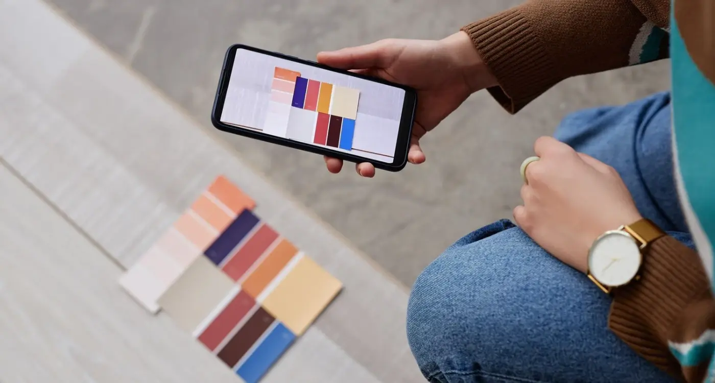
Colour Contrast and Typography Choices for Declining Vision
The Web Content Accessibility Guidelines recommend a contrast ratio of at least 4.5:1 for normal text, but for elderly users we aim for 7:1 or higher whenever possible (that's the AAA level standard). Dark text on light backgrounds generally works better than light text on dark backgrounds, though some users with certain eye conditions prefer dark mode, so offering both options makes sense. When implementing dark mode design, it's crucial to maintain proper contrast ratios across both light and dark themes.
Font size is non-negotiable. We never go below 16 pixels for body text, and 18-20 pixels is better for primary content. On that banking app, we used 20 pixel body text as the default, with an option to increase it to 24 or 28 pixels in settings. About 40% of users over 65 immediately increased the text size when they discovered that setting.
Font choice matters more than you'd think. Sans-serif fonts like Helvetica, Arial, or SF Pro (Apple's system font) tend to work better than serif fonts because the letterforms are cleaner and easier to distinguish. We avoid anything condensed or decorative. Line height should be generous, around 1.5 times the font size, because cramped text is harder to read when your vision isn't perfect.
Colour shouldn't be the only way to communicate information. If you're using red text to show an error, you also need an icon or label that says "error" because colour blindness increases with age. On a prescription management app, we used both colour coding and clear text labels for different medication types, so users didn't have to rely on distinguishing between shades of blue and green. This approach aligns with broader principles around supporting accessibility features that benefit users across different abilities and backgrounds.
Simplifying Navigation Without Being Patronising
This is where most apps fail. Developers either create overly complex navigation that confuses older users, or they strip away so much functionality that the app becomes useless. The balance is tricky.
We've found that older users prefer familiar navigation patterns over clever new approaches. A simple tab bar at the bottom with three to five clearly labelled options works better than hidden hamburger menus or gesture-based navigation. On an e-commerce app for a company selling mobility aids, we tested both approaches and the tab bar version had 60% better task completion rates.
Older users want to know where they are, how they got there, and how to get back... so breadcrumbs and clear back buttons aren't optional, they're required.
Information architecture needs to be shallow rather than deep. If users have to tap through four or five levels to find what they need, they'll get lost or give up. We try to keep things within two taps of the home screen whenever possible. On that healthcare app, we put the three most common tasks (book appointment, view test results, message doctor) right on the home screen with big, clear buttons. This follows the principle of distinguishing between essential features and nice-to-have additions when prioritising what appears prominently in your interface.
Labels need to be descriptive, not cute. "Messages" is better than "Inbox," "Help" is better than "Support," and "Account Settings" is better than just a gear icon. We use both icons and text labels together because icons alone can be ambiguous (does that star mean favourites, ratings, or premium features?).
Consistency across screens helps users build mental models of how the app works. If the back button is in the top left on one screen, it should be there on every screen. If you use blue for primary actions, keep using blue throughout the app.
Voice Control and Alternative Input Methods Worth Implementing
Voice input has been a lifesaver for older users with dexterity issues, and the technology has gotten good enough that it's worth implementing for any app targeting elderly users. On a journaling app we built for a mental health charity, about 30% of users over 70 used voice input for at least half of their entries because typing on a phone keyboard was too frustrating.
Both iOS and Android have built-in voice control features (Voice Control on iOS, Voice Access on Android) that work system-wide, but you can also add voice input for specific fields in your app using speech recognition APIs. Text entry fields, search boxes, and message composition are the obvious places to add voice input options... just make sure the microphone icon is big enough to tap easily. These accessibility considerations are becoming increasingly important as mobile technology advances, much like how 5G technology is transforming app capabilities across different user demographics.
- Speech-to-text input for all text fields longer than a few words, with a clear microphone button that's at least 48 pixels square
- Voice commands for common actions like "read message," "call doctor," or "go to home screen" using system-level voice control APIs
- Text-to-speech output for reading messages, articles, or instructions aloud, with adjustable playback speed
- Haptic feedback (vibration) when users tap buttons or complete actions, giving physical confirmation beyond just visual feedback
Screen readers like VoiceOver (iOS) and TalkBack (Android) are crucial for users with severe vision impairment, so your app needs proper accessibility labels on all interactive elements. This means going through your code and making sure every button, image, and input field has a clear description that makes sense when read aloud. It's tedious work but it matters enormously.
Onboarding That Builds Confidence Instead of Overwhelming
The onboarding experience can make or break an app for elderly users. Show them ten screens of instructions upfront and they'll bail before reaching the main app. Give them no guidance at all and they'll feel lost. Getting this right requires a different approach than what works for younger, more tech-savvy users.
We've had success with progressive disclosure, introducing features gradually as users need them rather than dumping everything in their lap at once. On that medication app, we showed users how to add their first medication during onboarding, then introduced reminder settings after they'd successfully logged a dose, then explained the refill ordering feature after they'd been using the app for a week. This staged approach kept the cognitive load manageable and reflects broader educational app development principles about pacing information delivery appropriately.
Include an optional tutorial that users can revisit anytime from the settings menu. Elderly users often want to review instructions multiple times before they feel comfortable, and knowing they can access help whenever they need it reduces anxiety.
Visual walkthroughs work better than text instructions. Short videos or animated demonstrations showing exactly what to tap and when work better than paragraphs of explanation. On a video calling app for a care home operator, we created 30-second tutorial videos for each main feature, and users watched them an average of three times each before attempting the task themselves.
Permission requests need clear explanations. When you ask for access to the camera or microphone or location, older users want to know exactly why you need it and what you'll do with that access. "This app needs access to your camera so you can take photos of your medications for your records" is way better than just "Allow camera access?"
Testing with Real Elderly Users and What We Learn Every Time
User testing with older adults always reveals things we didn't anticipate, no matter how experienced we think we are. The users we recruit are typically between 65 and 85 years old, with varying levels of smartphone experience (some have been using iPhones for years, others just got their first smartphone), and we watch them complete realistic tasks while thinking aloud about what they're doing.
One thing we see repeatedly is that older users read everything on the screen very carefully before taking action. Younger users scan and tap quickly, but elderly users want to understand what will happen before they commit. This means your copy needs to be clear and accurate, and button labels need to describe exactly what tapping them will do. "Submit" is vague... "Send Message" or "Confirm Booking" is specific. When choosing between different development approaches, consider how your choice will impact the ability to iterate quickly based on user feedback from these testing sessions.
Error messages cause disproportionate anxiety. When something goes wrong, older users often blame themselves rather than the app, and they get worried they've broken something or lost their data. We've learned to make error messages very reassuring and include clear recovery steps. "Something went wrong" is terrible... "We couldn't connect to the server. Your information is saved. Please check your internet connection and try again" is much better.
Loading times feel longer to older users because they're less confident that the app is actually doing something. We add loading indicators everywhere, even for operations that only take a second or two, and we include progress bars with percentage indicators when possible. On a photo upload feature, changing from a spinning wheel to a progress bar that said "Uploading... 47%" reduced support queries by half.
The feedback we get is often about things we consider basic. "I didn't know I could tap that" is common when something doesn't look tappable enough. "I couldn't find the back button" comes up when we've made it too small or put it in an unexpected place. "I wasn't sure if it worked" happens when we don't provide enough feedback after an action. These aren't failures on the user's part... they're failures in our design. Building confidence through successful interactions often mirrors the principles used in effective app engagement strategies, where positive user experiences lead to continued usage and advocacy.
Conclusion
Designing apps for elderly people isn't about creating a dumbed-down version of your regular app, it's about understanding real physical and cognitive constraints and designing around them thoughtfully. Bigger touch targets, better contrast, clearer navigation, and confidence-building onboarding aren't nice-to-haves, they're requirements if you want your app to actually work for older users.
The elderly population is growing rapidly and they're increasingly comfortable with technology (today's 70-year-olds have been using computers for decades), so this isn't a niche concern anymore. Apps that work well for older users tend to work well for everyone else too, because accessible design benefits all users, not just those with age-related limitations.
Testing with real elderly users will teach you more in an hour than months of assumptions and guesswork. Their feedback is direct, their needs are clear, and when you get it right, the gratitude is real because you've given them a tool that helps them stay independent and connected.
If you're building an app that needs to work for older users and want help getting the design right, get in touch and we can talk through your specific requirements and user needs.
Frequently Asked Questions
While Apple recommends 44 pixels, we've found 48 pixels is the bare minimum for elderly users, with 60 pixels working much better in practice. You should also include at least 12-16 pixels of spacing between adjacent buttons to prevent accidental taps from users with arthritis or tremors.
No, this approach often comes across as patronizing and creates unnecessary maintenance overhead. Instead, design your main app with elderly users in mind from the start - bigger text, better contrast, and clearer navigation benefit all users, not just older ones.
Never go below 16 pixels for body text, with 18-20 pixels being better for primary content. Always include a text size adjustment option in your settings - about 40% of users over 65 will increase the default size when they discover this feature.
Recruit users between 65-85 with varying smartphone experience levels and watch them complete realistic tasks while thinking aloud. Focus on observing where they hesitate, what they read carefully, and what causes confusion - their feedback is often about basic usability issues that younger testers miss.
Use familiar patterns like bottom tab bars with 3-5 clearly labeled options instead of hidden menus or gestures. Keep your information architecture shallow (within 2 taps of home screen) and always use descriptive labels with icons rather than icons alone.
Voice input is extremely valuable for users with dexterity issues - about 30% of users over 70 will use it regularly once they discover it. At minimum, add voice input to text fields and ensure your app works properly with system-level voice control features like iOS Voice Control and Android Voice Access.
Treating them like children or assuming they want everything oversimplified to the point of being useless. Older users want full functionality - they just need it presented differently with better visual design, clearer feedback, and more intuitive navigation patterns.
It's critical - aim for a contrast ratio of 7:1 or higher instead of the standard 4.5:1 recommendation. Additionally, never use color alone to communicate information; always pair it with text labels or icons since color blindness increases with age.
Share this
Subscribe To Our Learning Centre
You May Also Like
These Related Guides
How Do I Design for Users with Colour Blindness?

How Do I Make Sure My App's Dark Mode Doesn't Strain Users' Eyes?